Mind 001 - Editorial Sports Design Exploring Composition & Negative Space
Project description
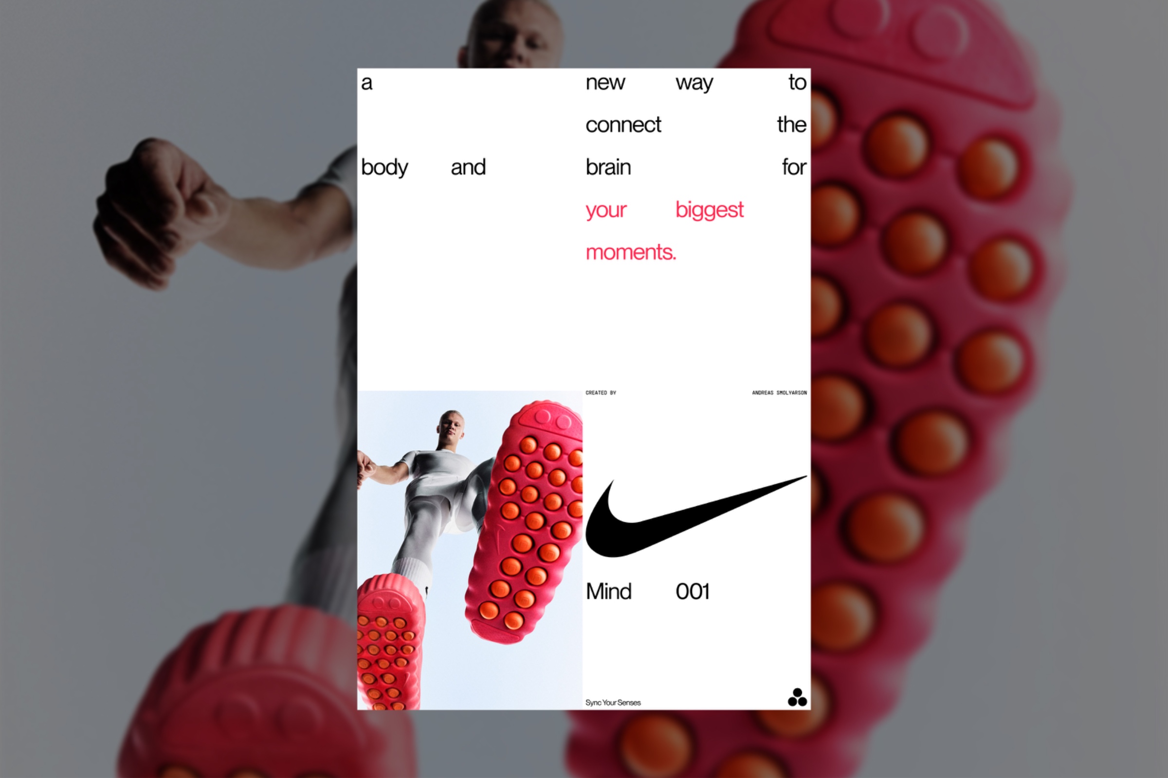
For this concept, I wanted to explore what happens when composition takes priority over convention. Instead of organizing every element around a single focal point, I fragmented the typography across the canvas, allowing the viewer's eye to naturally connect the message while moving through the layout. The photograph, oversized Swoosh, and generous negative space create visual pauses that give the composition rhythm rather than relying on perfect symmetry. This project became an exploration of editorial thinking—where spacing, hierarchy, and intentional restraint communicate just as much as the imagery itself. If you like my design, share your thoughts in the comments! Non-commercial concept project. Images © Nike. Typography: Pangram Pangram & Roman Postovoy.