Nike Mind 001 - Typography-Led Sports Poster Exploring Editorial Hierarchy
Project description
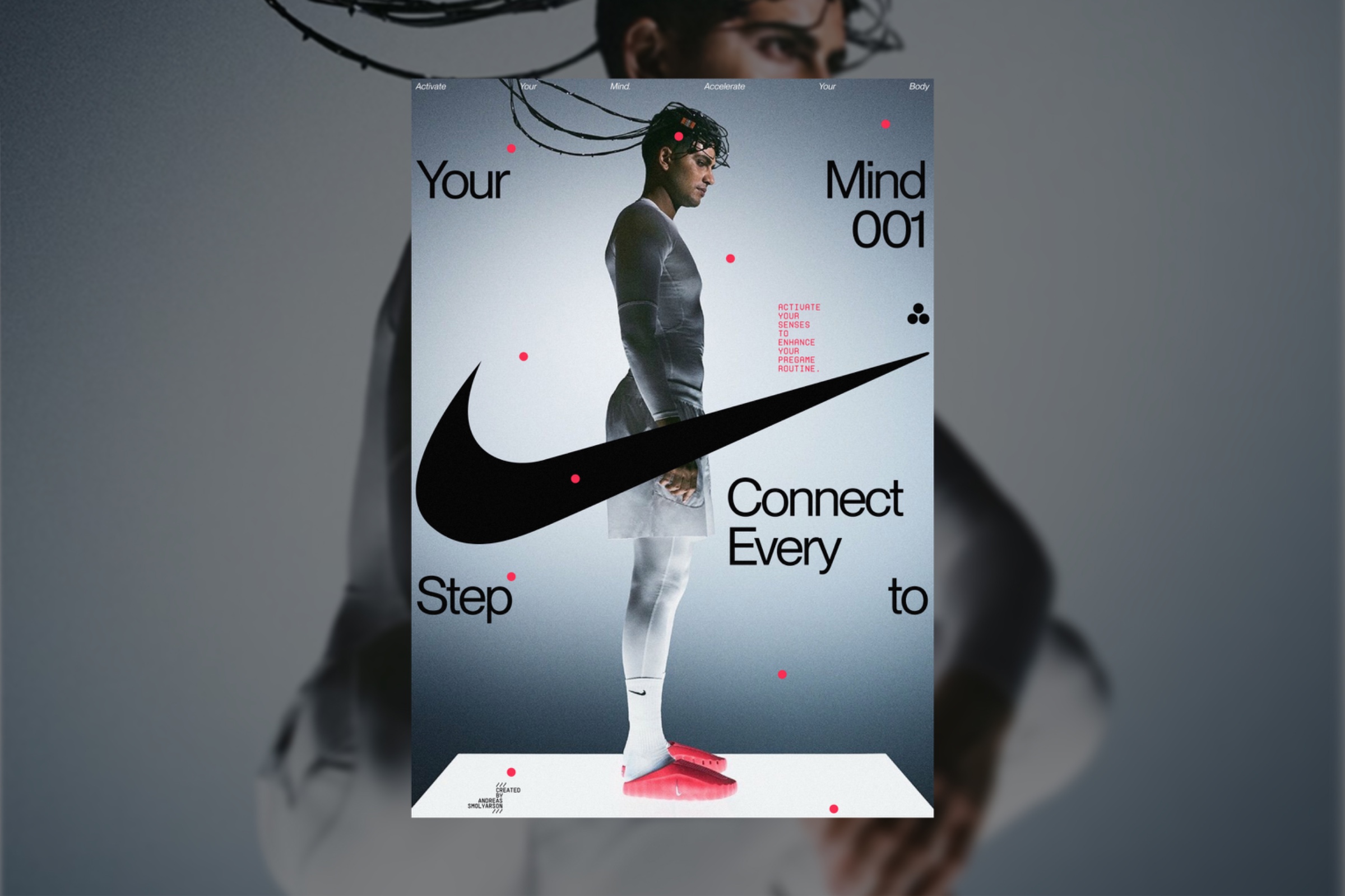
For this concept, I wanted to explore how typography and photography can occupy the same visual space without competing for attention. Instead of separating graphic elements from the image, I intentionally layered them together to create depth and tension. The oversized typography establishes hierarchy, while the Swoosh acts as a directional element that reinforces movement across the composition. Every decision—from the type placement to the restrained color palette—was made to build a cohesive editorial system rather than a conventional sports advertisement. This project became an exploration of how hierarchy, overlap, and composition can communicate energy before a single word is read. If you like my design, share your thoughts in the comments! Non-commercial concept project. Images © Nike. Typography: Pangram Pangram & Roman Postovoy.