

Tarot Reading & Horoscope – Apps on Google Play
Project description
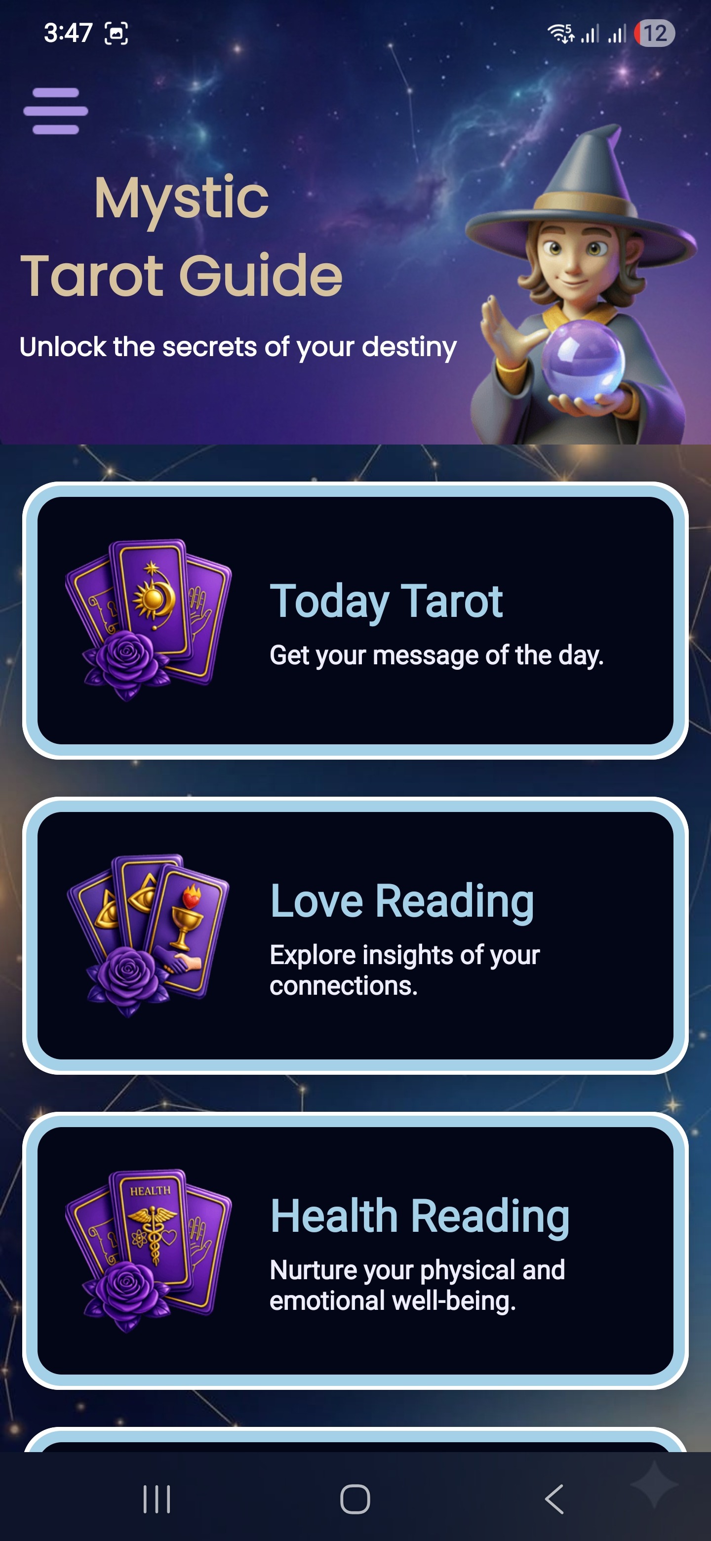
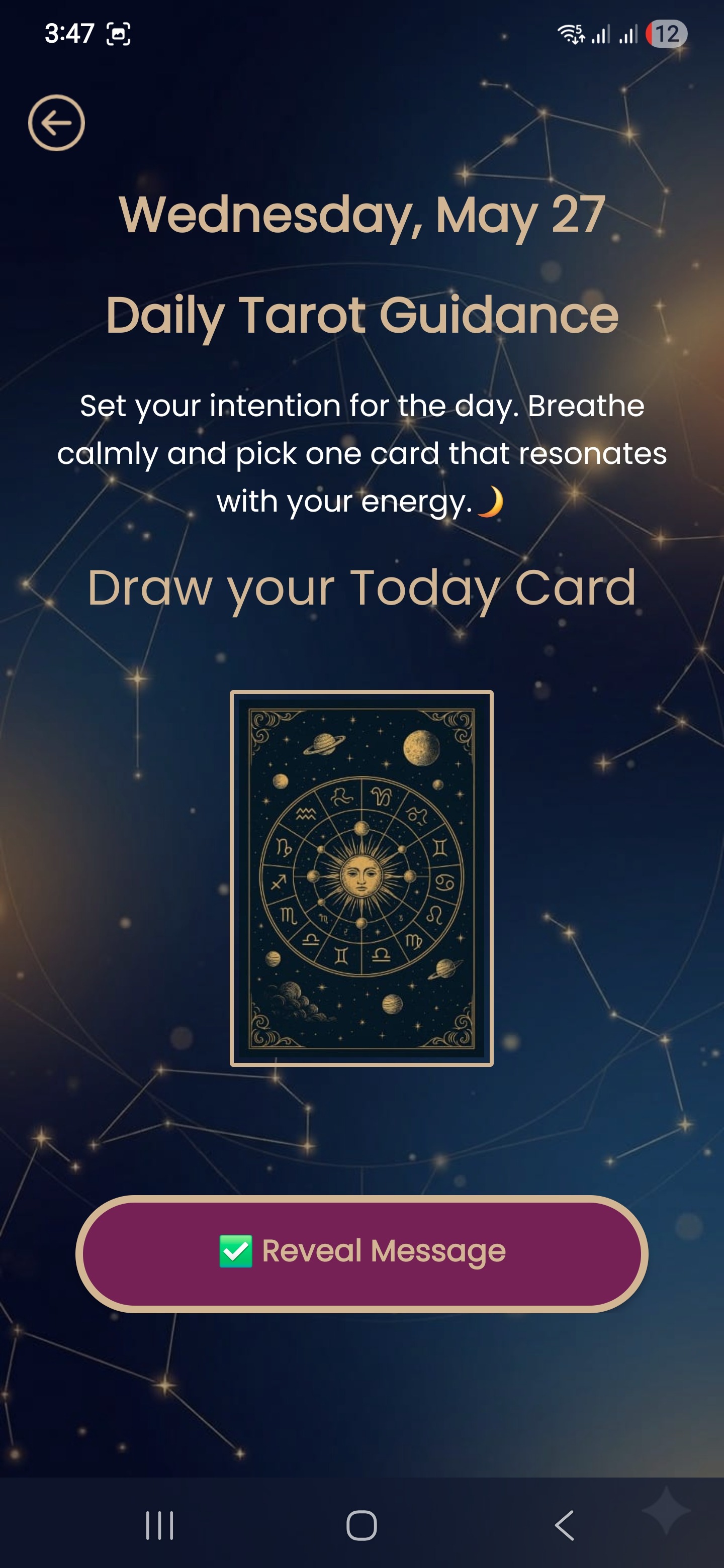
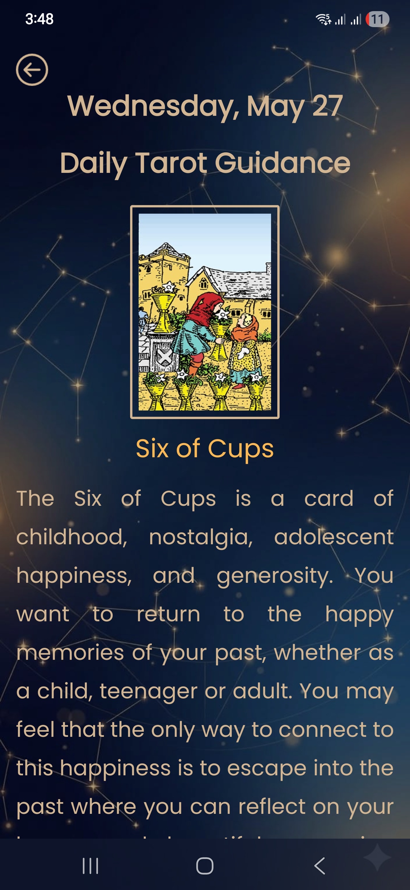
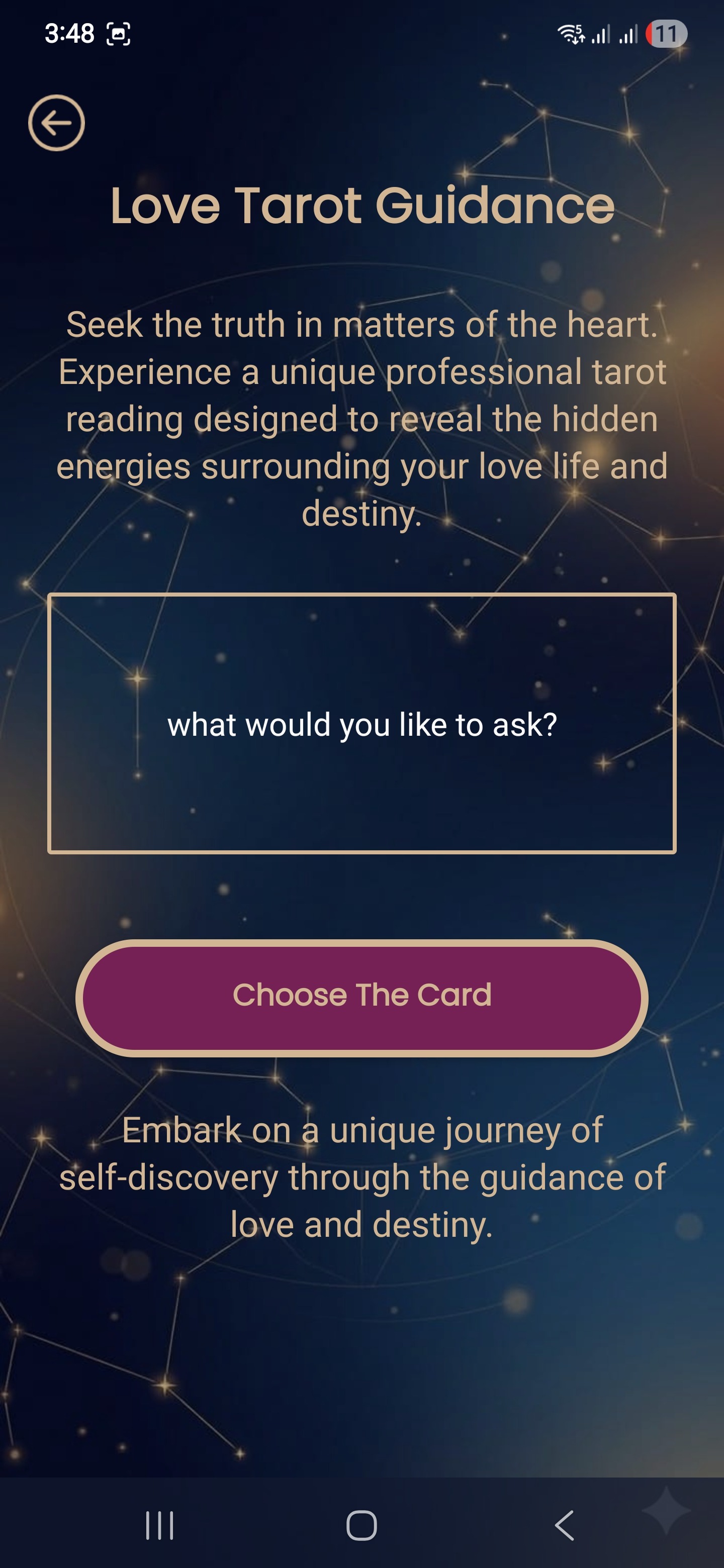
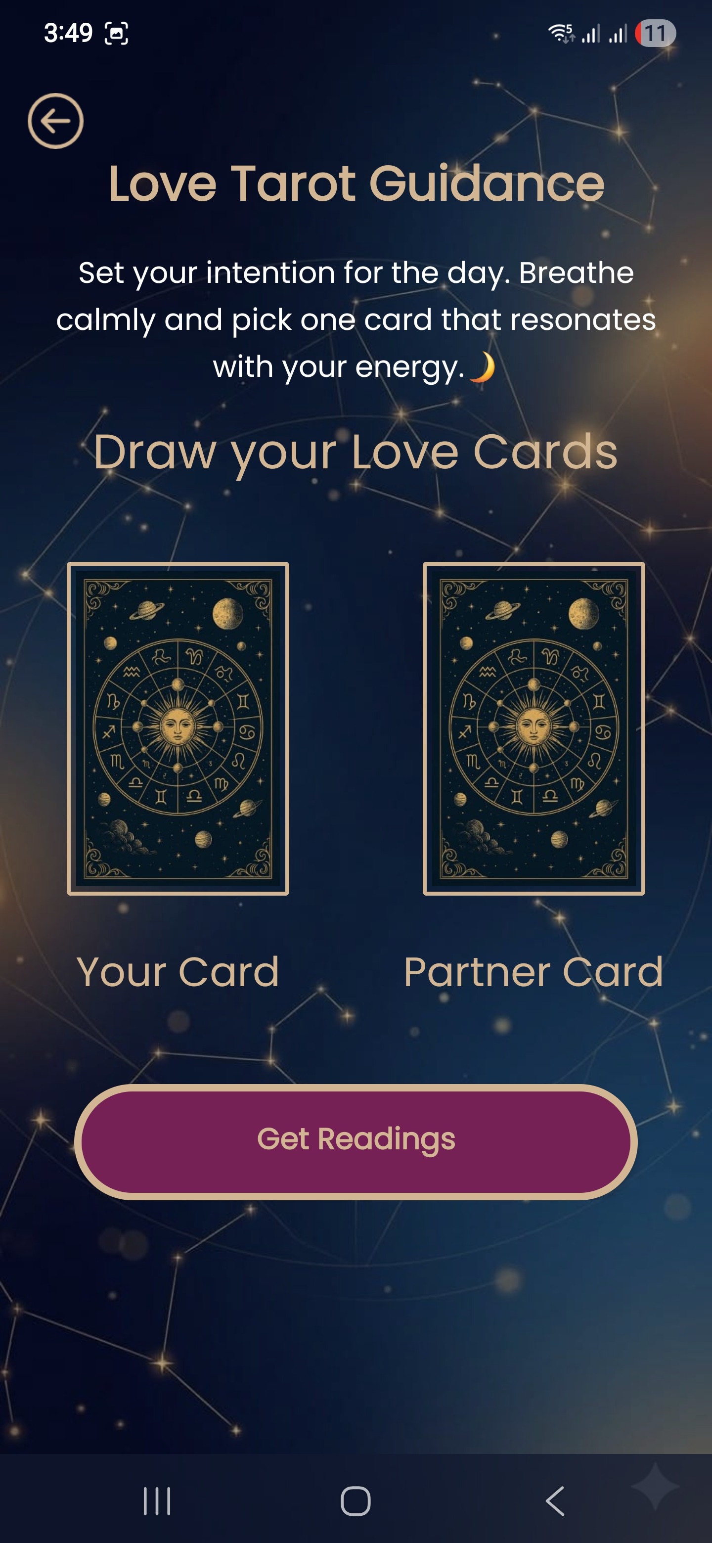
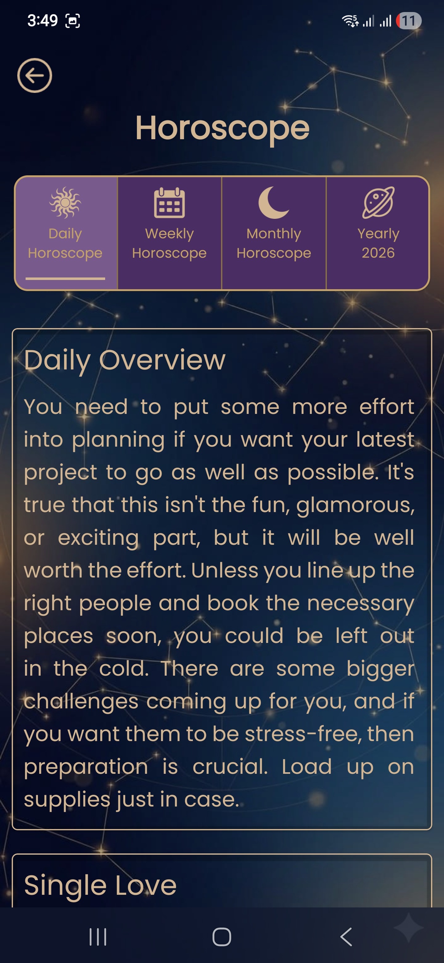
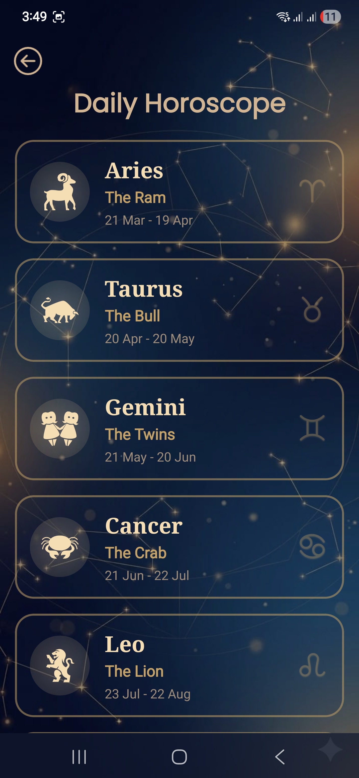
Tarot Reading & Destiny Cards is a lifestyle mobile application designed to bring the timeless art of tarot into the daily routines of modern users. The design challenge was clear: translate a deeply symbolic, centuries-old practice into a digital experience that feels both intuitive and spiritually immersive — without losing the mystique that makes tarot meaningful. The result is a clean, elegant interface built on the iconic Rider Waite Tarot deck, now available to 50,000+ users on Android with a 4.7-star rating. The Design Challenge Tarot has always been a visual and emotional experience. Most existing tarot apps felt either too cluttered or too clinical — they failed to honour the atmosphere that makes a real card reading feel significant. The goal was to design something that felt like holding a physical deck: intimate, focused, and personal. Key challenges included: Presenting 78 unique cards with rich symbolism in a scannable, accessible layout Designing multiple reading spreads (1-card, 2-card, 3-card) without overwhelming users Making upright vs. reversed card meanings easy to switch between Ensuring the UI felt calm and focused, not noisy or distracting Design Approach & UI/UX Process The design process began with a deep study of how physical tarot readings actually work — the ritual, the pace, the focus. This informed every UX decision: Visual Language: A restrained colour palette of deep midnight tones with gold accents was chosen to evoke the feel of a candlelit reading table. Typography was kept minimal and readable to let the card artwork breathe. Navigation & Flow: The app uses a bottom-navigation structure with clearly separated reading modes — Daily Card, Love Reading, Yes/No, Past-Present-Future, Career, and Health. Each reading type follows its own focused, distraction-free flow. Card Interaction: Cards are presented full-screen with tap-to-reveal interactions, mimicking the physical act of flipping a card. Upright and reversed meanings are toggled cleanly within the same card view — no nested menus. Onboarding: New users are guided through a gentle introduction to the Major and Minor Arcana before their first reading, building comfort without overwhelming. Accessibility: Large tap targets, high-contrast text on card descriptions, and clear iconography ensure the app is usable across all age groups. Key Features Designed Card of the Day — daily single-card pull with full interpretation Love Tarot — two-card spread for relationship guidance Yes / No Tarot — single-focus decisional spread Past, Present & Future — three-card spread Career & Money Reading Health & Wellness Reading Full 78-card library with Upright & Reversed meanings 2026 updated horoscope insights Outcome The app launched to an enthusiastic reception from the spiritual wellness community. Users praised the calm, focused UI and the depth of card interpretations — describing it as "visually calming and clairvoyant-feeling." With 50,000+ downloads and a 4.7-star rating, the design successfully bridges the gap between spiritual tradition and modern mobile UX.
Support this project
Tarot voted for this project