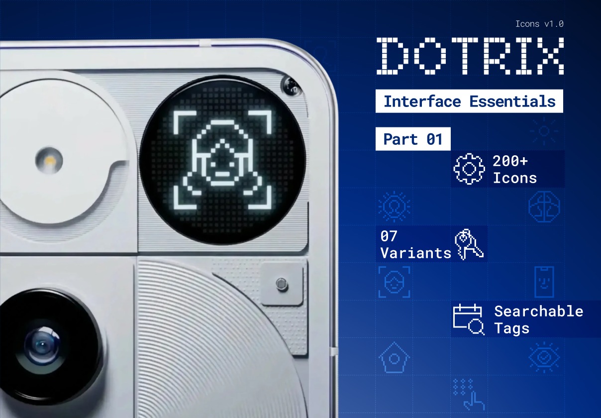
DOTRIX · Interface Essentials · Part 1


Project description
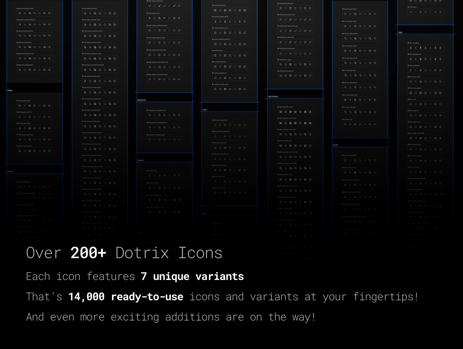
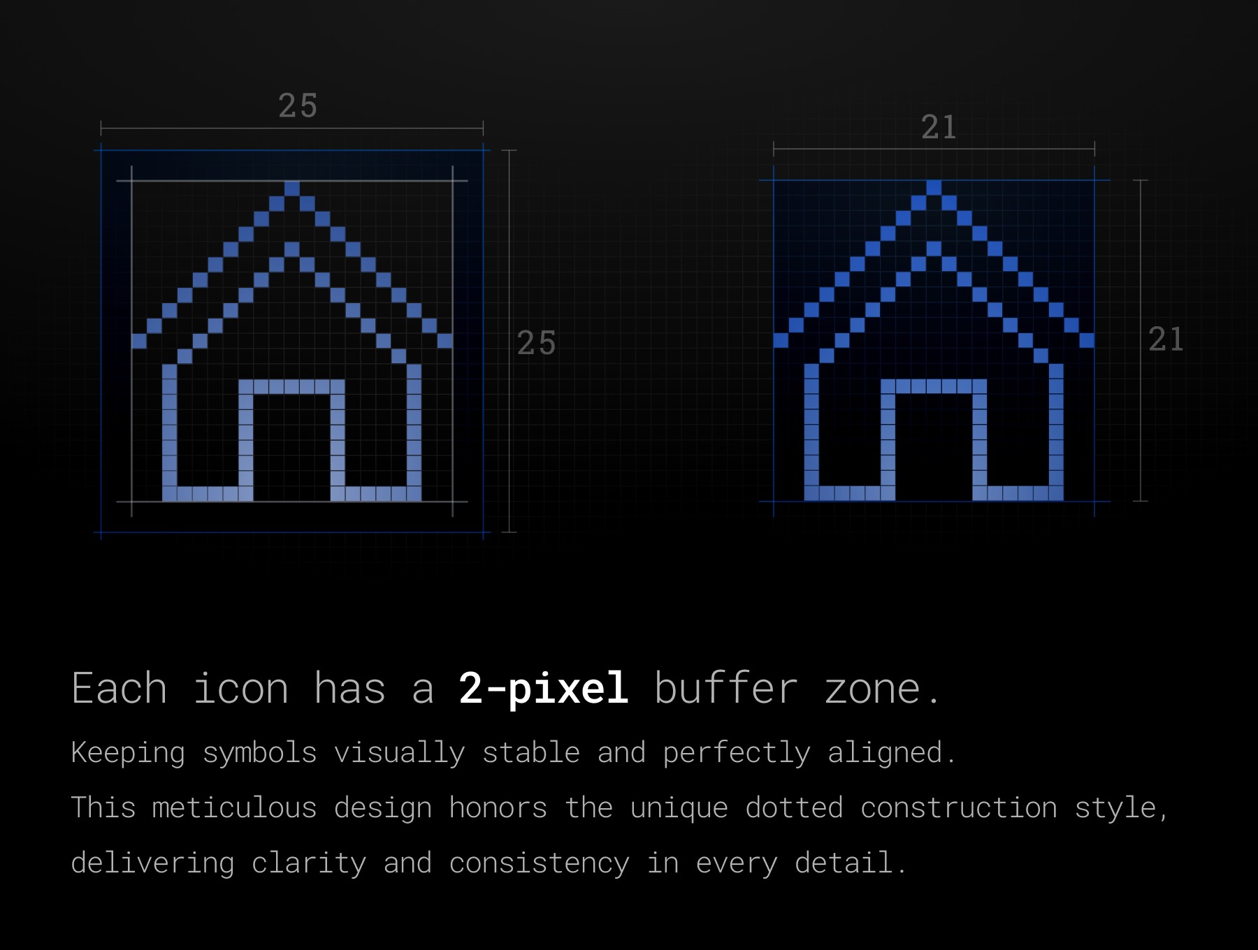
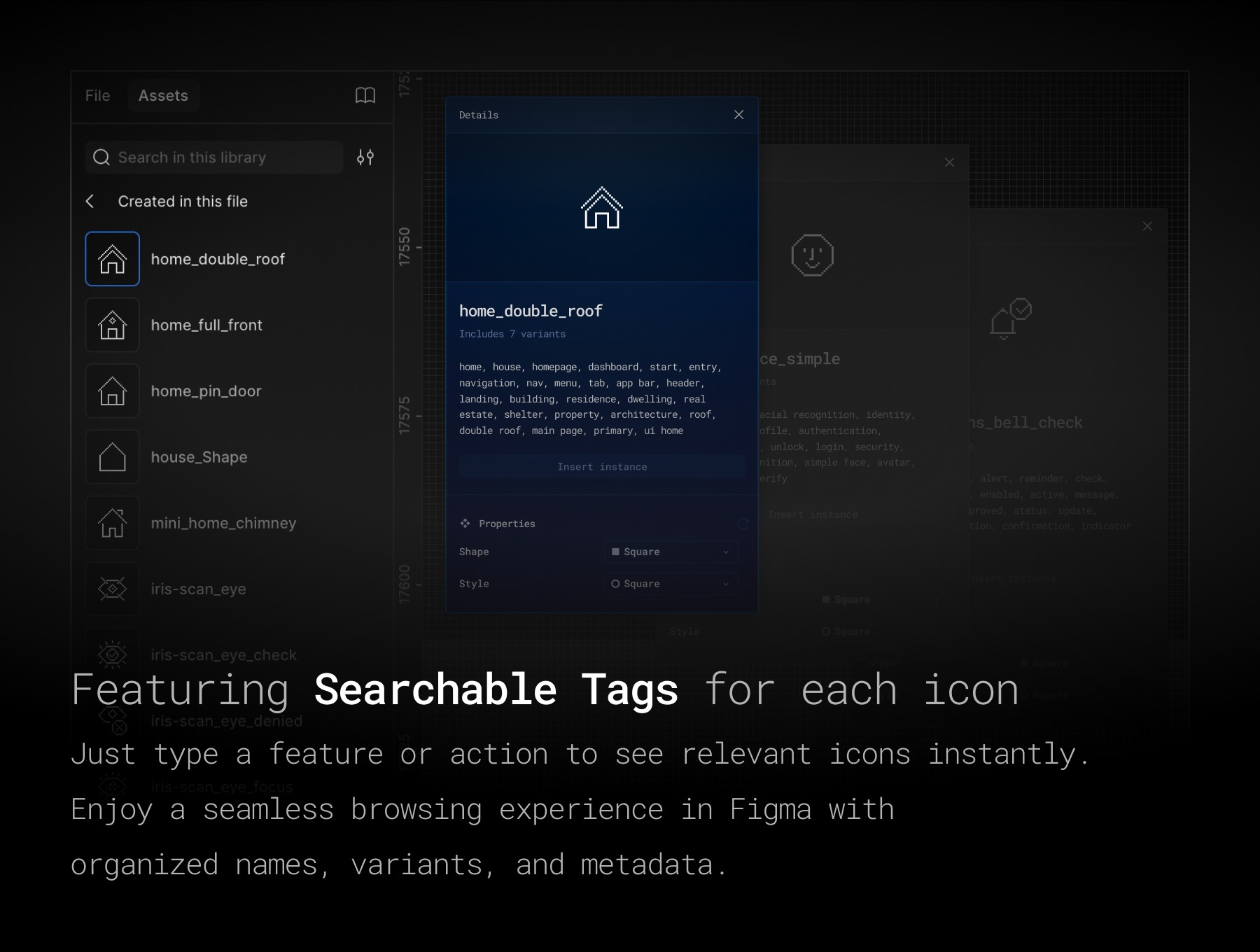
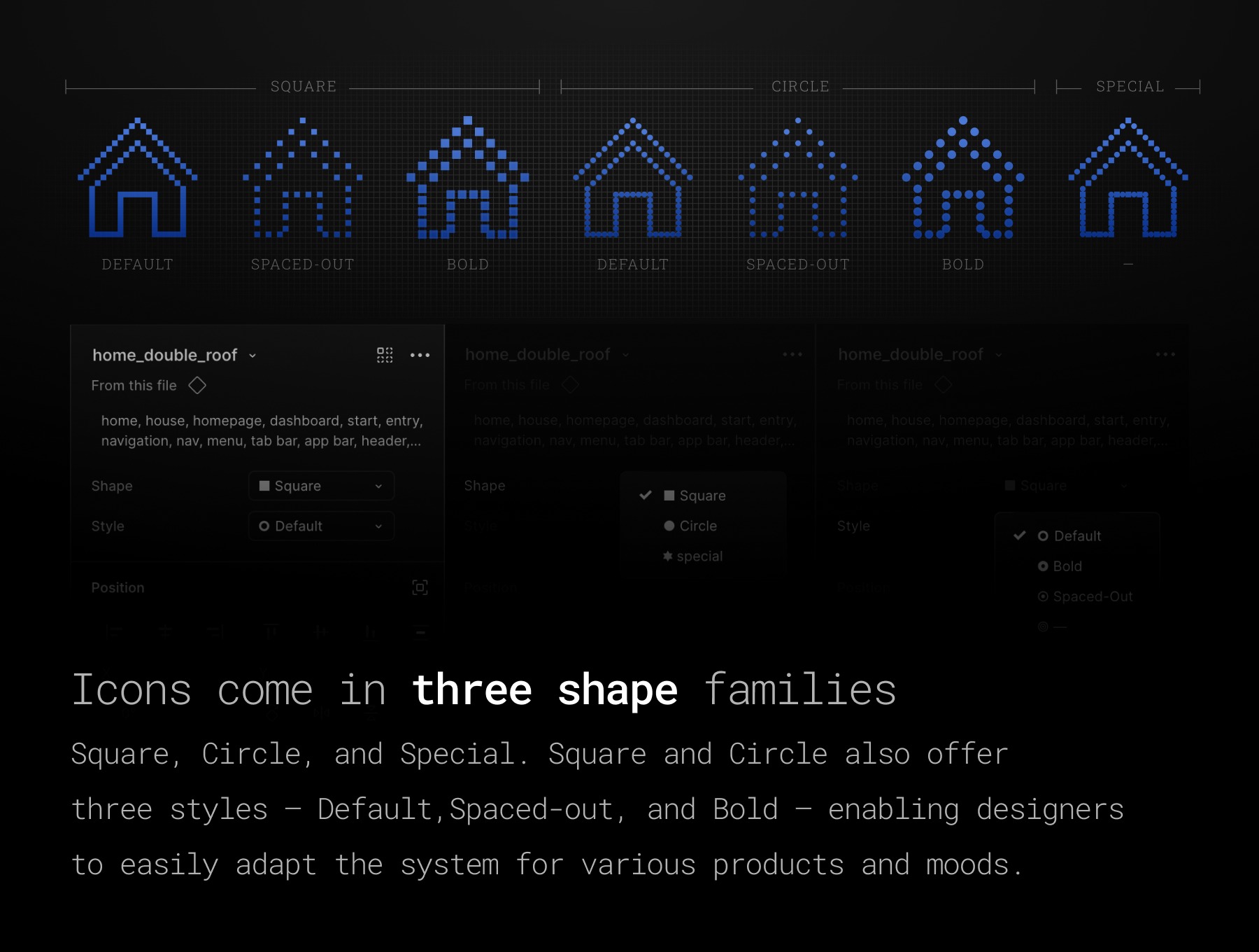
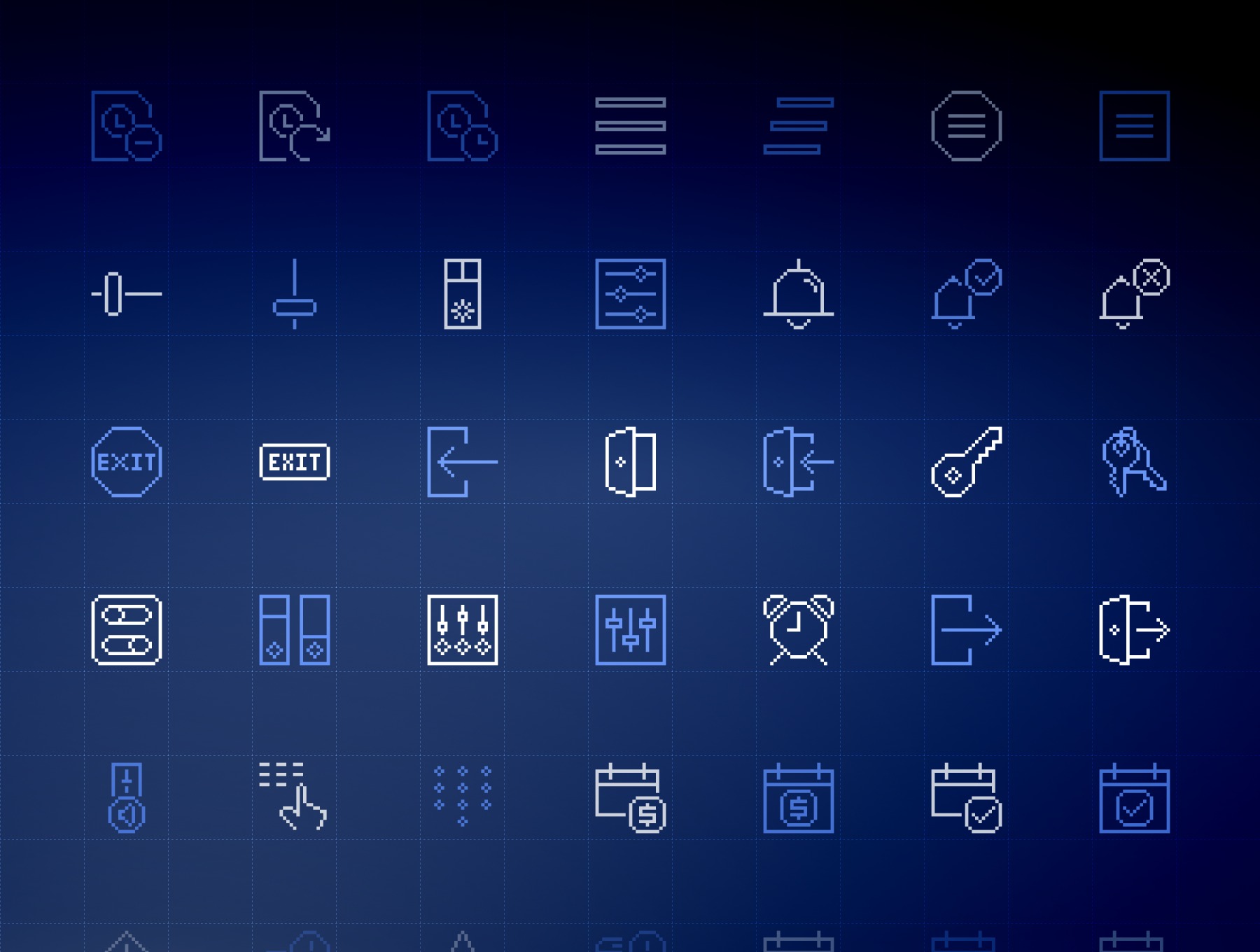
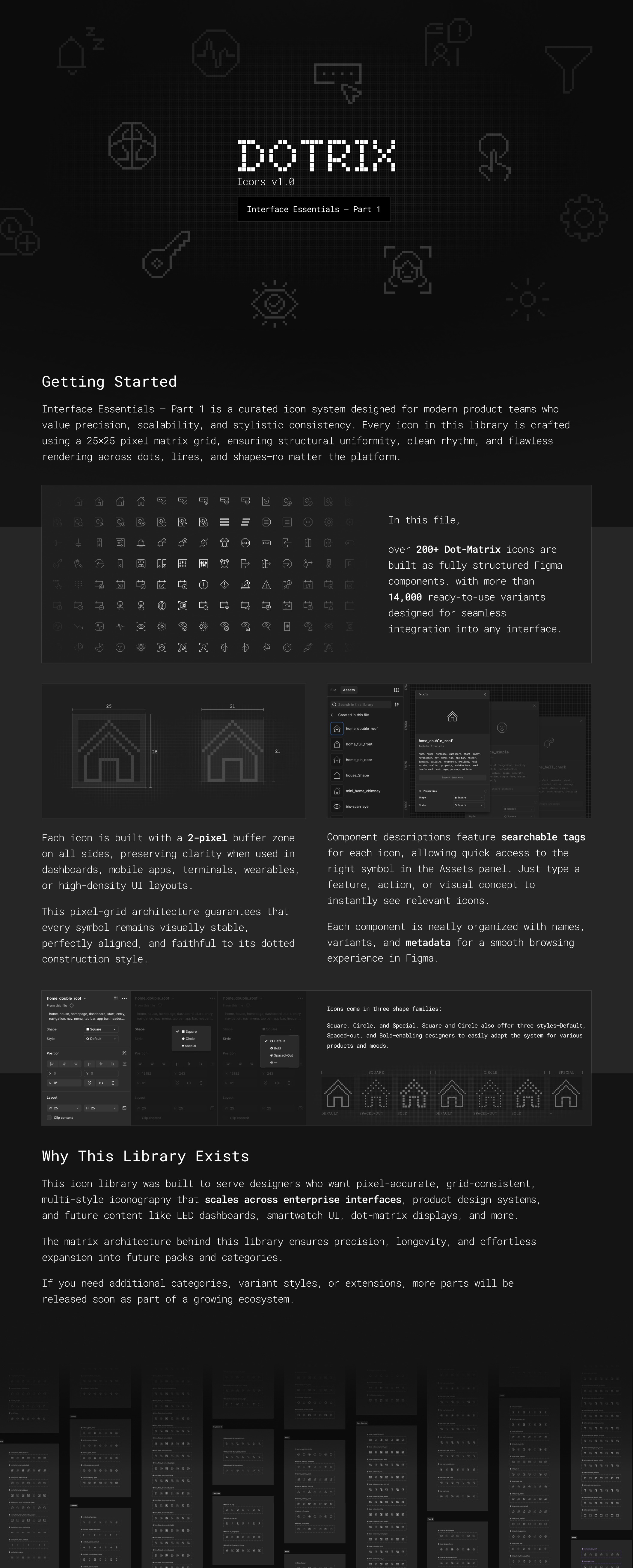
DOTRIX – Interface Essentials · Part 1 is a dot-matrix UI icon system designed for product teams who care about precision, consistency, and scalability. Every icon is drawn on a 25×25 pixel matrix with a 2-pixel safety buffer on all sides. This grid architecture keeps the icons sharp and structurally consistent across dashboards, apps, wearables, terminals, and dense product UIs. The library ships as a fully structured Figma component set with smart naming, searchable tags, and variant properties for rapid swapping. -- What's inside 200+ core interface icons: Home, menu, login/logout, password, controls, notifications, filters, alerts, stats, timers, biometrics (Touch ID, Face ID, Iris Scan, Voice ID), date/calendar and more. 14,000+ ready-to-use variants: Built from a combination of Shape and Style properties, so you can switch a single icon between different visual treatments in seconds. Shape variants: - Square – crisp, technical dot shape - Circle – soft, friendly dot shape - Special – alternating square/circle dot pattern for a distinctive hybrid look Style variants: - Default – balanced everyday weight - Spaced-out – airy, minimal spacing - Bold – denser dot rhythm for stronger emphasis Square and Circle support all style weights, while Special is designed as a fixed, expressive treatment. -- Built for Figma workflows Each icon is a Figma component with Shape and Style exposed as properties. Component descriptions include keyword tags, making it easy to search icons by intent (home, dashboard, alert, filter, date, etc.) directly from the Assets panel. Consistent snake_case naming across categories for clean handoff to design and dev teams. Optimized for dark and light themes, micro-states, and design-system tokens. Ideal use cases: - Design systems and UI kits - SaaS dashboards and admin tools - Mobile and web apps - Retro / Tech, HUD, and data-driven interfaces - Dot-matrix, pixel, or grid-based visual languages - Future-ready system This pack is Interface Essentials · Part 1 – the foundation of a larger DOTRIX ecosystem. Future releases will add new domains and icon families while keeping the same grid, naming logic, and variant structure, so your icon language can grow with your product.


Support this project
Upvote