

DOTRIX · Interface Essentials · Part 3
Project description
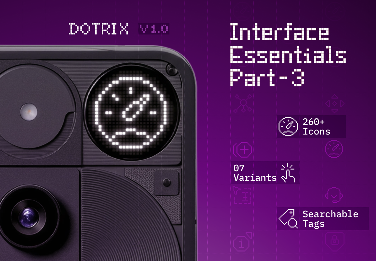
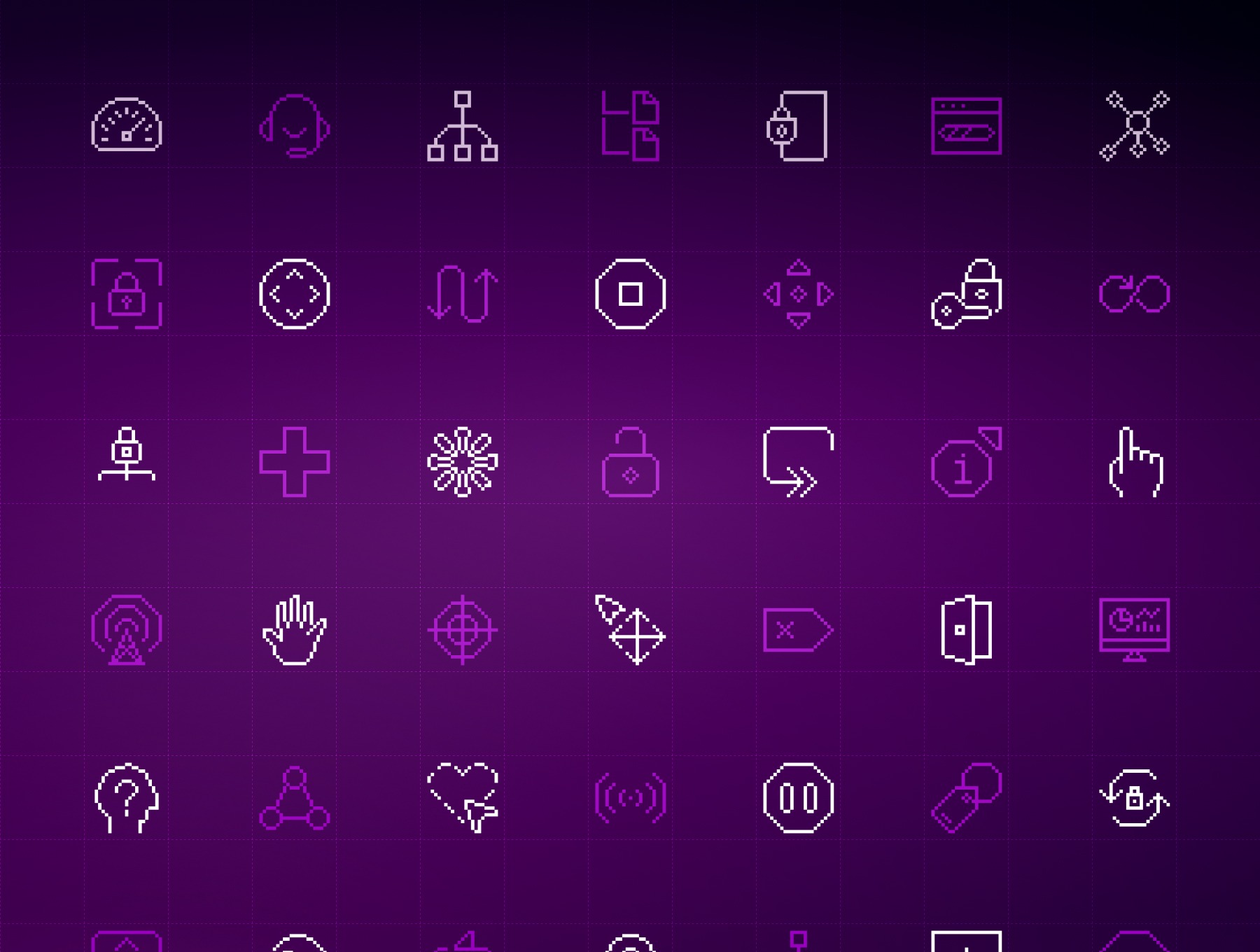
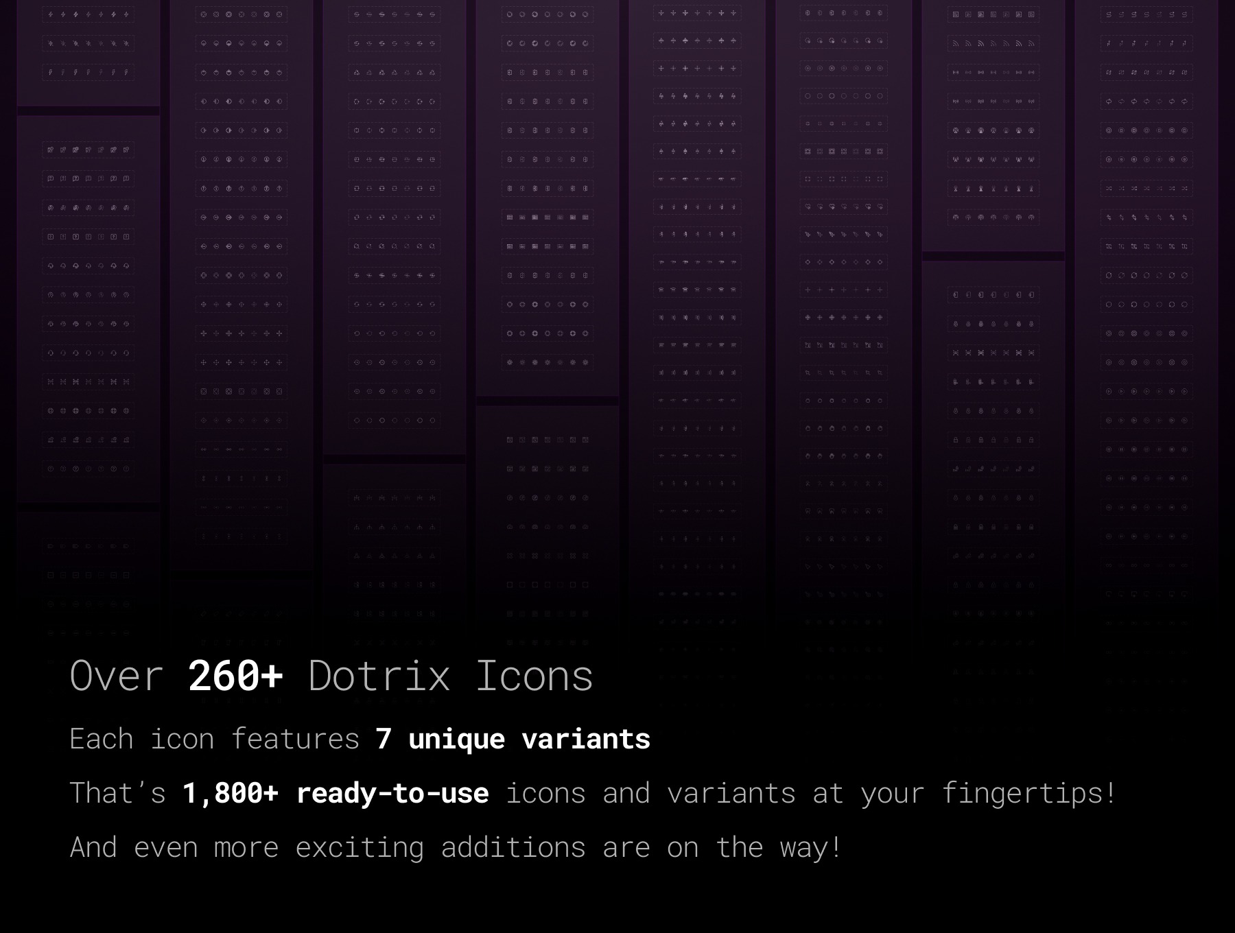
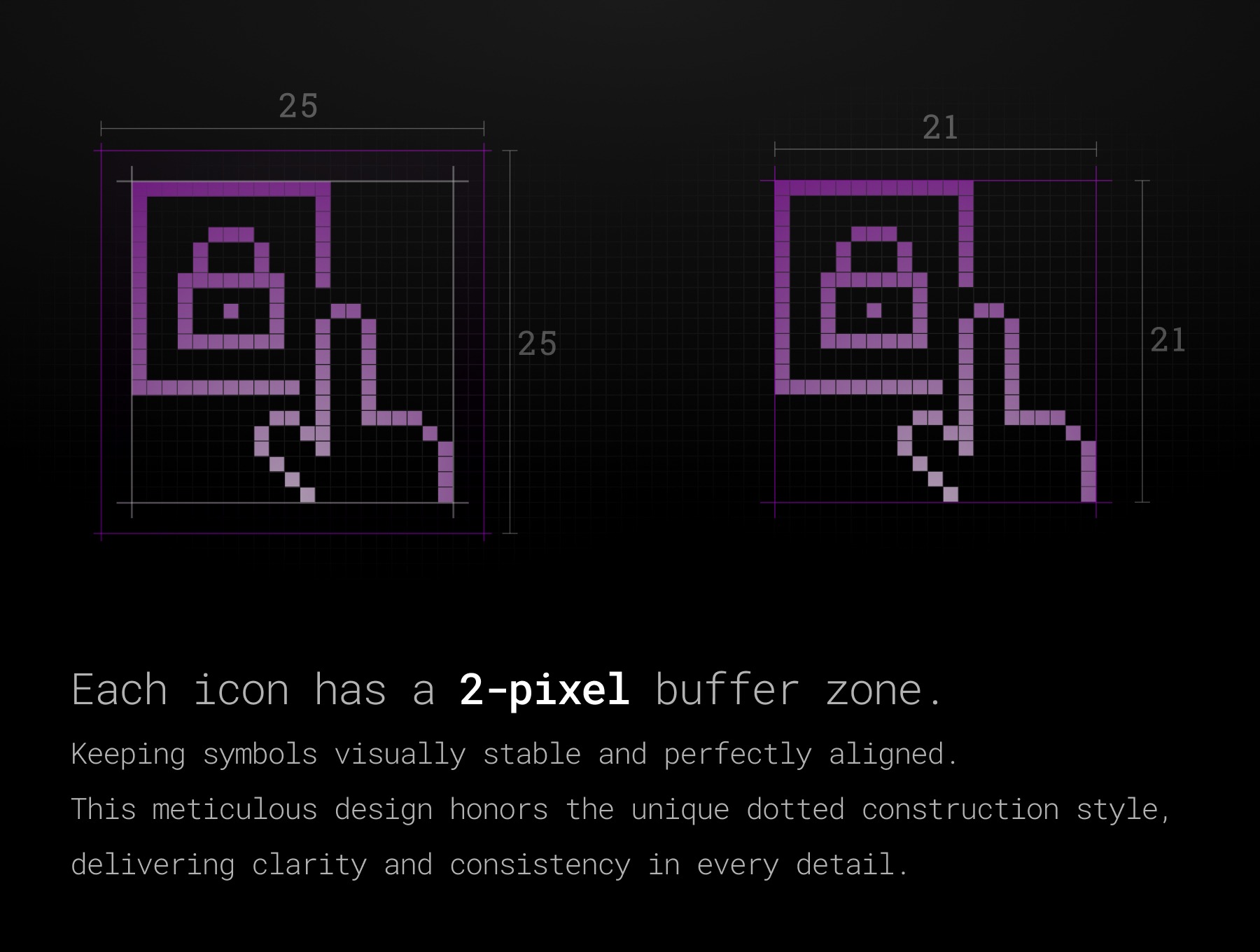
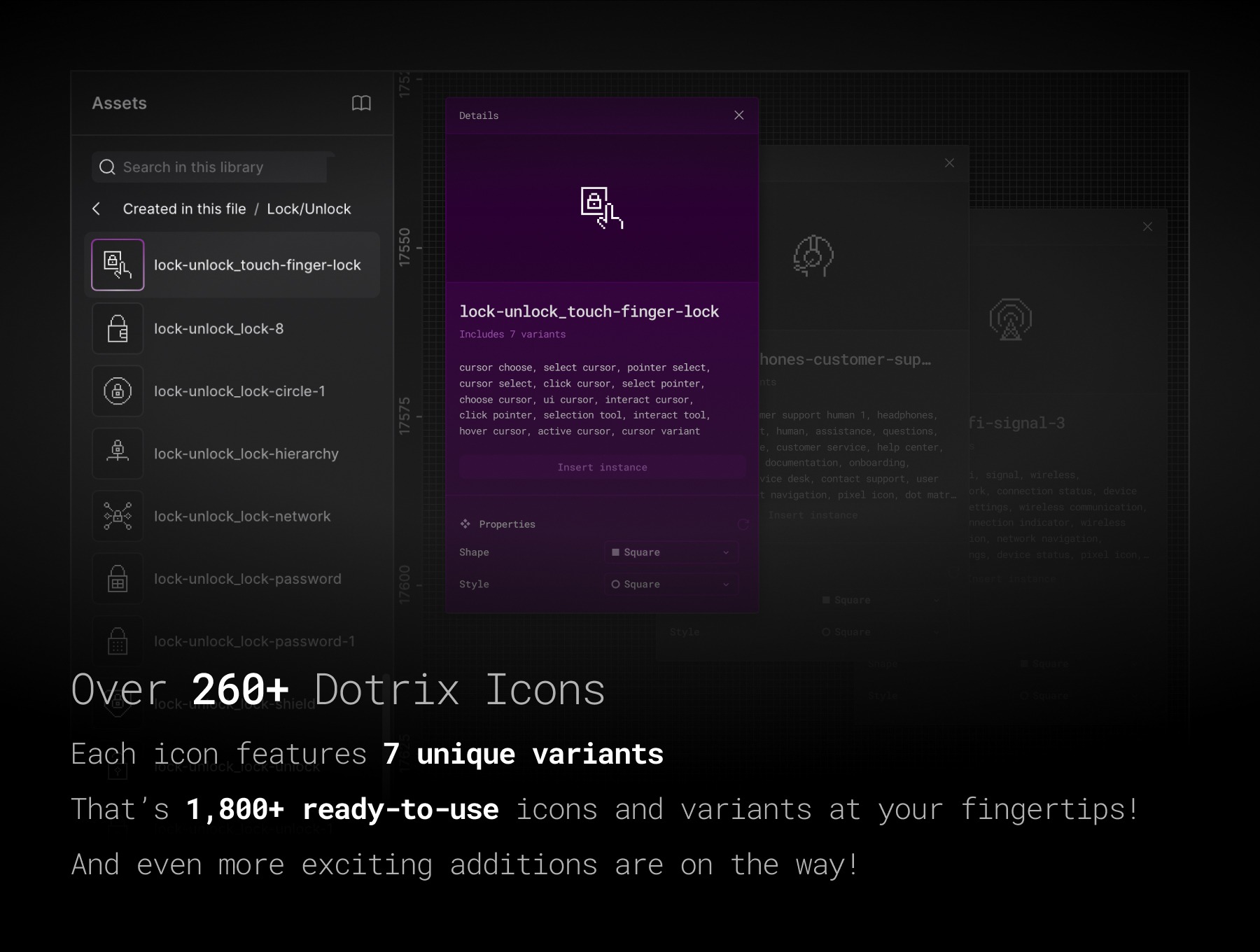
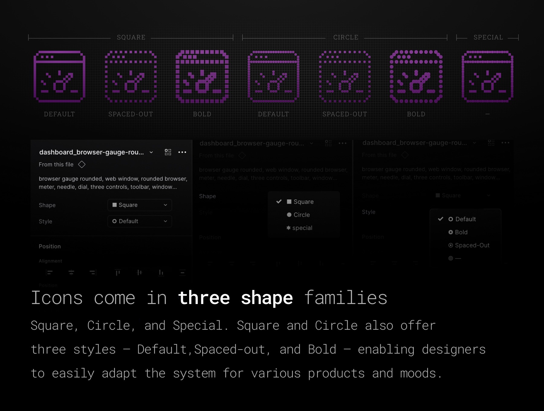
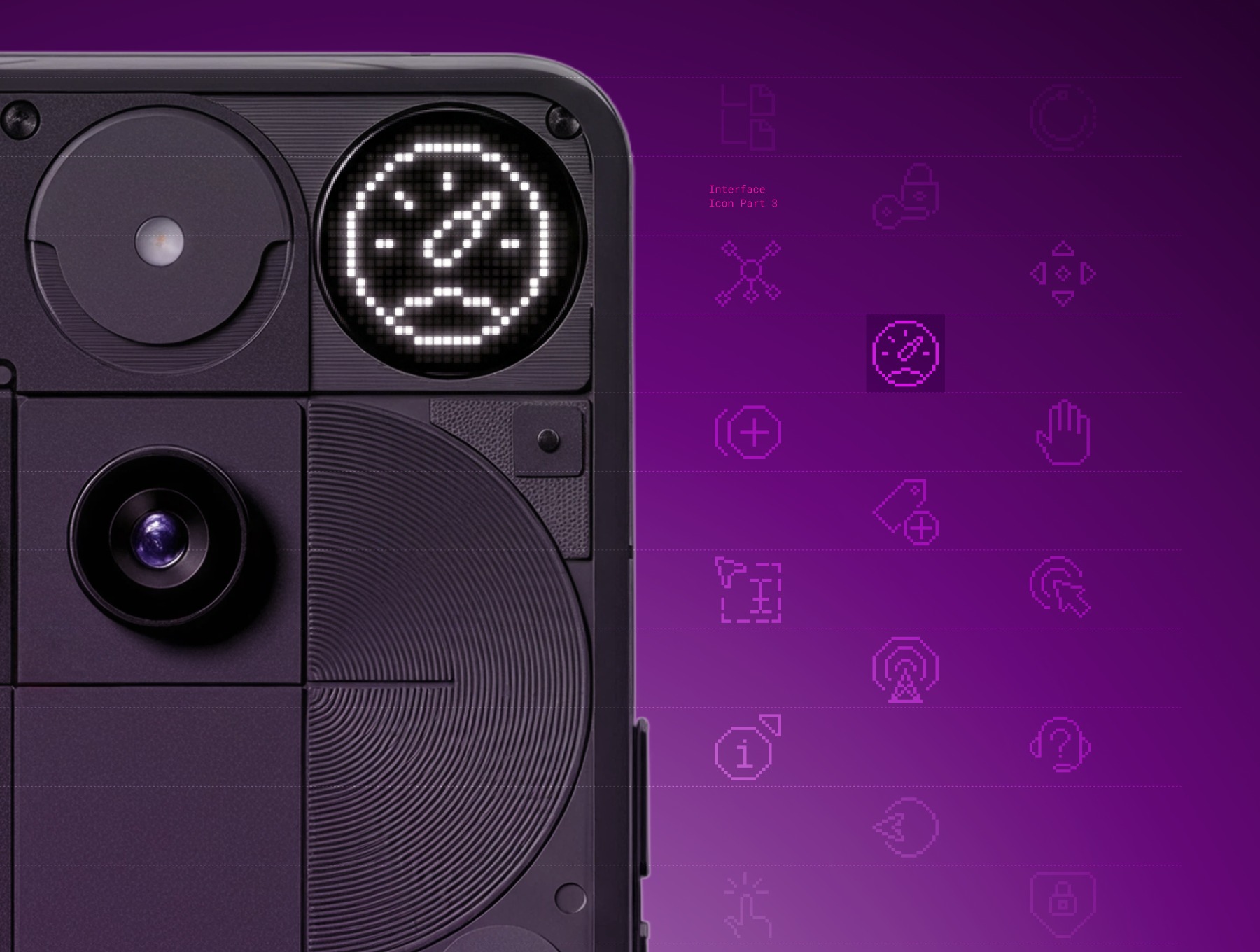
Every interface answers one question: what can I do here? Tap it. Drag it. Lock it. Sync it. Play it, pause it, power it down. Part 3 of DOTRIX · Interface Essentials is the icon set for those moments, the controls people reach for hundreds of times a day, drawn dot by dot on a strict 25×25 matrix. 260+ icons. 1,800+ variants. 15 categories. Seven constructions for every single subject. Part 1 covered navigation and identity. Part 2 covered editing and content actions. Part 3 covers control and interaction: selecting, organizing, gesturing, synchronizing, and operating devices. It shares the grid, the variant structure, and the naming of the first two parts, so it drops in beside them without a visual seam. It also stands fine on its own. ------------------------------------------------------------------- What's inside: 15 categories built around real interface behavior: - Select (36) — Pointers, targets, selection frames, click subjects, and drag hands for choosing and manipulating content - Touch Gestures (36) — Tap, swipe, scroll, flip, and expand, with directional and multi-finger instructions - Lock/Unlock (28) — Locks, unlocked forms, keyholes, doors, password details, and shield subjects - Multimedia Controls (28) — Play, pause, stop, record, track skip, rewind, fast-forward, shuffle, and loop - Tags/Bookmarks (24) — Tags and bookmarks with document, search, favorite, lock, and action details - Remove/Add (19) — Addition, subtraction, and removal in plain, circle, square, and tab forms - Move (19) — Directional cursors, target arrows, multi-direction buttons, and horizontal or vertical scrolling - Synchronize (15) — Single and paired arrows in circular and square routes, with clock, search, lock, and warning details - Hierarchy/Organization (13) — Branching structures, connected nodes, and file hierarchies - Loading (13) — Progress arcs, bars, and activity forms, plus six opening-door subjects - Help (12) — Question marks, message containers, user assistance, support headsets, and a help wheel - Dashboard (9) — Browser gauges, full and flat-base dials, module grids, and analytics panels - Wireless (8) — Wi-Fi and RSS subjects, including framed feeds and antenna-like forms - On/Off (4) — Three power-button subjects and one eject subject - Connect (3) — Three flash subjects, including flash-off ------------------------------------------------------------------- A note on meaning, so you pick the right icon the first time: the Loading doors signal opening or entry, not measured progress. Connect is built from flash metaphors, not network diagrams. Power and eject are separate subjects, so keep them distinct in your labels. ------------------------------------------------------------------- Seven constructions. Every subject. Shape and Style are native Figma component properties. Switch the look of an icon in one click, without redrawing a thing. --- Shape: Square — square dots for a crisp, technical rhythm Circle — circular dots for a softer, friendlier feel Special — square primary dots joined by circular bridge dots, a hybrid pattern you will not find in other sets --- Style: Default — primary and bridge dots combine into the complete subject Spaced-out — bridge dots removed, leaving an open, airy construction on the same grid Bold — larger centered dots for more weight and emphasis Square and Circle each support all three styles. Special is a fixed hybrid treatment. That is seven variants per icon, 1,869 across the library. ------------------------------------------------------------------- Built on a deliberate matrix: Every icon keeps its full 25×25 transparent frame. Default and Spaced-out styles sit in a 21×21 drawing field with a 2-pixel buffer on all sides, so the dots stay aligned and the glyph stays legible in dashboards, mobile apps, terminals, and wearables. Artwork is white-filled vector with no live strokes, so scale the whole frame uniformly and the proportions hold. ------------------------------------------------------------------- Built for Figma workflows: Native components and variants — Swap Shape and Style from the properties panel and your instances stay connected Searchable descriptions — Every component carries keyword tags. Type tap, swipe, lock shield, fast-forward, or sync warning into the Assets panel and the right icon appears Predictable naming — A consistent category_descriptor structure, for example lock-unlock_touch-finger-lock and wireless_wifi-signal-3, keeps handoff to engineering clean One visual grammar — Pick a construction once and carry it across every related control ------------------------------------------------------------------- Made for: - Product design systems and UI kits - SaaS dashboards and admin panels - Media players and device-control interfaces - Mobile apps and touch-interaction guidance - Developer tools, terminals, and data-dense products - Security, access, and support flows - Dot-matrix, pixel-grid, HUD, and retro-tech visual languages ------------------------------------------------------------------- One system. Three parts. More coming. Part 1: System, navigation, and identity Part 2: Editing and content actions Part 3: Control and interaction Use one part where it fits. Bring the parts together when your product needs a broader vocabulary. Every future part will ship on the same 25×25 matrix, with the same component architecture and naming logic. Highlights 260+ dot-matrix icons across 15 control and interaction categories 1,800+ variants, with seven constructions for every subject Square, Circle, and hybrid Special dot treatments Figma components with Shape and Style properties Keyword-tagged descriptions and consistent category_descriptor naming Same grid and architecture as Parts 1 and 2, so the three parts work as one growing icon language Platforms
Support this project
Copees voted for this project