Online Course App UI, Subscription & Creator Platform Design
Project description
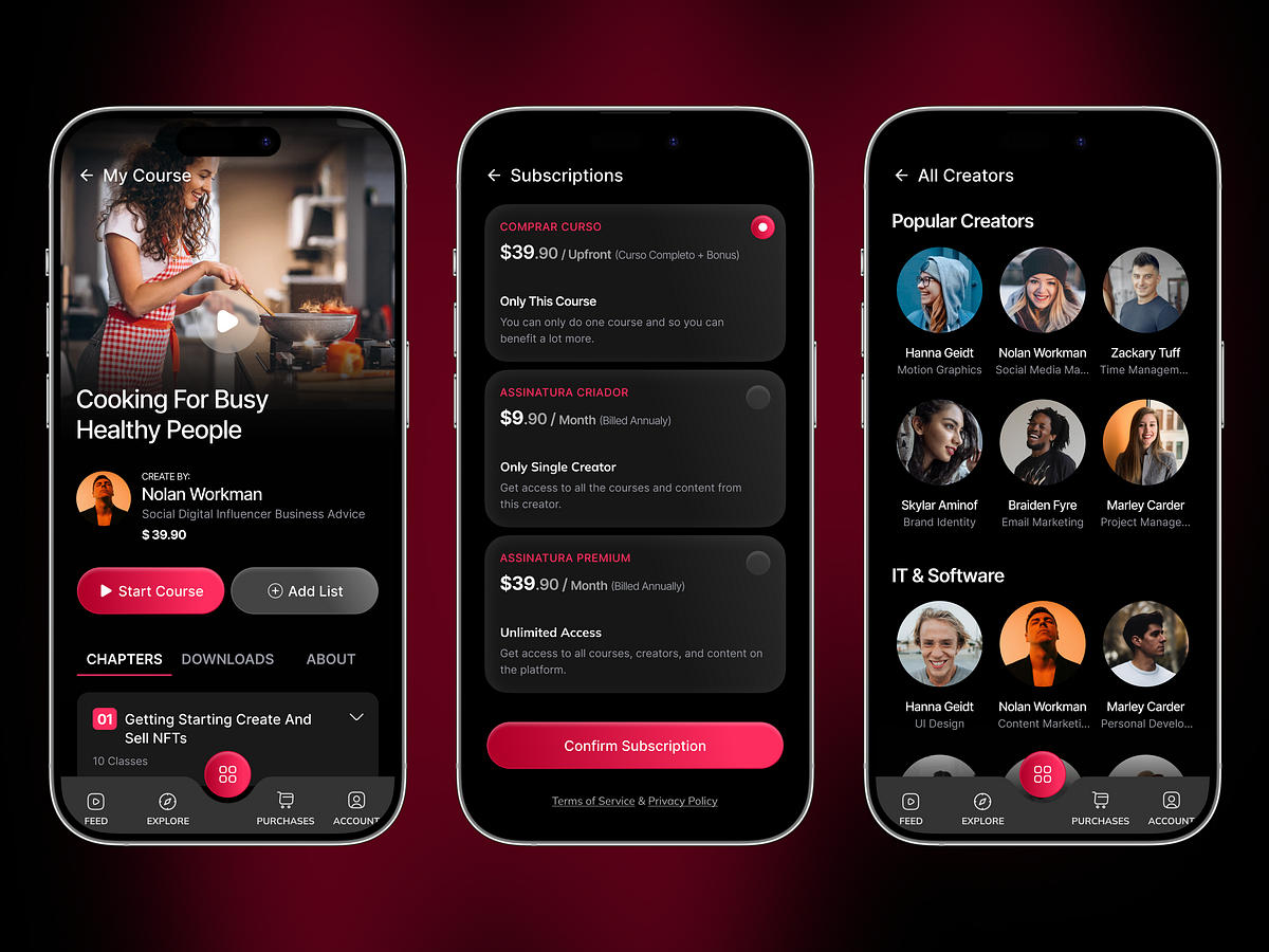
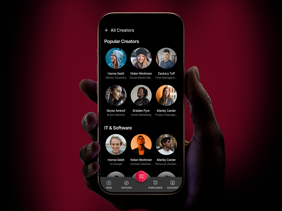
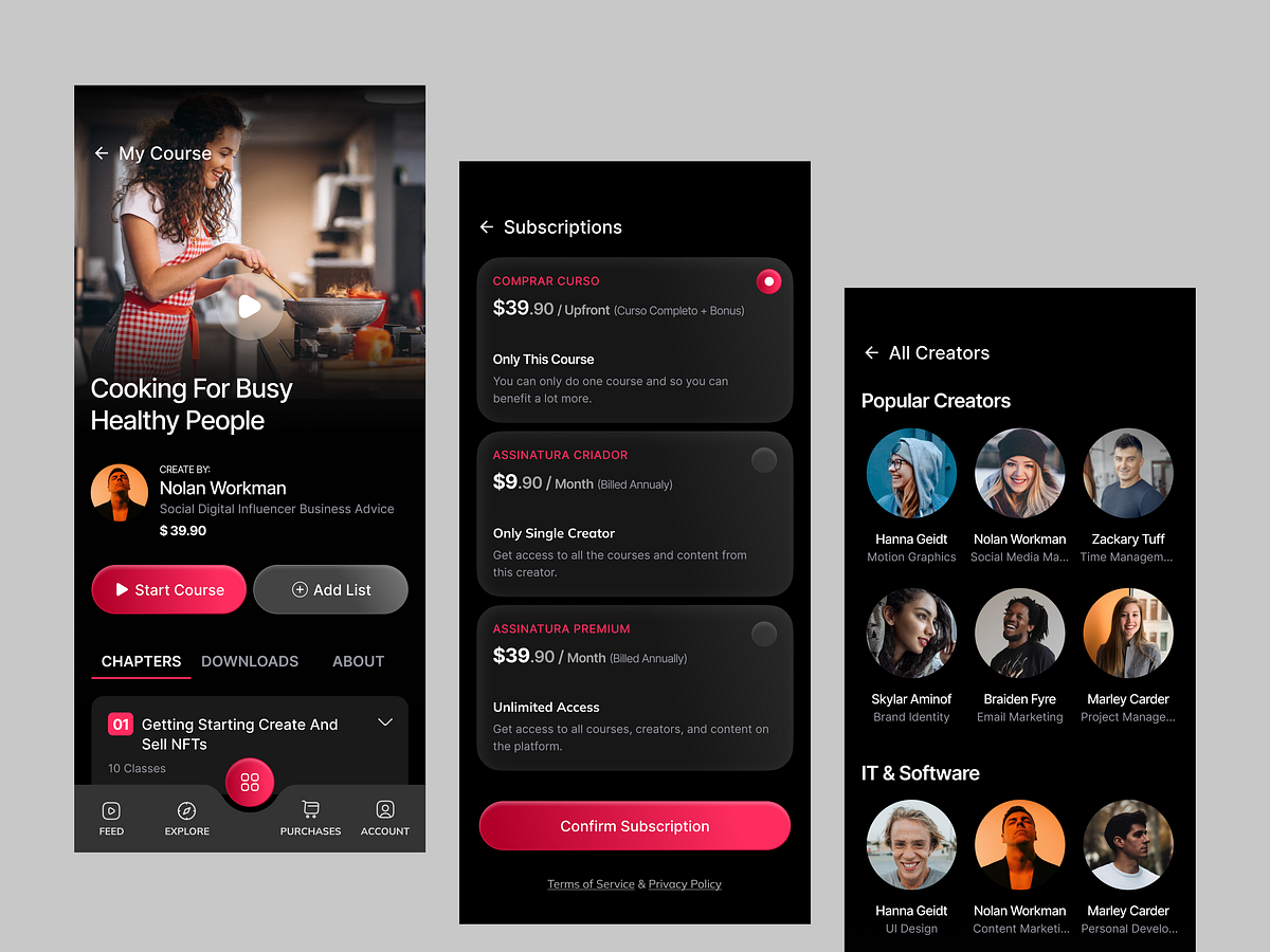
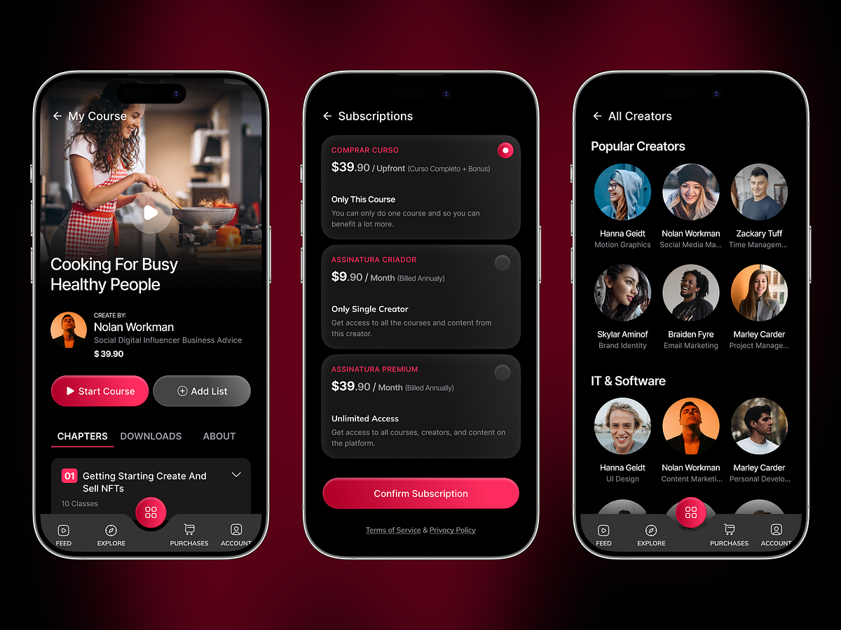
This e-learning mobile app is designed to simplify how users discover, consume, and commit to digital courses. The experience focuses on reducing friction at every step—from course exploration to subscription and content engagement. The course detail screen prioritizes decision-making by presenting essential information upfront: course preview, instructor credibility, and pricing. This ensures users can quickly evaluate value without unnecessary navigation. A structured chapter system breaks down content into manageable segments, improving completion rates and overall learning experience. The subscription flow is intentionally minimal, allowing users to compare plans effortlessly and commit without confusion. The creator discovery section introduces a social layer to the platform, helping users build trust and explore more content organically. Combined with a dark UI approach, the design enhances focus, reduces visual fatigue, and delivers a premium product feel. Overall, the design balances business goals (conversion & retention) with user needs (clarity, speed, and ease of use), making it ideal for modern edtech and creator-driven platforms. 1. Clear Content Hierarchy Hero course preview → instructor info → CTA → chapters — ei flow ta user ke naturally guide kore without confusion. 2. Instant Value Visibility Course title + creator + price ek screen e — decision making fast hoy, bounce rate kome. 3. Strong Primary CTA Placement “Start Course” button ta highly visible + thumb-friendly position e — conversion optimized. 4. Subscription Clarity Multiple pricing options clean card layout e — cognitive load kom, comparison easy. 5. Creator Discovery UX “Popular Creators” section ta trust build kore + exploration encourage kore. 6. Dark UI Optimization Content-heavy app e dark mode eye strain komay + premium feel create kore. 7. Micro Interaction Thinking Active states, toggles, and selections clearly visible — feedback instant. 8. Navigation Simplicity Bottom navigation minimal + predictable — learning flow interrupt hoy na. 9. Content Chunking Chapters breakdown → large content ke digestible kore → retention baray. 10. Trust & Credibility Layer Instructor identity + structured content → user confidence increase kore. Want a high-converting mobile app like this? Let’s design your product → Click on "Get in touch" on our profile — we'd love to bring your ideas to life!