

TPOP Packaging Design
Project description
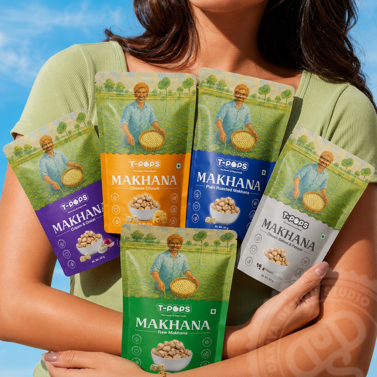
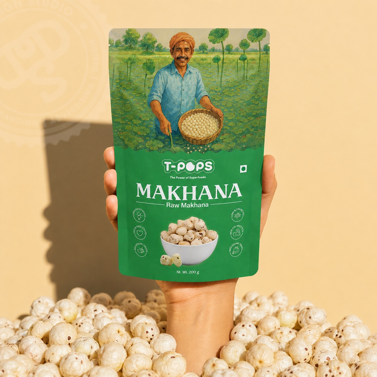
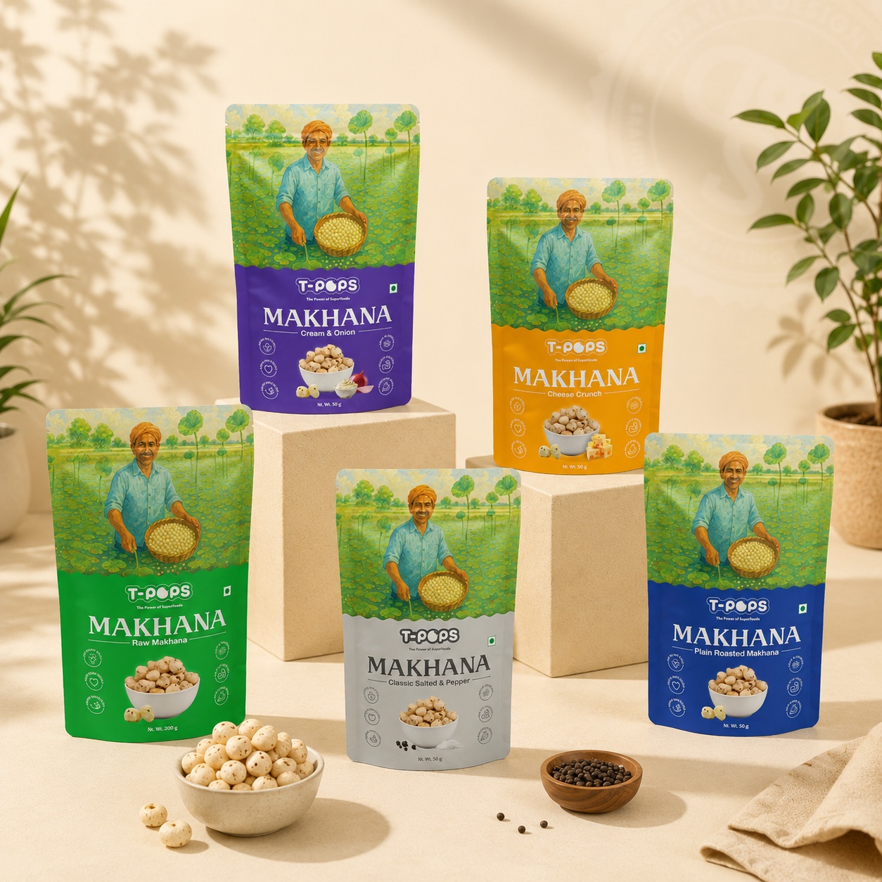
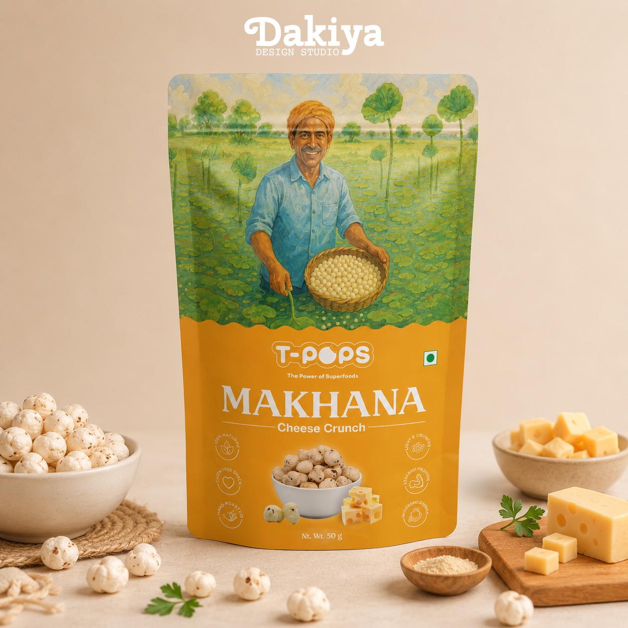
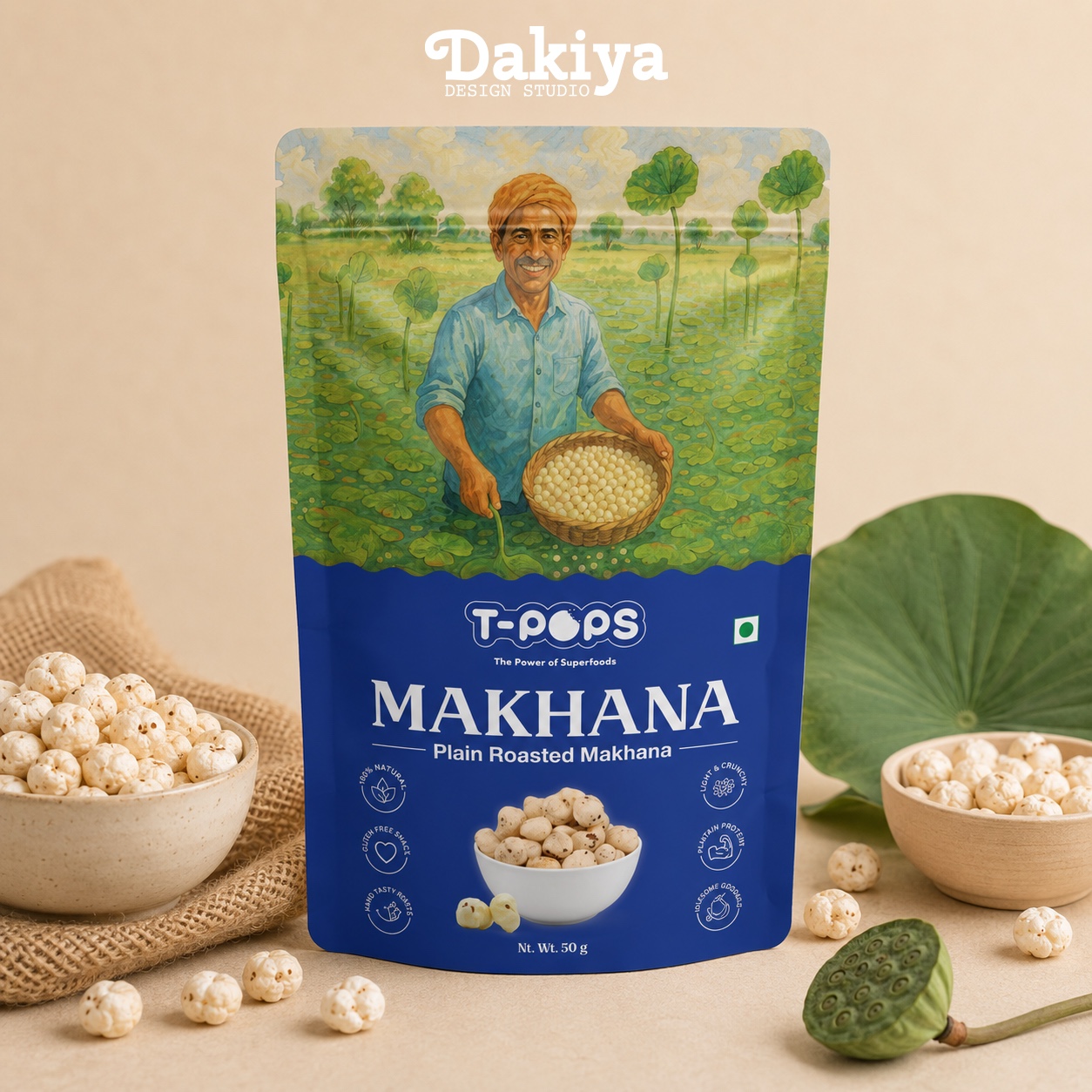
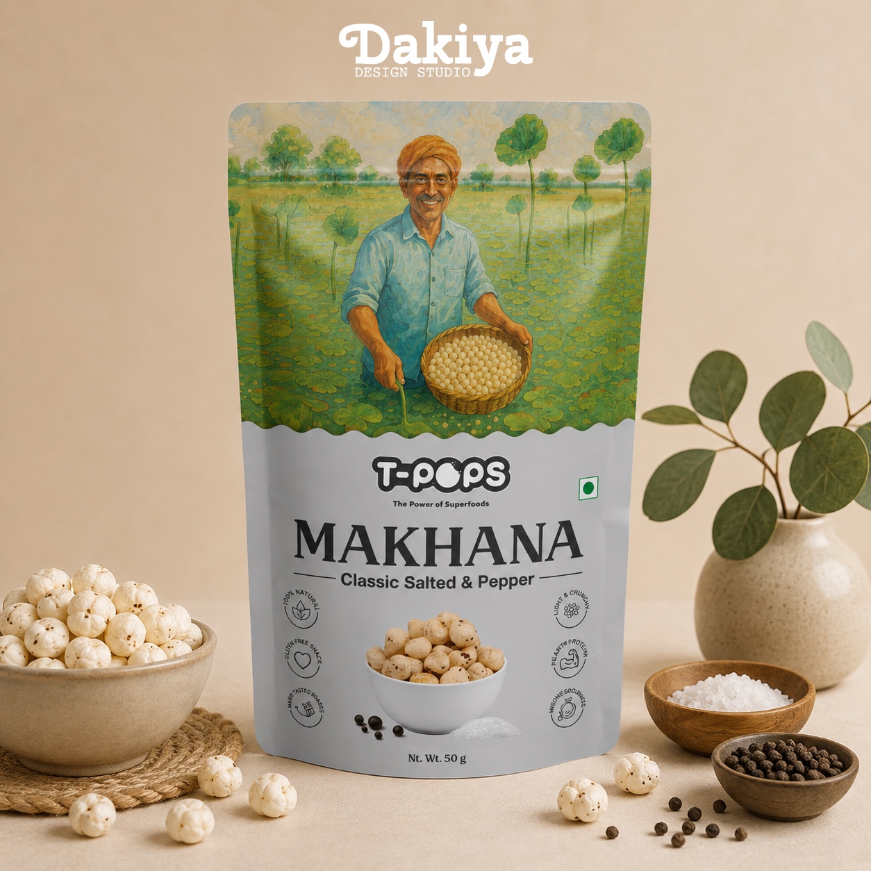
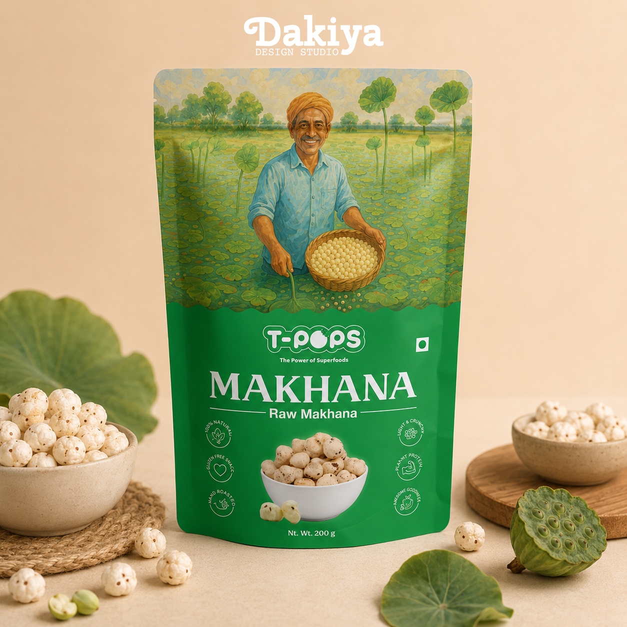
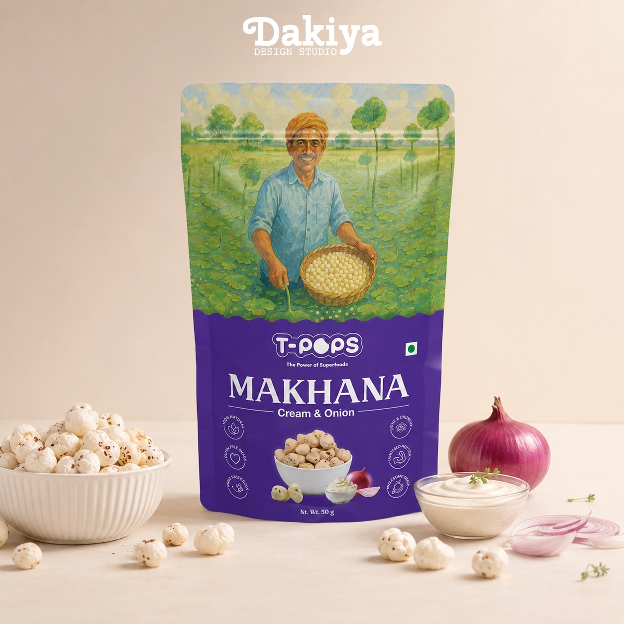
A story that starts with the farmer. 🌱 For this packaging project, we wanted the design to say more than just “makhana.” The artwork brings the farmer right to the front — celebrating the people and the fields where the journey begins. The fresh, illustrated landscape reflects the natural origin of the makhana, while the smiling farmer adds a sense of warmth, pride and happiness to the pack. Each flavour gets its own bold colour, making the range easy to recognise while keeping the overall identity connected. Clean typography, strong product shots and a simple visual hierarchy bring everything together without taking away from the story. Because when the raw material is this important, the story behind it deserves to be seen too. 🌾 #DakiyaDesignStudio #PackagingDesign #MakhanaPackaging #BrandDesign #DesignStory
Support this project

Dmytro voted for this project