Creative Golden Aaja Digestive Biscuit Packaging Design Concepts

Project description
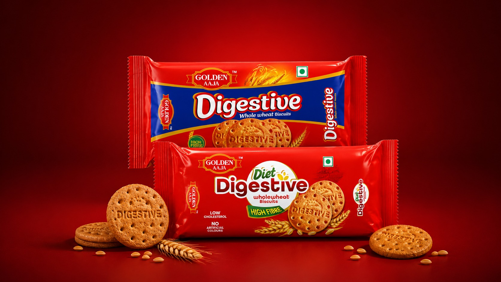
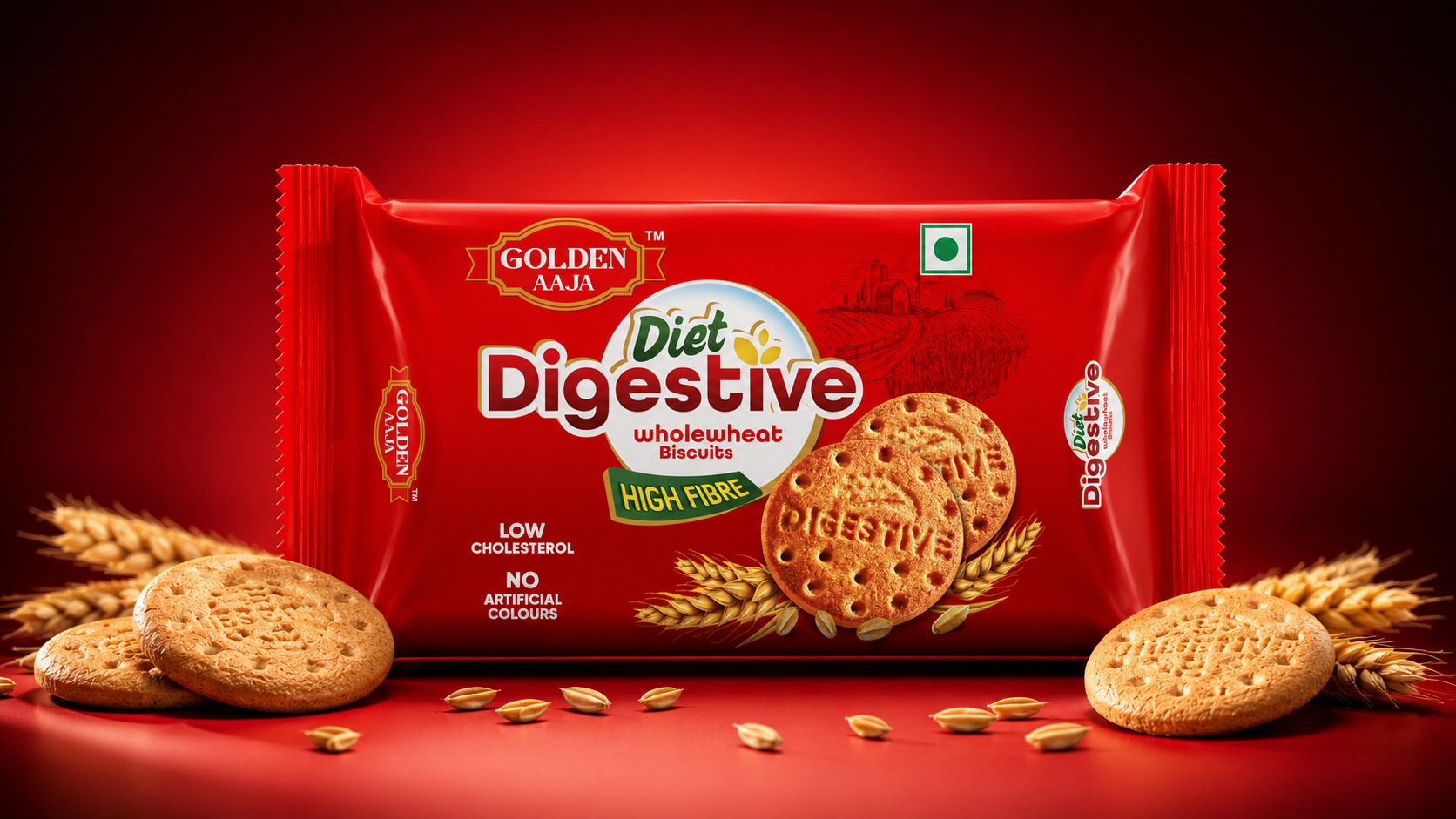
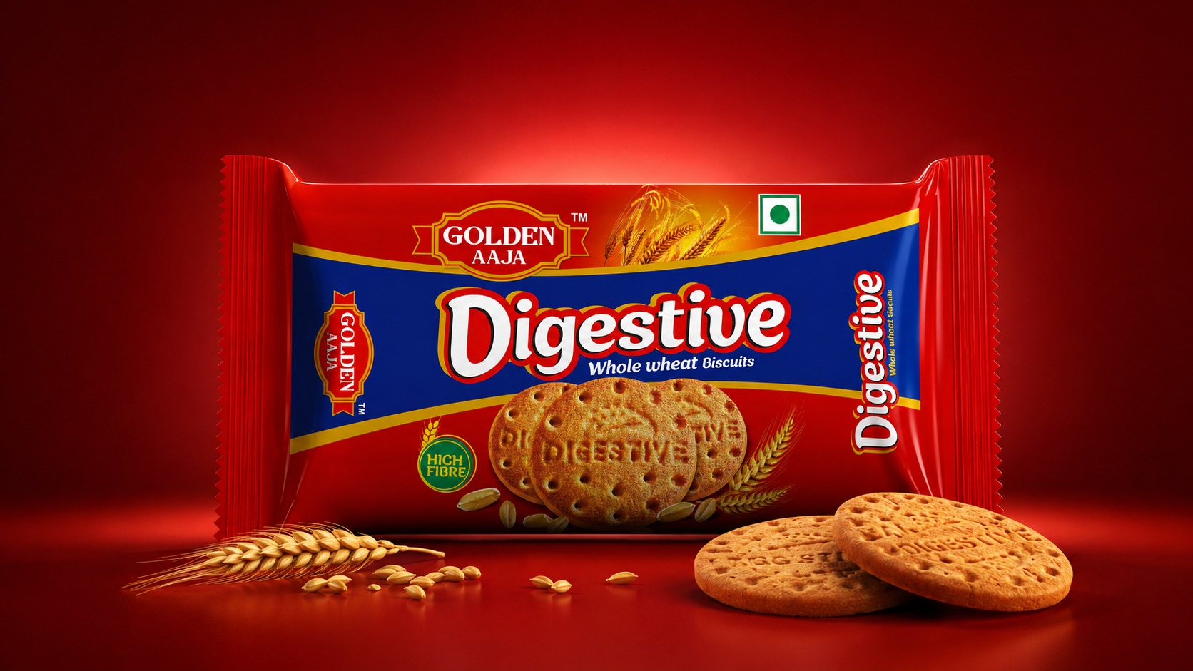
Golden Aaja Digestive and Diet Digestive Biscuit Packaging Design is a packaging design project created to give a distinctive and contemporary identity to two whole-wheat biscuit variants under the Golden Aaja brand. The objective was to create packaging that communicates the product category, nutritional positioning, and brand character clearly while maintaining strong shelf visibility. The Digestive Biscuit design uses a bold combination of deep blue, vibrant red, and golden accents to create a rich and energetic visual appearance. The prominent “Digestive” typography immediately establishes the product identity, while the biscuit imagery, wheat elements, and high-fibre communication reinforce the whole-wheat positioning. The Diet Digestive variant follows a different visual direction, using a strong red background with a clean white circular element, green typography, wheat illustrations, and prominent nutritional communication to create a more health-focused appearance. Both designs retain consistent Golden Aaja brand elements while giving each product its own visual personality. The packaging focuses on clarity, colour balance, product appetite appeal, and easy recognition at the point of purchase. The overall approach combines traditional biscuit-packaging cues with a bold and modern graphic language, creating a cohesive range that can stand out on retail shelves while communicating the key product benefits effectively.
Support this project
Upvote