

Fomic: Responsive cleaning website design
Project description
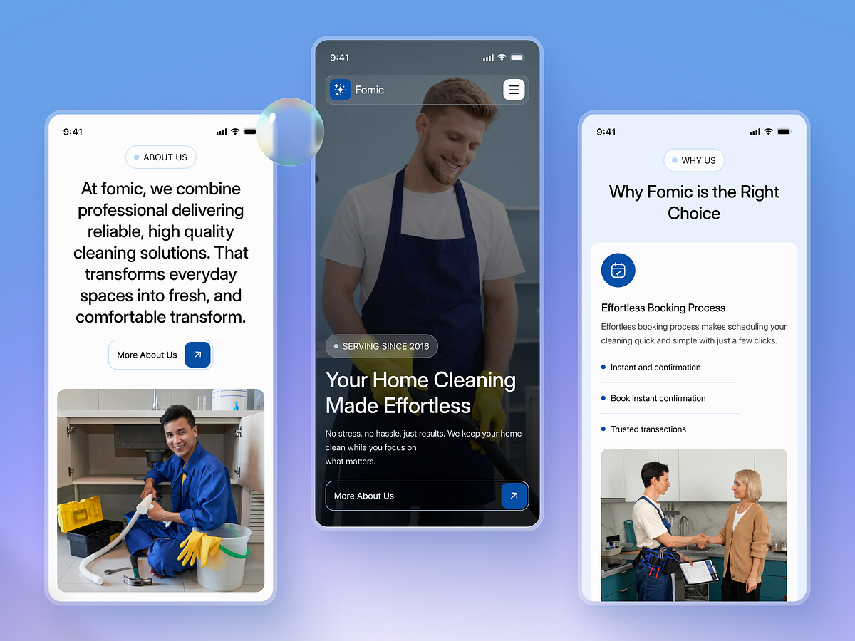
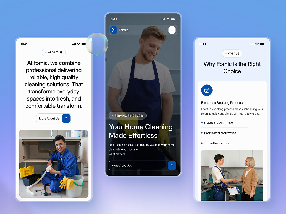
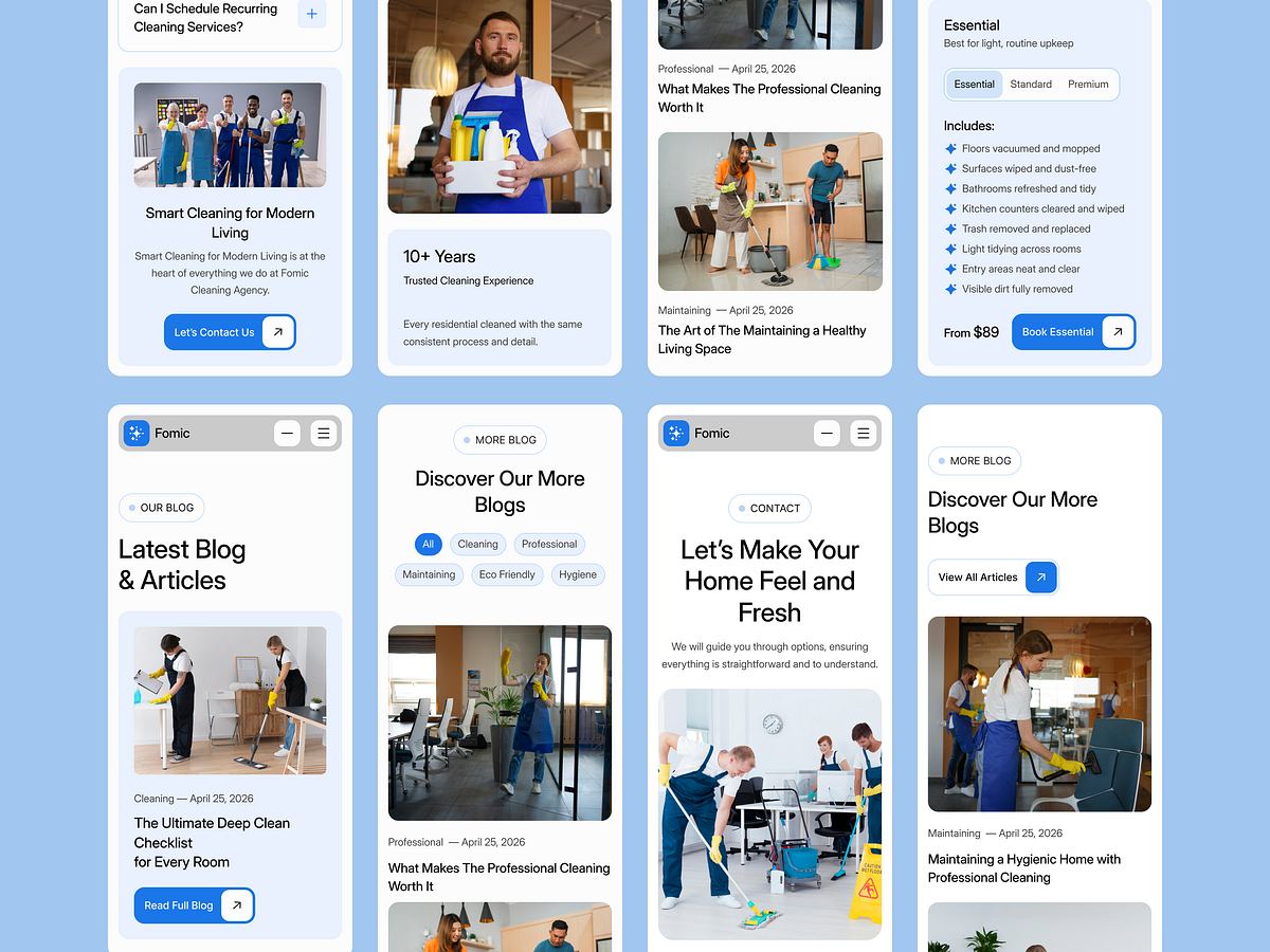
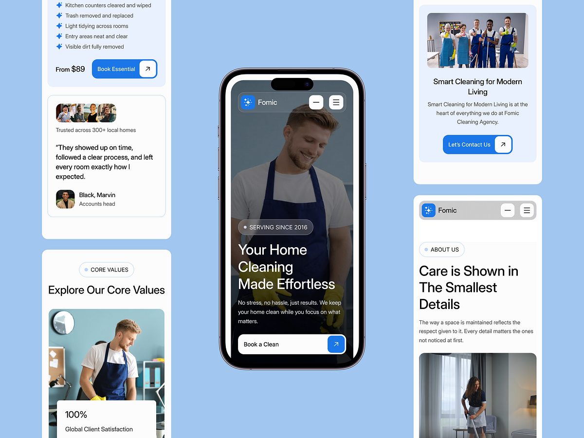
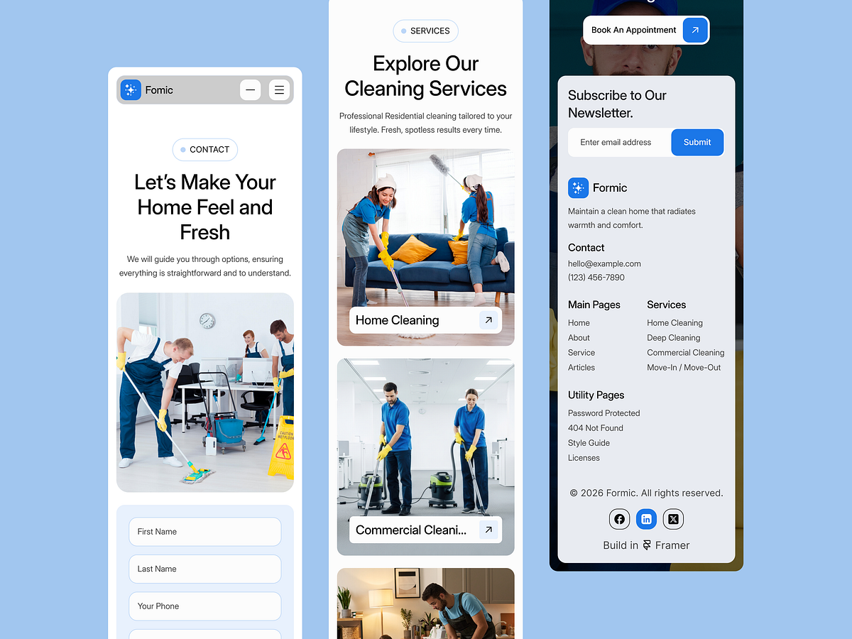
Fomic’s Webflow service section at desktop and phone widths, with two different ways to browse the offering. At 1440 pixels, wide cards participate in a scroll-linked sequence. At 390 pixels, the section presents one card at a time with previous and next controls. The smaller layout gives the image and description their own reading space rather than squeezing two cards side by side. A service is still presented through its photograph, name, short explanation, and detail-page link. The mobile treatment preserves readable service content. Its tradeoff is visibility: fewer alternatives appear at once, so clear navigation controls become an important part of the design. ✨ Let’s turn your vision into a digital reality. This project represents our commitment to clean, functional, and scalable design. We help startups and established businesses stand out in crowded markets through strategic UI/UX and seamless development. Why partner with Grabui Library? Expertise in Modern SaaS & Tech Aesthetics Full-cycle support: From Wireframe to Live Site Focus on User Retention and Conversion 👋 Have a project in mind? Don't let your idea sit on the shelf. Send us a Direct Message here on Dribbble. Let's chat about your goals and how we can help you achieve them. Send Message 📩

Support this project
Be the first to upvote