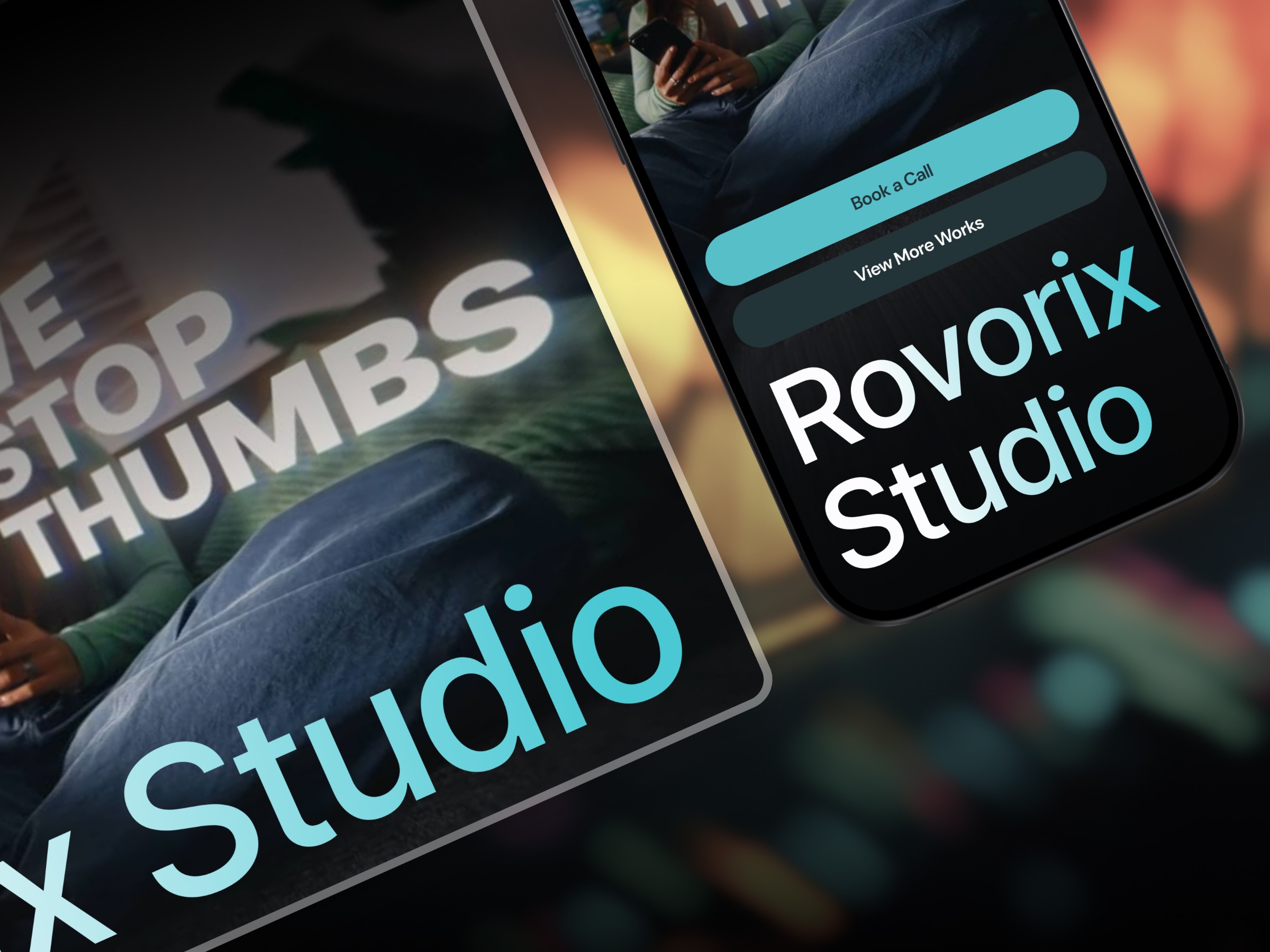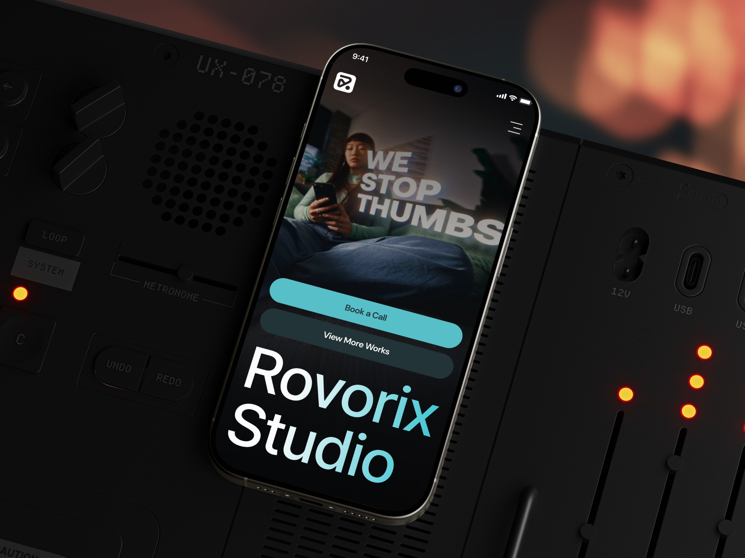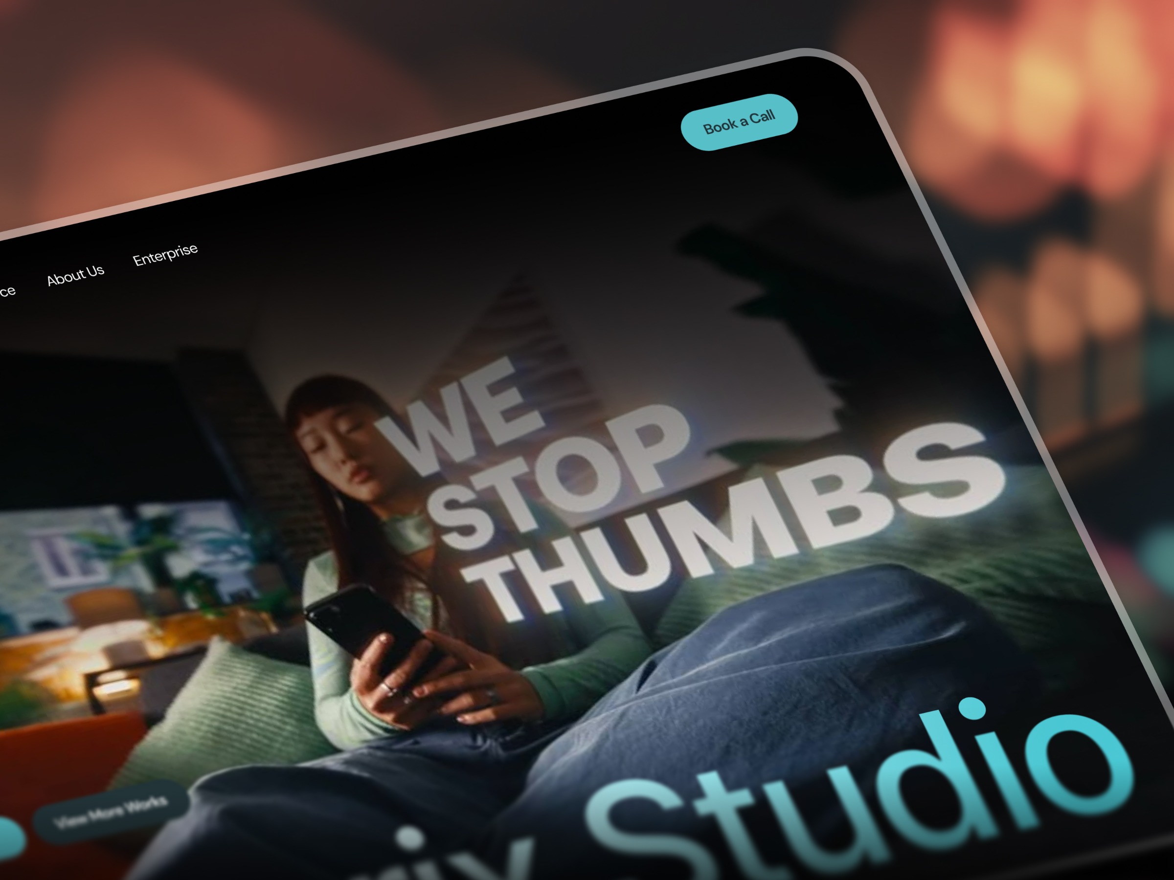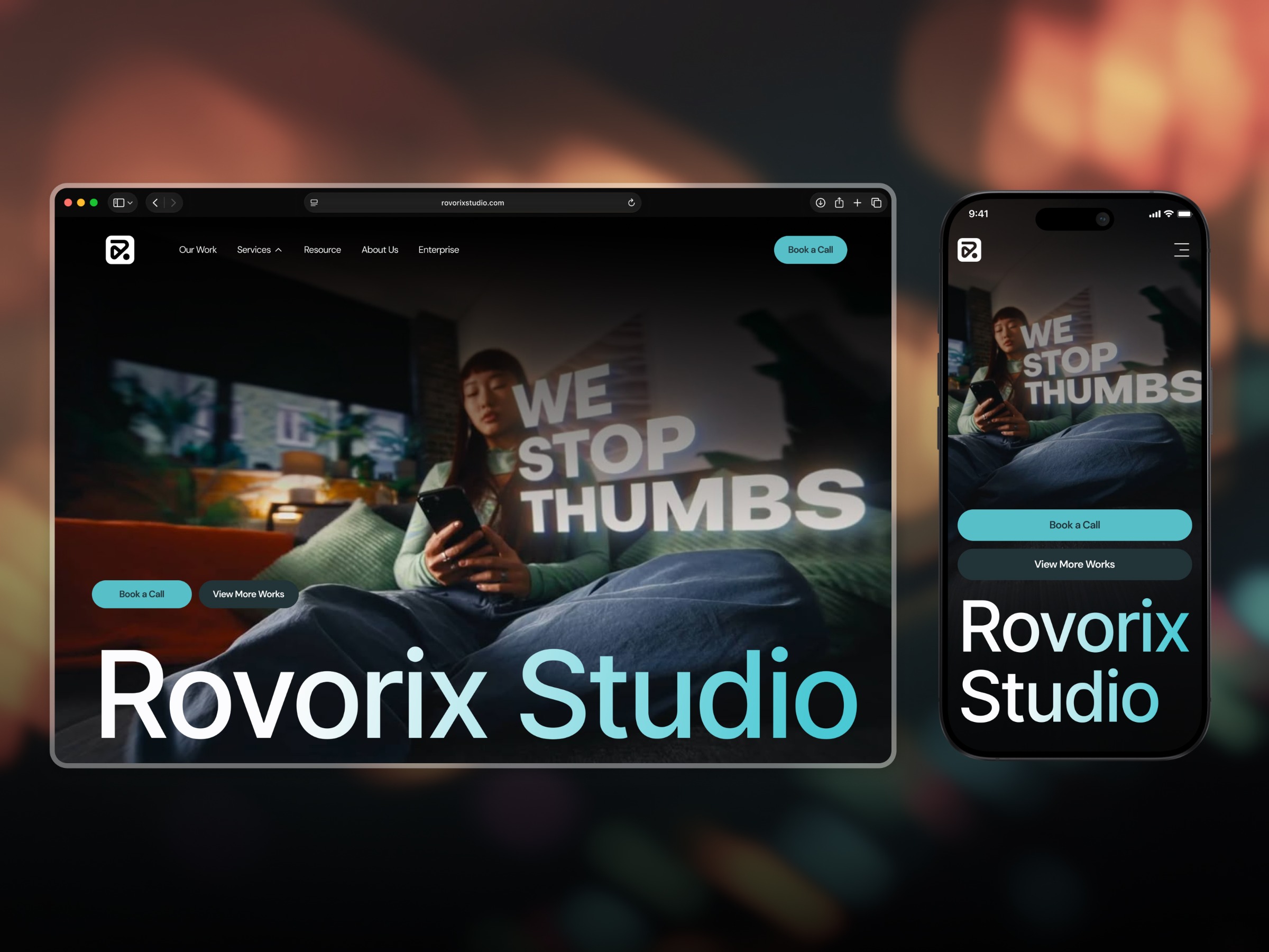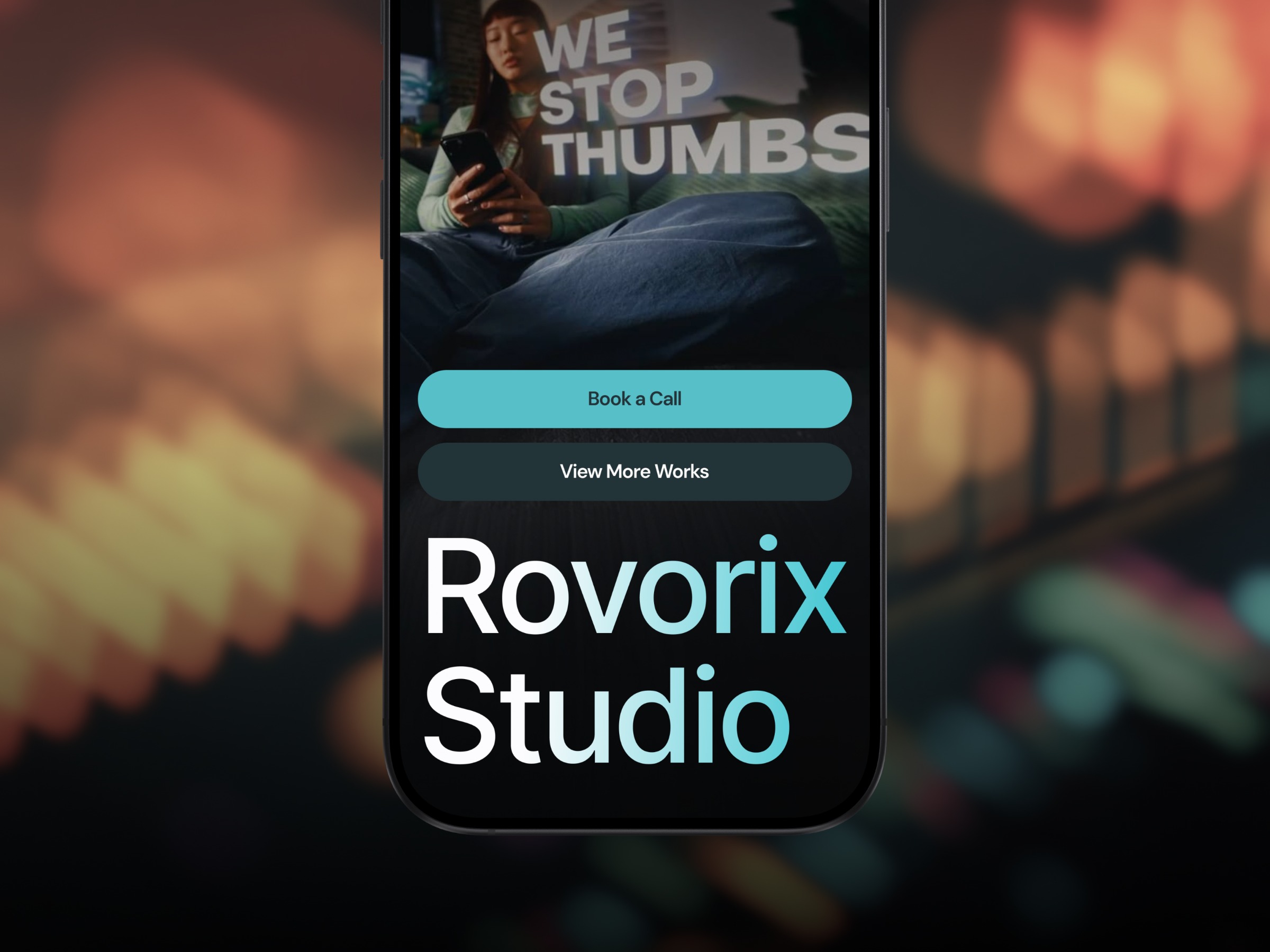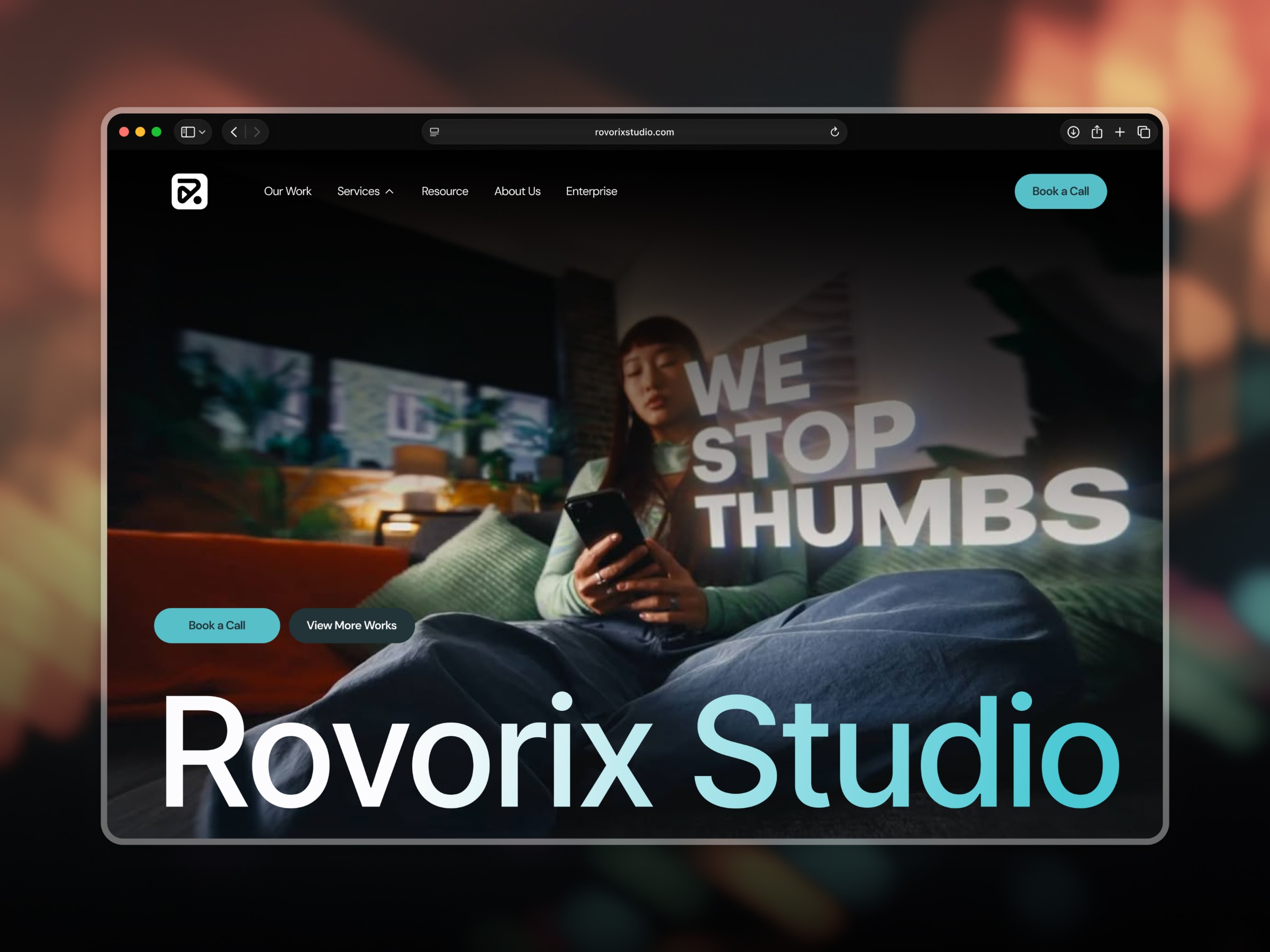

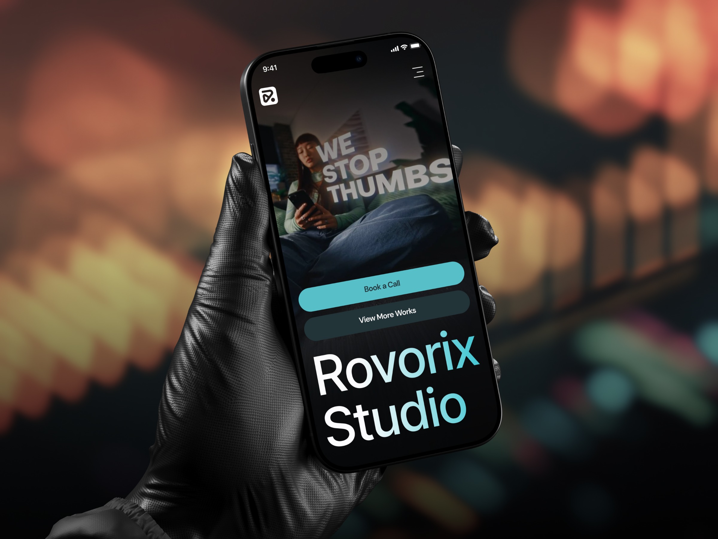
Mobile Website (Responsive View)
Project description
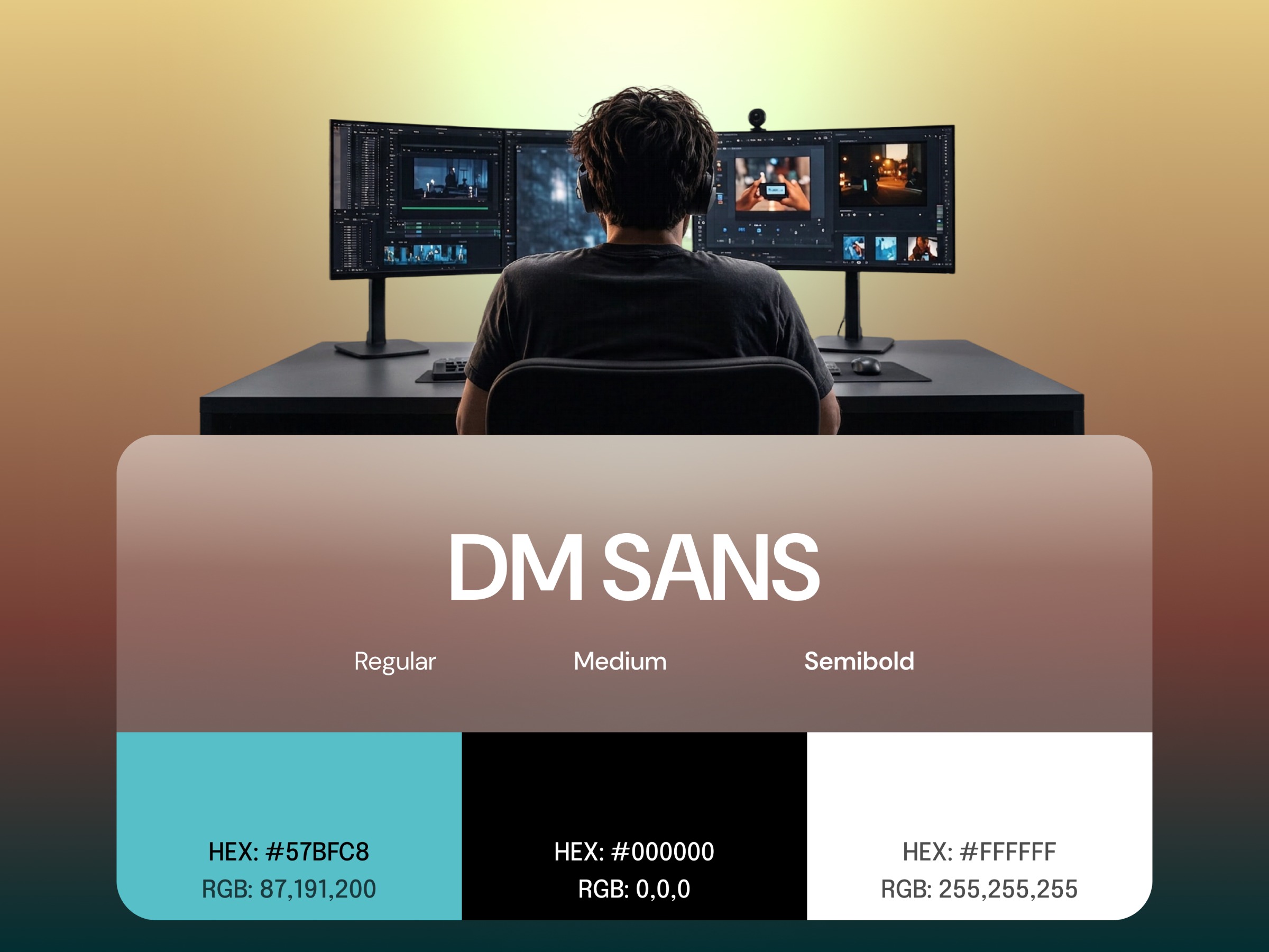
About the Project For Rovorix Studio, a creative agency focused on high-impact digital experiences, we designed a modern, mobile-responsive landing page and visual web platform. We built the interface around a sleek dark theme paired with high-contrast cyan accents and clean DM Sans typography, prioritizing bold visual storytelling and effortless usability. We structured the adaptive layout to transition seamlessly from desktop viewports down to a mobile-optimized experience—incorporating stacked primary and secondary call-to-action triggers, a compact hamburger navigation system, and prominent hero messaging tailored for high engagement across all screen sizes. Project Objective Our primary objective was to create a sleek, cinematic, high-impact digital agency website optimized for seamless cross-device responsiveness. Built on a pitch-black background highlighted by vibrant cyan accents, dynamic media assets, and bold typographic hierarchies, we aimed to seamlessly capture visitor attention immediately and communicate Rovorix Studio's core value proposition: producing thumb-stopping visual media and high-converting digital brand identities.