Autovera - Mobile & Responsive UI Adaptation

by Grabui Library · Mar 2026
web
VIDEO
Project description
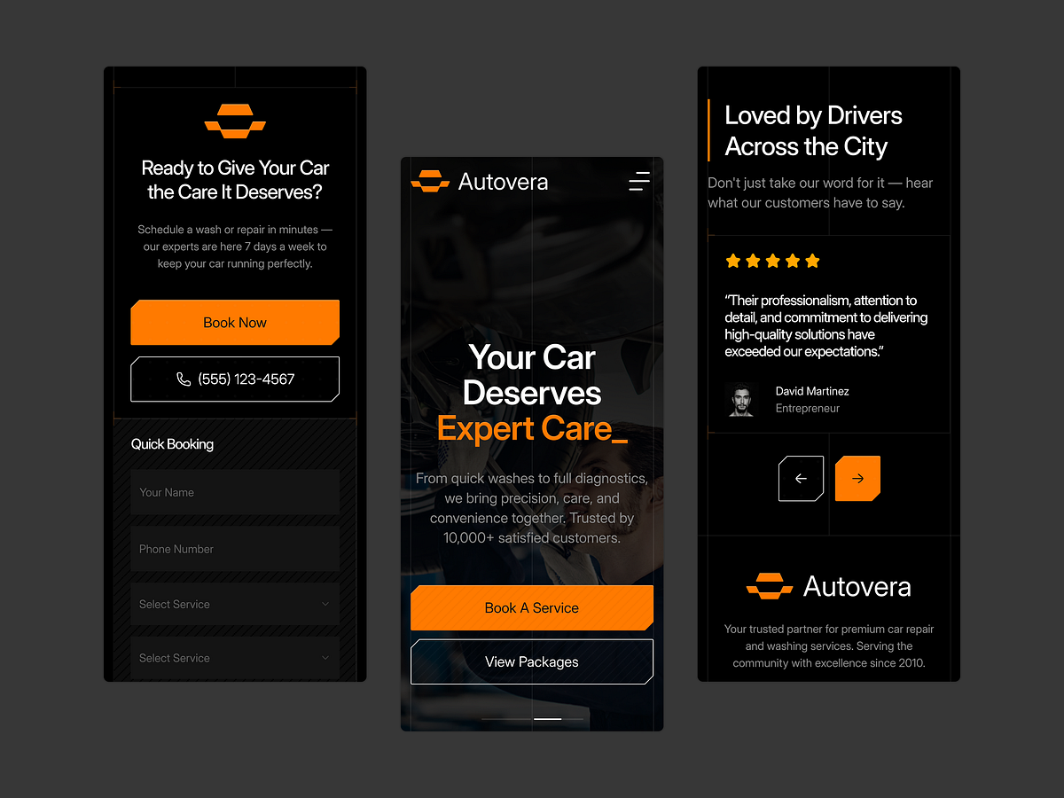
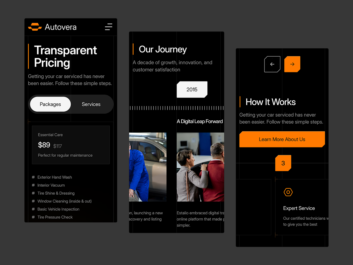
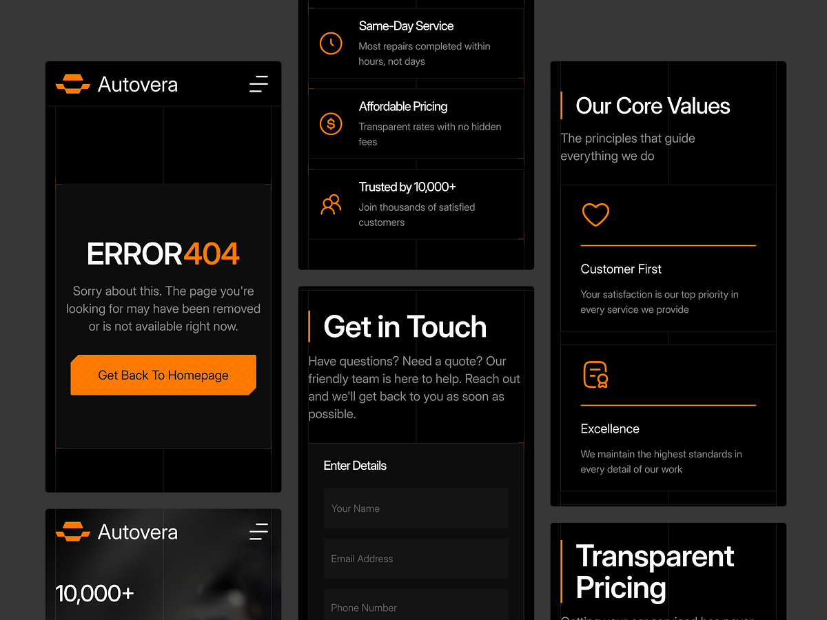
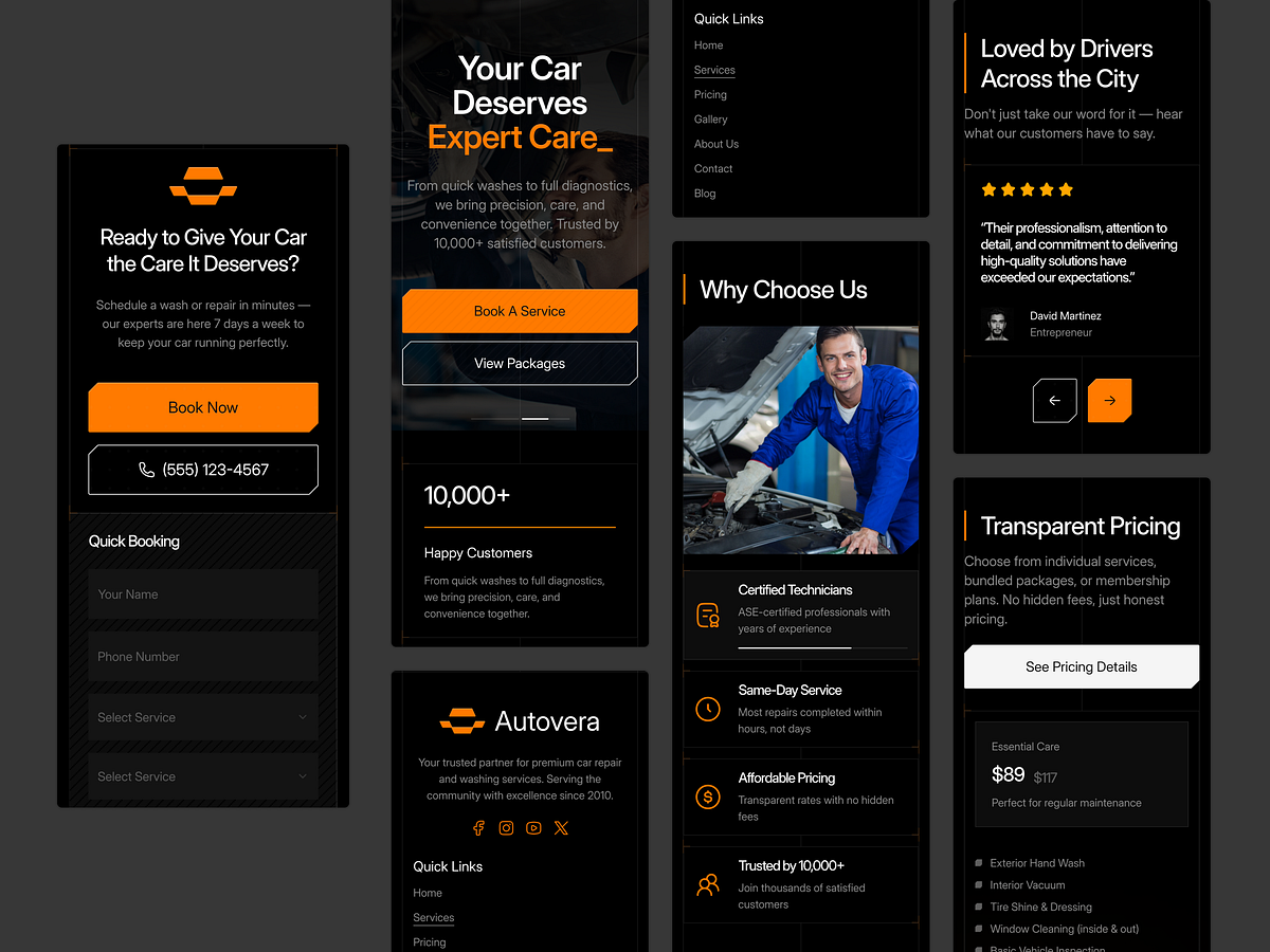
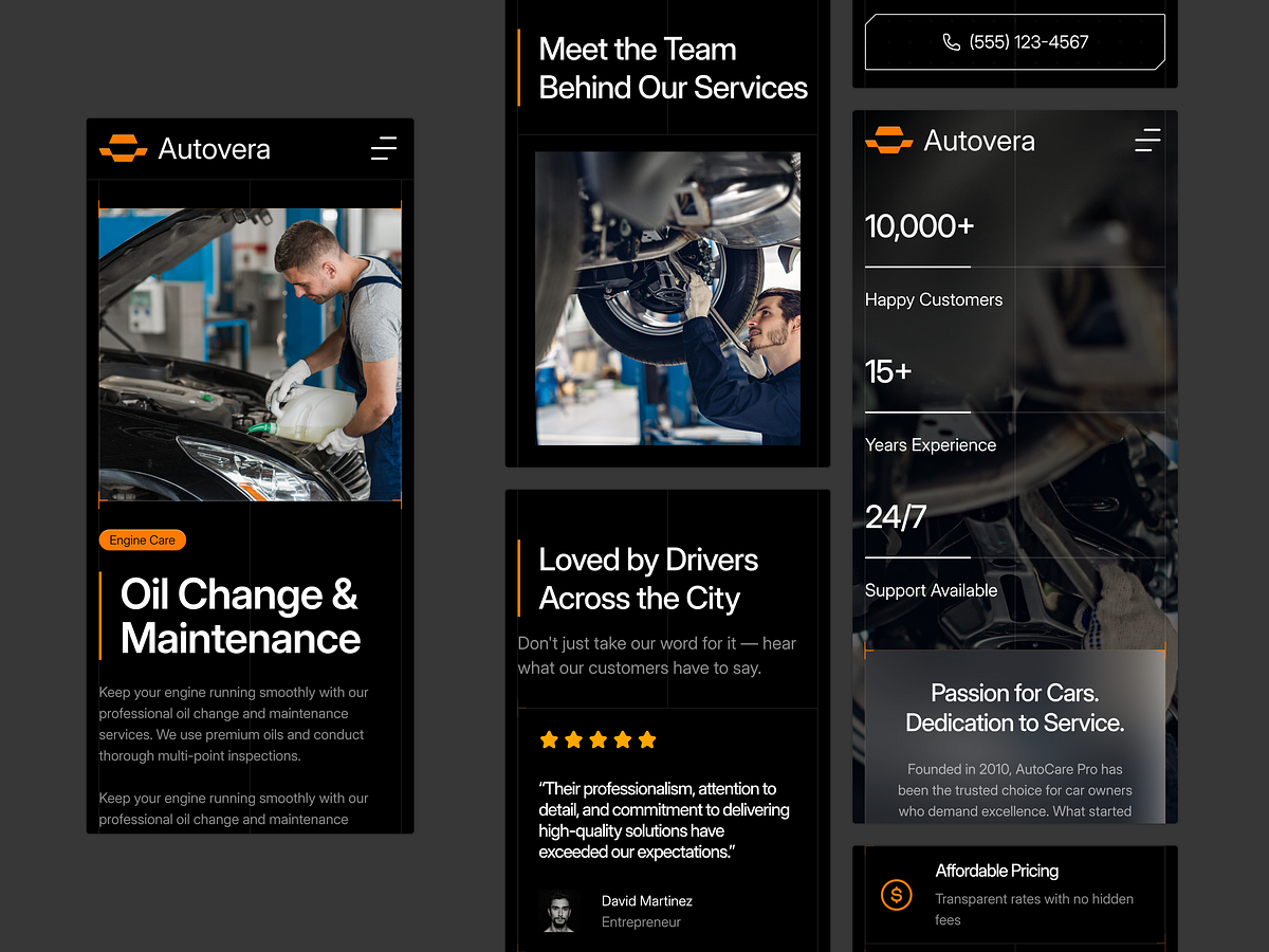
A luxury experience shouldn't break on a smaller screen. For the Autovera project, we prioritized a "thumb-friendly" interface. We know that over 60% of automotive research happens on mobile devices, so the responsive adaptation wasn't an afterthought—it was the foundation. Responsive Highlights: Stacked Typography: adjusted leading and kerning for maximum readability on iOS and Android. Touch-Optimised Sliders: Car galleries that swipe naturally without friction. Collapsible Navigation: A hamburger menu that keeps key conversion points (like "Book a Test Drive") accessible. We ensured the visual hierarchy remains intact from 1920px down to 375px. Does your current project scale this smoothly? Let's discuss in the comments.

Support this project
Upvote