Avenix Responsive E-Commerce Experience

Project description
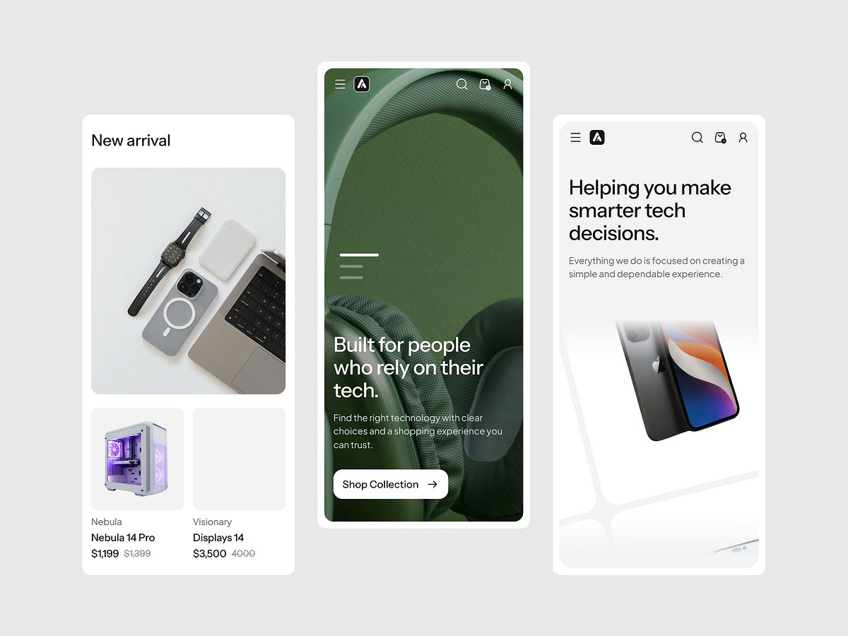
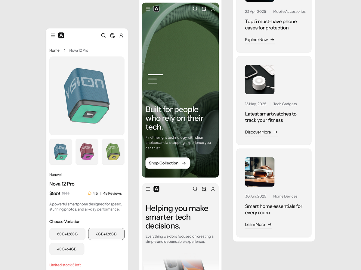
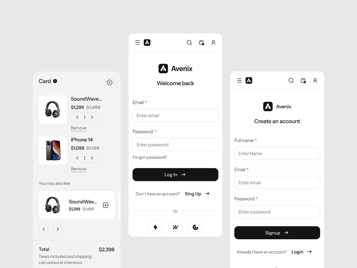
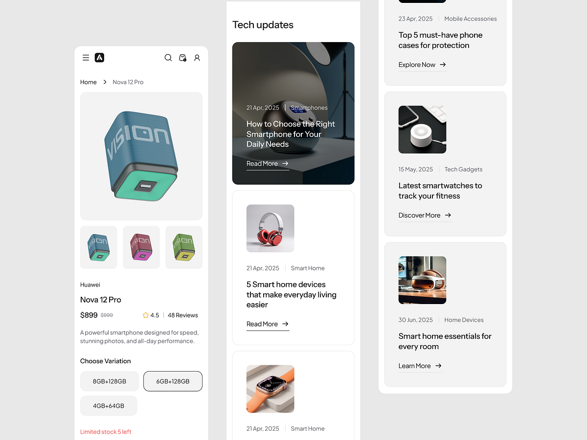
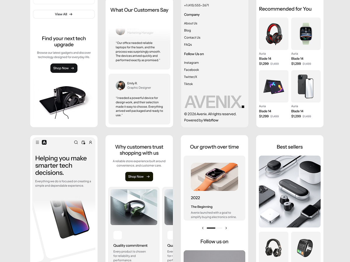
Avenix was designed as a fully responsive e-commerce project with a focus on clarity, speed, and consistency across desktop, tablet, and mobile screens. Every section was refined to maintain strong hierarchy, flexible spacing, and smooth browsing behavior on all breakpoints.Rather than simply resizing layouts, we rethought the experience for smaller screens to keep the shopping journey intuitive and conversion-friendly.✦ Responsive design highlightsOptimized desktop, tablet, and mobile layoutsSimplified content flow for smaller screensFlexible product cards and content modulesTouch-friendly interactions and spacingReadable typography across breakpointsConsistent visual hierarchy on every device✦ Project stats3 responsive breakpoints20+ reusable sectionsScalable component-based layoutMobile-first usability improvementsConversion-focused product presentationThe goal was to create a shopping experience that feels premium and effortless no matter where users browse.

Support this project
Upvote