

Doorix Responsive Web Design System
Project description
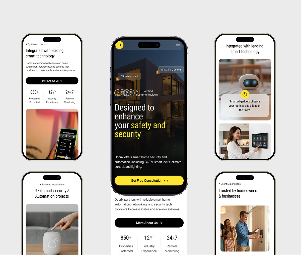
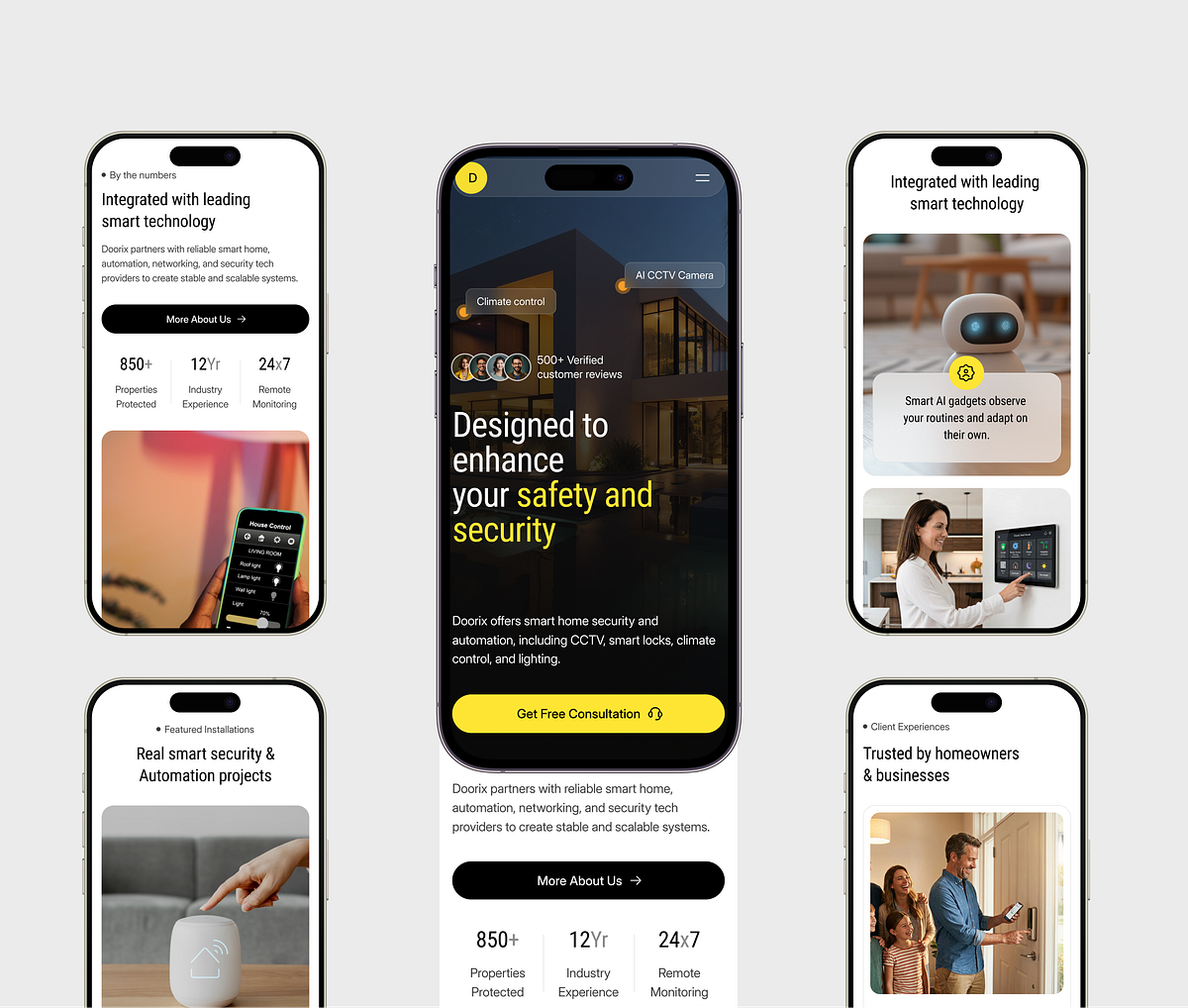
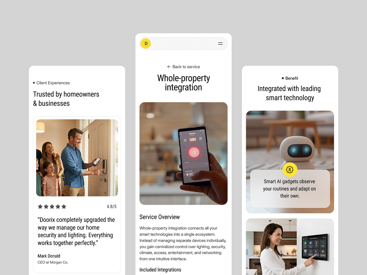
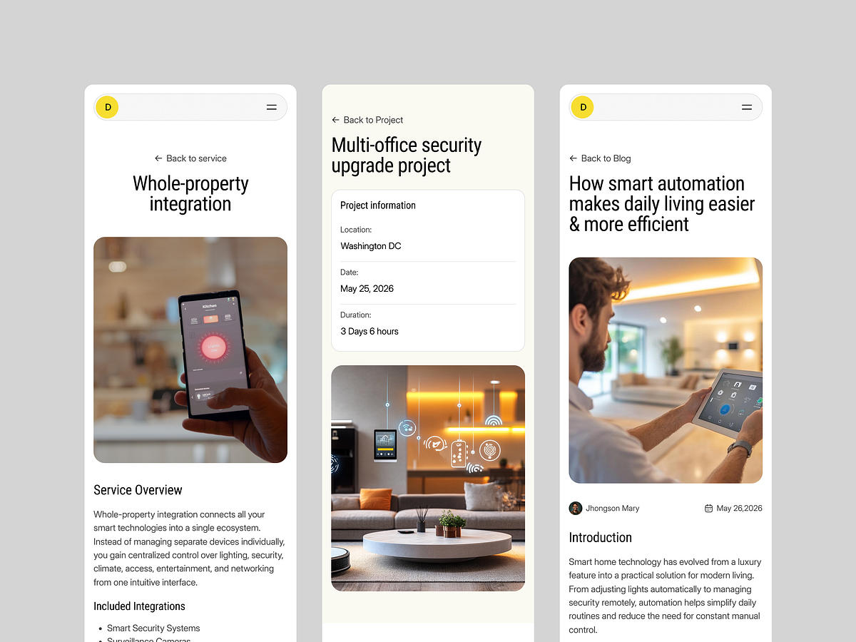
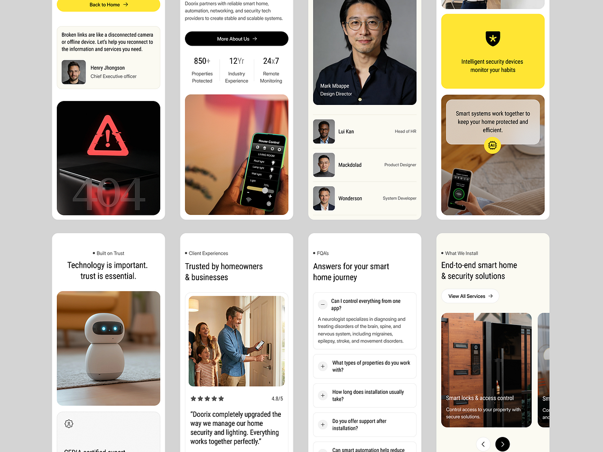
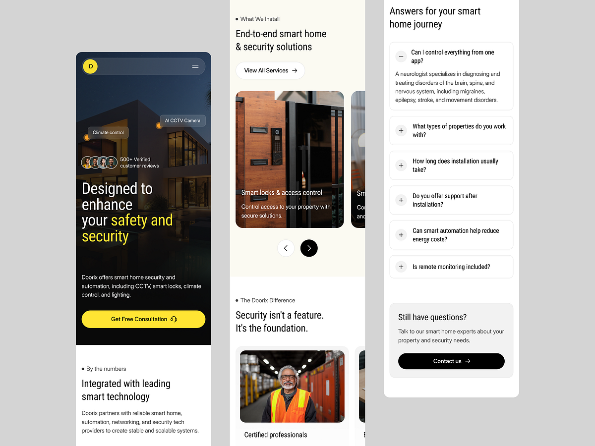
This responsive smart home website was built for a homeowner checking providers between rooms, not a designer admiring a desktop mockup. Service modules share one content pattern, project cards preserve their labels, and the consultation action remains reachable without following the entire page. We rejected reduced desktop layouts that turn headings into five-line blocks. At narrow widths, type steps down early and image crops protect the installed equipment rather than the empty room. Working on something similar? WhiteFrame Creative builds websites end to end: structure, interface, motion, live build. Most of what we do is deciding what stays on the fold and what goes. That's the job. Send a DM with the screen that's giving you trouble and we'll tell you how we'd approach it. Send Message 📩

Support this project
Grabui voted for this project