Eateria - Responsive Website Experience

Project description
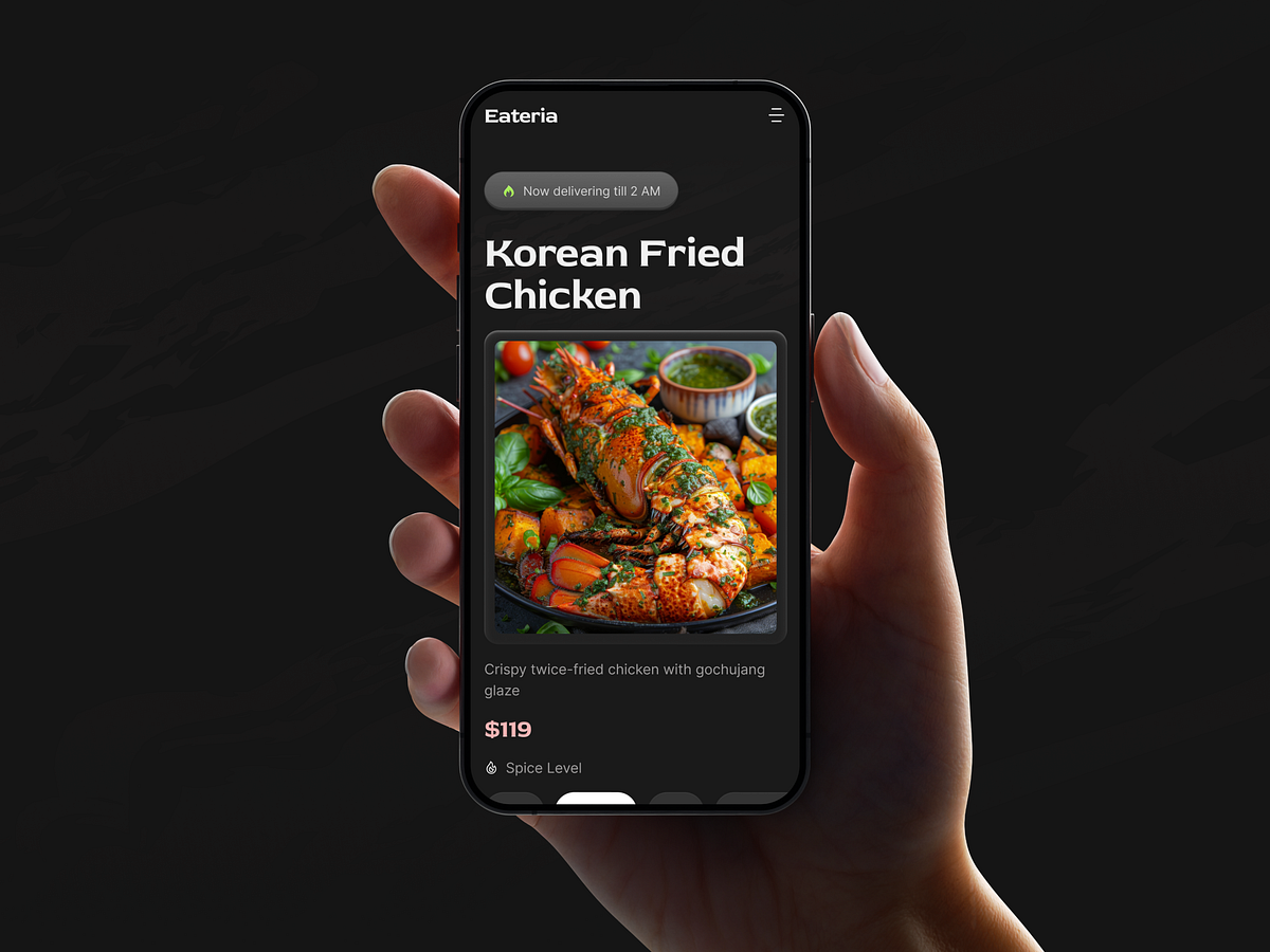
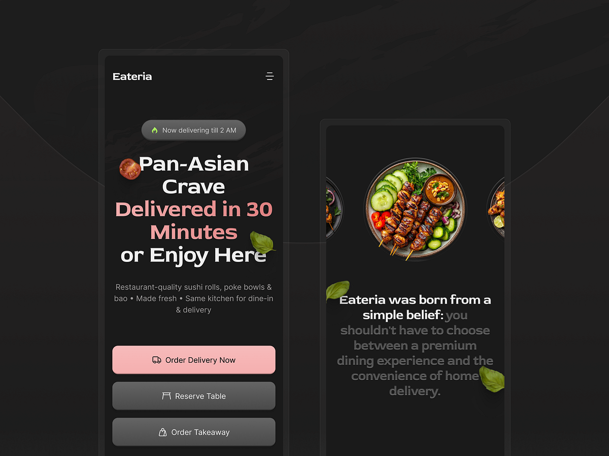
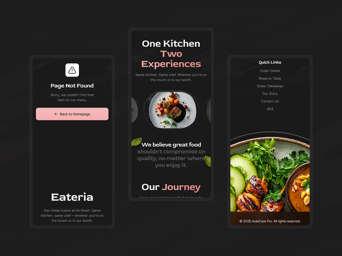
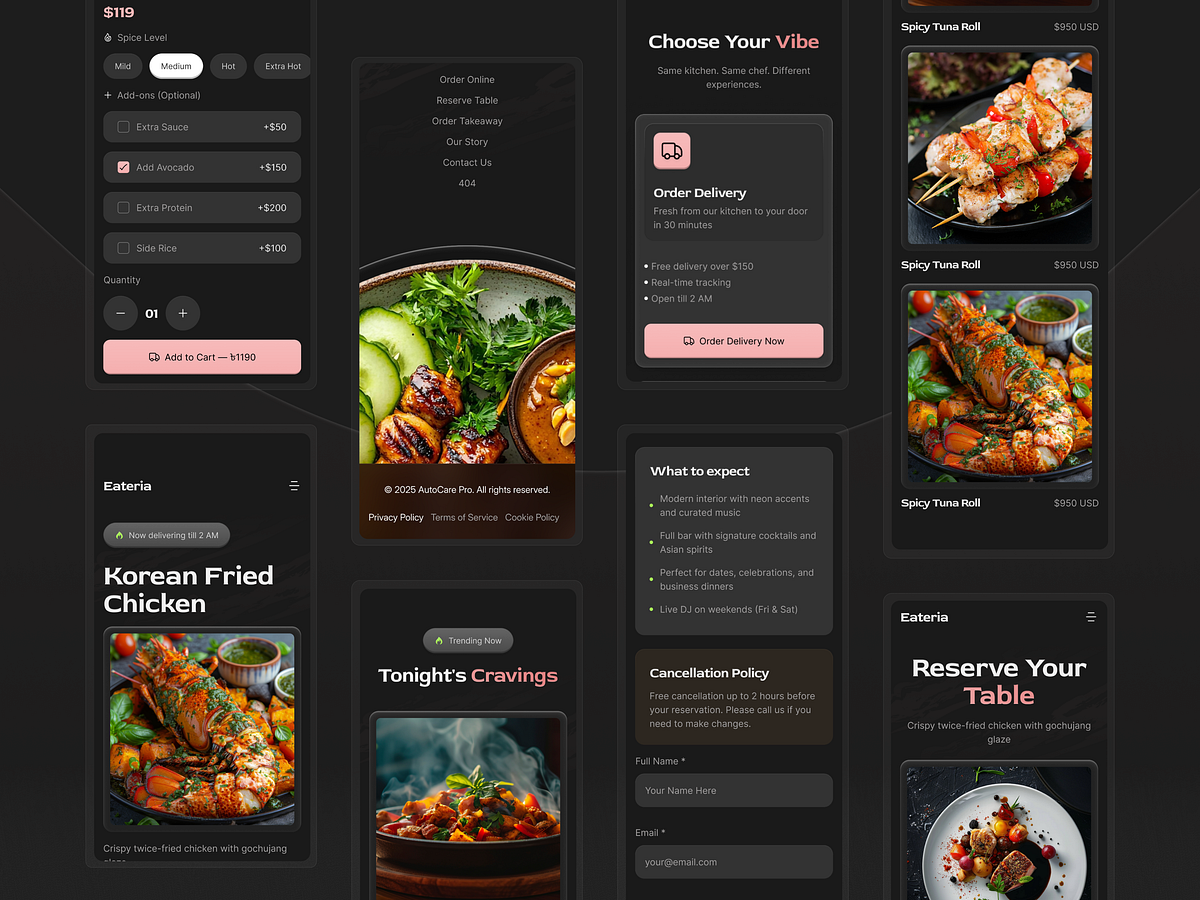
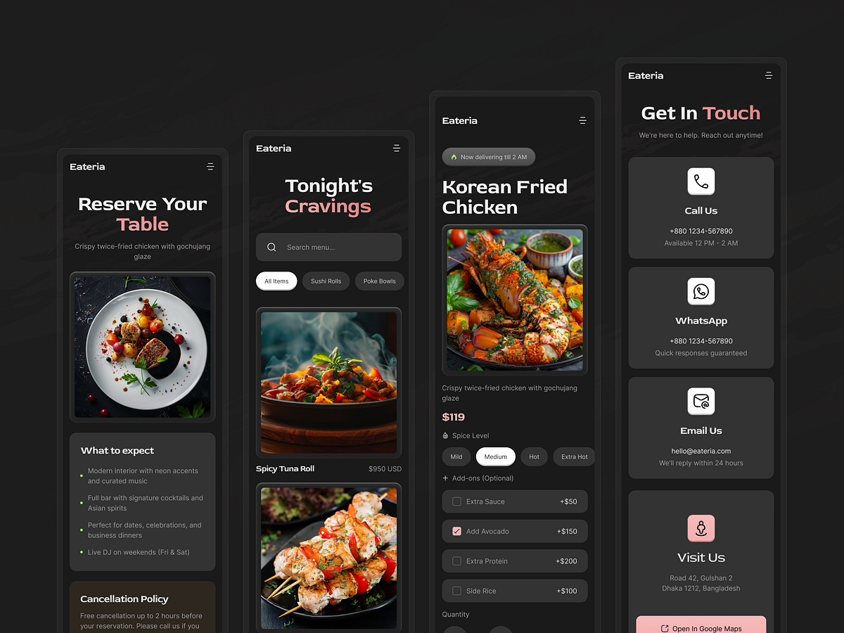
A great restaurant website should feel seamless on every screen — and that was a major focus in this project.For Eateria, we designed a responsive experience that keeps the brand premium while making browsing, menu discovery, and booking interactions easy on desktop, tablet, and mobile.Our responsive focus→ Simplified navigation for smaller screens→ Better thumb-friendly CTA placements→ Optimized menu and content stacking→ Clear typography scaling across breakpoints→ Image handling that preserves visual quality→ Consistent spacing system for all devices→ Faster, cleaner interaction flow on mobileWhy it mattersToday, a large portion of restaurant traffic comes from mobile users. That means responsiveness is not just a design feature — it directly affects discoverability, engagement, and conversions.Responsive highlights→ Mobile-first layout thinking→ Clean readability on every device size→ Flexible content blocks→ User-friendly booking journey→ Performance-conscious visual structureThis project was designed to help restaurant brands look polished everywhere while giving users a smooth and confident browsing experience.
Support this project
Upvote