

Medlume: Responsive hospital website hero
Project description
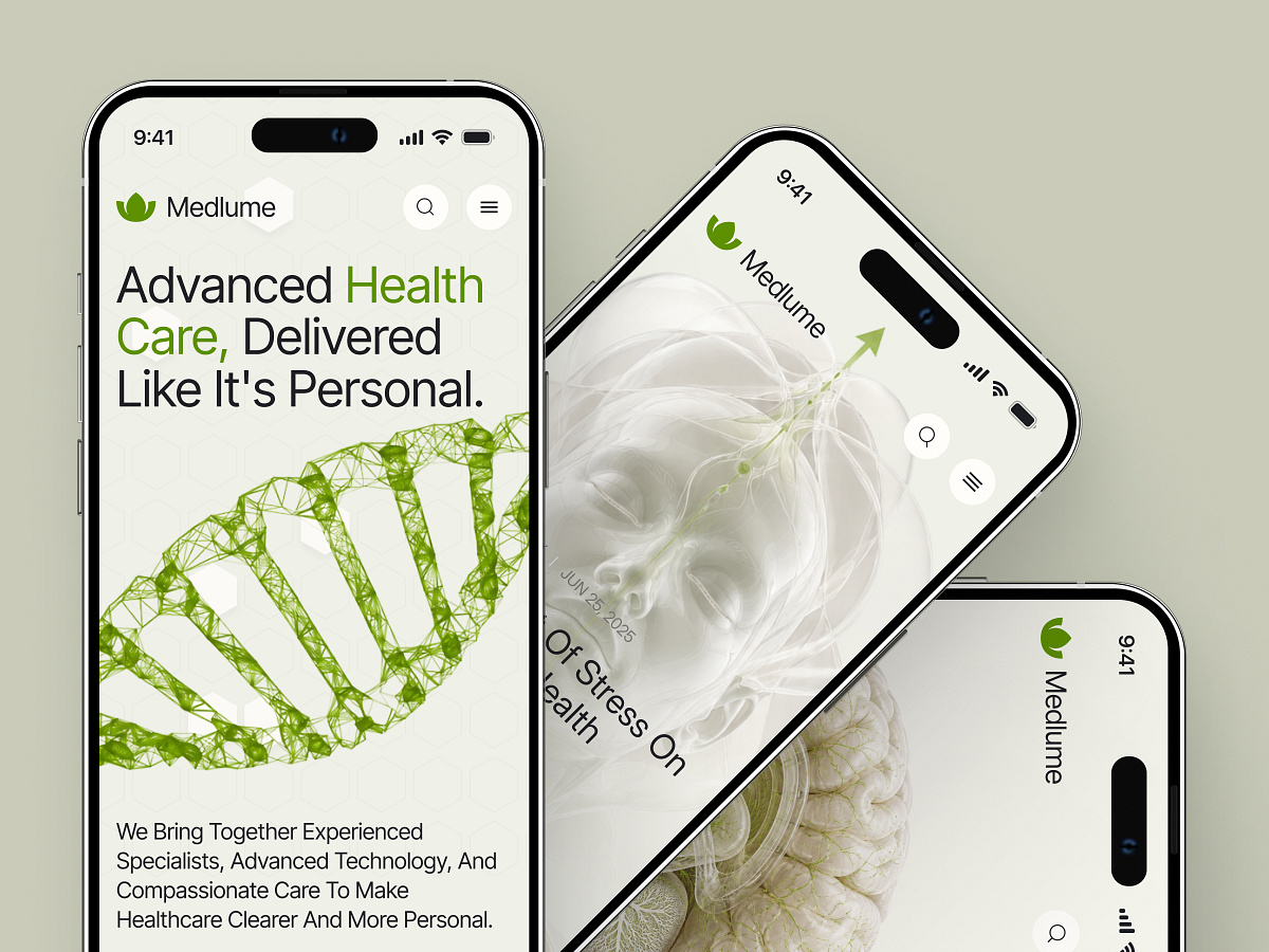
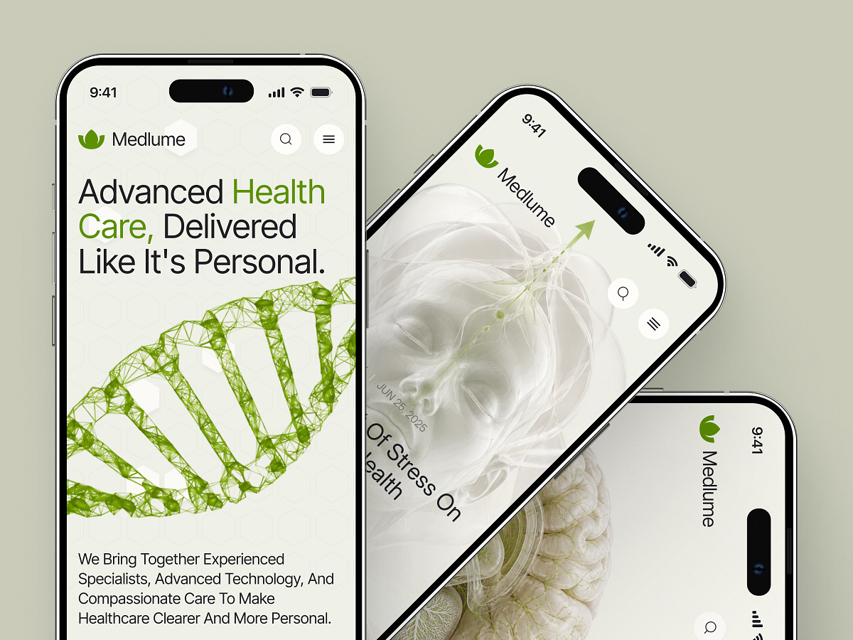
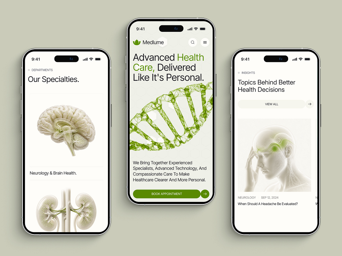
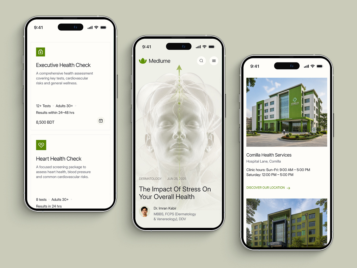
Shot overview: Medlume's Responsive design overview. Design decisions The headline steps down from 72px to 58px below 1024 pixels and to 44px below 480, with line height adjusted at each step, so it fits in three lines on the phone. The six-item navigation folds into a menu, but search stays visible as its own icon beside it. The booking action becomes a full-width pill under the introduction. What stays consistent The DNA illustration, the green emphasis on Health Care, and a single primary action. Why it matters Search and booking both remain within the first phone screen instead of moving behind the menu, so the two most direct routes to care need no extra tap to find. ✨ Let’s turn your vision into a digital reality. This project represents our commitment to clean, functional, and scalable design. We help startups and established businesses stand out in crowded markets through strategic UI/UX and seamless development. Why partner with Grabui Library? Expertise in Modern SaaS & Tech Aesthetics Full-cycle support: From Wireframe to Live Site Focus on User Retention and Conversion 👋 Have a project in mind? Don't let your idea sit on the shelf. Send us a Direct Message here on Dribbble. Let's chat about your goals and how we can help you achieve them. Send Message 📩

Support this project
Be the first to upvote