Mobile-First Shopping Experience — Lustro Template

by WhiteFrame Creative · Mar 2026
shot
VIDEO
Project description
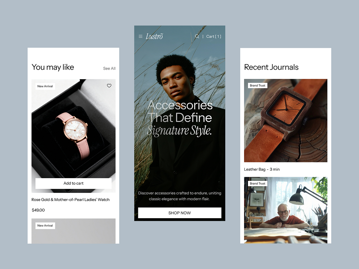
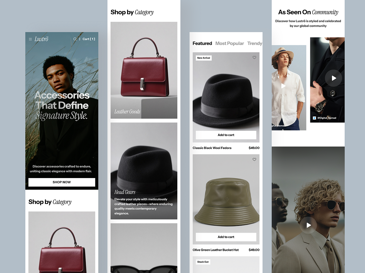
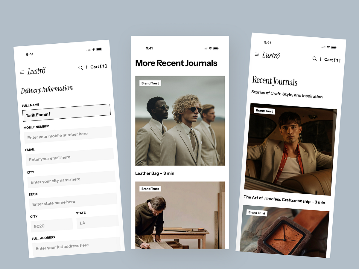
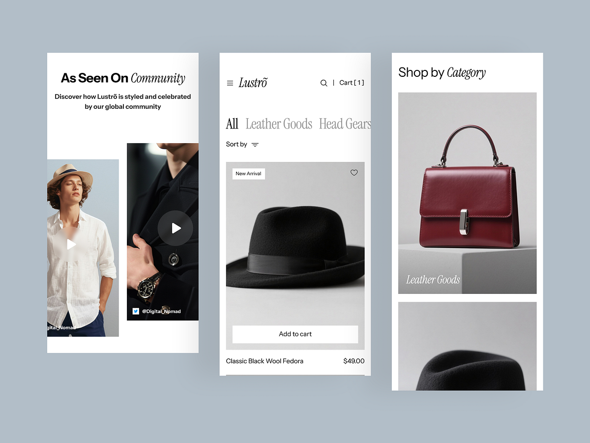
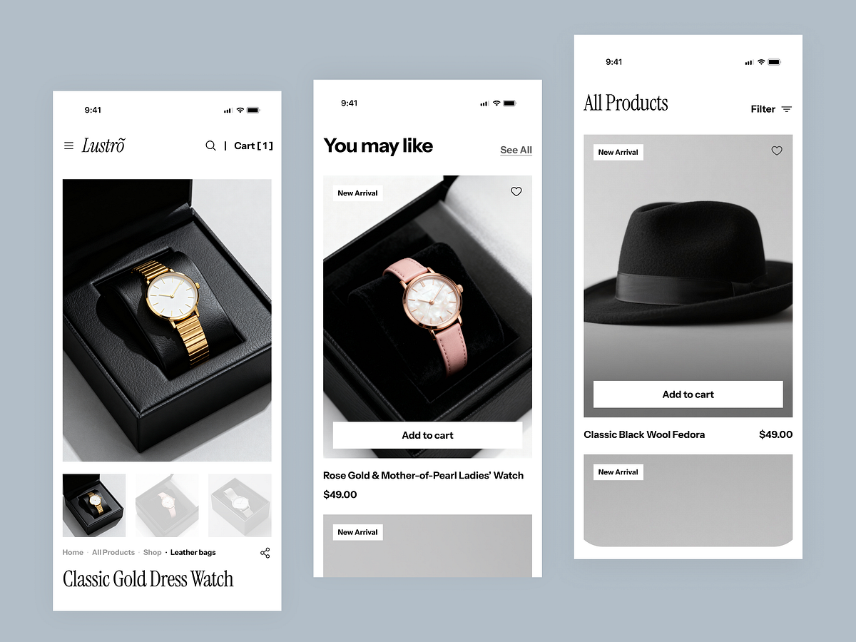
Did you know 75% of fashion purchases happen on mobile? 📱 Most templates look great on desktop but break the experience on smaller screens. Lustro is different. We designed the mobile breakpoint first. ✨ Responsive Highlights: Thumb-Friendly Navigation: Critical links are easily reachable. Smart Filtering: A refined mobile drawer for sorting products without clutter. Fast Loading: Optimized assets ensure customers don't bounce due to lag. Sticky Actions: "Add to Cart" remains accessible as users scroll. Don't lose sales to bad UX. Grab Lustro on GrabUI and give your mobile visitors the VIP treatment.

Support this project
Upvote