
Tourvia Responsive Travel Template: Mobile, Tablet & Desktop UI
Project description
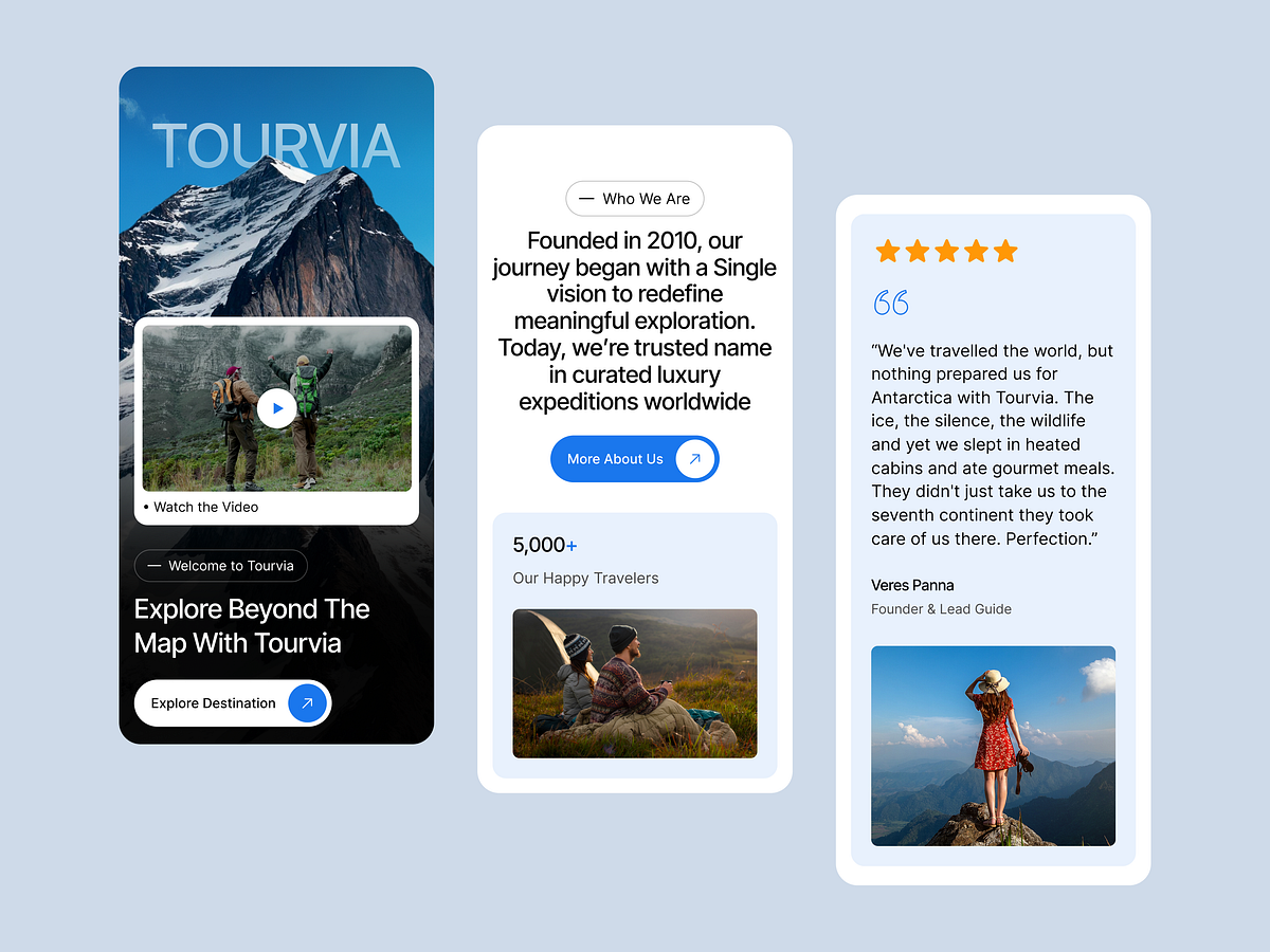
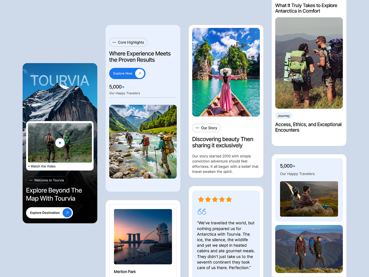
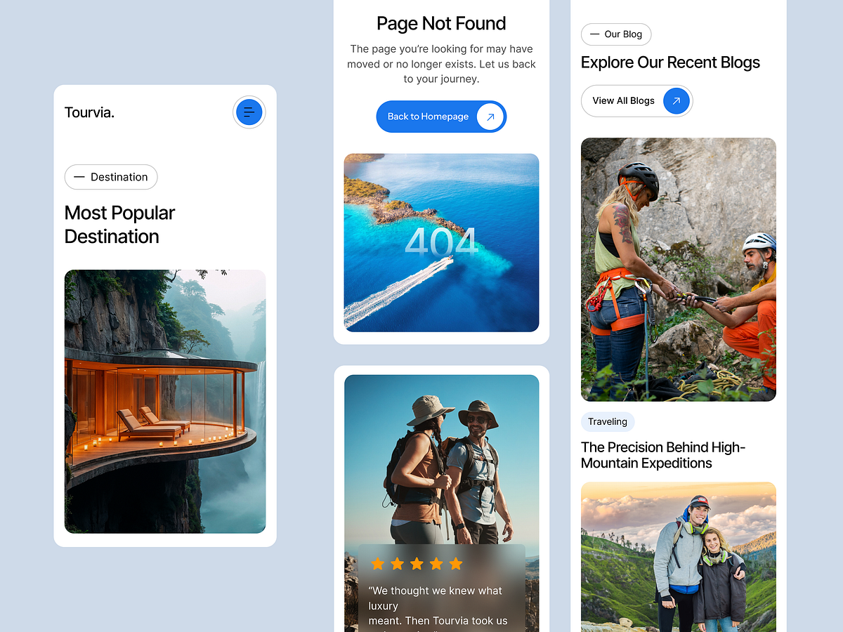
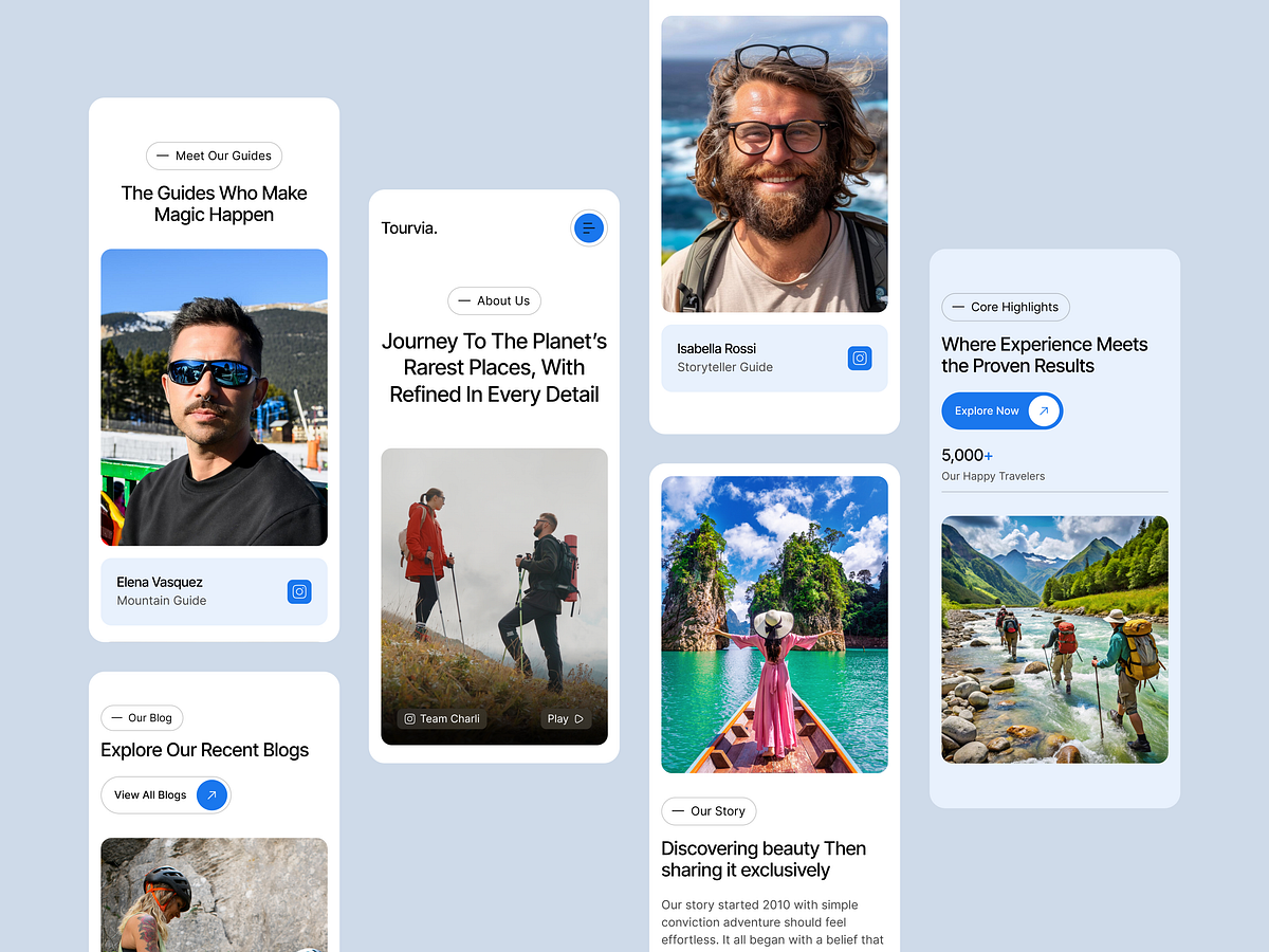
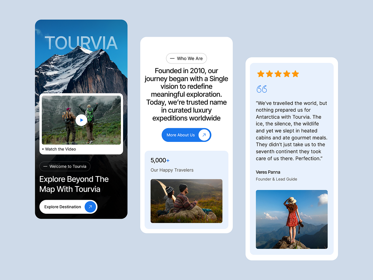
Pixel-perfect on every screen. 📱💻 Tourvia is engineered mobile-first so your travel brand looks flawless from a 4-inch phone to an ultrawide desktop. What we do for responsive: fluid breakpoints, touch-friendly sliders, auto-collapsing navigation, retina-ready visuals, and re-flowing CSS grid layouts that never break, no matter the device. Why it matters: • 73% of travelers research and book on mobile. • 53% of visitors bounce if a mobile page loads slowly. • Responsive + fast = higher rankings and more conversions. Tourvia is optimized for speed and SEO, so you capture every traveler on every device. Only in the GrabUI Library. ✨ Let’s turn your vision into a digital reality. This project represents our commitment to clean, functional, and scalable design. We help startups and established businesses stand out in crowded markets through strategic UI/UX and seamless development. Why partner with Grabui Library? Expertise in Modern SaaS & Tech Aesthetics Full-cycle support: From Wireframe to Live Site Focus on User Retention and Conversion 👋 Have a project in mind? Don't let your idea sit on the shelf. Send us a Direct Message here on Dribbble. Let's chat about your goals and how we can help you achieve them. Send Message 📩