Split Payment Flow Redesign | Fintech Mobile App UX Case Study
Project description
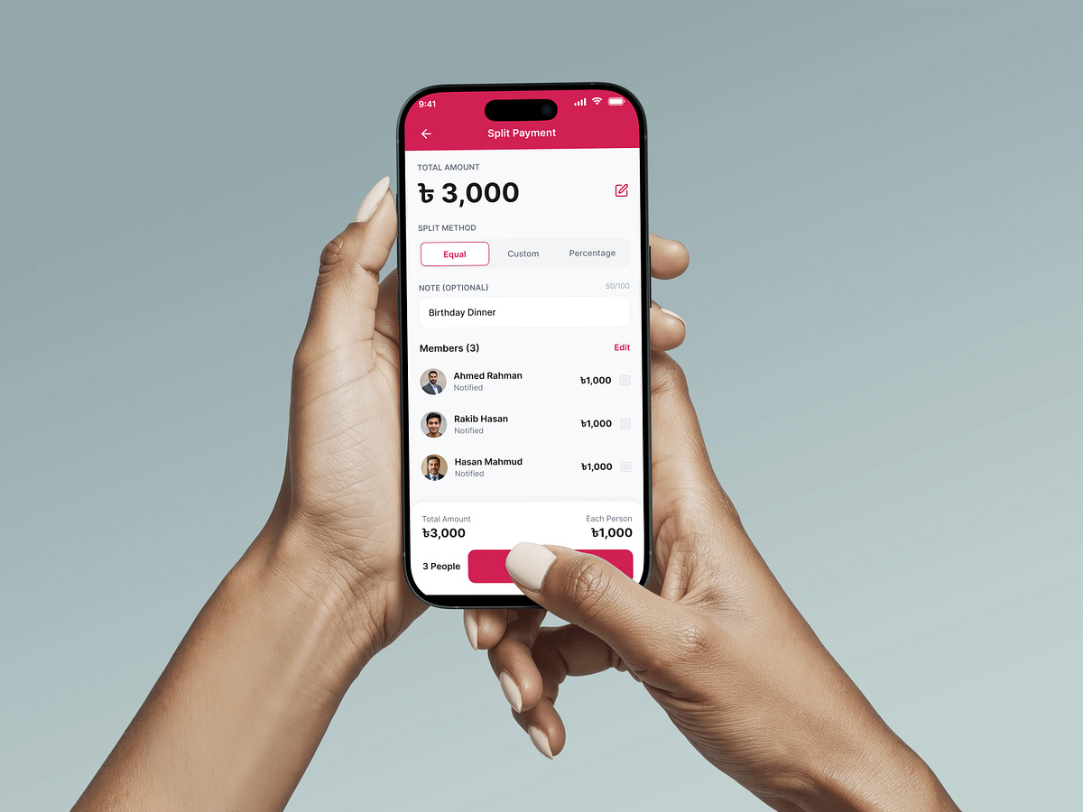
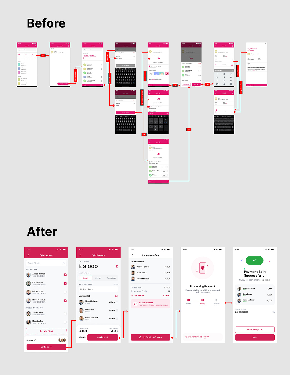
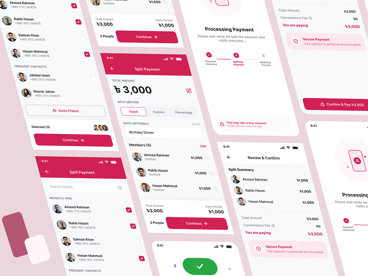
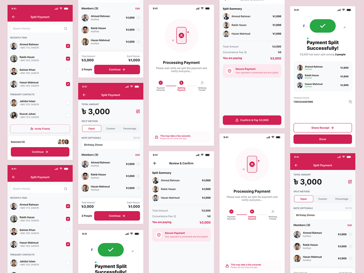
Making split payments faster, simpler, and more intuitive. This concept redesign reimagines a complex split payment experience into a clean, user-centered flow. The original journey required multiple screens and repetitive interactions, increasing cognitive load and slowing down task completion. The redesigned experience focuses on reducing friction by streamlining the process into just five essential steps while maintaining clarity and flexibility. Design Goals ✱ Reduce unnecessary screens and interactions ✱ Minimize cognitive load during payment splitting ✱ Improve information hierarchy and readability ✱ Enable faster equal, custom, and percentage-based splits ✱ Create a modern fintech experience with intuitive interactions Key Improvements ➔ Simplified 5-step payment flow ➔ Smart contact selection with search and recent contacts ➔ All-in-one split setup screen ➔ Live amount calculation and validation ➔ Sticky action buttons for better accessibility ➔ Clean review & confirmation experience ➔ Modern success screen with receipt sharing Design Process Research → User Flow → Wireframing → High-Fidelity UI → Prototyping → UX Optimization