 PRO
Law Firm Website — Interface & Layout System
Project description
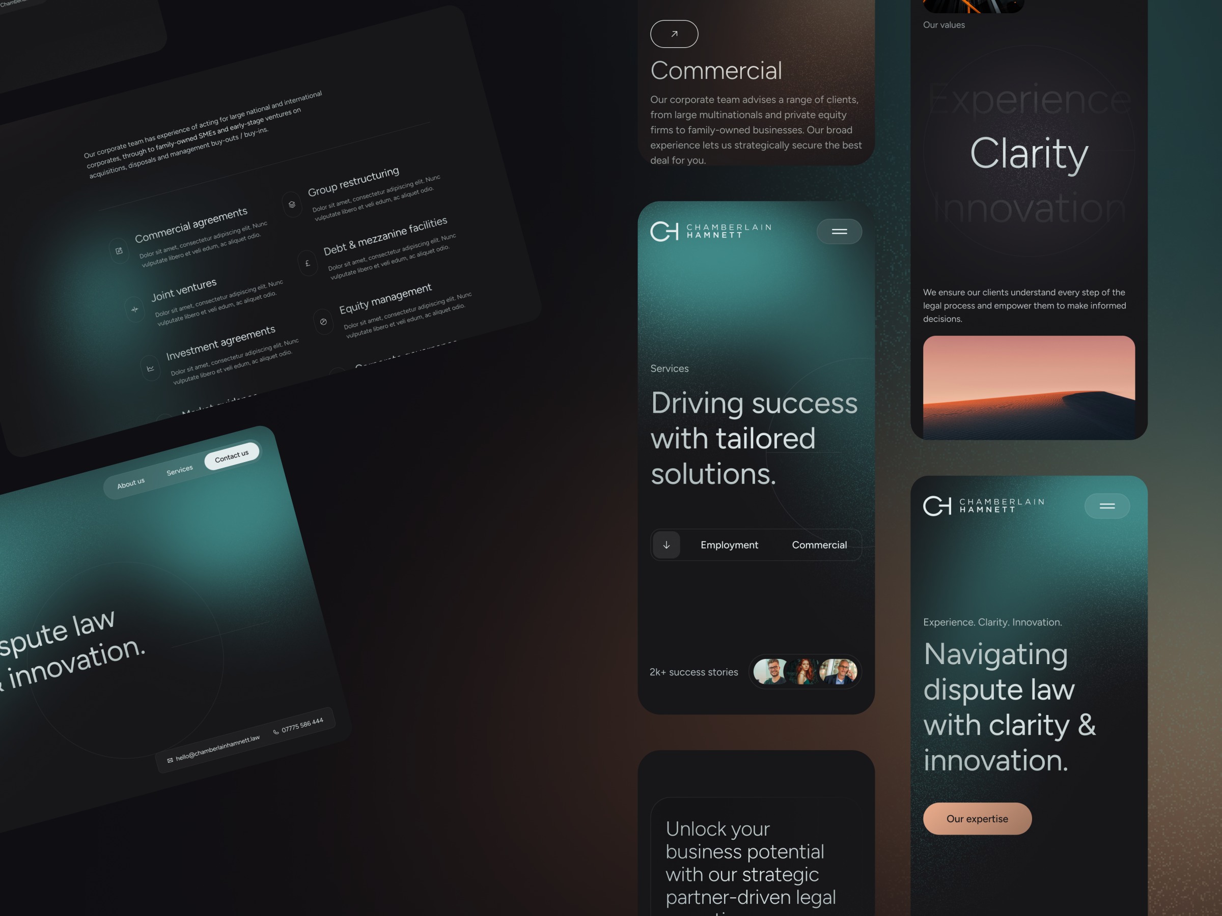
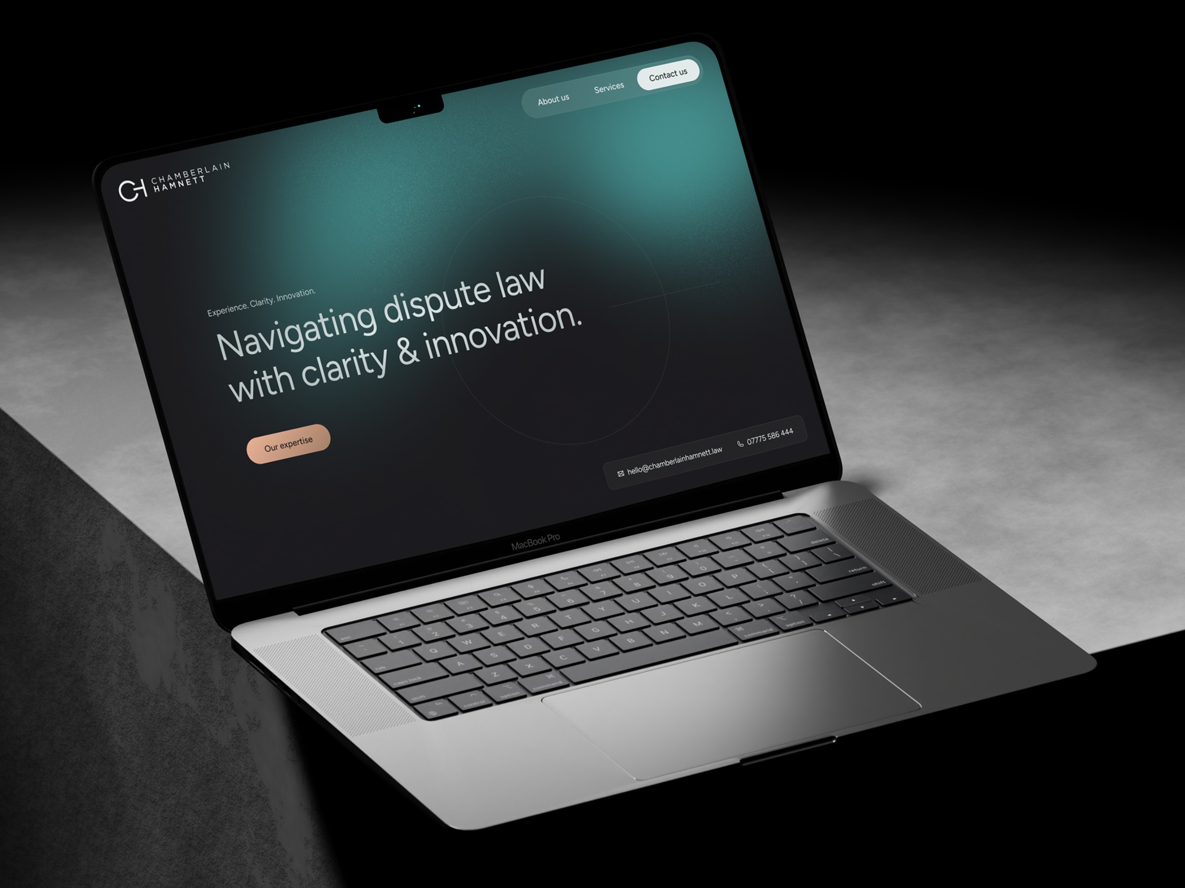
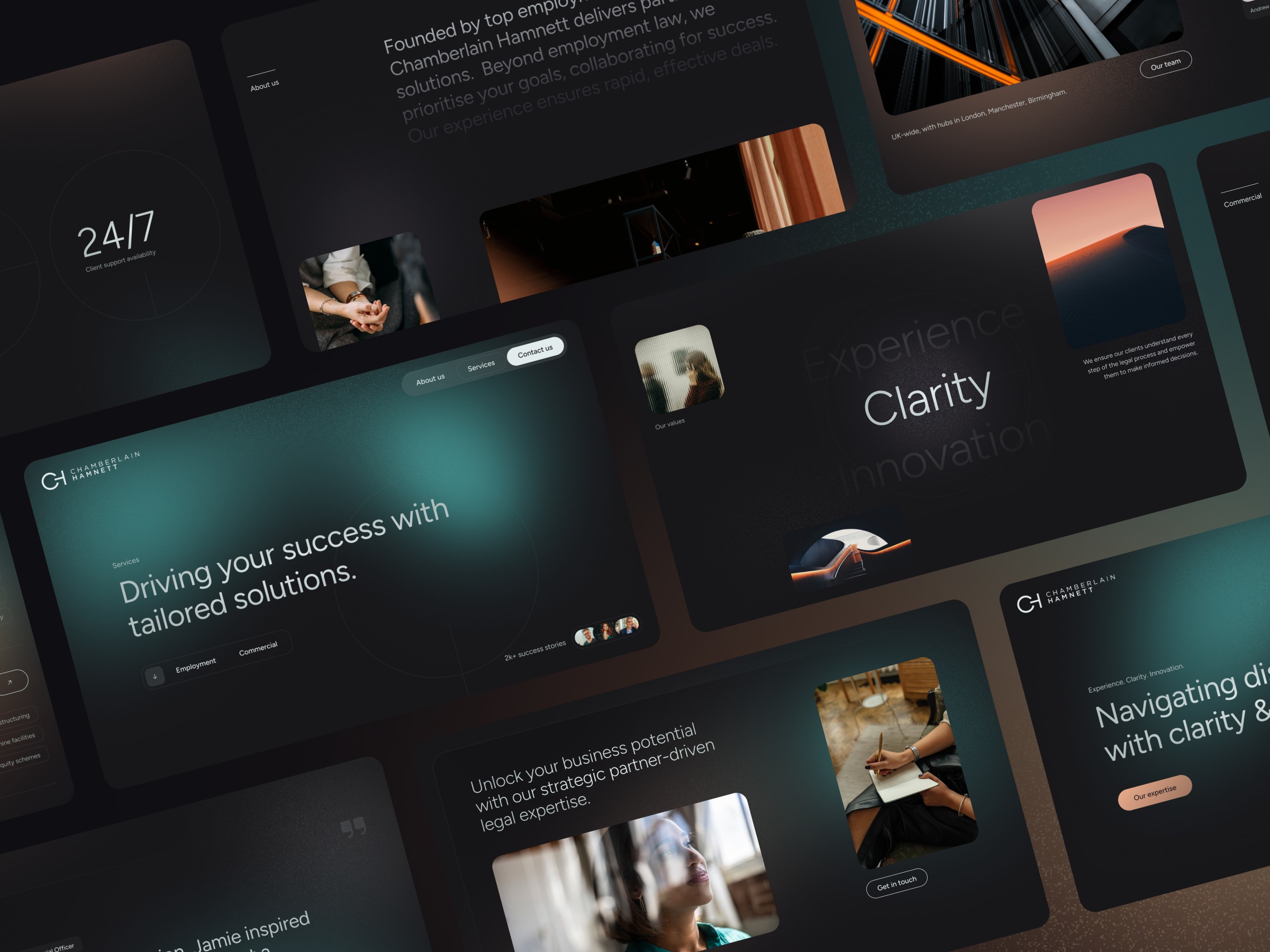
Continuing with the law firm project, looking at how the system translates from desktop down to mobile. We wanted smaller viewports to carry the same atmosphere and warmth—keeping the soft light leaks, subtle grain, and documentary photography intact rather than stripping everything back to a stripped-down template. The modular cards and restrained type hierarchy do the heavy lifting here, keeping key stats, practice areas, and actions clear and easy to scan on the move. A closer look at the homepage hero for Chamberlain Hamnett. For a dispute law practice, the opening screen needed to feel assured and approachable right away—relying on generous breathing room, restrained typography, and a clear focal point rather than packing too much above the fold.