

Bellecare

Project description
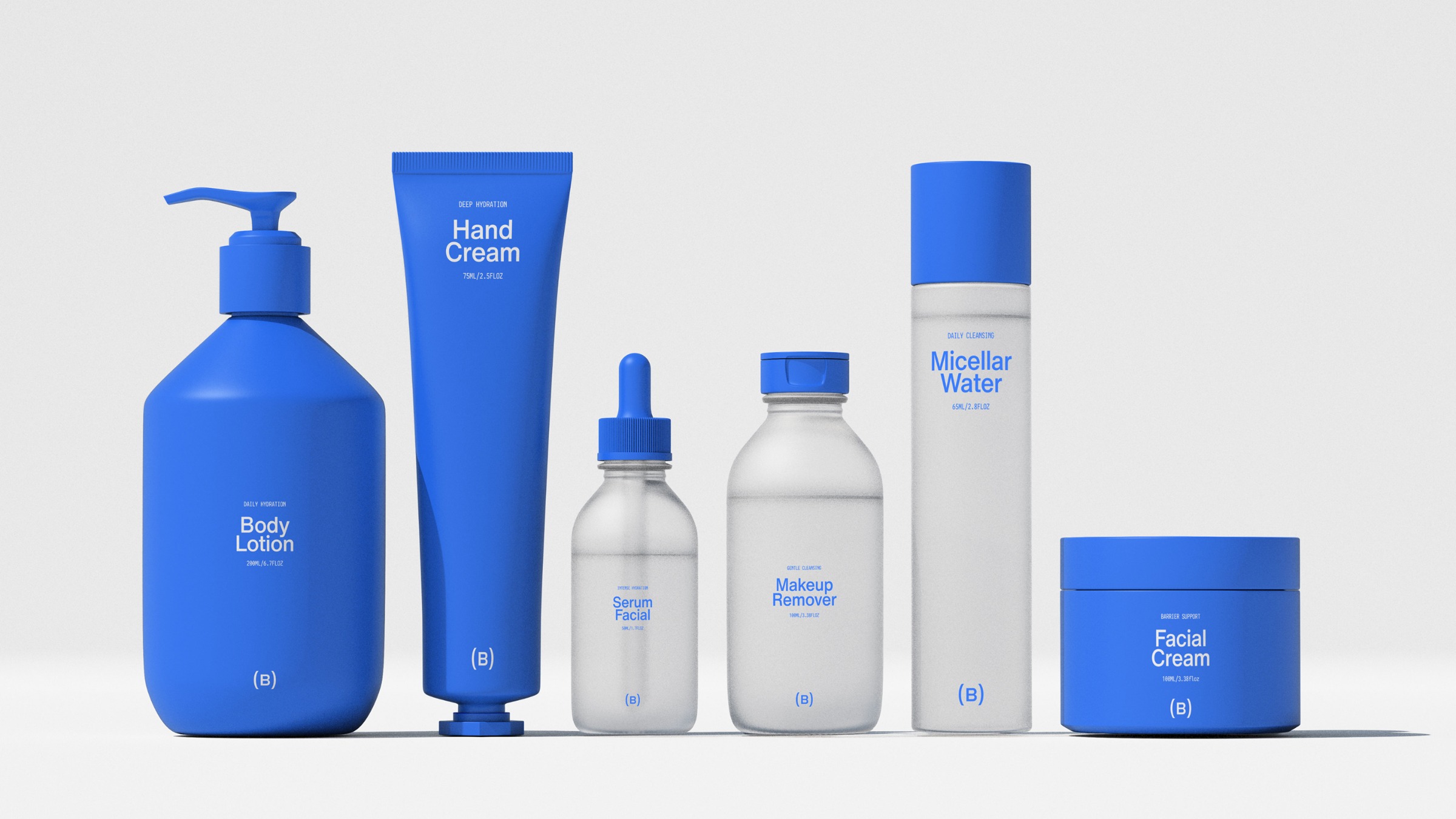
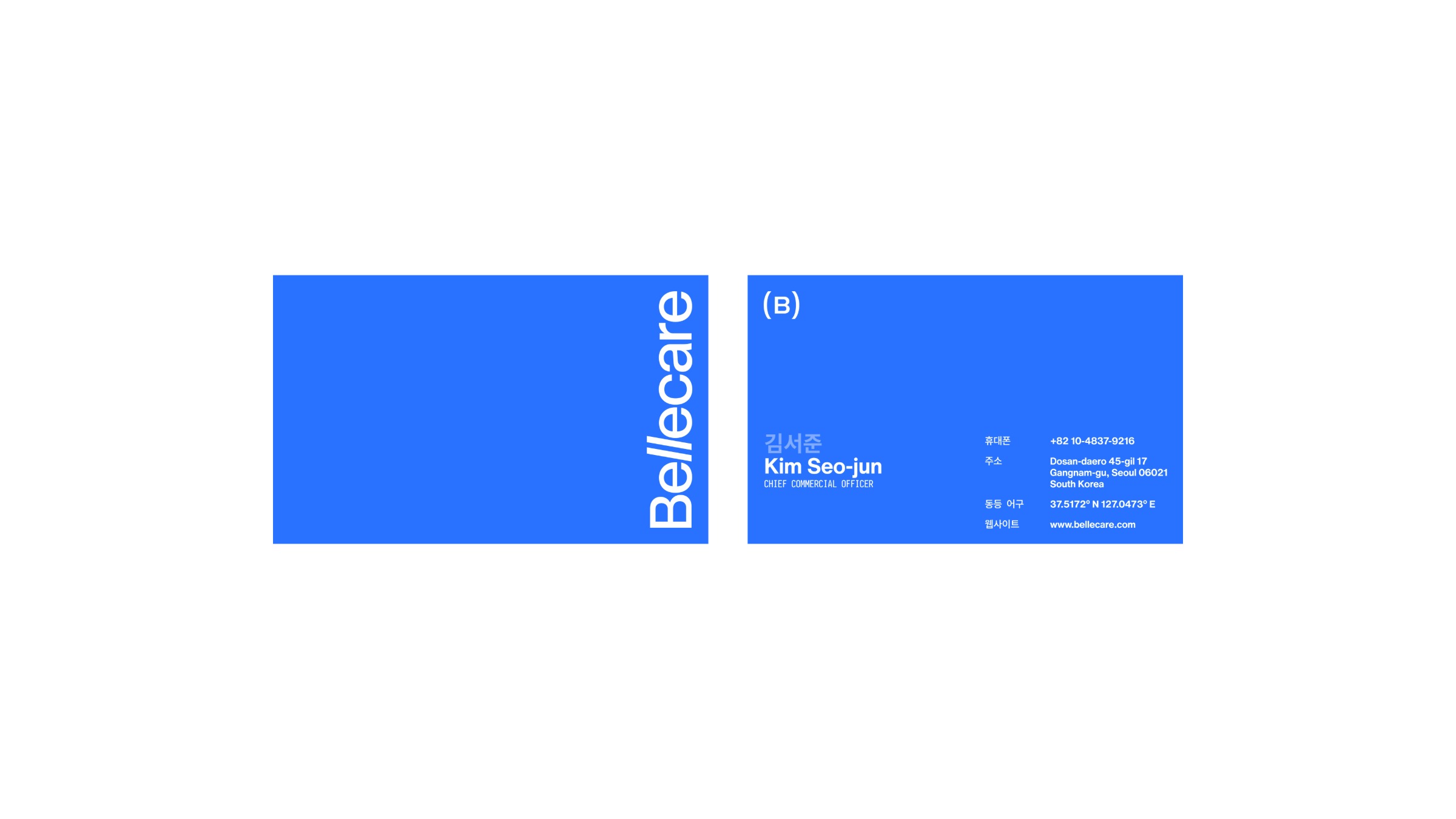
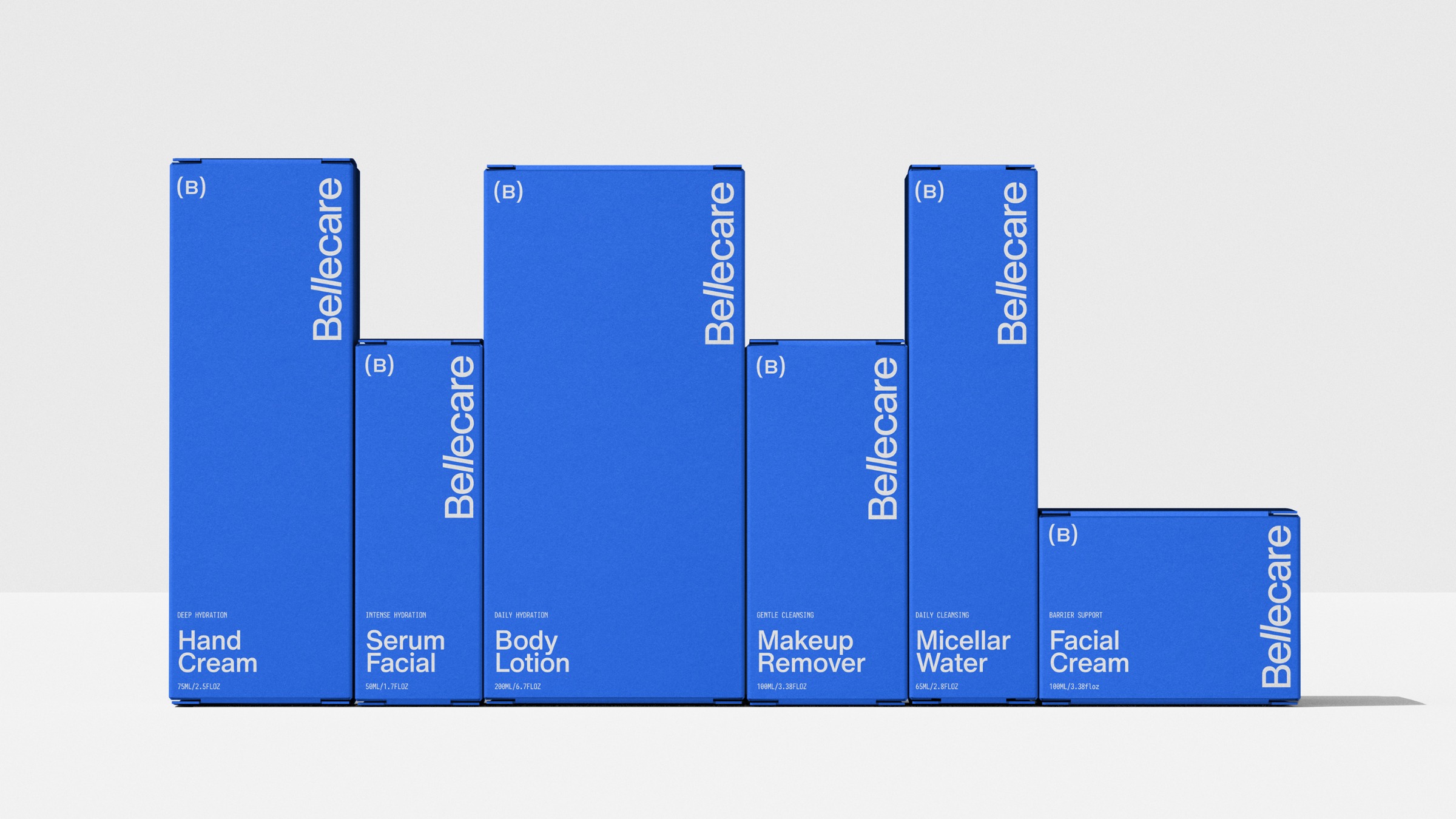
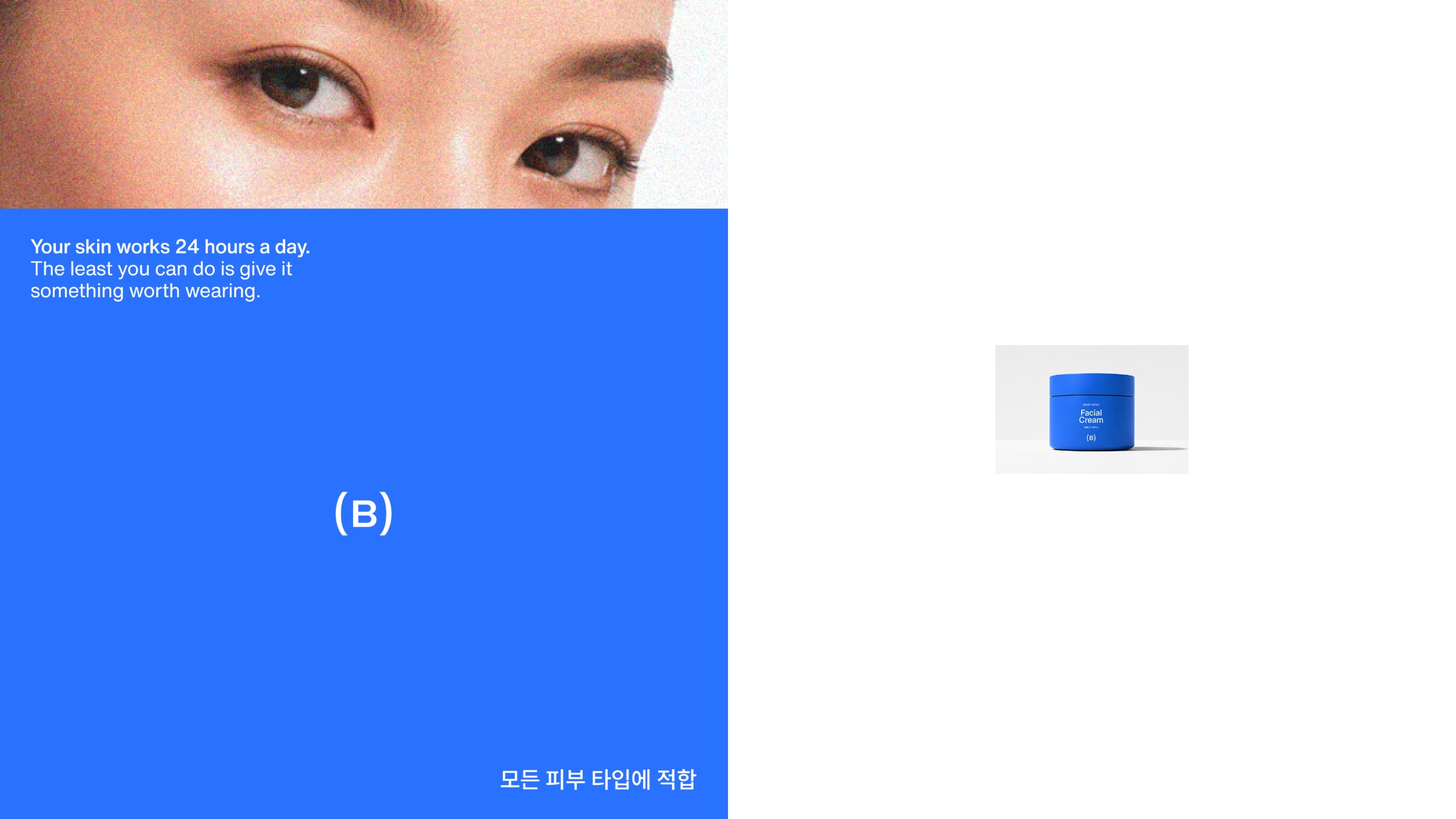
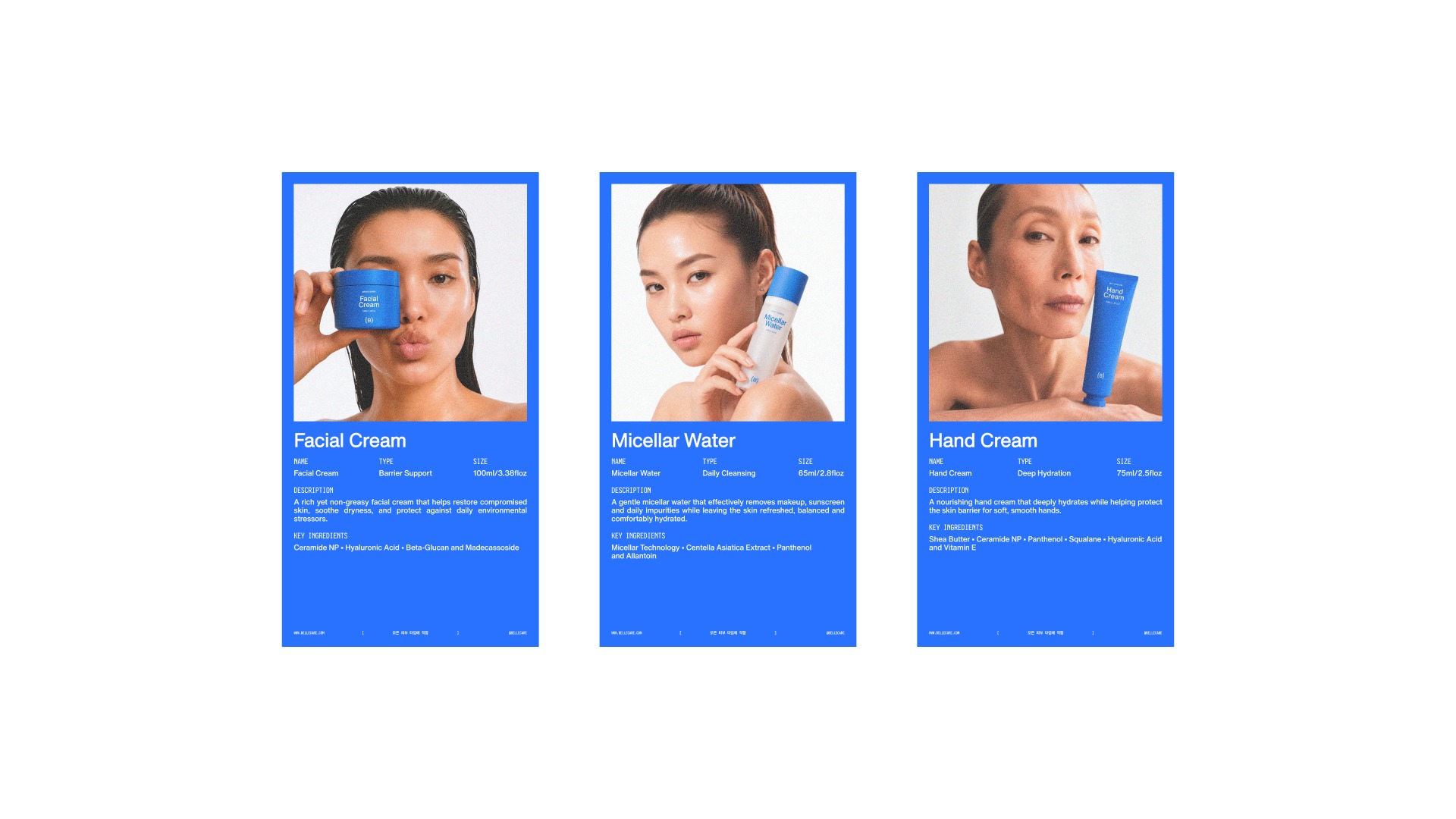
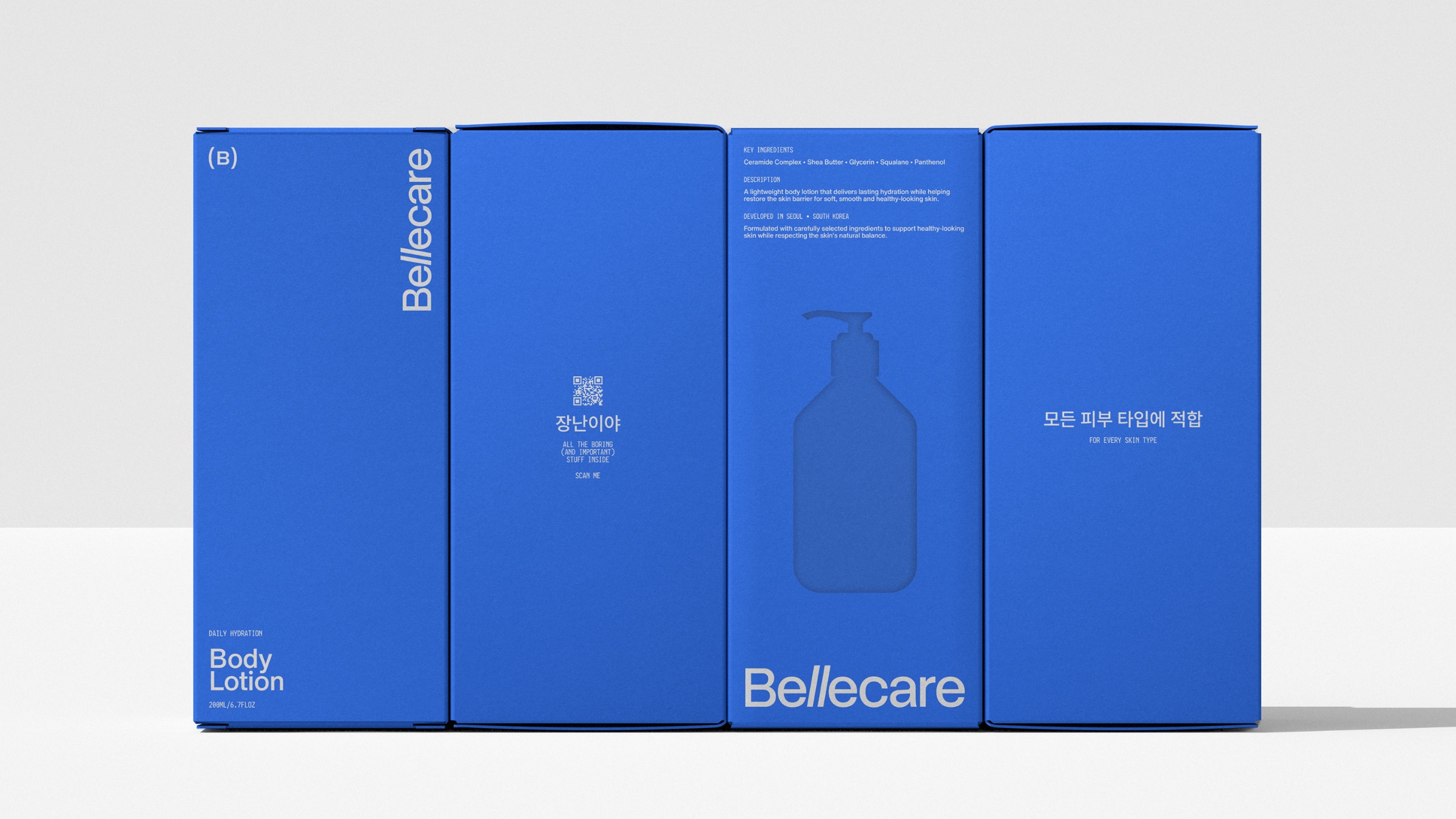
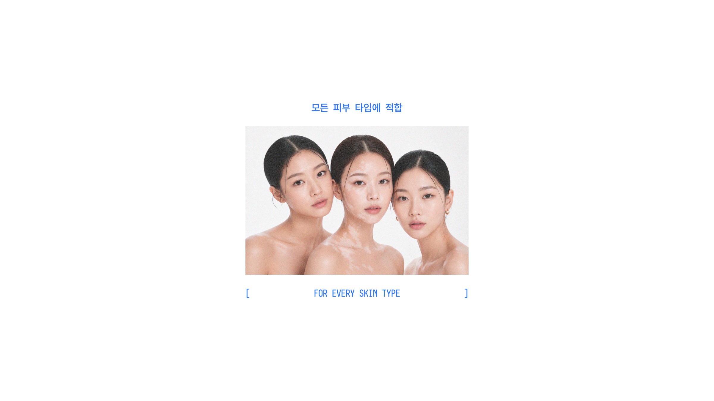
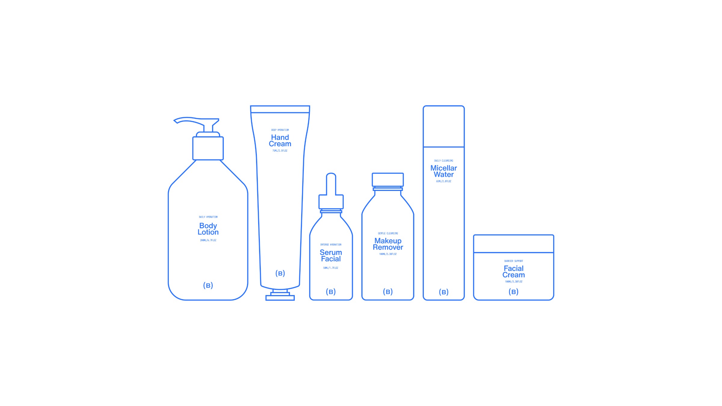
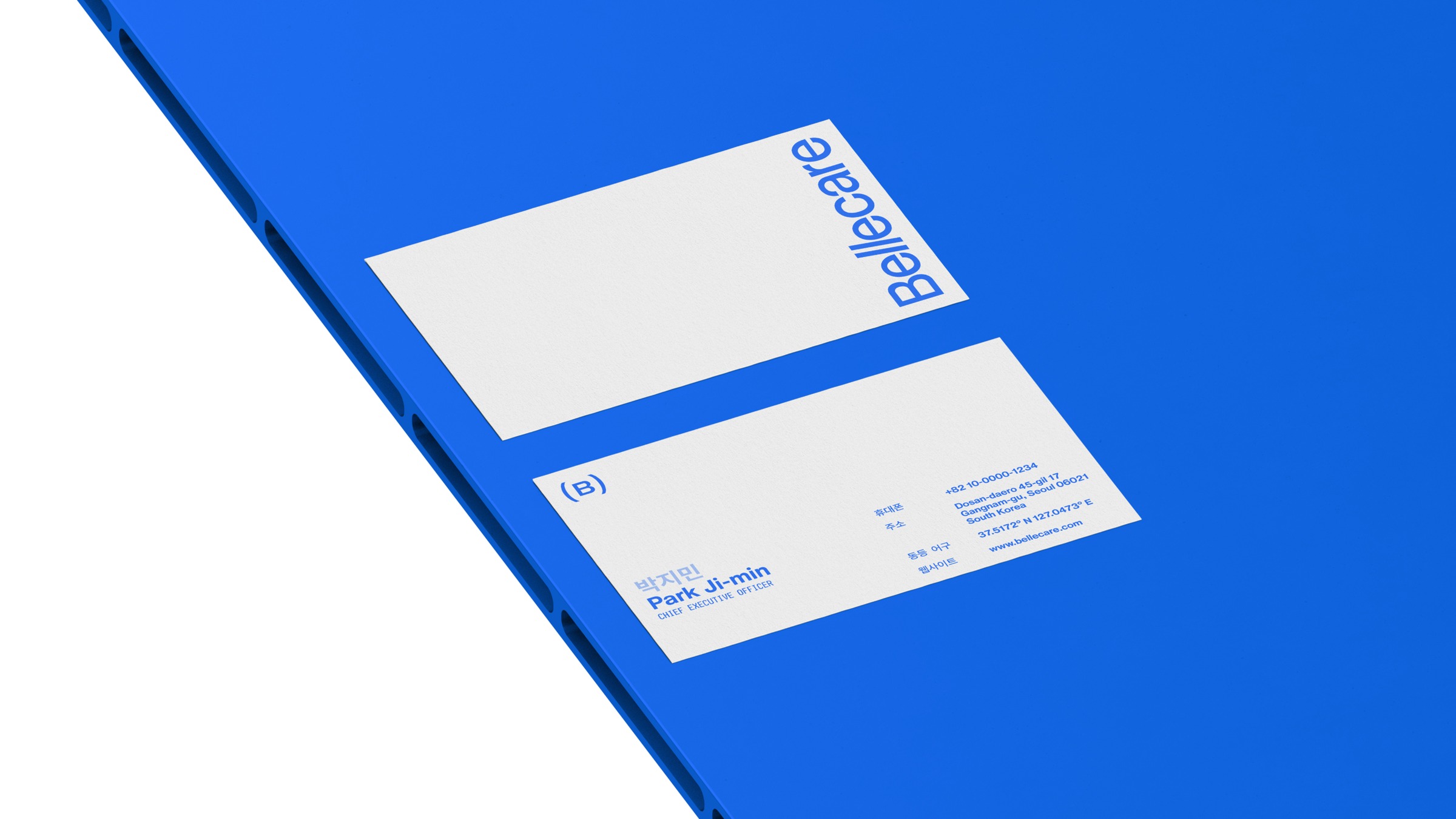
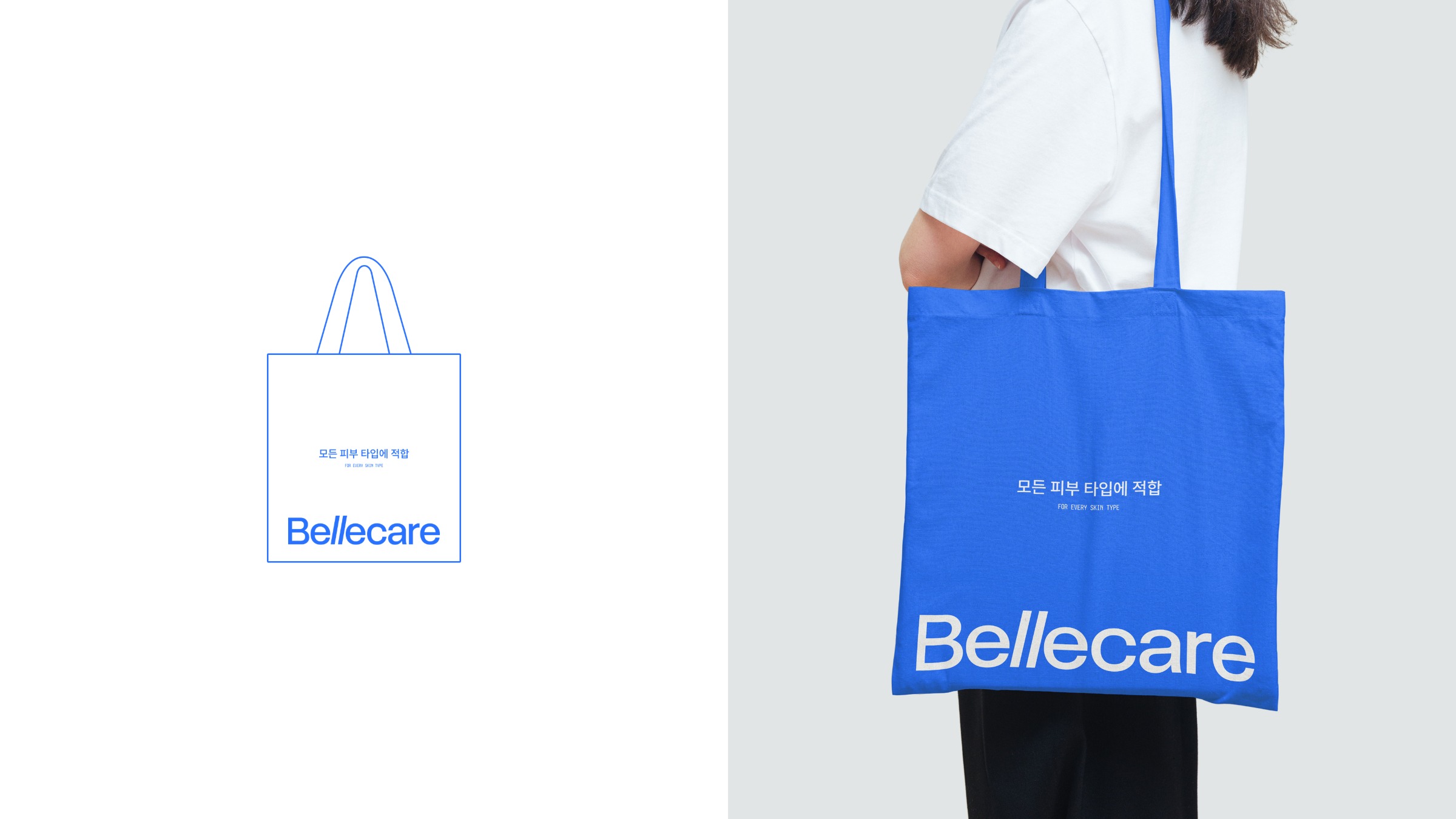
Bellecare was born from the union of beauty and care. Created in South Korea, the brand emerged in a market where skincare is deeply rooted in culture and differentiation requires more than effective formulas. The challenge was to transform skincare into a simple, intuitive, and universal experience. Developing this identity meant competing in a segment dominated by botanical greens, earthy tones, and gold accents. Instead of following these familiar codes, the project took the opposite approach: removing excess. Every decision was made to strengthen brand recognition through simplicity. This approach guides the entire visual system. The identity is built around the relationship between blue and white, a choice that creates contrast within the category while connecting with the cultural meaning of blue in South Korea, where it represents water, renewal, and balance. The typography, based on a Neue grotesk structure, features a subtle intervention in the letter L, creating a distinctive detail without compromising readability. The art direction draws inspiration from South Korean photography, exploring shallow depth of field, subtle blur, texture, and compositions defined by negative space. In packaging, the same principle eliminates everything secondary: the front-facing design highlights only the brand and product identification, while ingredients and technical information are accessed through an integrated QR Code. The signature For every skin type reinforces this approach, expressing a skincare philosophy that is simple, direct, and universal.






Support this project


Varad, Manuel, Bertolino and 10 others voted for this project