Hue&Cry — Visual Identity & Website

Project description
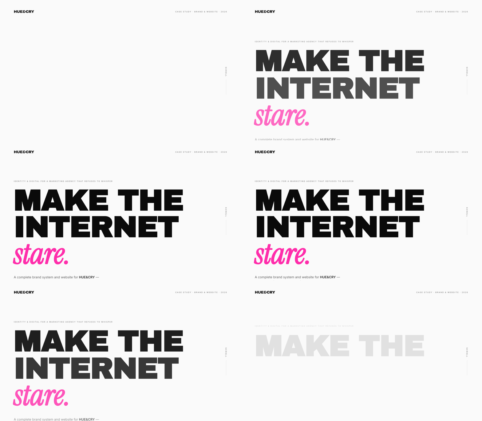
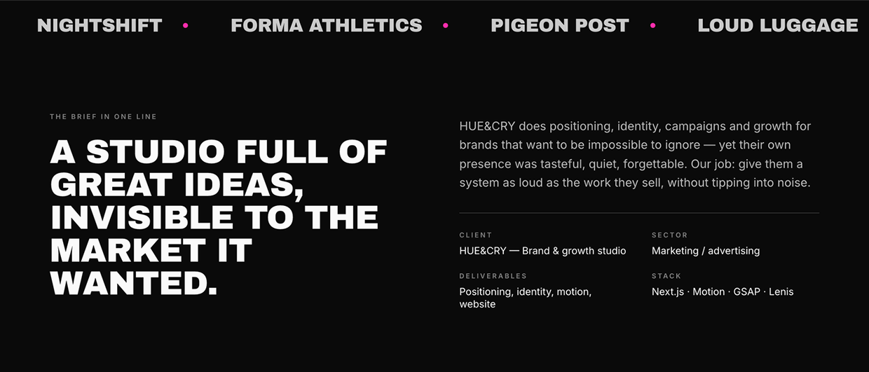
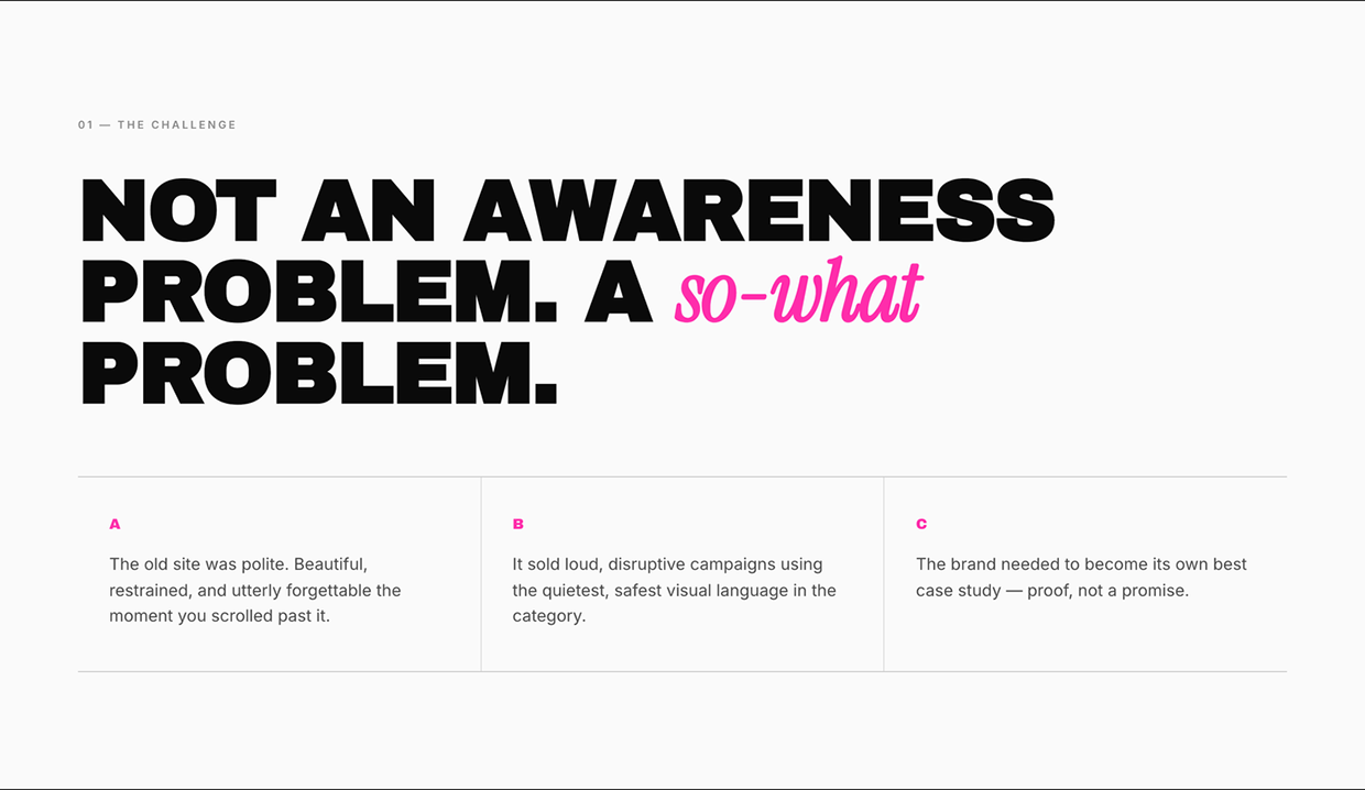
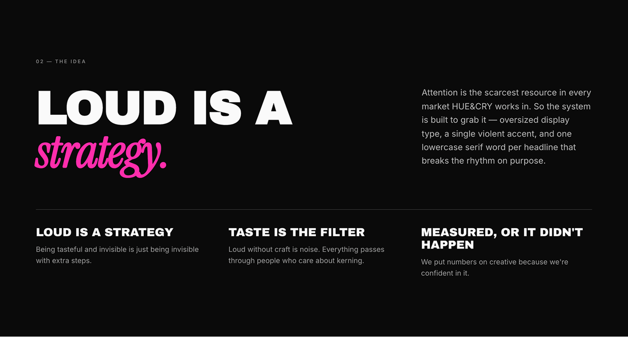
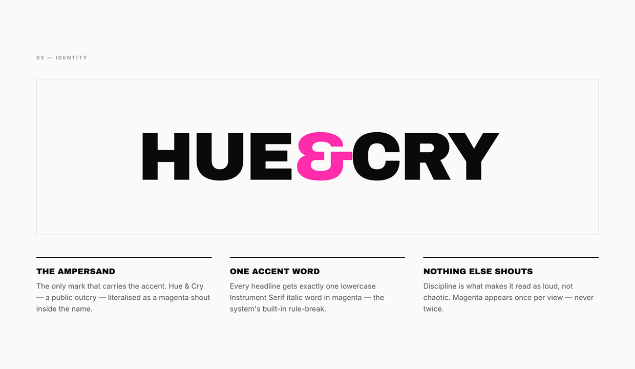
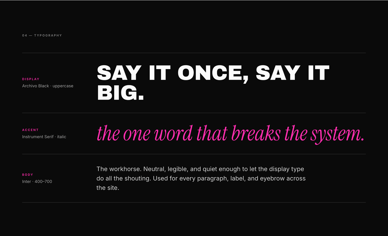
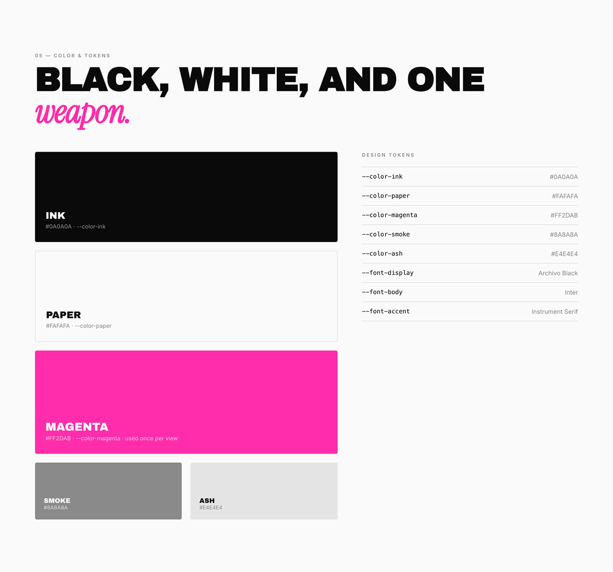
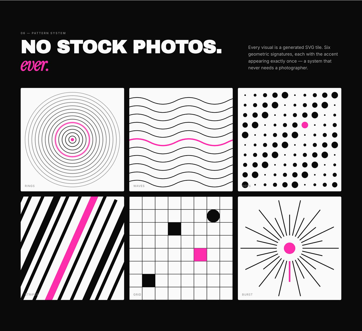
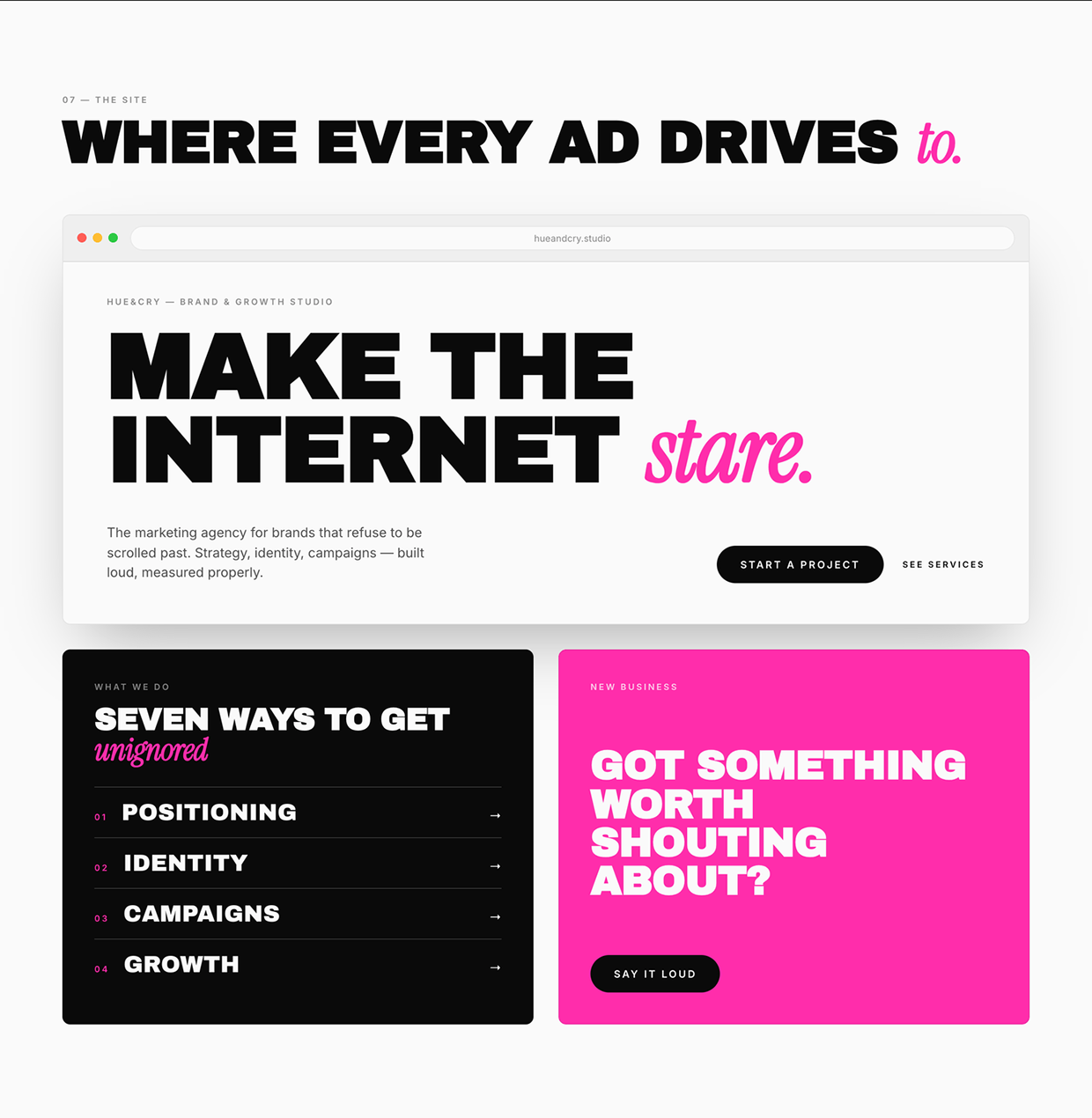
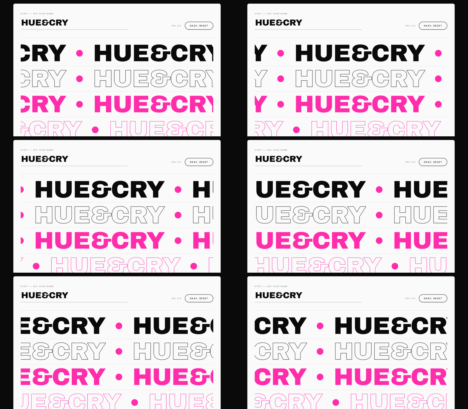
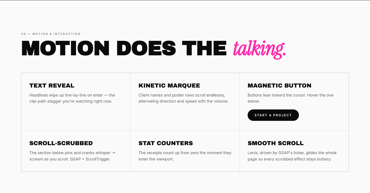
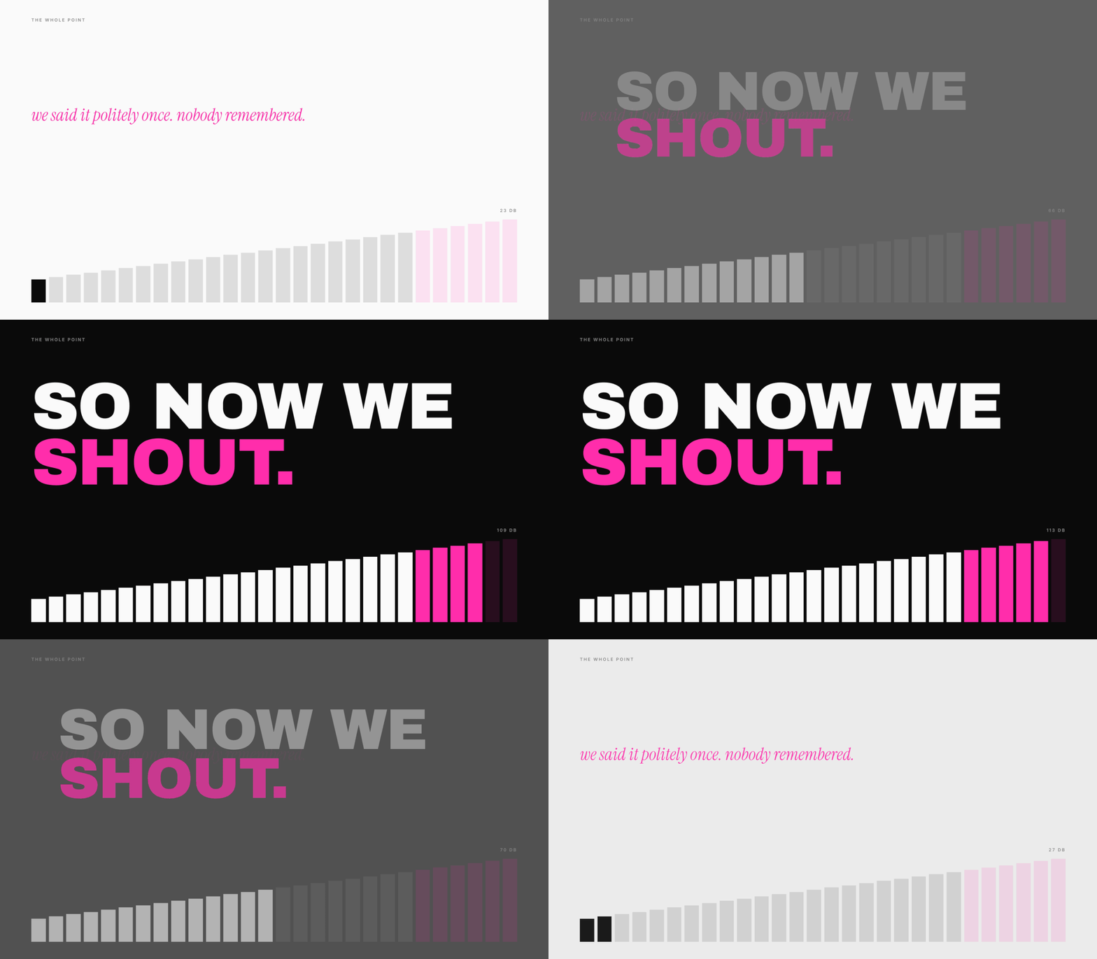
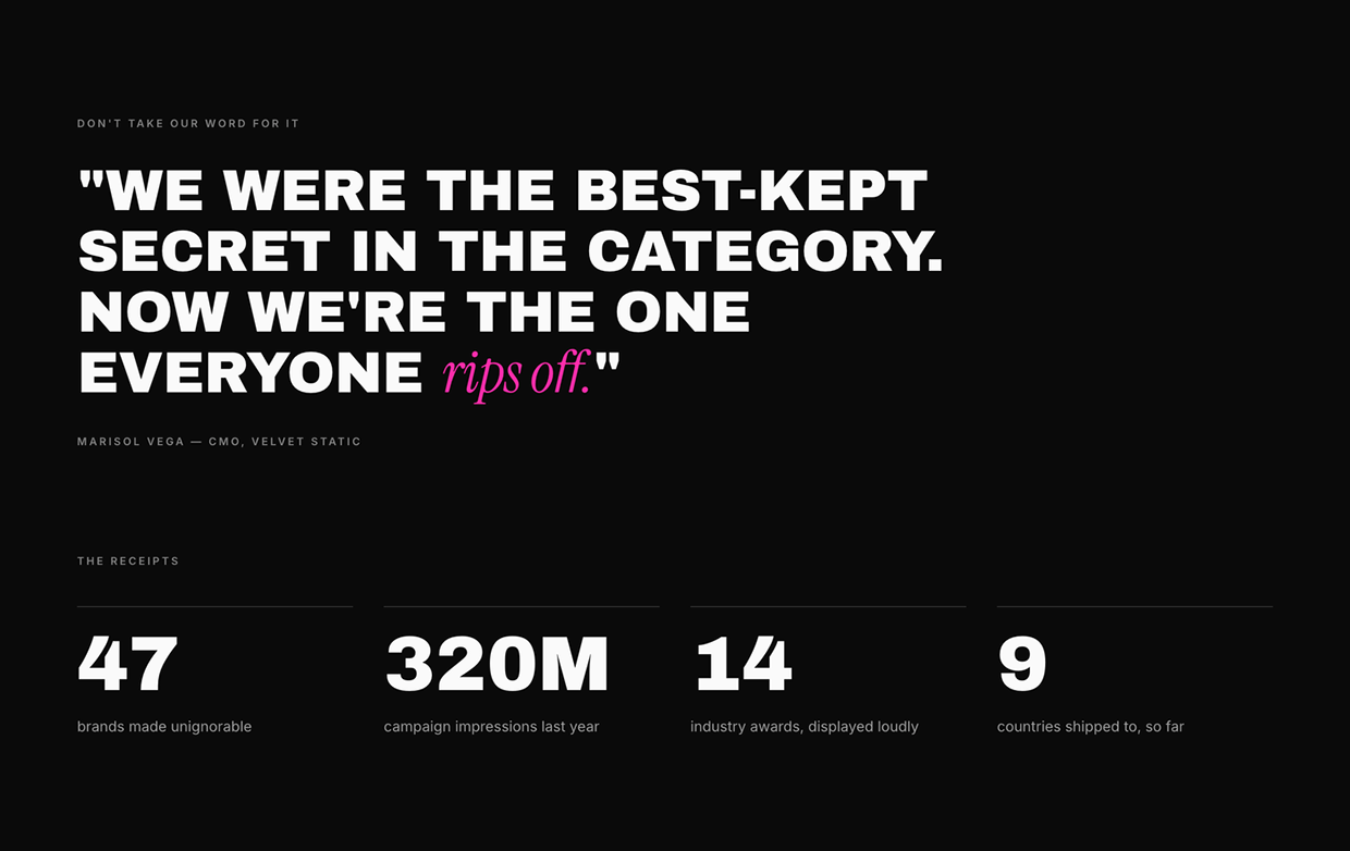
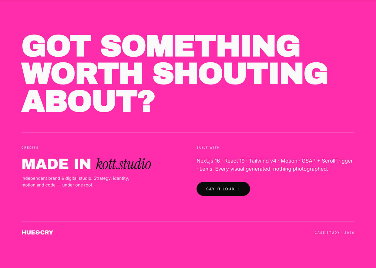
Hue&Cry is a brand and growth studio for companies that refuse to whisper. The identity and website were built around one simple idea: make the brand impossible to scroll past. Instead of creating a quiet, polished agency look, we leaned into a louder visual system — oversized typography, sharp contrast, direct copy, expressive layouts, and motion-led digital moments. The identity gives Hue&Cry a flexible language for everything from strategy decks to campaigns: bold type, high-energy composition, punchy messaging, and a confident tone that feels more like a launch than a brochure. The website extends that system into an interactive experience. It introduces the studio, explains the services, showcases the attitude, and makes the brand promise tangible: strategy, identity, campaigns, growth, digital, design, and development — built loud, measured properly, and impossible to ignore.
Support this project
Upvote