Waml: a compliance brand that doesn't look like one

Project description
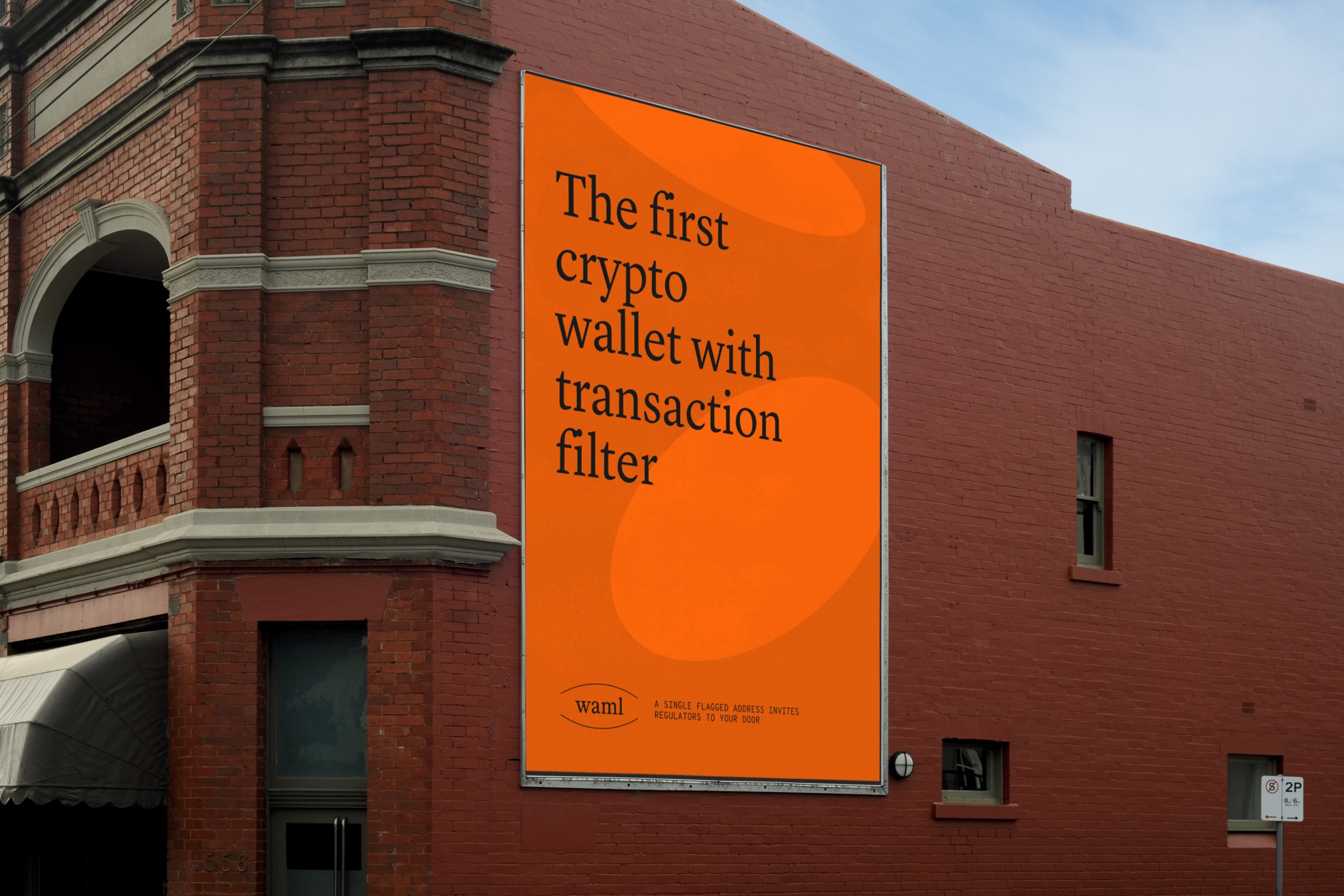
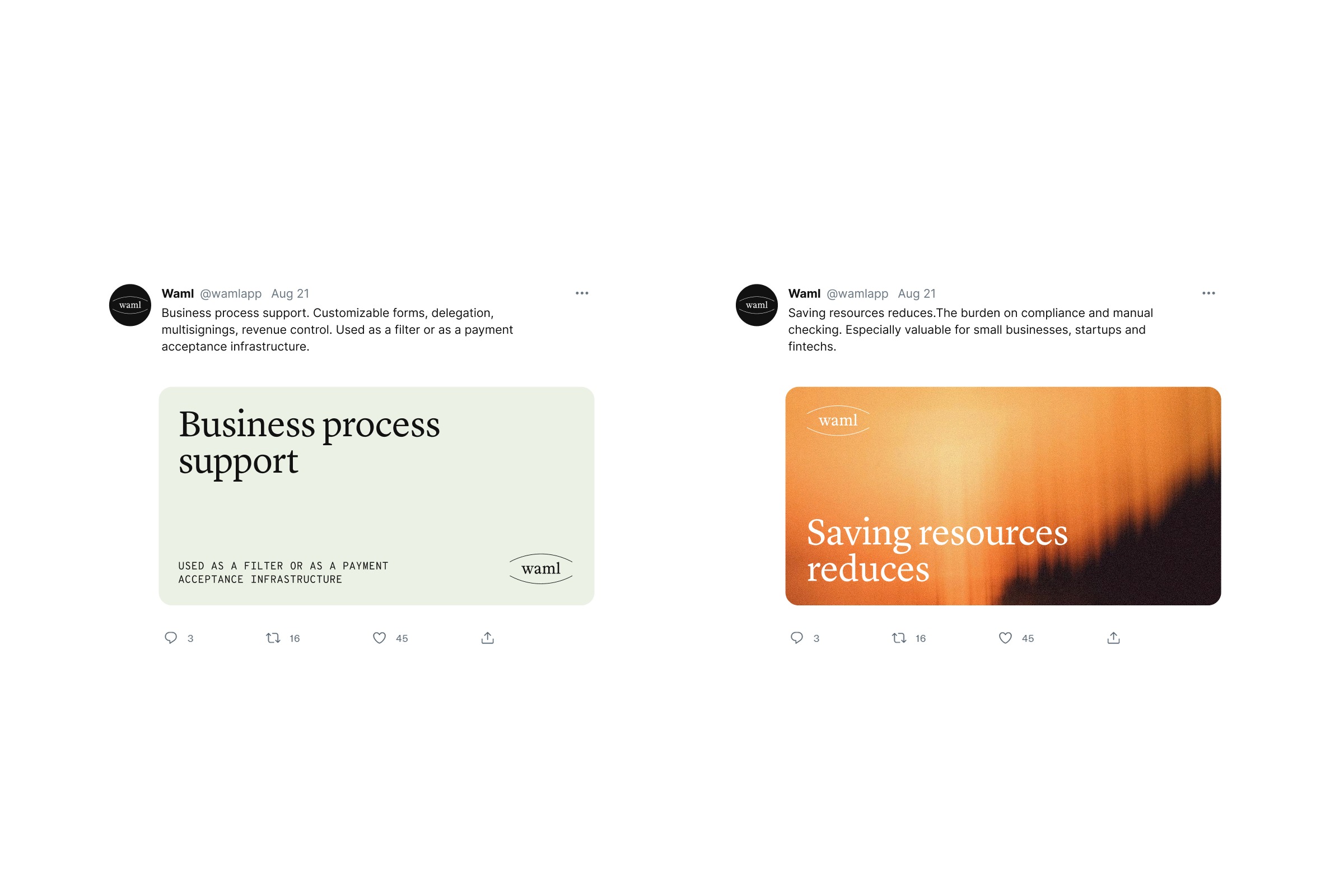
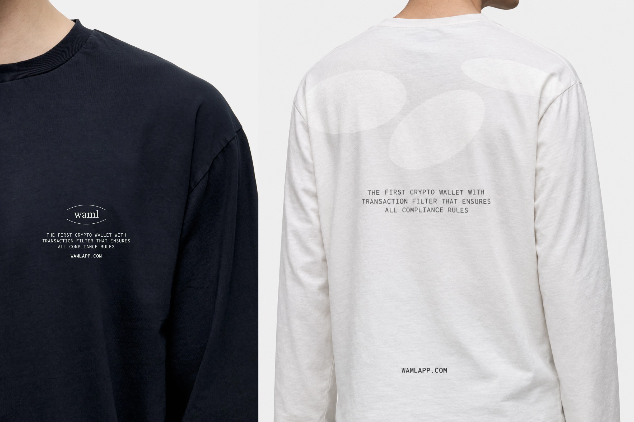
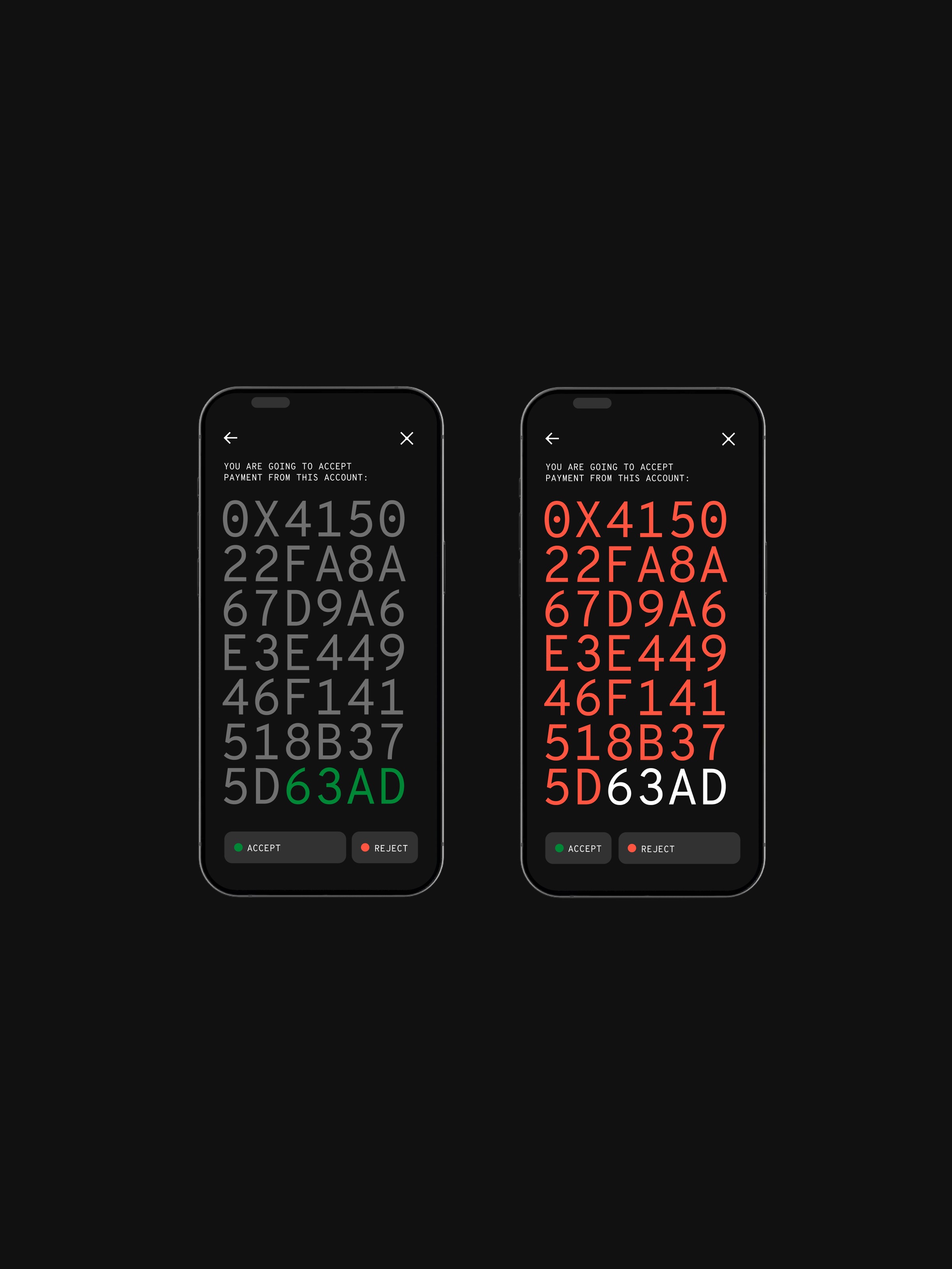
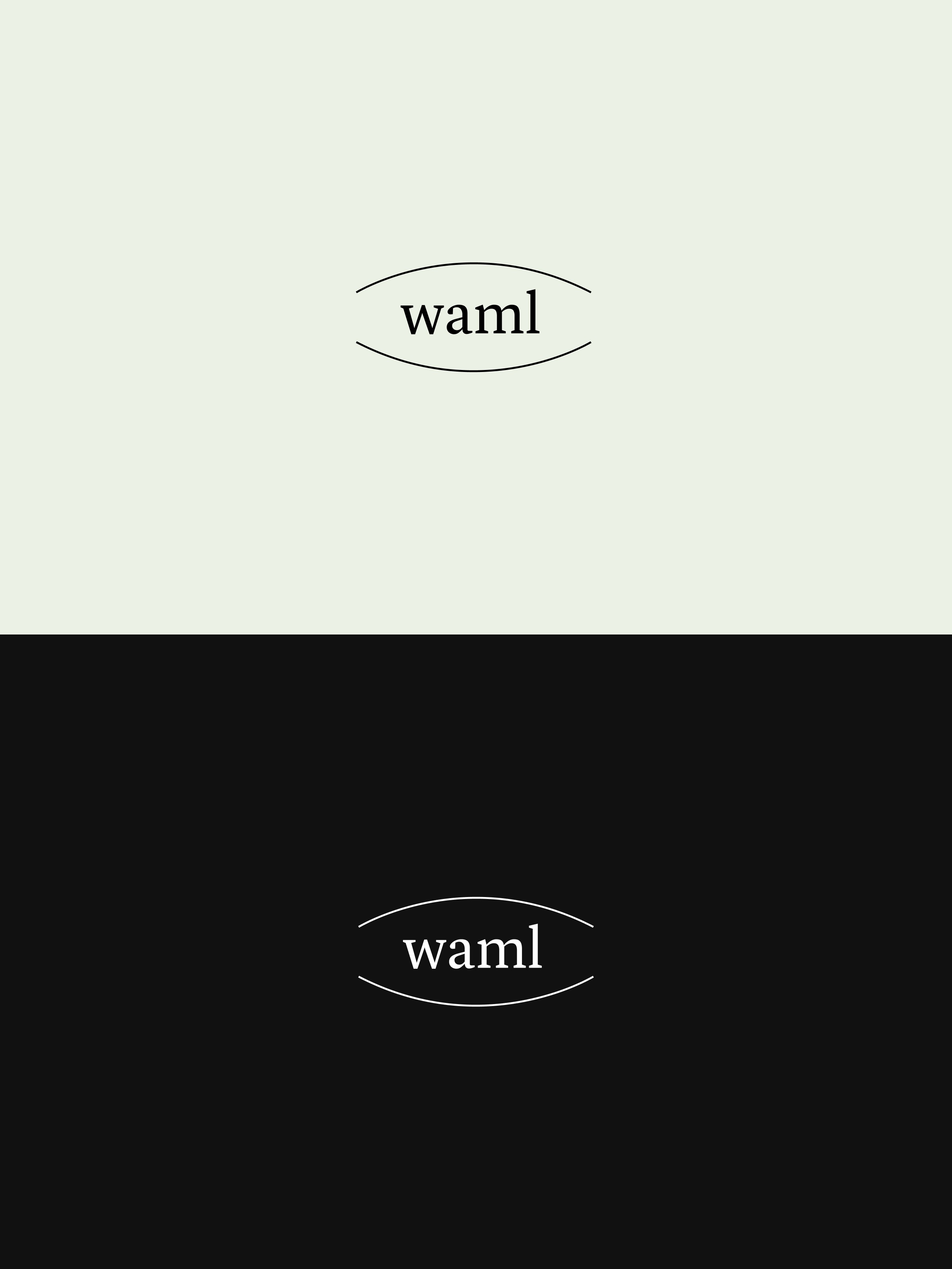
Waml is the first crypto wallet with a built-in transaction filter — it checks every incoming payment against compliance rules before it lands. But compliance usually looks like cold, bureaucratic and built for auditors. Our brief was to break that pattern and make a product people actually want to use. One that protects without taking away control. And with the design that feels like a safe space — trustworthy enough for a fintech, calm enough for someone who just wants to receive a payment without stress. The identity comes down to two words: safe space. The world of crypto is fast, loud, and chaotic. Waml is the calm, clear place inside all of it. The logo is literally a “safe space”. And it's dynamic: the shape holds, but you can drop any text or idea inside it. Around it, the noisy moving world is drawn as overlapping ovals in perspective — chaos on the outside, one clean, clear safe space in the middle. The typographic and colour system follows the same logic: clear, calm, direct. Nothing that competes with the information. Everything in service of legibility at a moment that matters. A custom icon set built on one rule: round the inner corners, keep the outer ones sharp — and any icon becomes a Waml icon. The system can grow without a designer in the room. Whaml: *safe space for your crypto business*
Support this project
Upvote