

LOGO Design for "TORD AI & COG 21" - AI Platforms
Project description
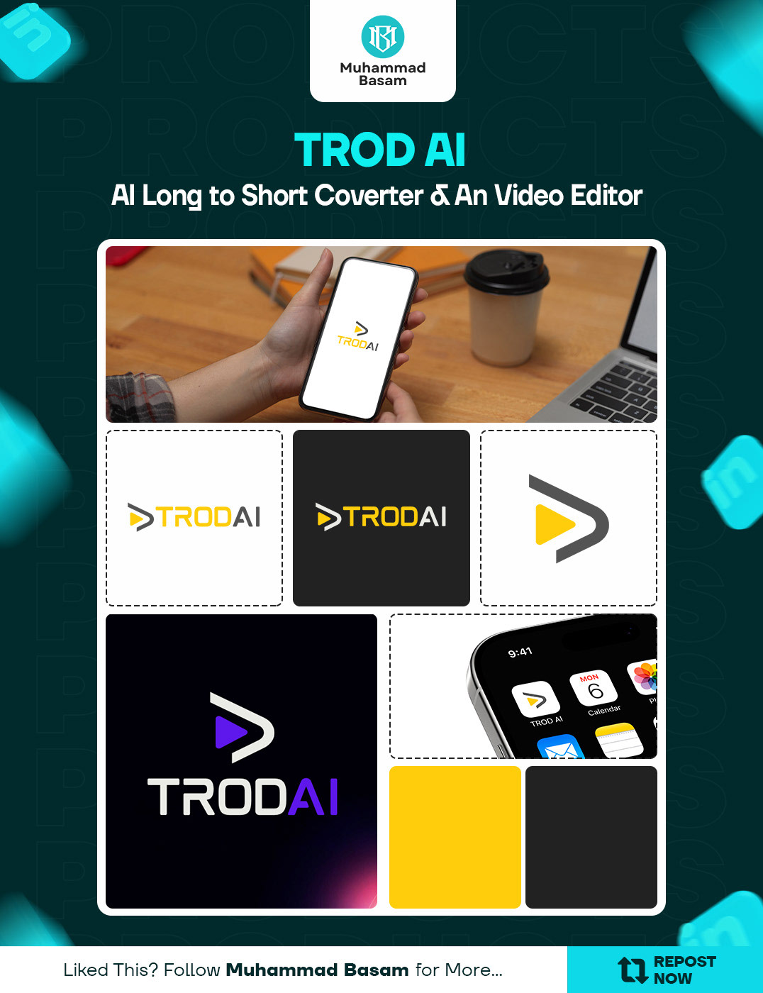
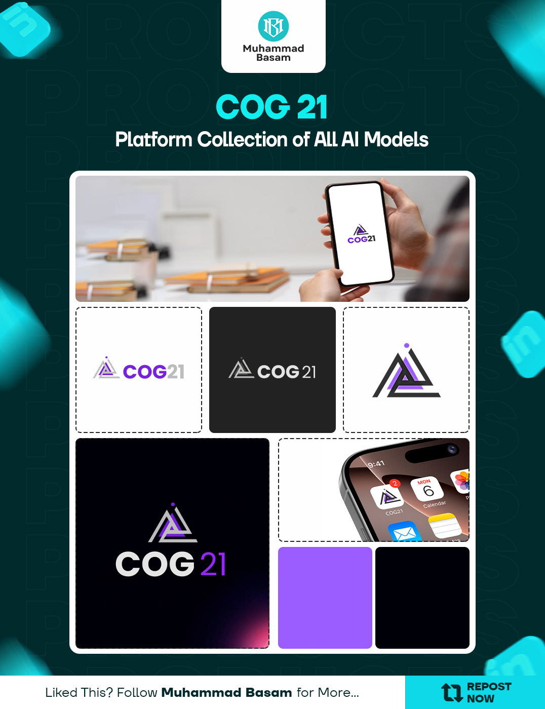
𝐒𝐨𝐦𝐞 𝐏𝐫𝐨𝐣𝐞𝐜𝐭𝐬 𝐅𝐞𝐞𝐥 𝐒𝐦𝐚𝐥𝐥 𝐚𝐭 𝐭𝐡𝐞 𝐒𝐭𝐚𝐫𝐭 𝐁𝐮𝐭 𝐓𝐮𝐫𝐧 𝐈𝐧𝐭𝐨 𝐒𝐨𝐦𝐞𝐭𝐡𝐢𝐧𝐠 𝐁𝐢𝐠𝐠𝐞𝐫, 𝐎𝐧𝐜𝐞 𝐭𝐡𝐞 𝐈𝐝𝐞𝐚 𝐓𝐚𝐤𝐞𝐬 𝐒𝐡𝐚𝐩𝐞. This week, I completed the logo design work for two new SaaS products, and both came out with their own clear identity. The first one is TROD AI. It’s a tool that helps users turn long content into short, clear pieces without losing meaning. So the logo needed to feel fast, sharp, and focused. Something that reflects the idea of taking something big and converting it into something clean. The second one is COG 21. This platform brings together different AI models in one place. People can generate images, build agents, set up automation, and do a lot more inside one system. So its branding needed to feel modern, stable, and ready for future tools that will be added. Both logos were designed with careful use of shapes, spacing, and typography so they match the SaaS look and still feel unique on their own.
Support this project
Be the first to upvote