

AXON — Premium Neobank UI Direction
Project description
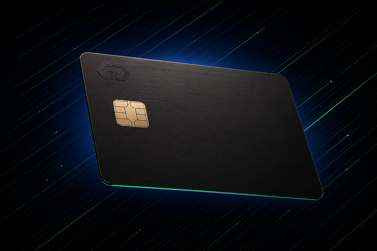
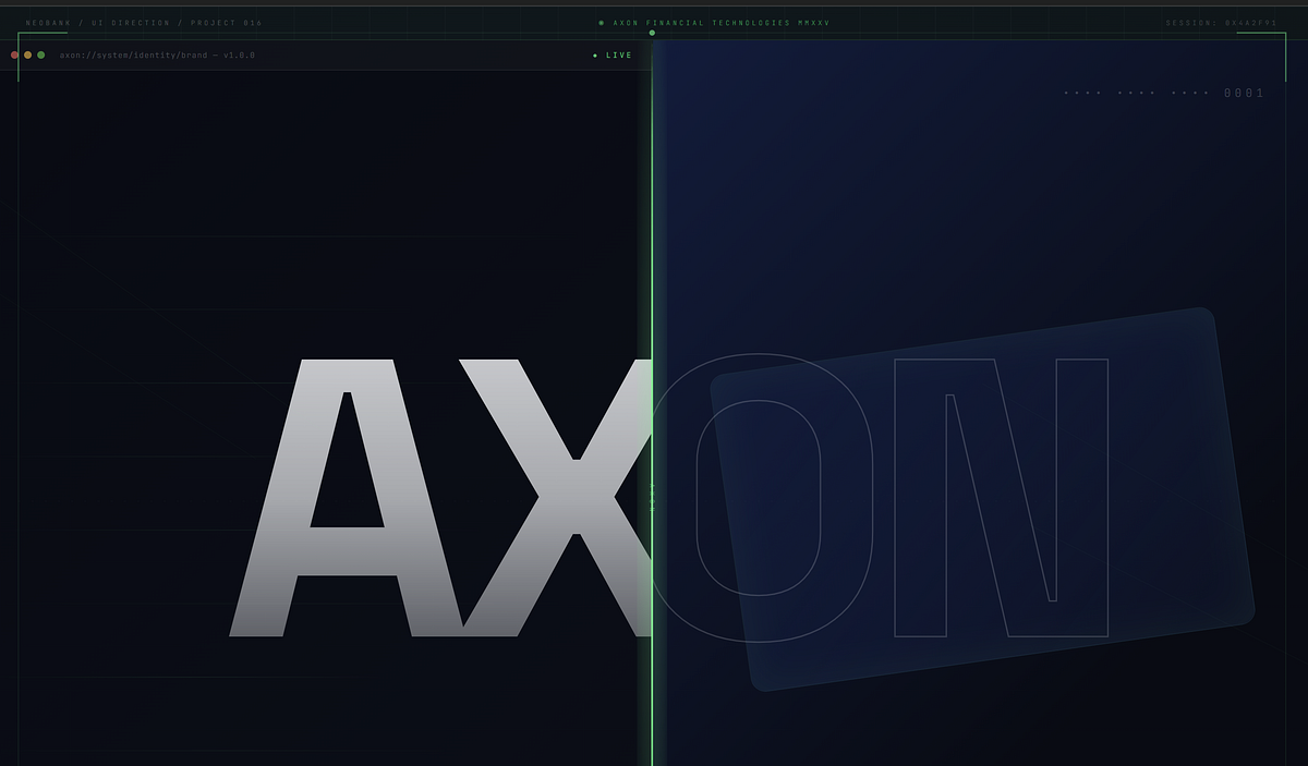
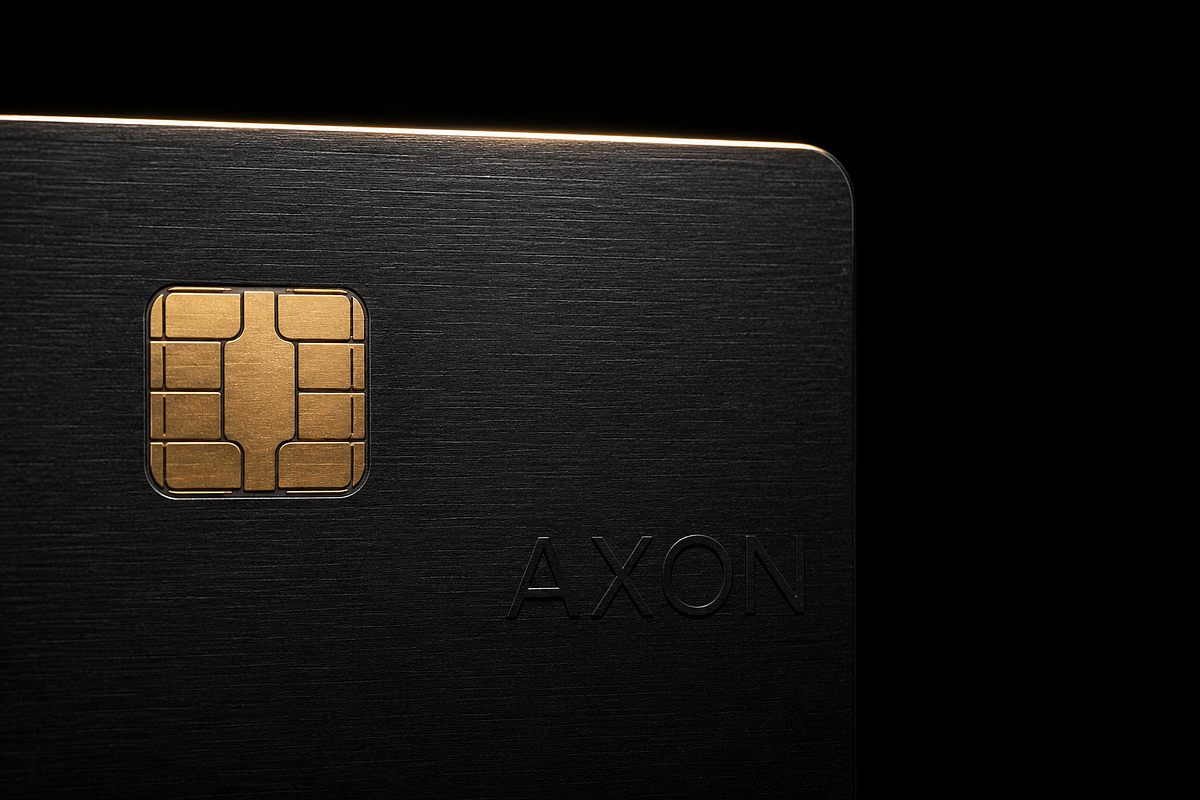
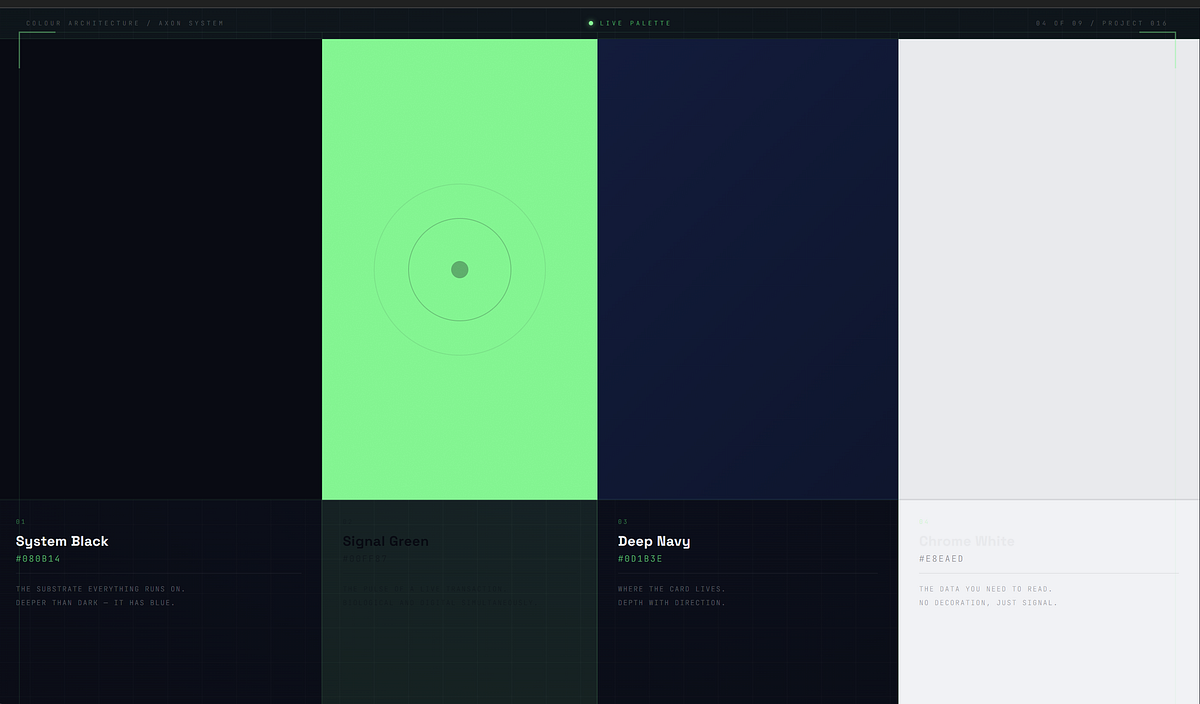
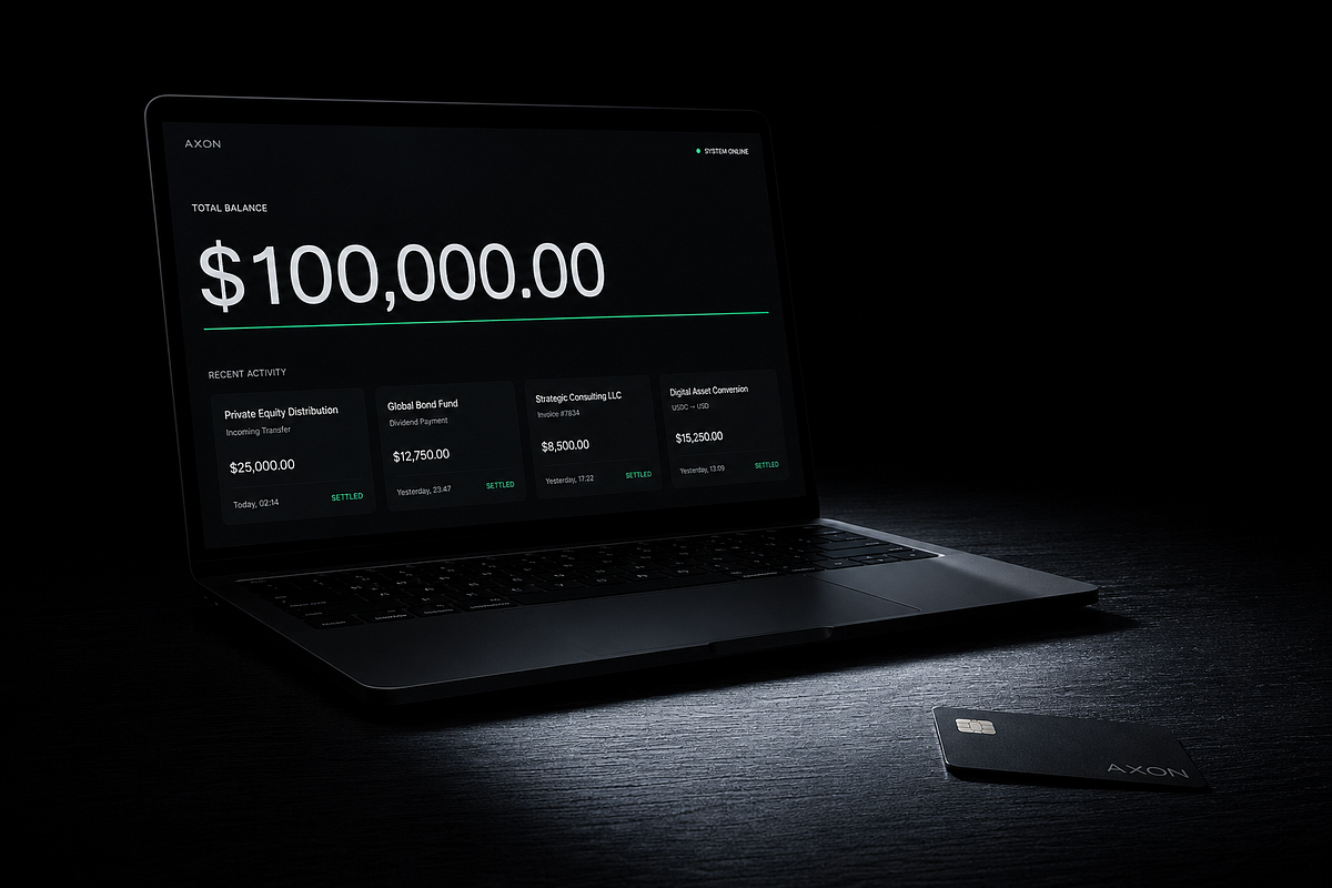
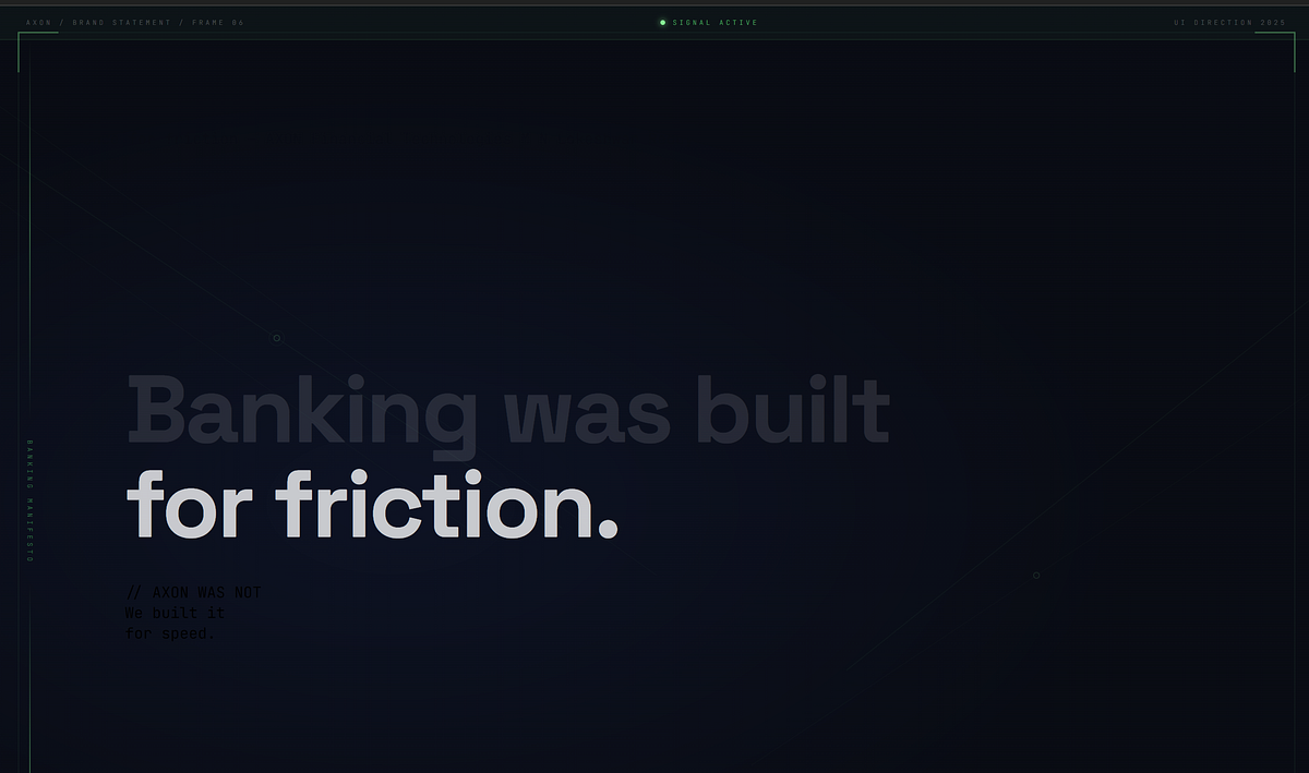
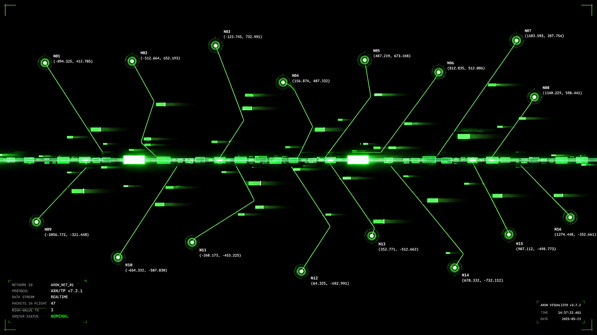
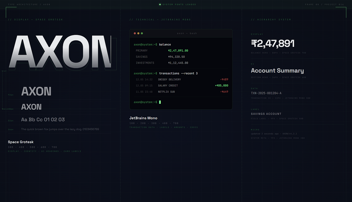
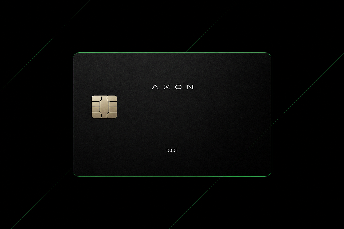
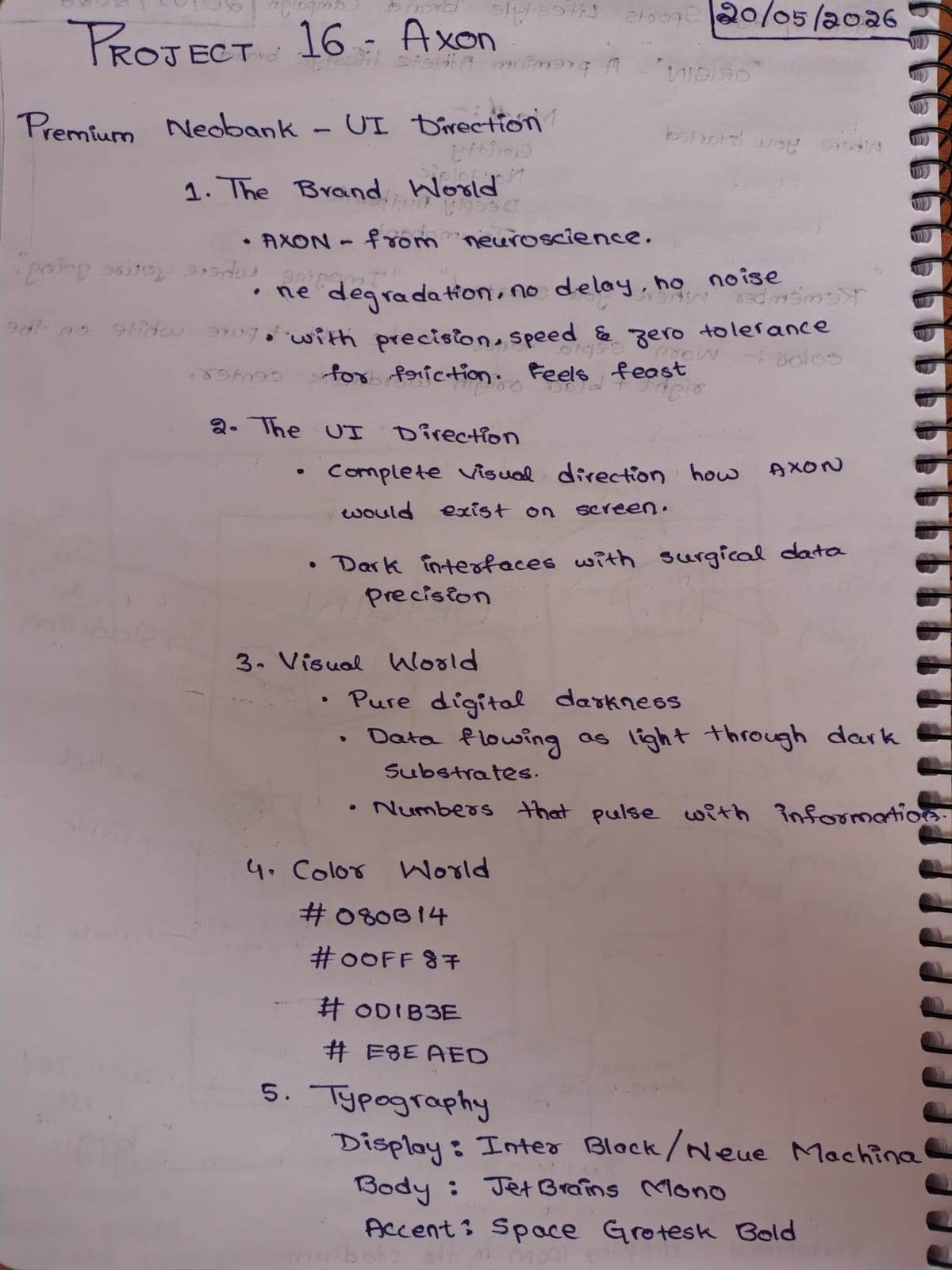
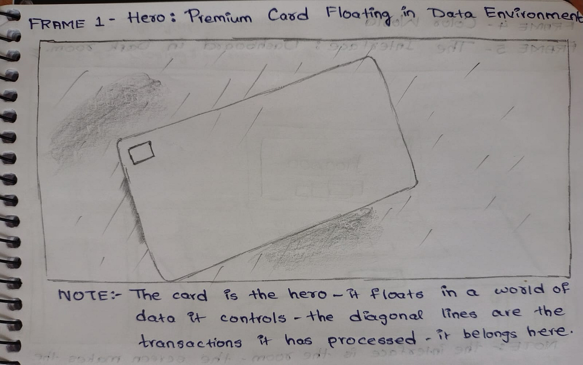
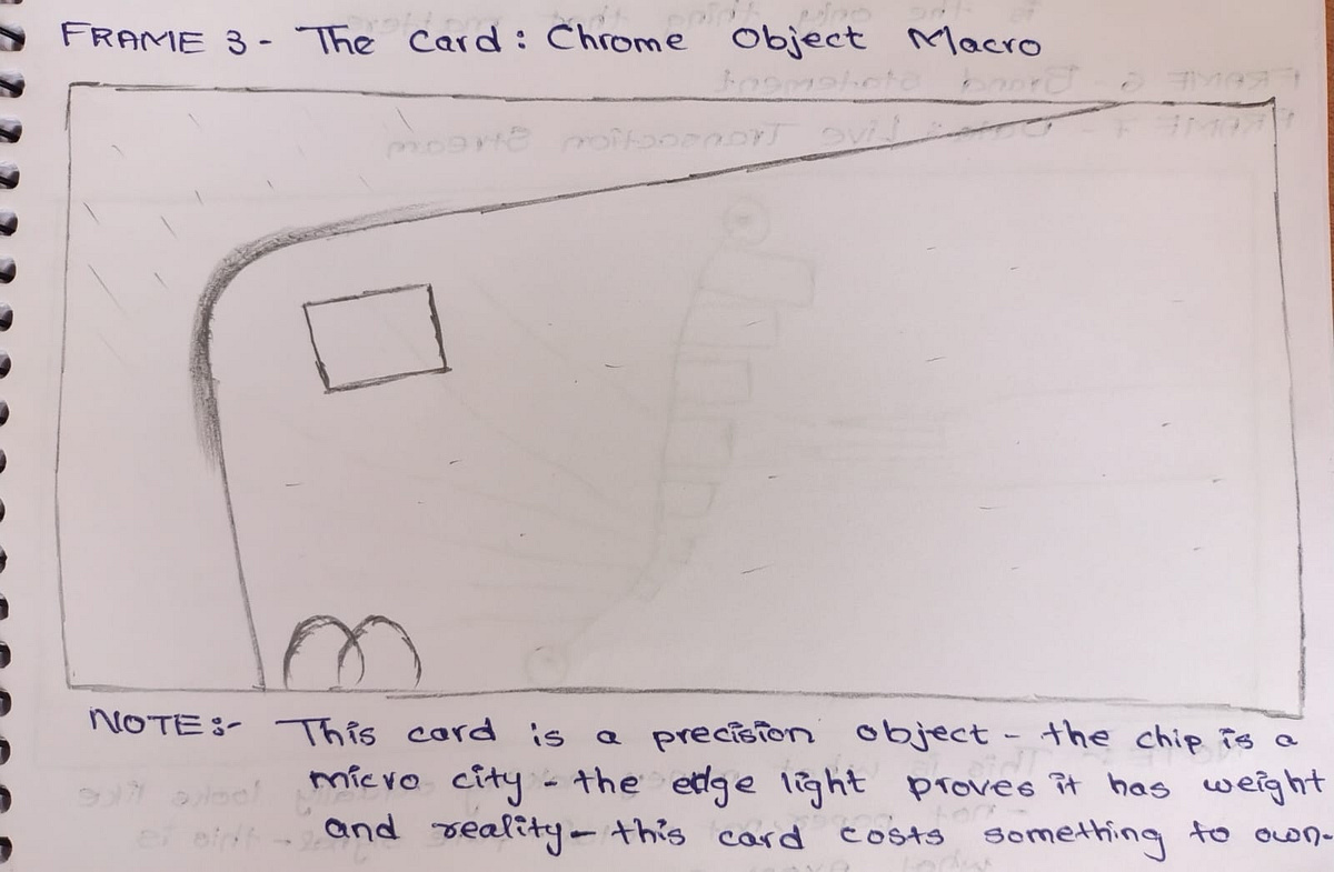
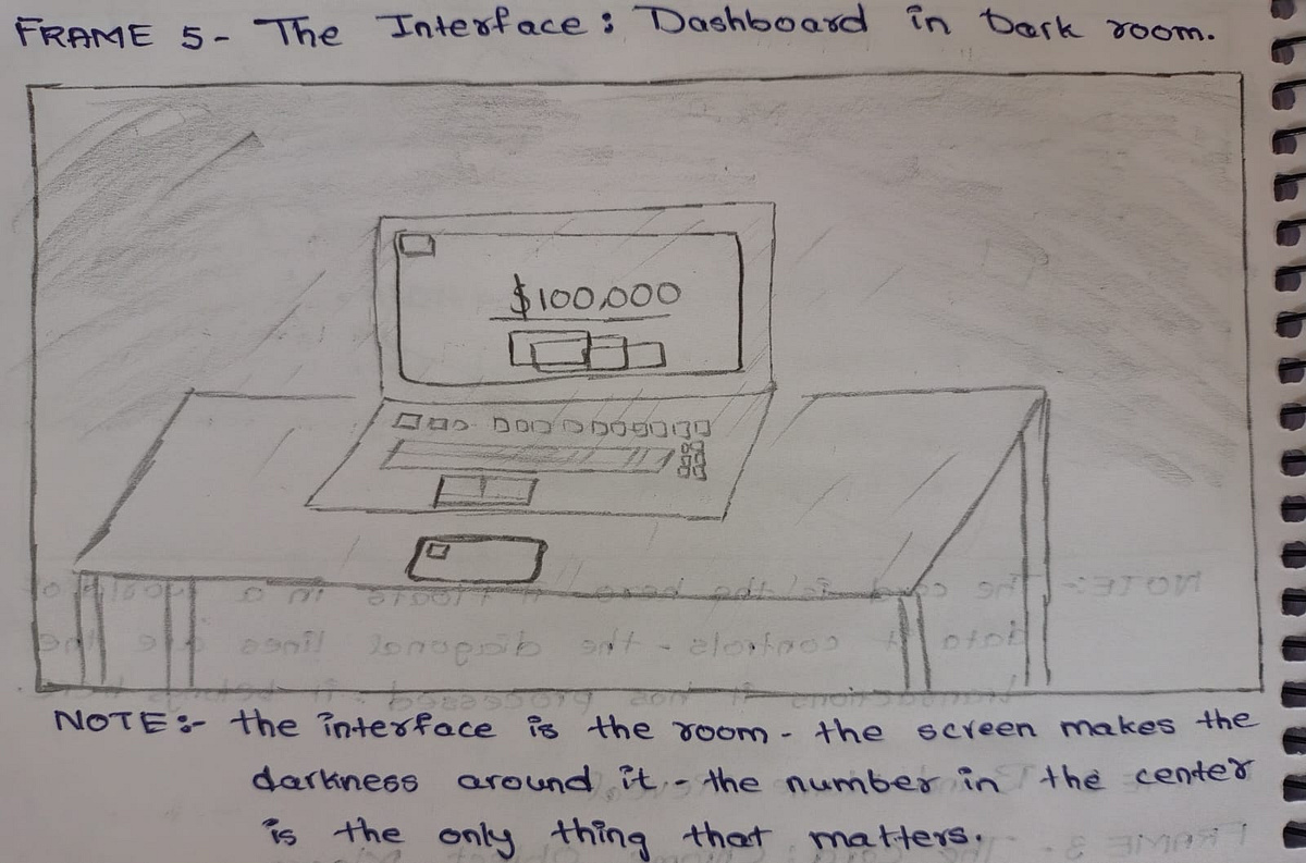
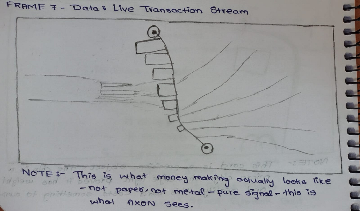
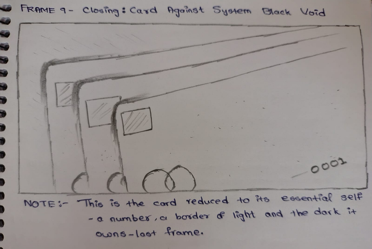
AXON is built for the person who finds current banking interfaces an insult to their intelligence. Not a bank that feels friendly. A bank that feels fast. The visual direction lives entirely in the language of digital precision — terminal interfaces, live data streams, the physical card as a material object in a world that has forgotten what physical objects feel like. This is a complete UI Direction project: above-the-fold visual world, card design direction, dashboard energy, and data visualization language — every frame atmosphere-locked from the first to the last. System Black. Signal Green. Deep Navy. Chrome White. Every number is a decision. Every pixel is a commitment. Zero tolerance for friction. The screen is the product.M N LOKESHWAR REDDY, Creative Director.
Support this project
MN voted for this project