COCOA PULSE — Modern Choco-Pie Snack Brand Direction

Project description
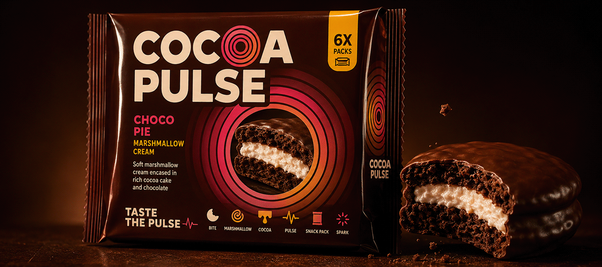
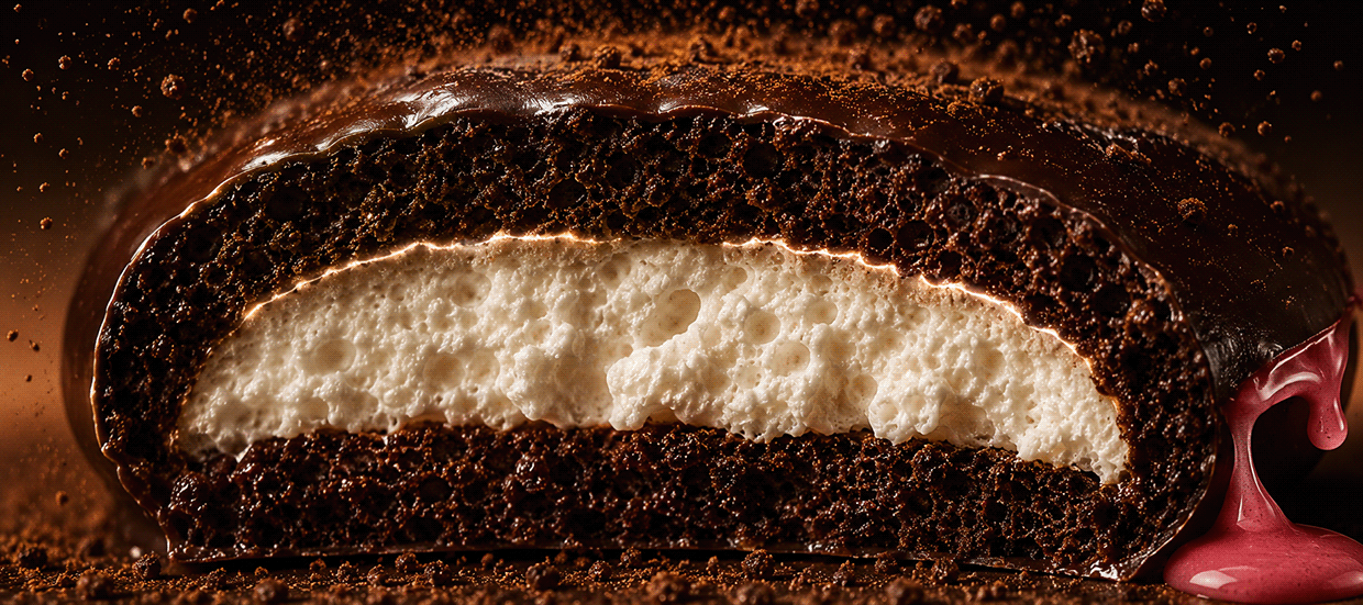
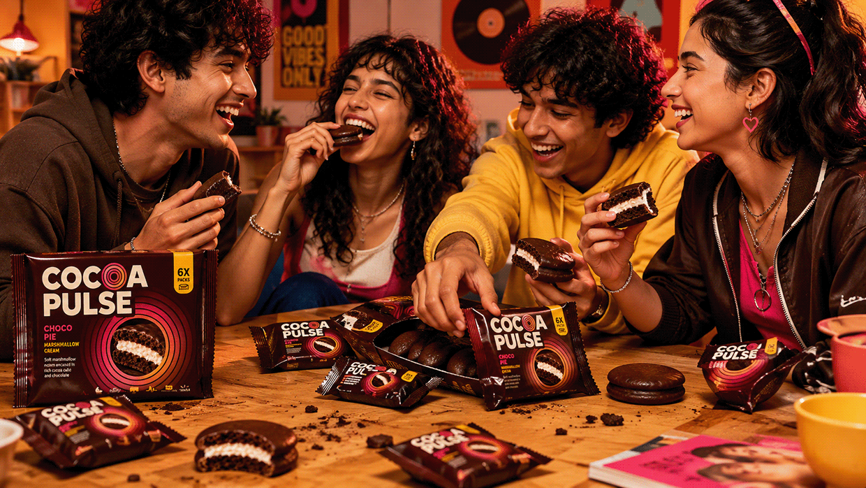
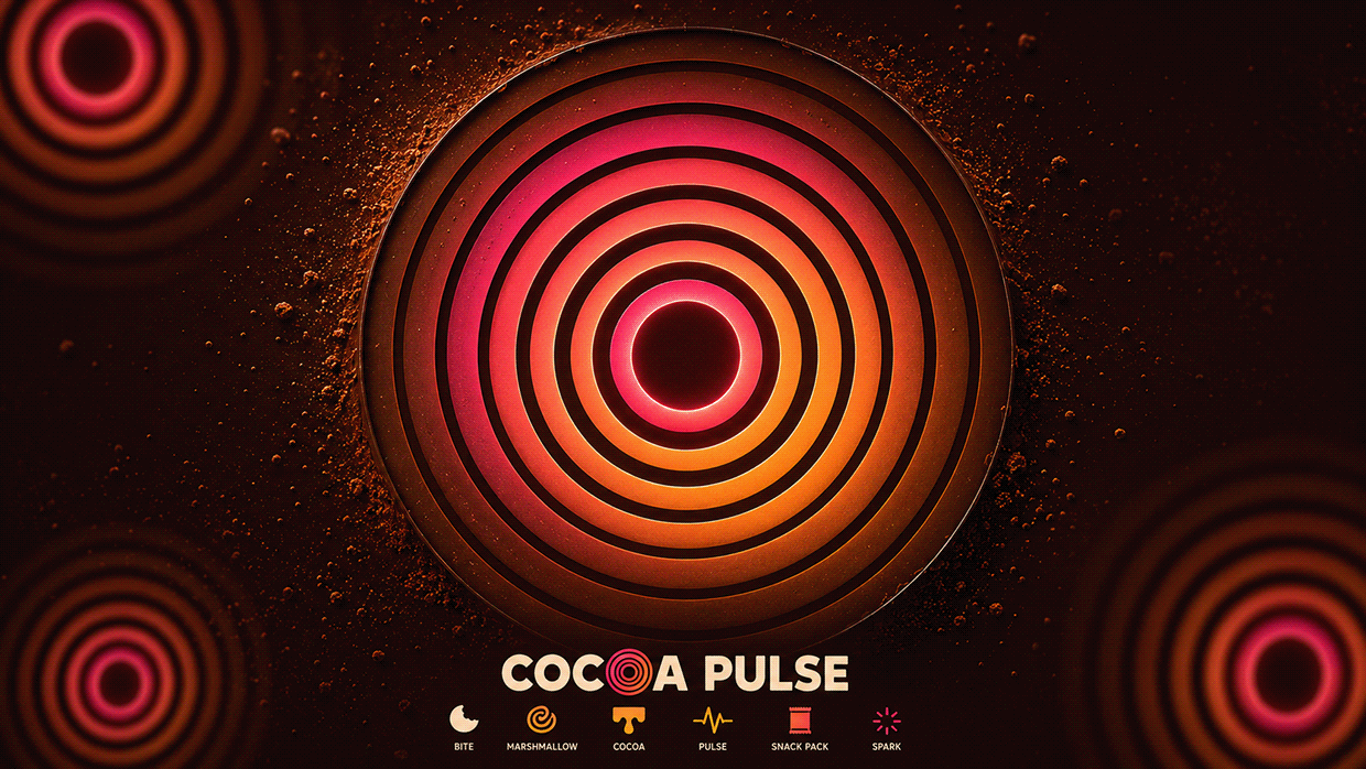
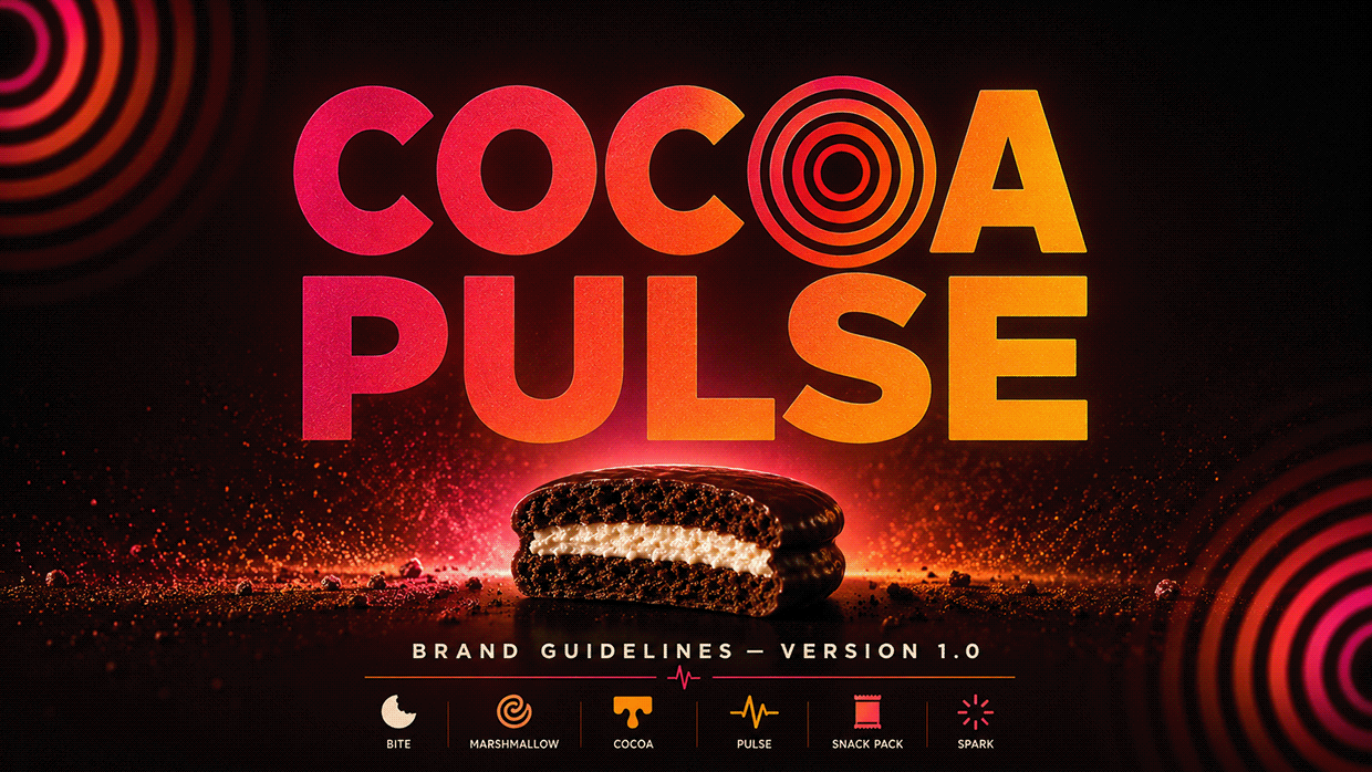
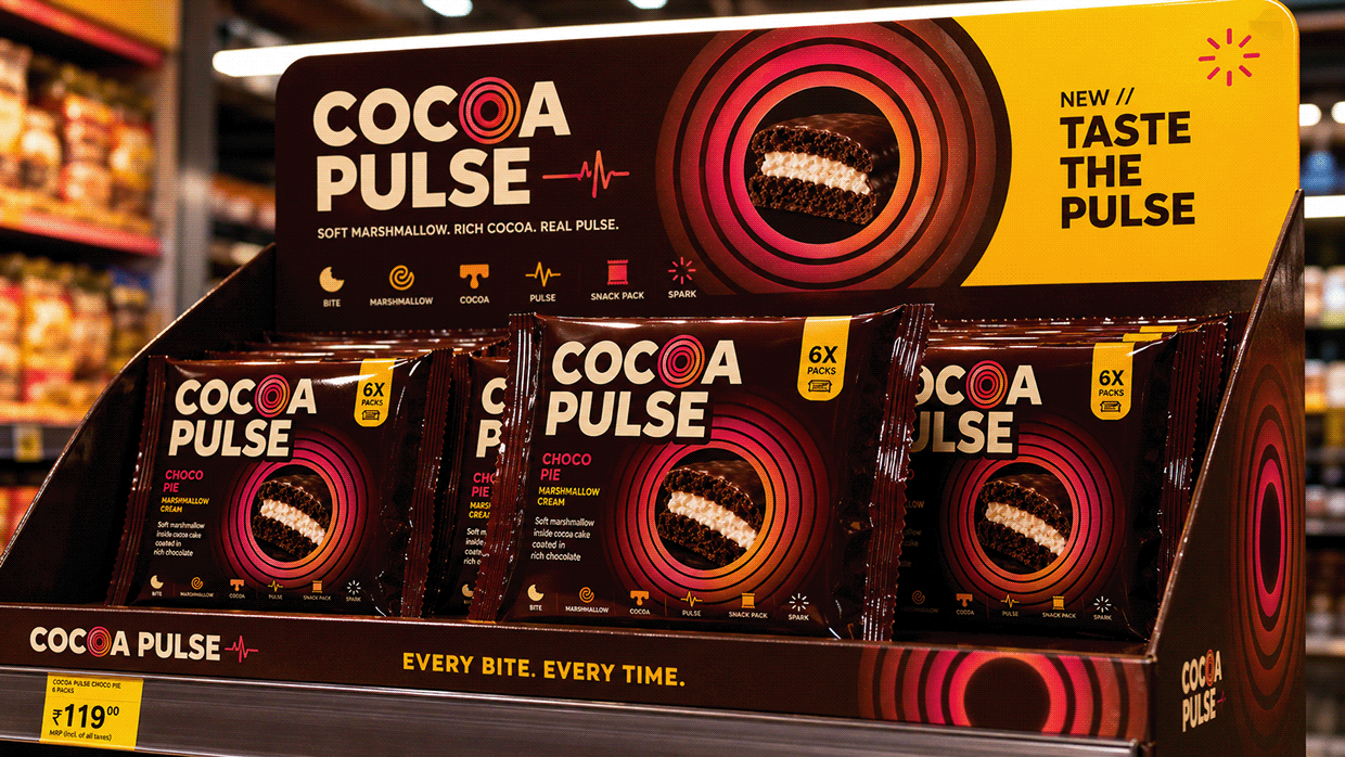
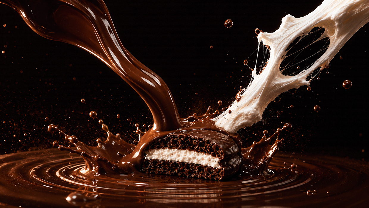
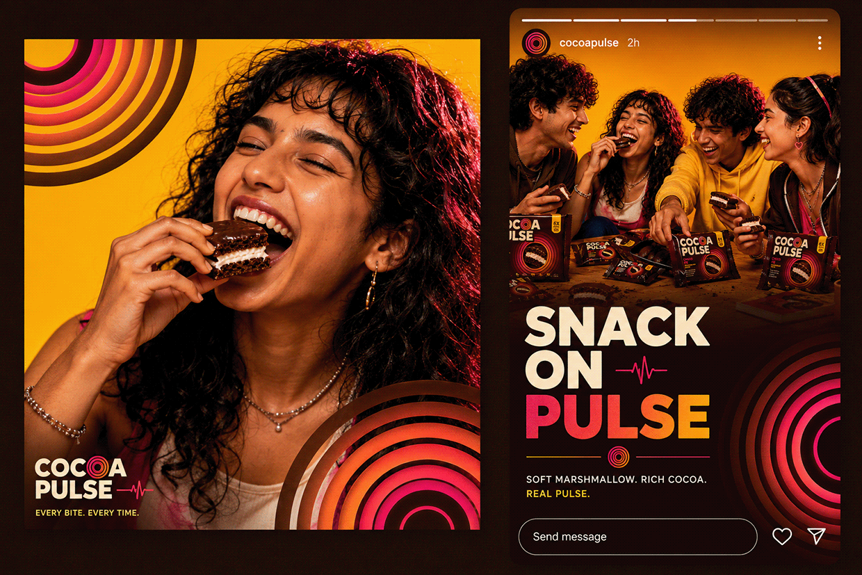
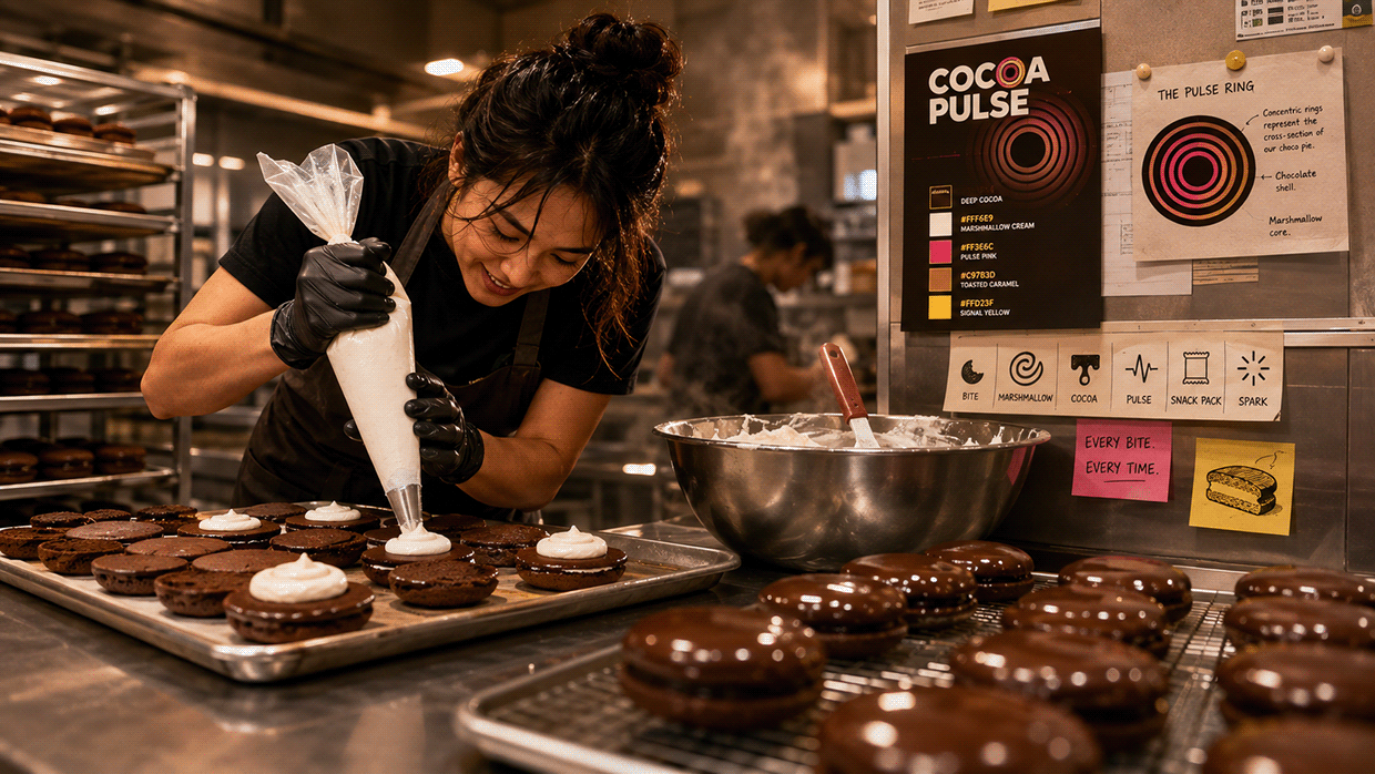
COCOA PULSE is a chocolate-coated marshmallow pie built for people who snack with intention — the kind of snack you post before you eat. The visual direction breaks from nostalgic choco-pie packaging entirely, built on "The Pulse" — a ring motif pulled directly from the pie's own cross-section, turning the product's inside into the entire identity system. The Pulse Ring: concentric rings representing chocolate shell and marshmallow core, doubling as a heartbeat icon, derived directly from the product itself. Color is Deep Cocoa, Marshmallow Cream, Pulse Pink, Toasted Caramel, and Signal Yellow — with a radial Pulse Pink→Deep Cocoa gradient applied only to the ring motif and hero moments. Imagery is bold, saturated, hard-flash contrast — chocolate drip caught mid-fall, marshmallow stretch frozen mid-pull, macro cross-section reveals. This is what intention looks like when you snack. M N LOKESHWAR REDDY, Creative Director

Support this project
Upvote