

FOVEA — Optical Eyewear Logo Direction
Project description
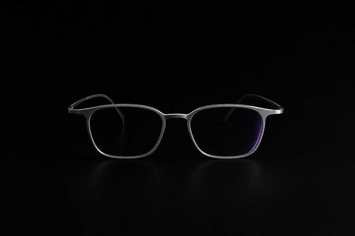
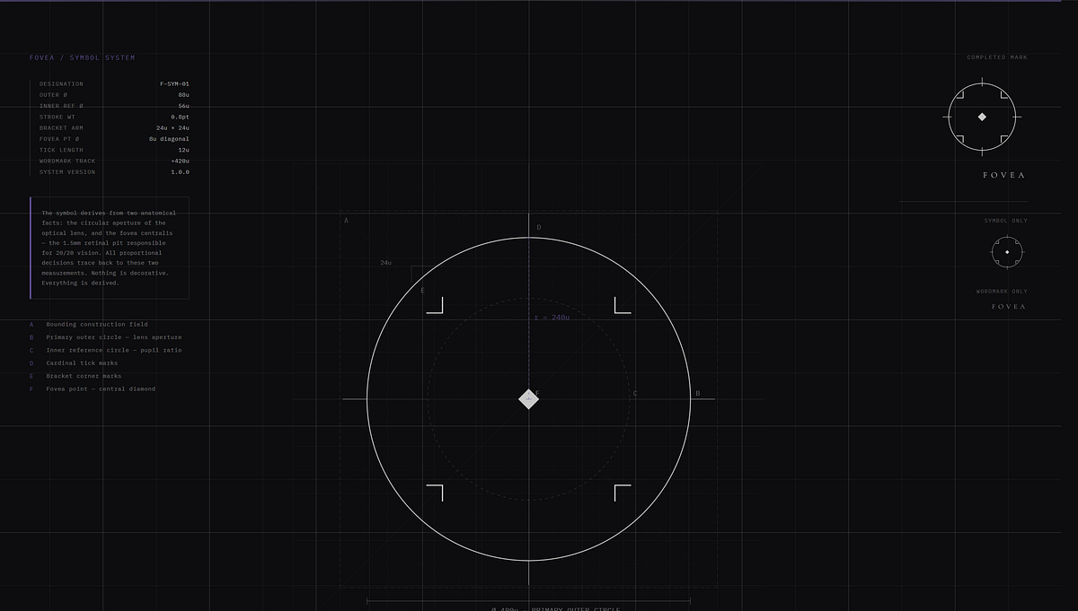
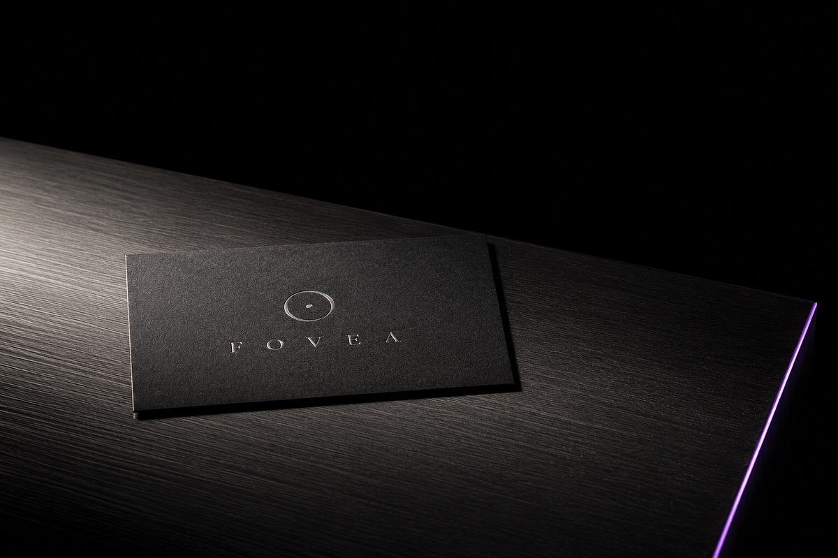
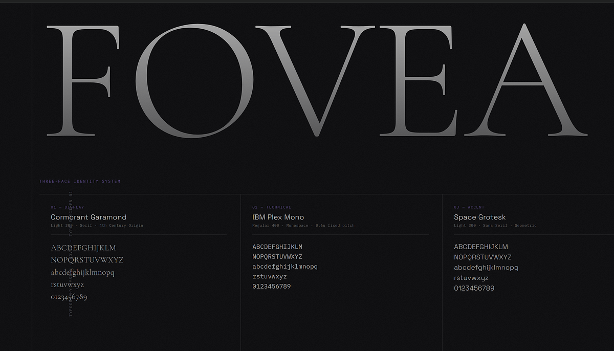
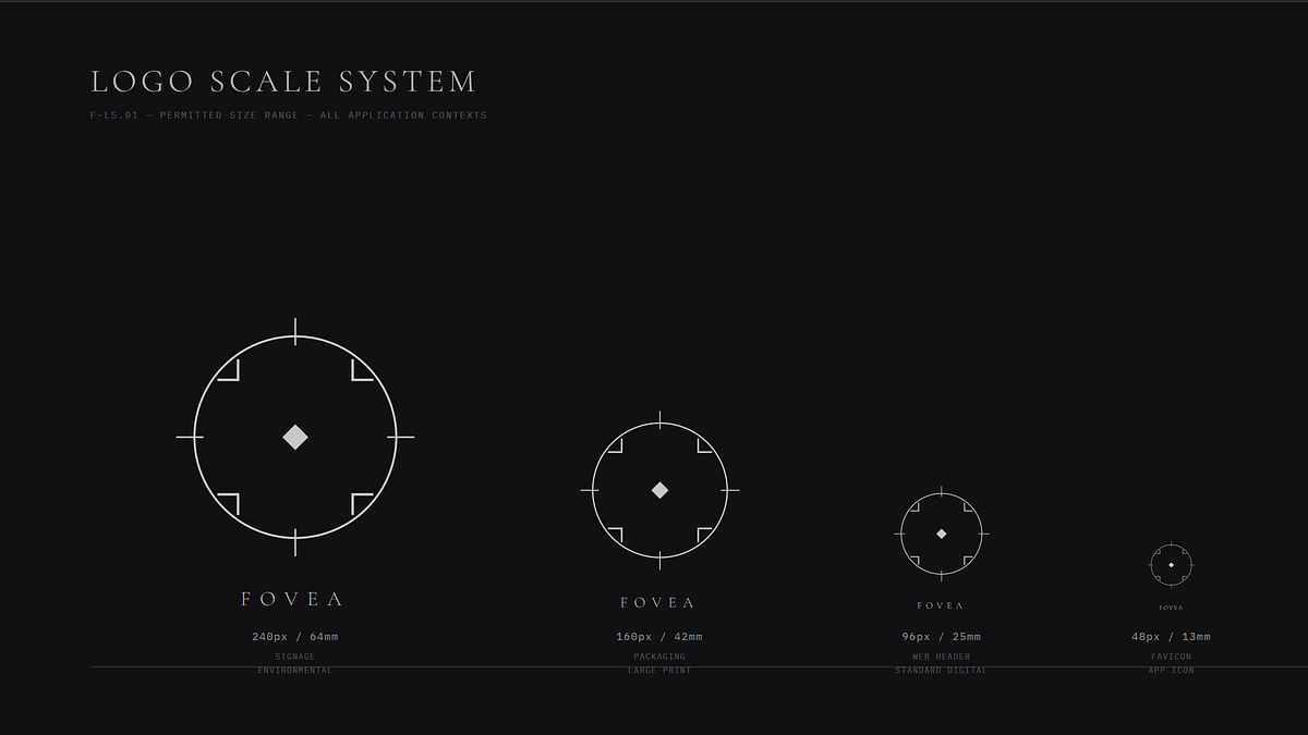
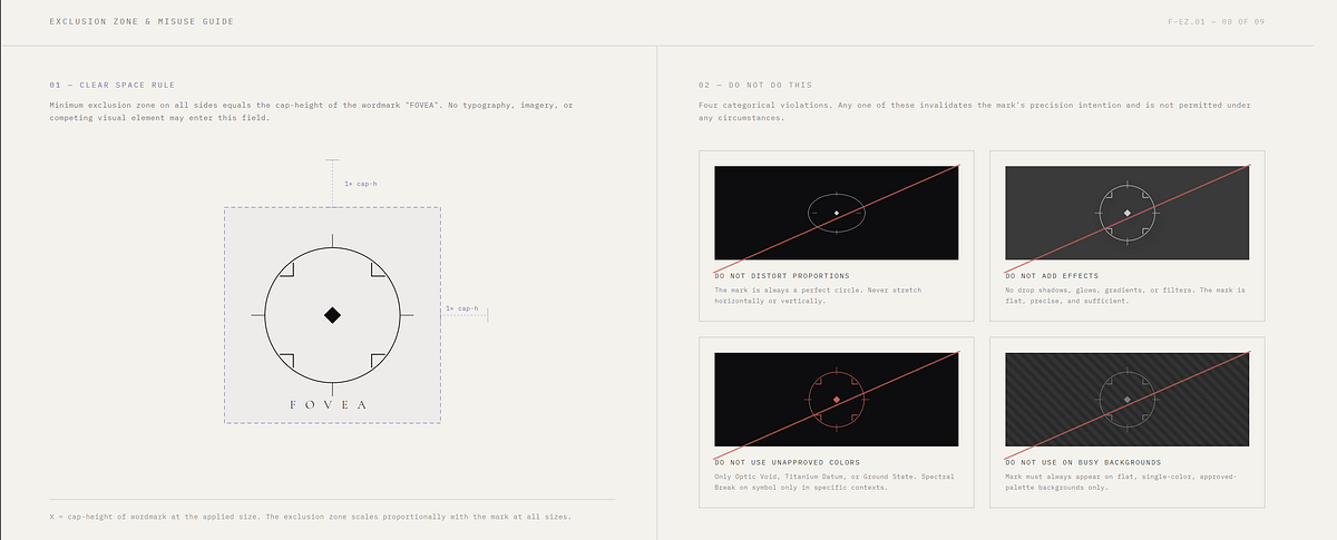
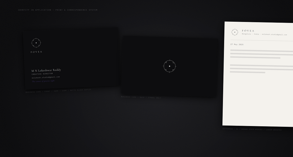
FOVEA is named for the fovea centralis — the 1.5mm pit at the center of the human retina responsible for all acute vision. A precision optical studio, not an eyewear brand. The identity system was built entirely from this anatomical truth: that the instrument through which you see the world deserves to be the most considered object you carry.The mark is a precision optical symbol — the measurement reticle geometry of a lens aperture with four bracket-corner marks and a central fovea point at the diamond. Not designed — derived. Every proportion traces back to two measurements: the lens circle and the anatomical fovea. The wordmark is set in Cormorant Garamond Light, tracked to the extreme, because a frame that thin deserves type that thin.Atmosphere Lock applied across all AI frames: single-source jeweller's lamp at 12 degrees, 4×5 large format film precision, Karl Blossfeldt botanical specimen rigor and Albert Watson's command of void. The color world is near-monochromatic — Optic Void, Titanium Datum, Ground State — with one spectral break violet that appears only where light physics demands it.Nine frames. Three AI image directions. Six technical system frames. The mark at every scale from 240px environmental signage to 28px minimum permitted use. The brand in application — card, letterhead, stationery — on a designer's surface at pre-dawn.M N LOKESHWAR REDDY, Creative Director.


Support this project
MN voted for this project