
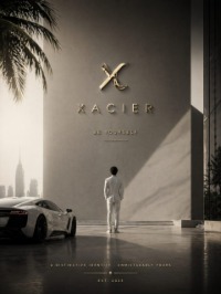
KŌDO — Premium Travel Lifestyle Brand Direction

Project description
KŌDO means the path one travels. A premium travel lifestyle brand built for the person for whom travel stopped being an event and became a state of being. This is not luggage. It is the complete visual language of a life in motion — in airport lounges at 6am, on bullet trains between cities, in every transit space that becomes temporarily yours. The visual world lives in pre-dawn airport architecture, motion-blurred terminal corridors, the temperature split of cool fluorescent against warm transit amber wayfinding, and the specific quiet of departure halls before the crowds arrive. Every frame shares one atmosphere: ISO 6400 digital grain, hard diagonal compositional energy, Julius Shulman architectural precision meeting Wolfgang Tillmans intimacy in transit. Jet Graphite. Transit Amber. Titanium. Void White. The journey is where you feel most yourself.M N LOKESHWAR REDDY, Creative Director.


Support this project
MN voted for this project