
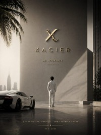
MERIDIAN — Ultra-Luxury Real Estate Typography Direction

Project description
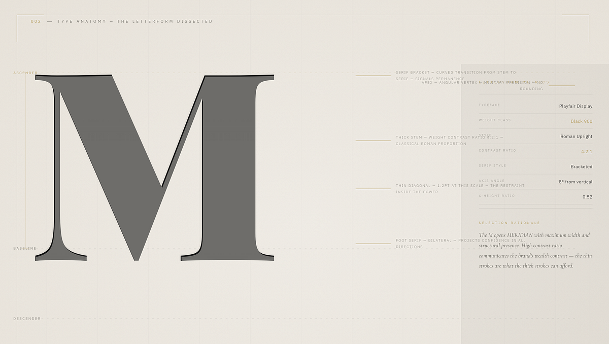
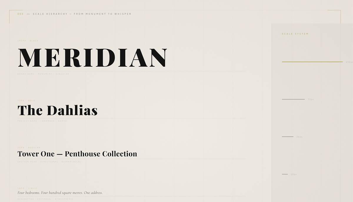
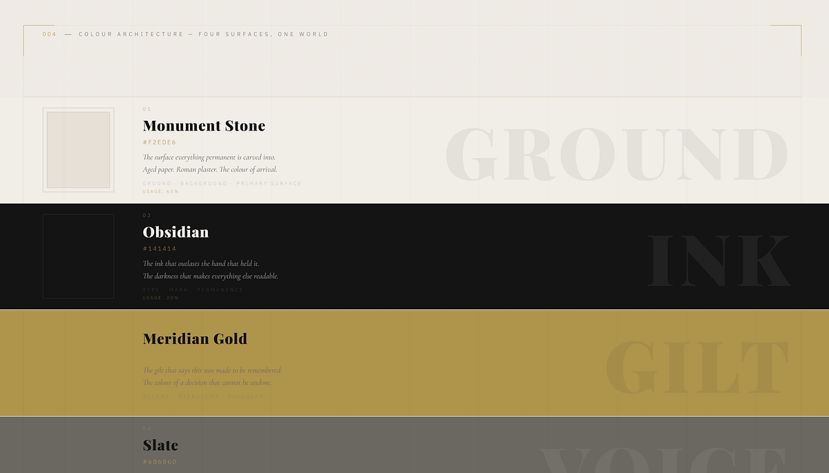
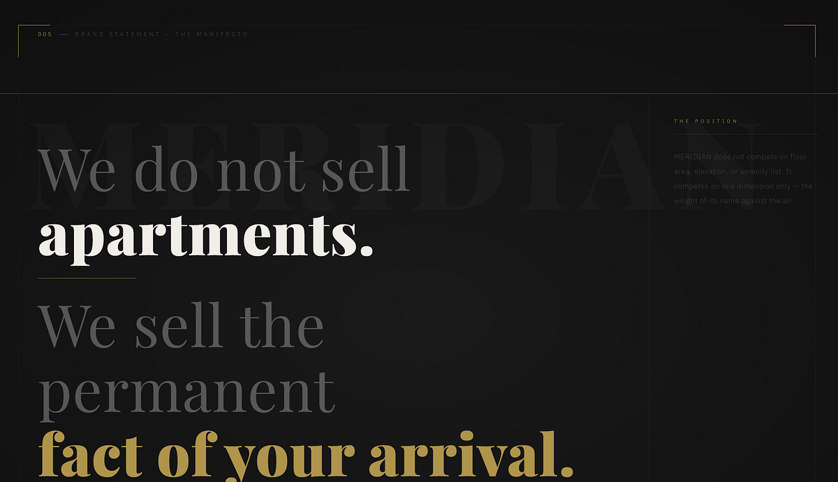
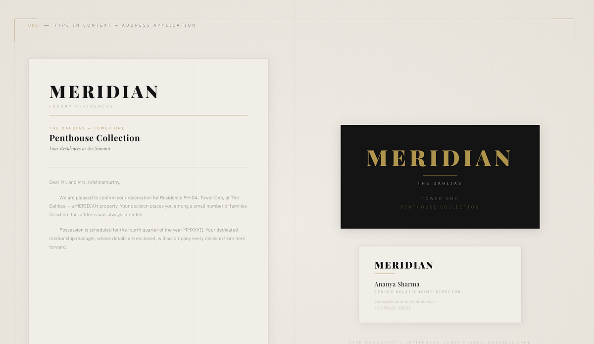
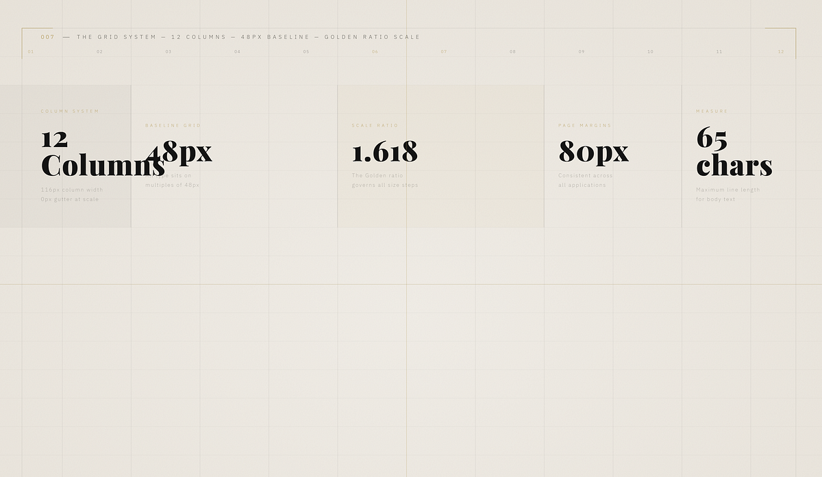
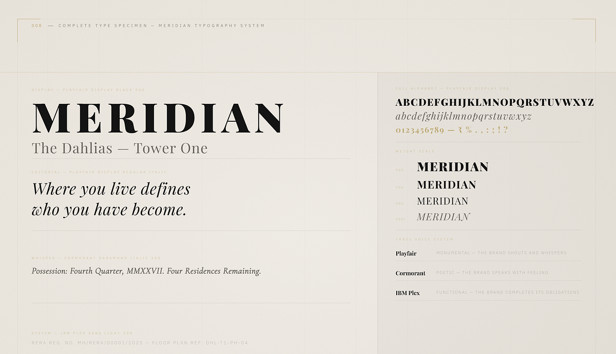
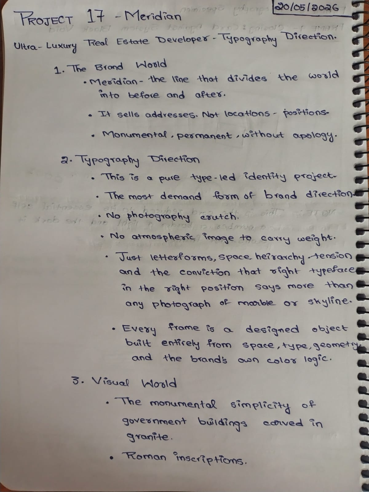
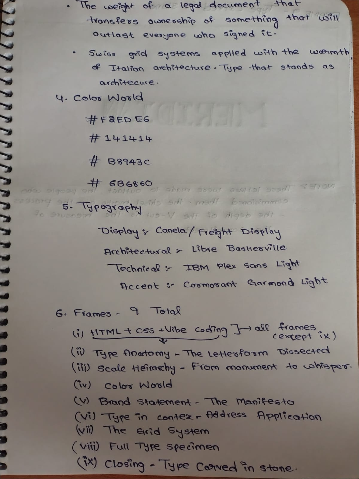
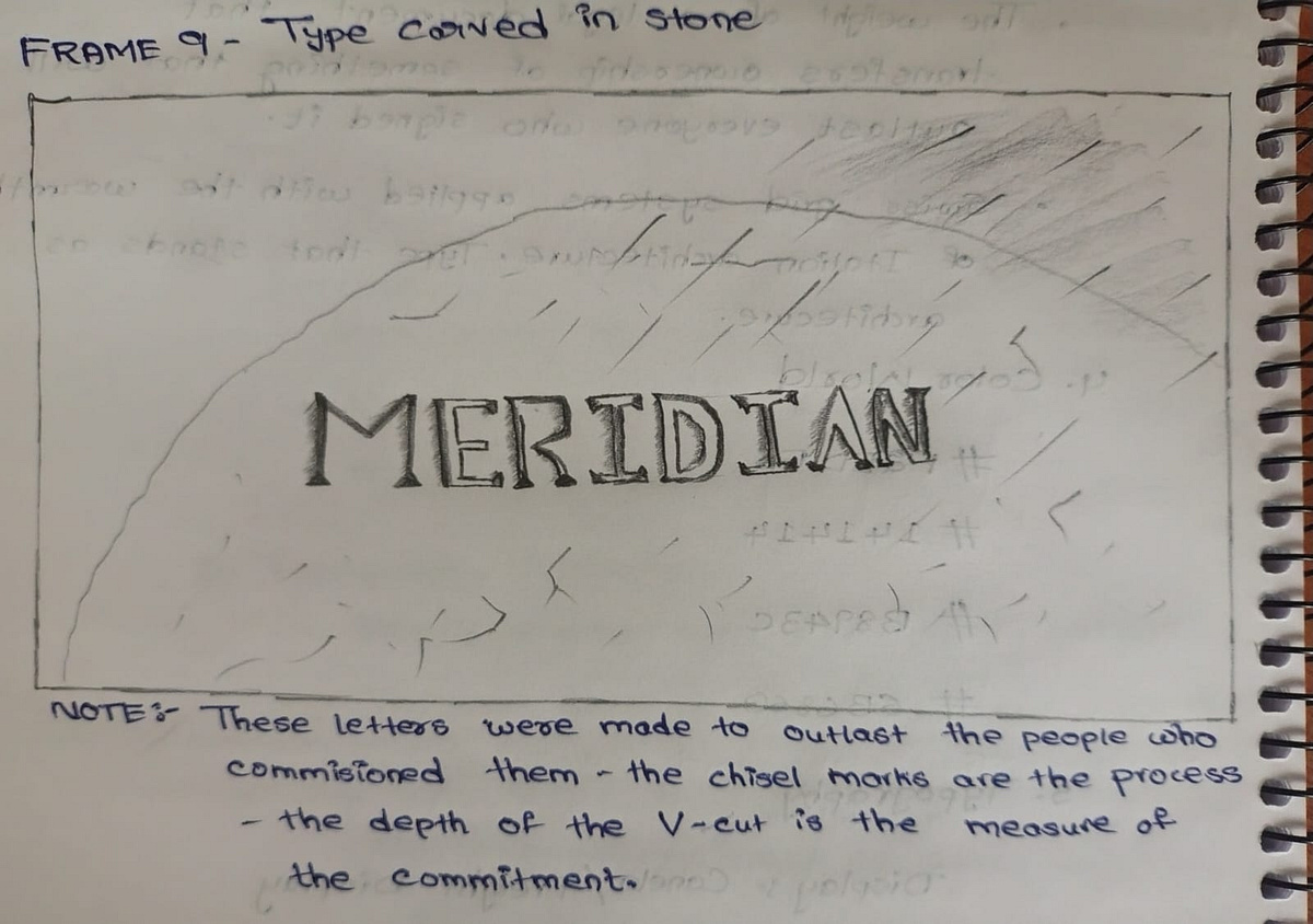
Typography Direction is the most demanding form of brand direction. No photography. No atmospheric images to carry the weight. Only letterforms, space, hierarchy, tension, and the conviction that the right typeface in the right position says more than any photograph of marble or skyline. MERIDIAN is an ultra-luxury residential real estate developer that does not sell apartments. It sells the permanent fact of arrival. This project delivers complete typography direction — letterform anatomy dissected, scale hierarchy from monument to whisper, the Swiss 12-column grid system made visible, three typeface voices documented and demonstrated, and the brand applied across letterhead, lobby plaque, and business card. Playfair Display. Cormorant Garamond. IBM Plex Sans. Three voices. One position. The type is the building.M N LOKESHWAR REDDY, Creative Director.

Support this project
MN voted for this project