NIB — Chocolate Bar Identity & Grid System

Project description
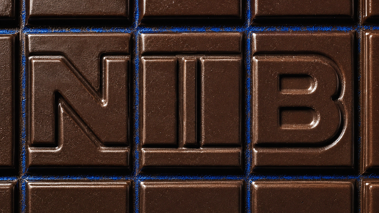
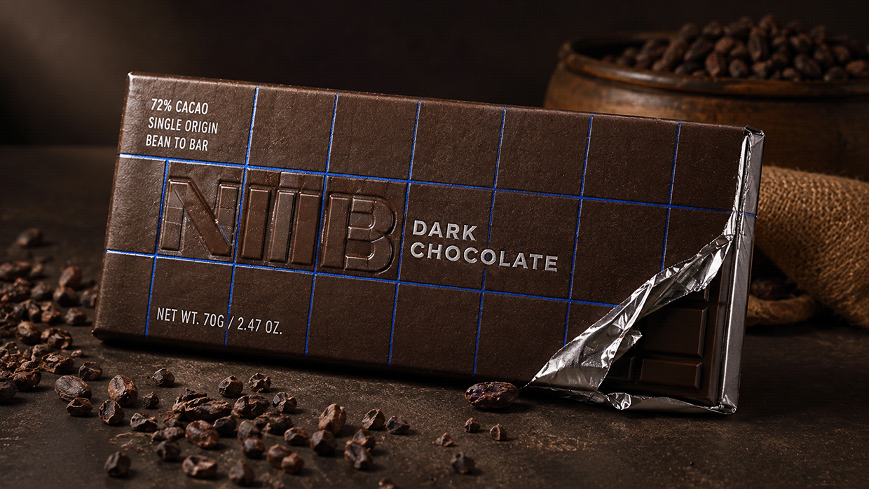
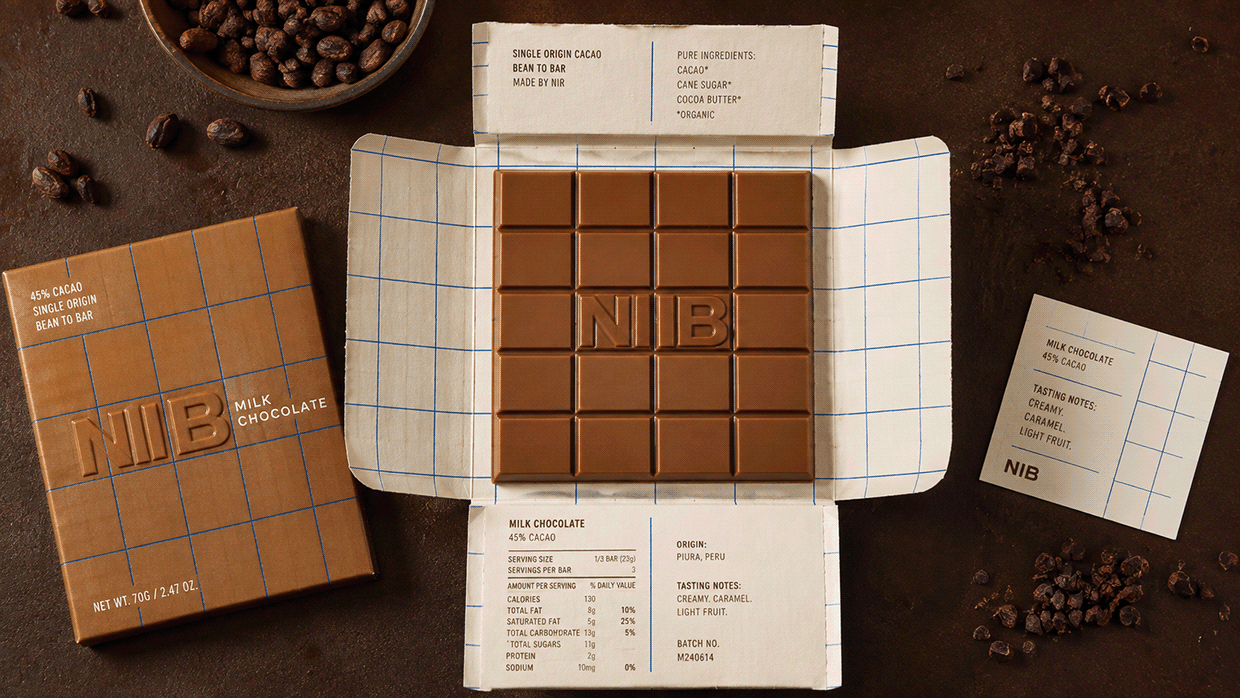
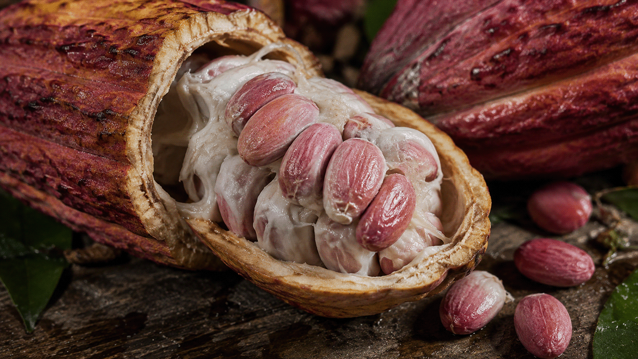
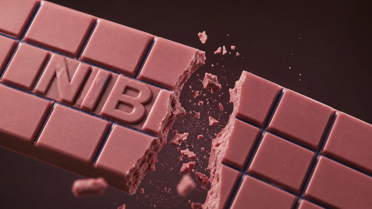
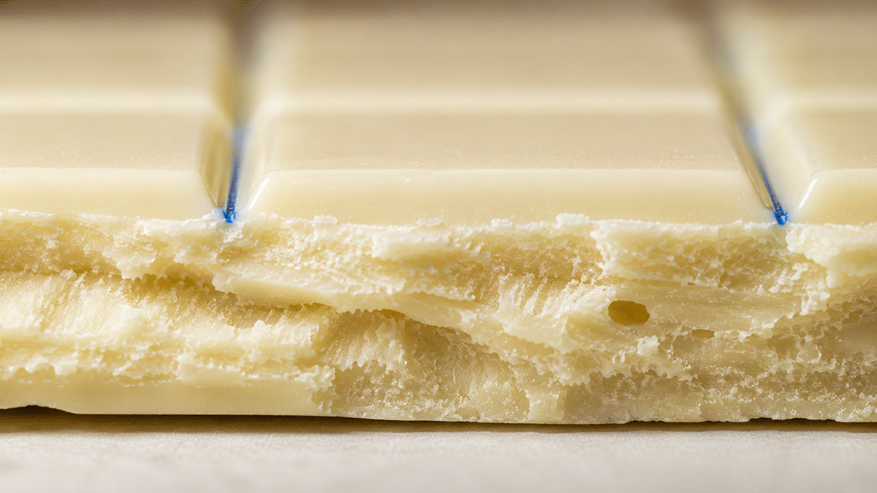
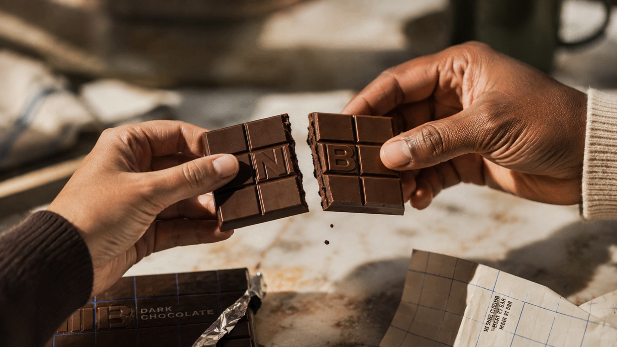
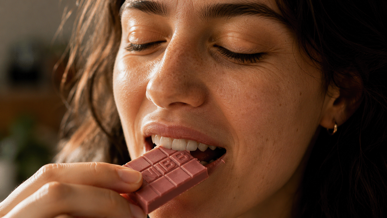
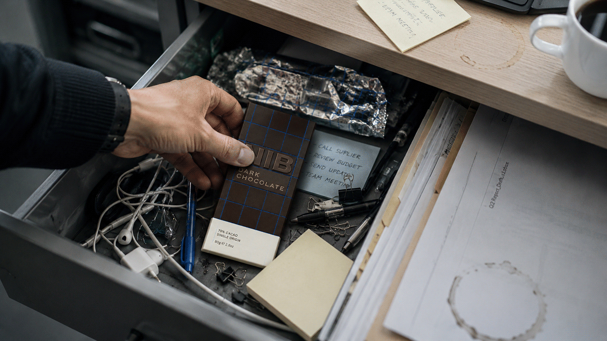
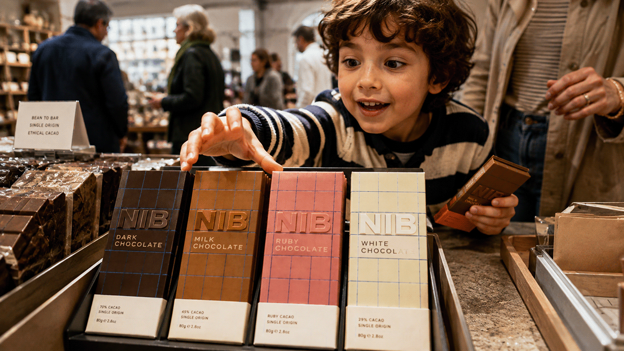
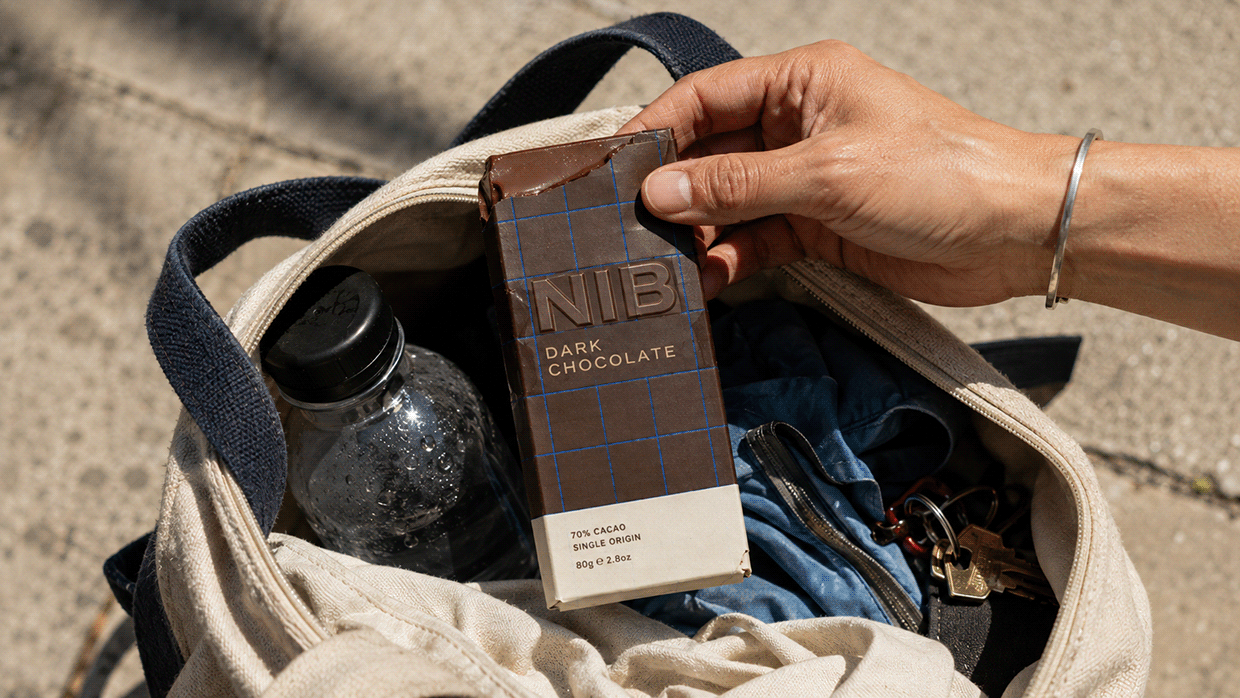
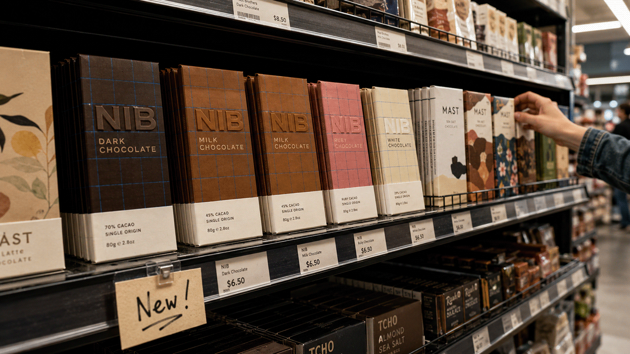
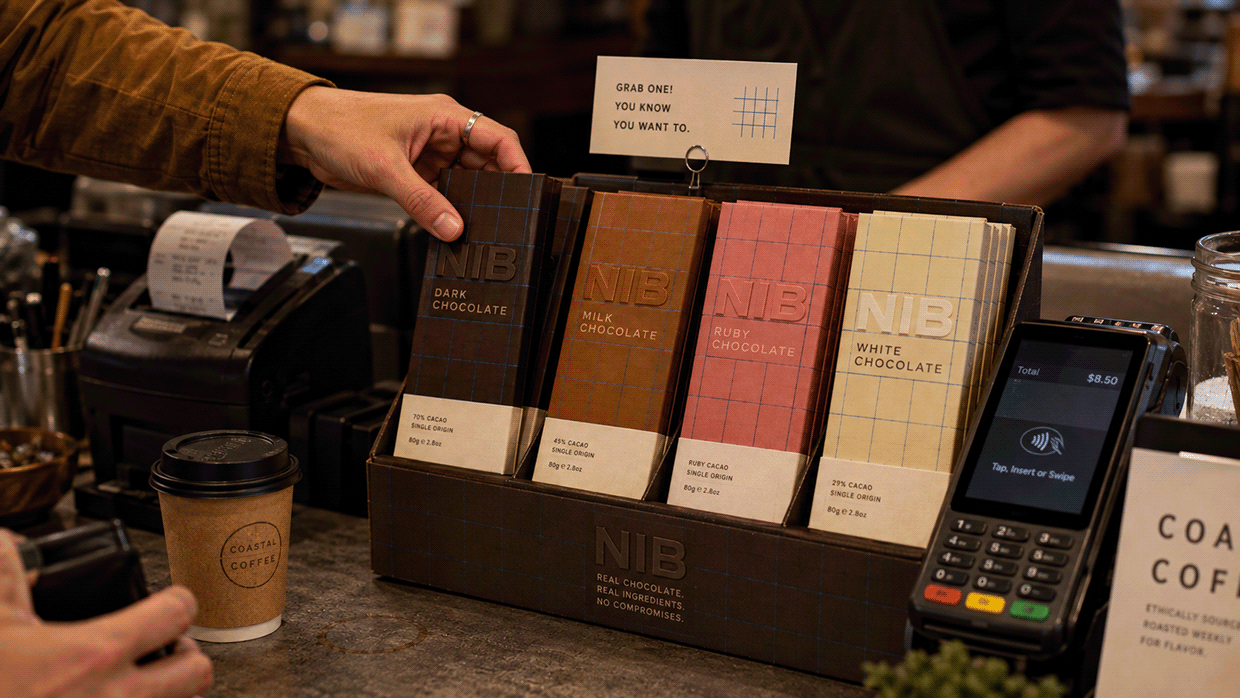
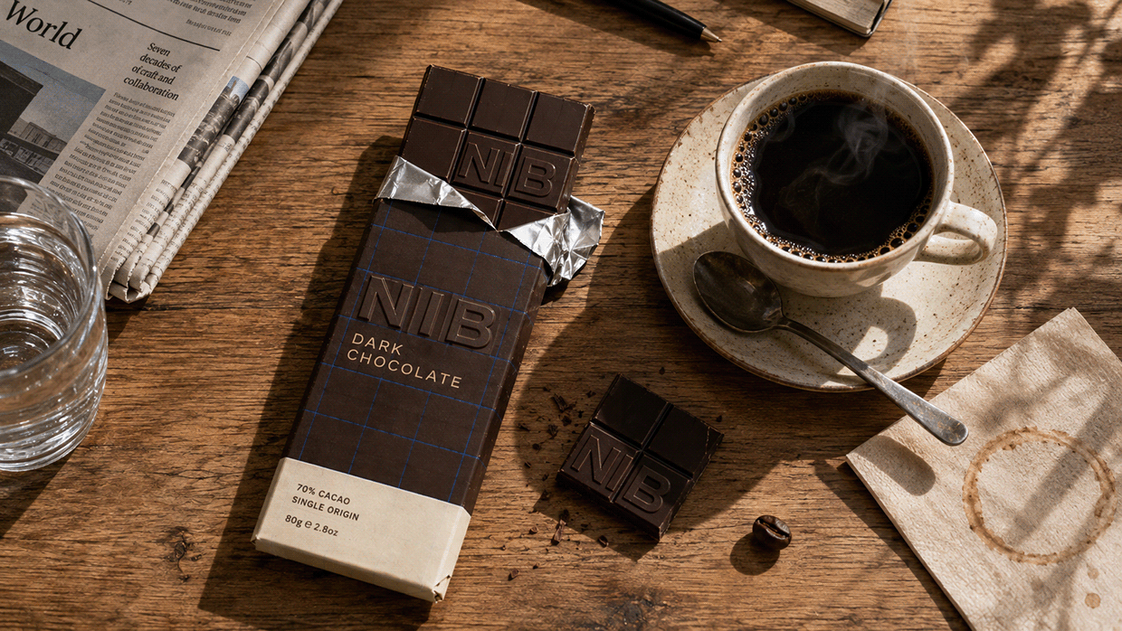
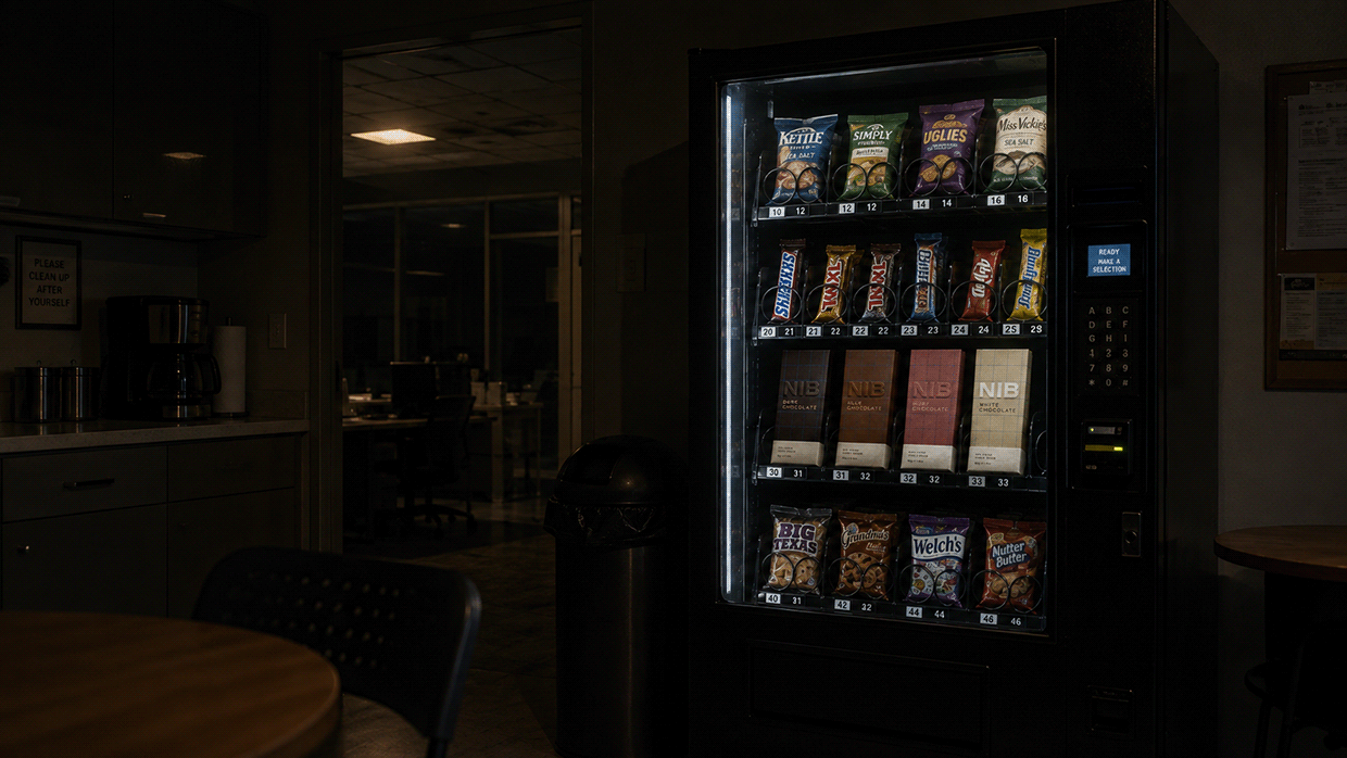
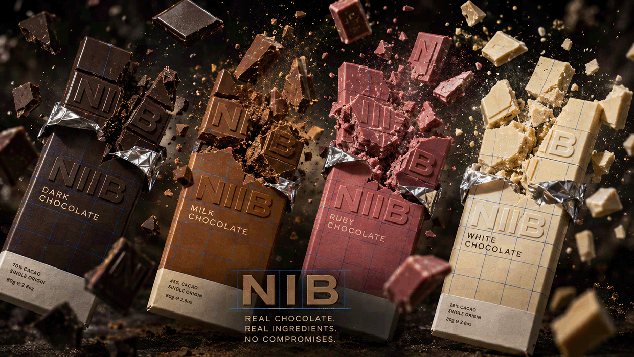
NIB is built around the one real feature every chocolate bar already has and no brand has ever claimed as an identity: the snap-line grid molded into the bar itself. That grid becomes the entire graphic system — wordmark, packaging pattern, and the universal Snap-Line Blue ink color that appears only on that grid, on every variety, nowhere else. Four varieties: Dark, Milk, Ruby (real ruby-cacao pink), and White. Each variety's color stays exclusive to its own bar. The wordmark's letterforms sit inside grid cells exactly like the bar's own molded squares — never a decorative font applied separately. Every frame carries a different camera distance, angle, and setup: extreme macro, human mid-distance, wide retail, low dramatic angle. No two frames repeat the same perspective. This is what structural honesty looks like when it becomes a brand. M N LOKESHWAR REDDY, Creative Director

Support this project
Upvote