RŌEN — Brand Identity Direction

MN LOKESH
by MN LOKESH · Jun 2026
shot

Upvote

1
RŌEN — Brand Identity Direction
Project description

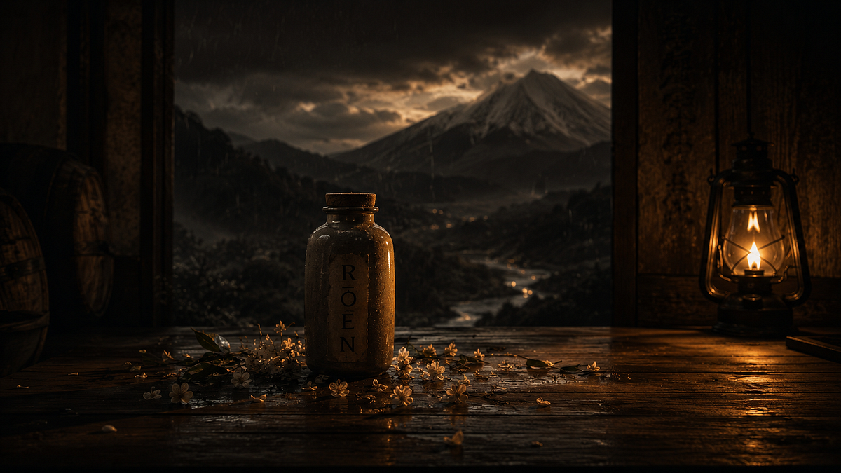
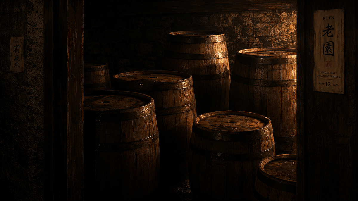
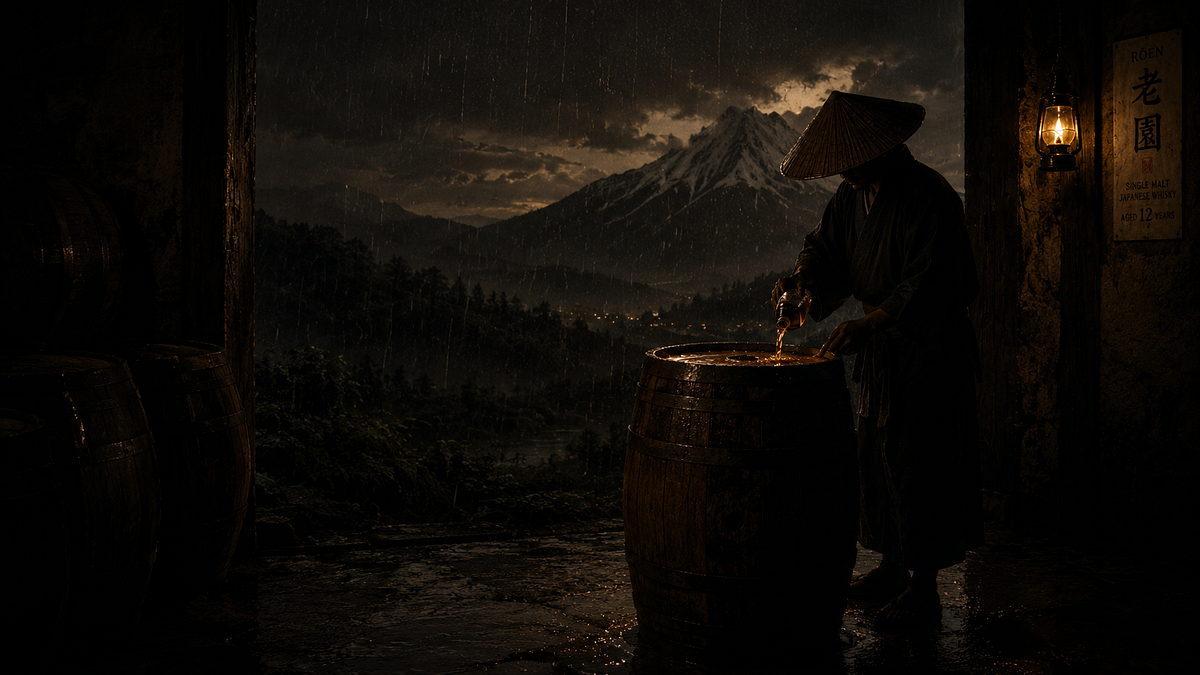
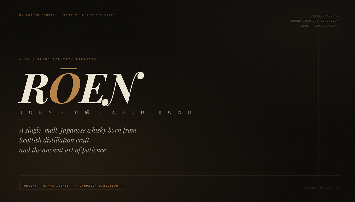
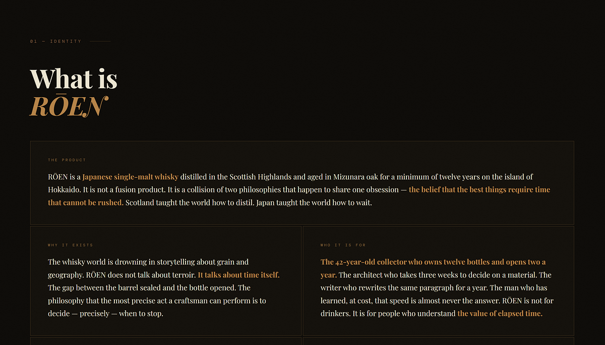
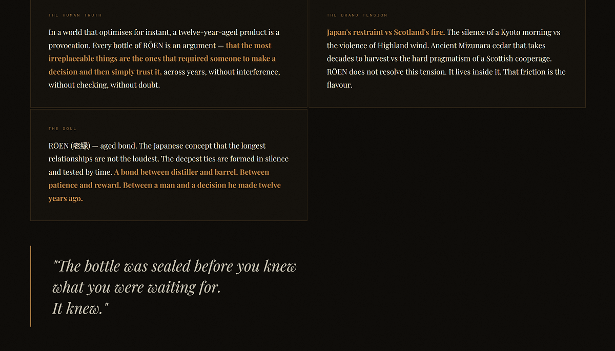
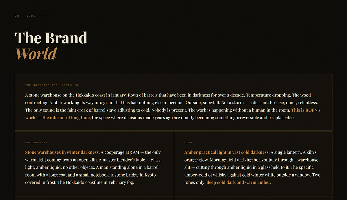
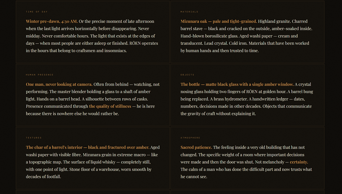
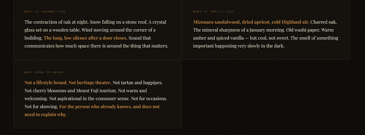
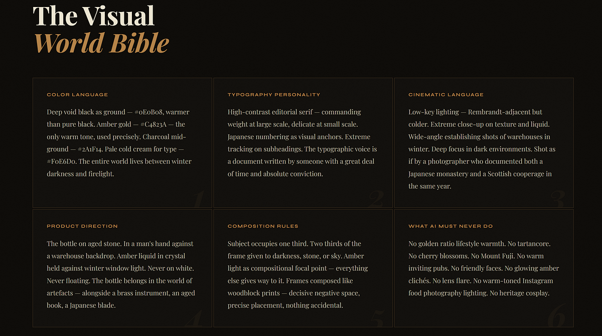
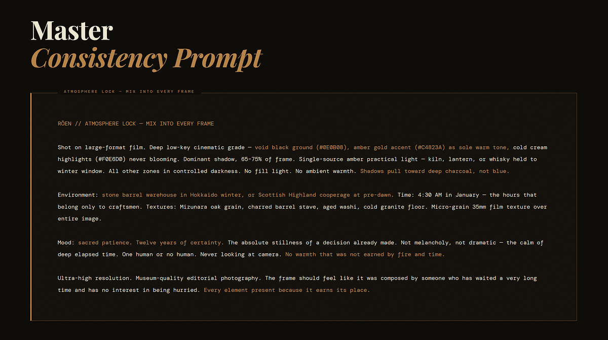
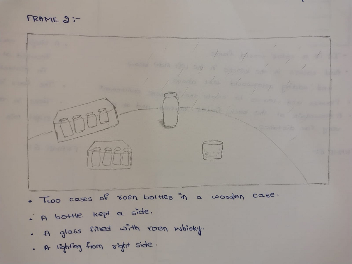
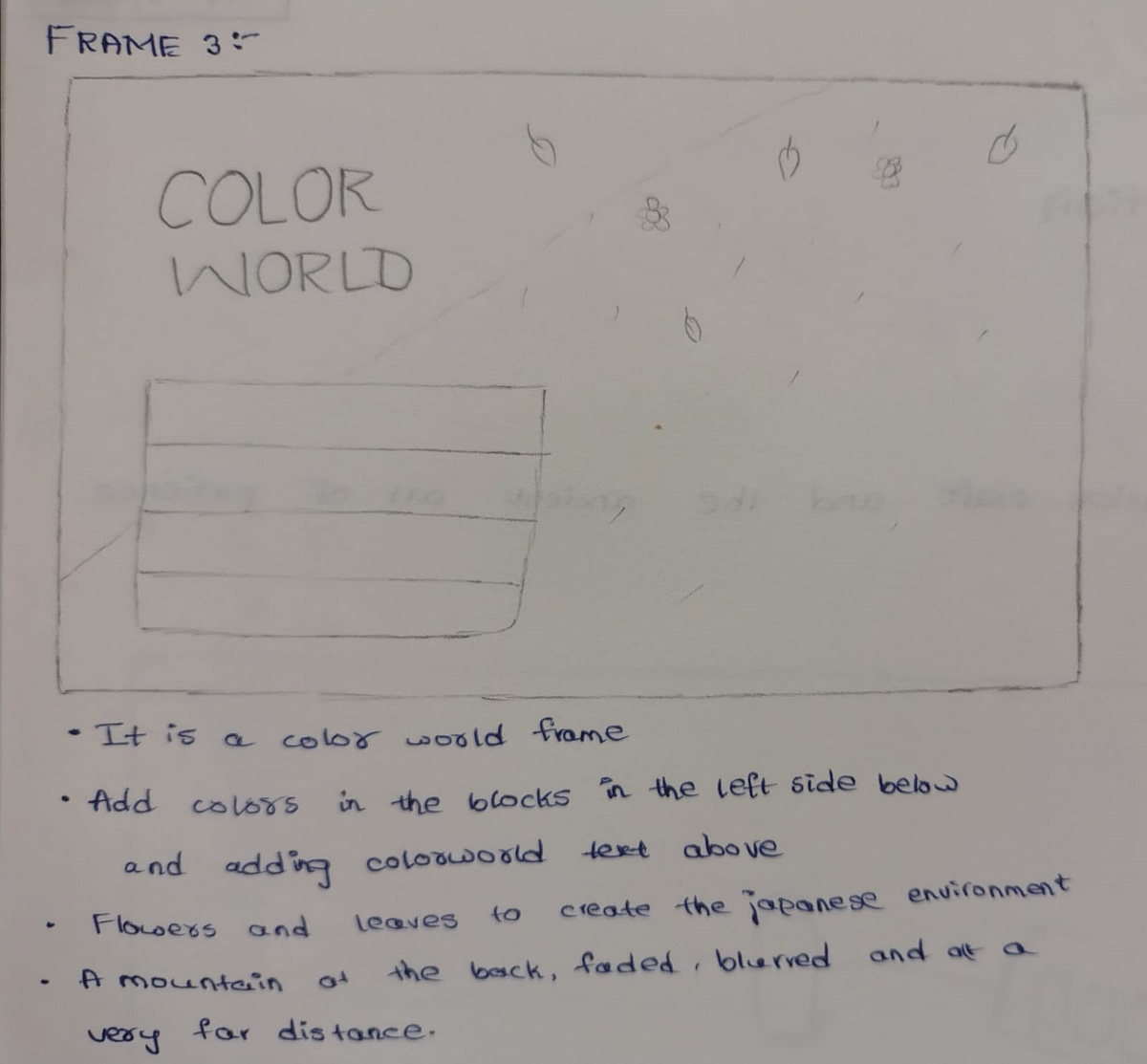
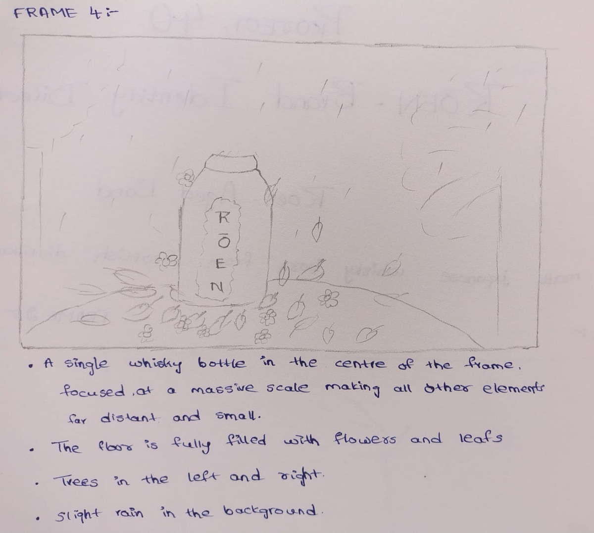
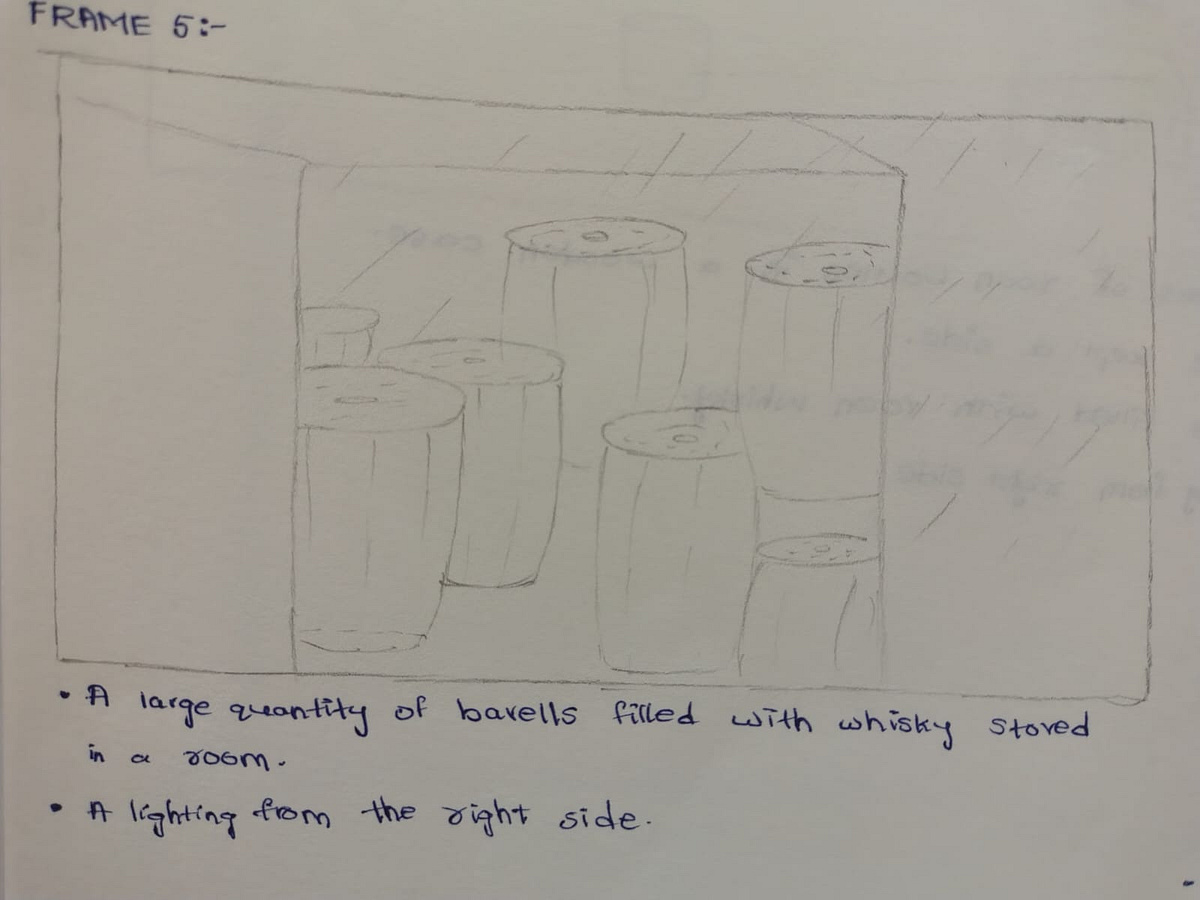
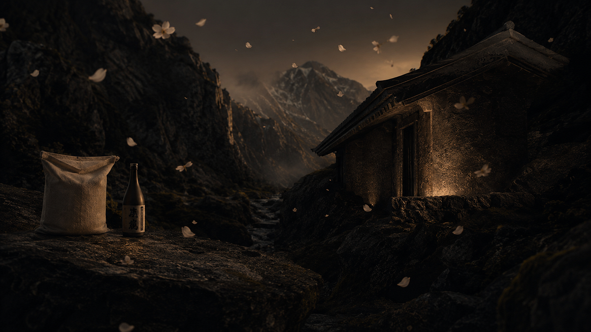
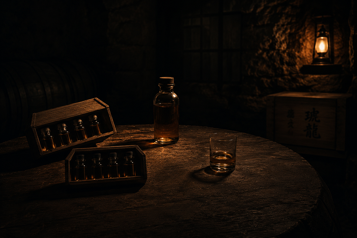
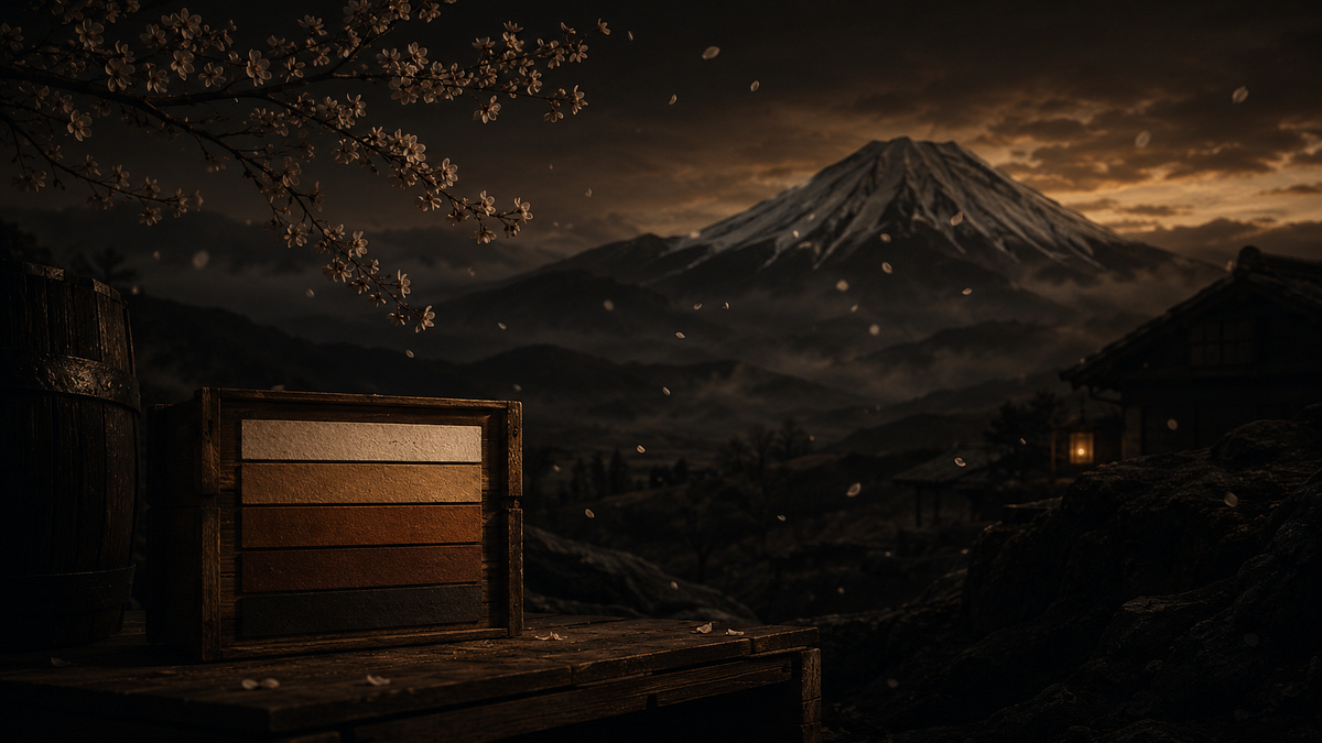
RŌEN (老縁) is a Japanese single-malt whisky distilled in Scotland and aged in Mizunara oak for twelve years on the Hokkaido coast. The brand world lives in stone barrel warehouses in January — deep cold dark, a single amber lantern, the sound of oak contracting at night. No warmth that was not earned by fire and time.Every frame built around one tension: Scotland's violence and Japan's restraint occupying the same bottle. The visual language is low-key, Rembrandt-adjacent — void black ground, amber gold as the only warm tone, cold cream type. Composition rule: two thirds of every frame belongs to darkness.This is not whisky lifestyle. This is twelve years of certainty made visible.Creative Direction — M N LOKESHWAR REDDY
RŌEN — Brand Identity Direction Image 0RŌEN — Brand Identity Direction Image 1RŌEN — Brand Identity Direction Image 2RŌEN — Brand Identity Direction Image 3RŌEN — Brand Identity Direction Image 4RŌEN — Brand Identity Direction Image 5RŌEN — Brand Identity Direction Image 6RŌEN — Brand Identity Direction Image 7RŌEN — Brand Identity Direction Image 8RŌEN — Brand Identity Direction Image 9RŌEN — Brand Identity Direction Image 10RŌEN — Brand Identity Direction Image 11RŌEN — Brand Identity Direction Image 12RŌEN — Brand Identity Direction Image 13RŌEN — Brand Identity Direction Image 14RŌEN — Brand Identity Direction Image 15RŌEN — Brand Identity Direction Image 16RŌEN — Brand Identity Direction Image 17RŌEN — Brand Identity Direction Image 18

Support this project

Upvote

1
© 2026 Copyright Privacy Policy and Terms of Service