

SPIDERADE BCAA ORANGE — Redefining Energy Through Bold Visuals
Project description
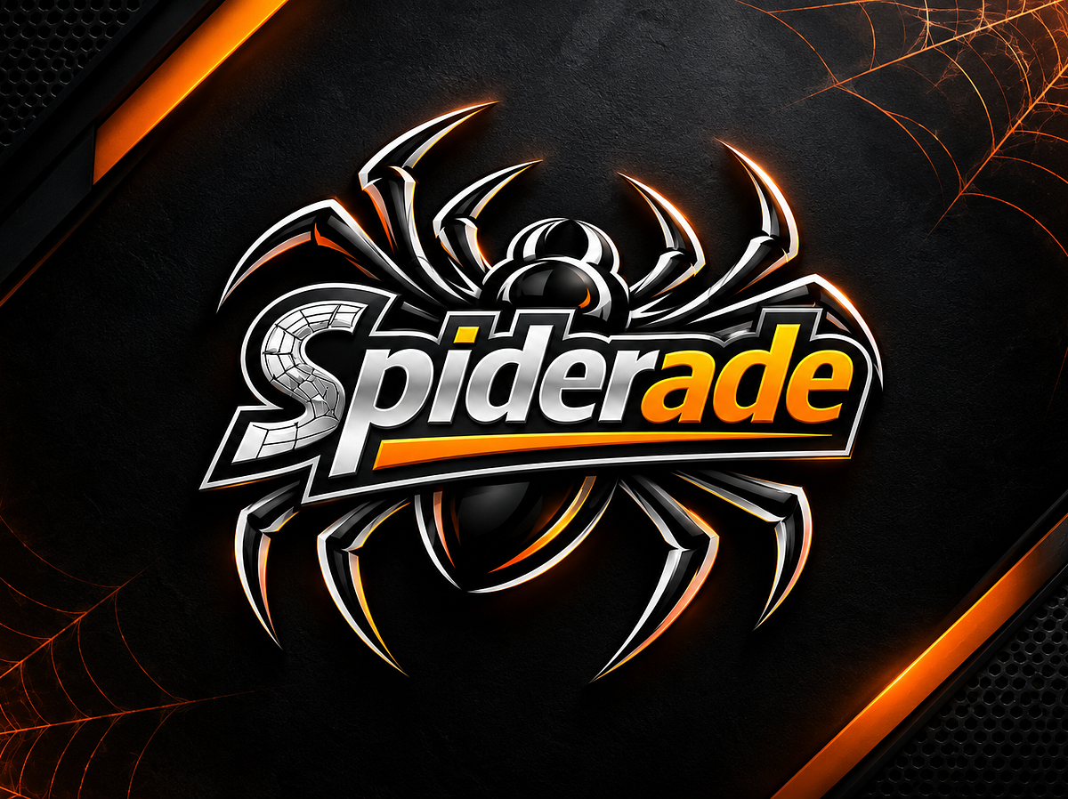
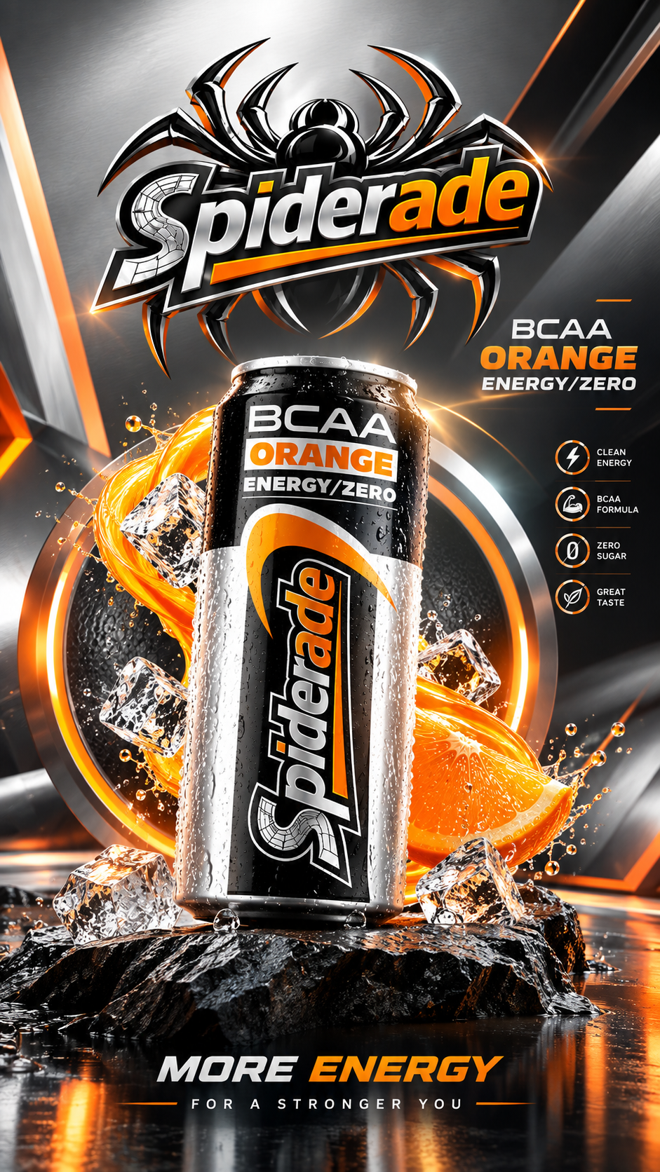
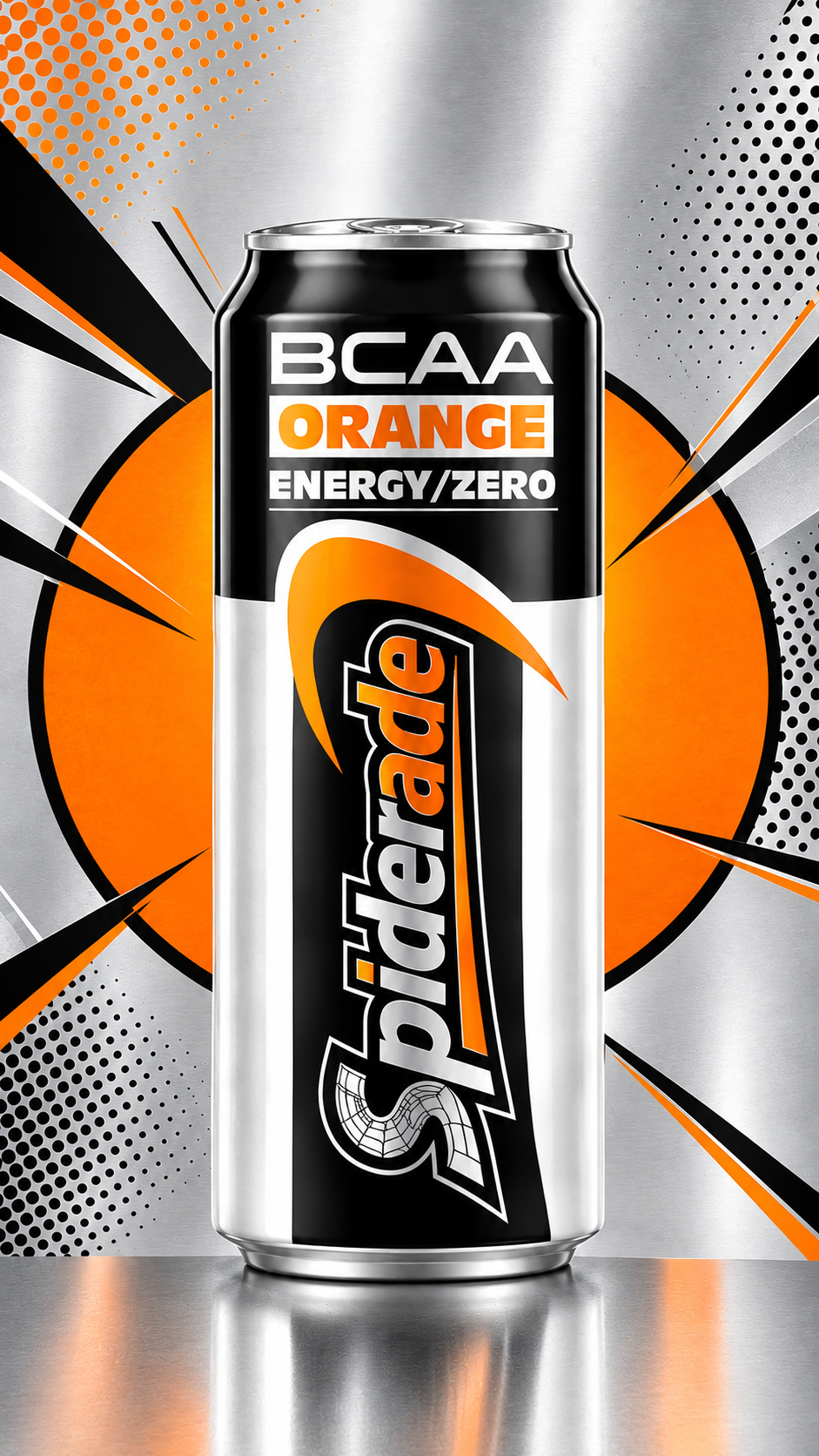
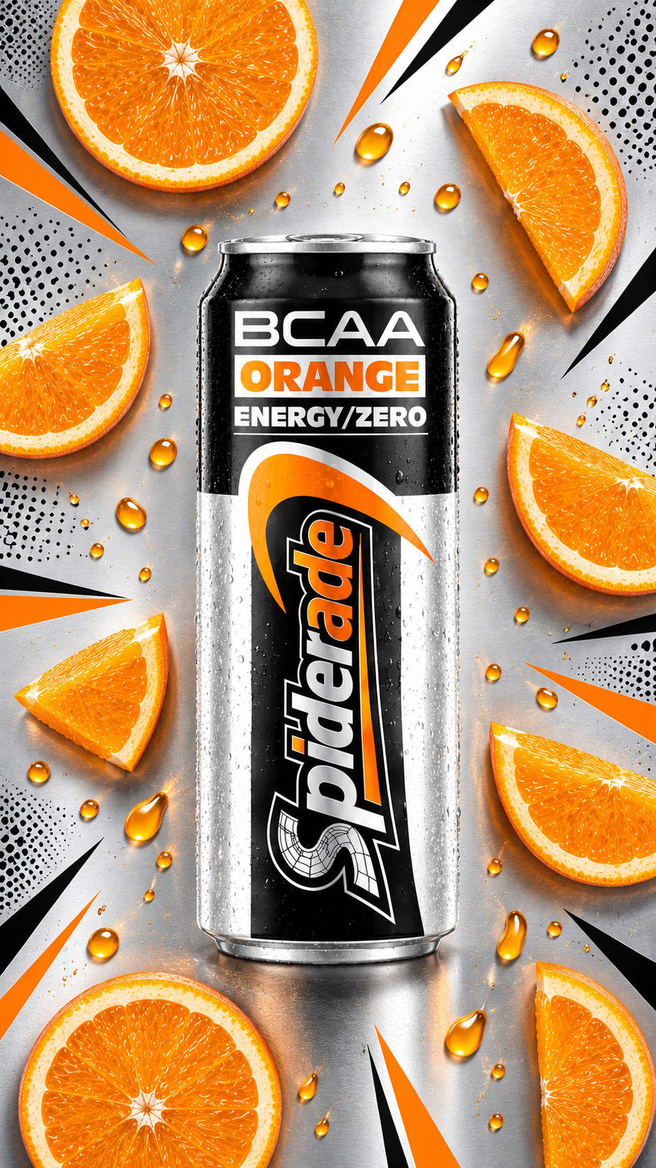
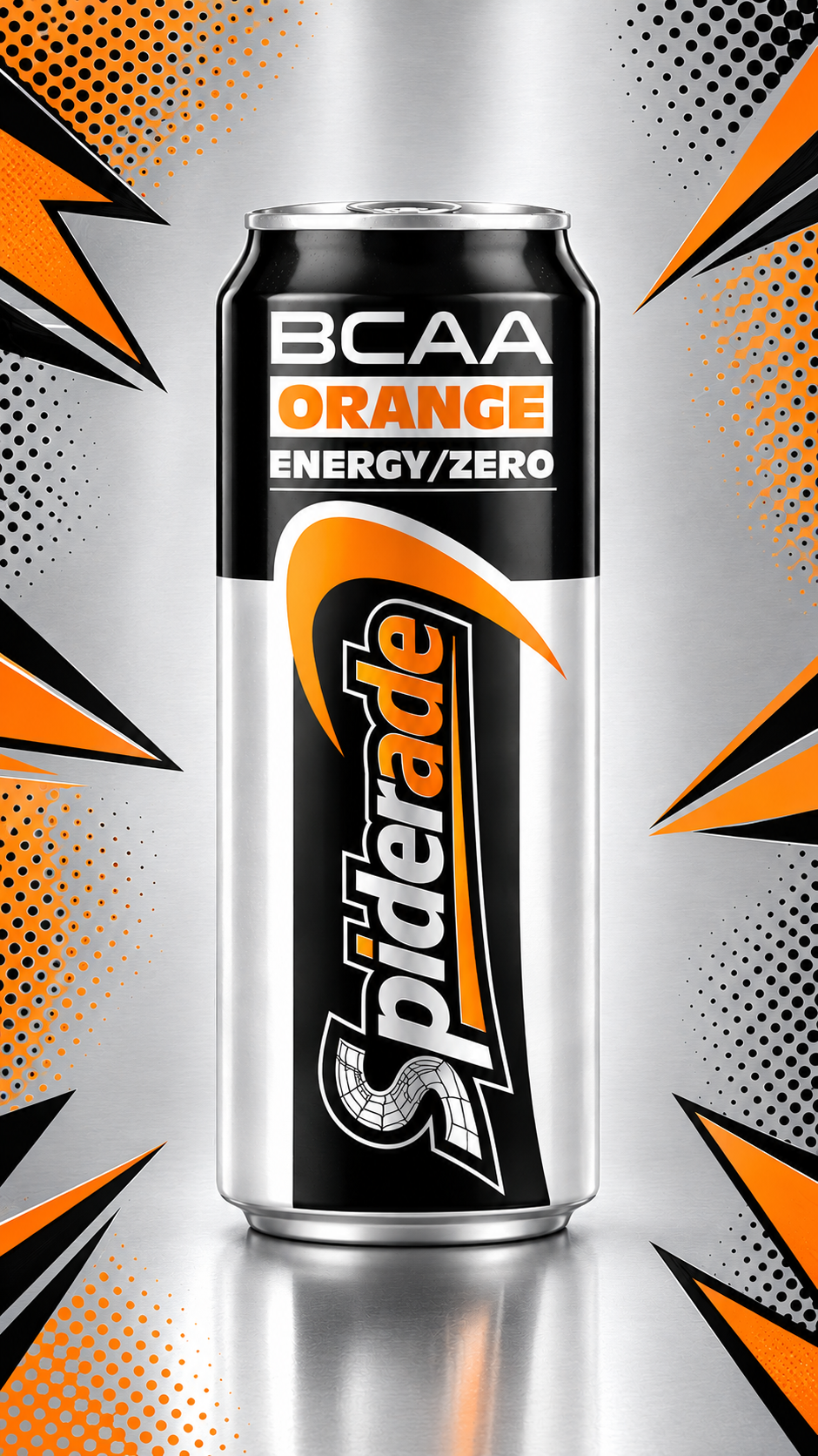
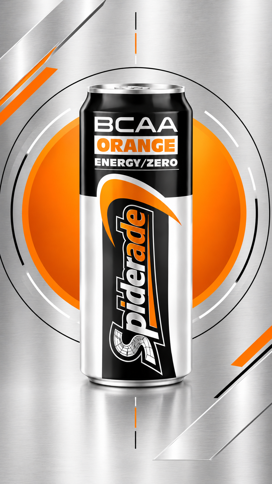
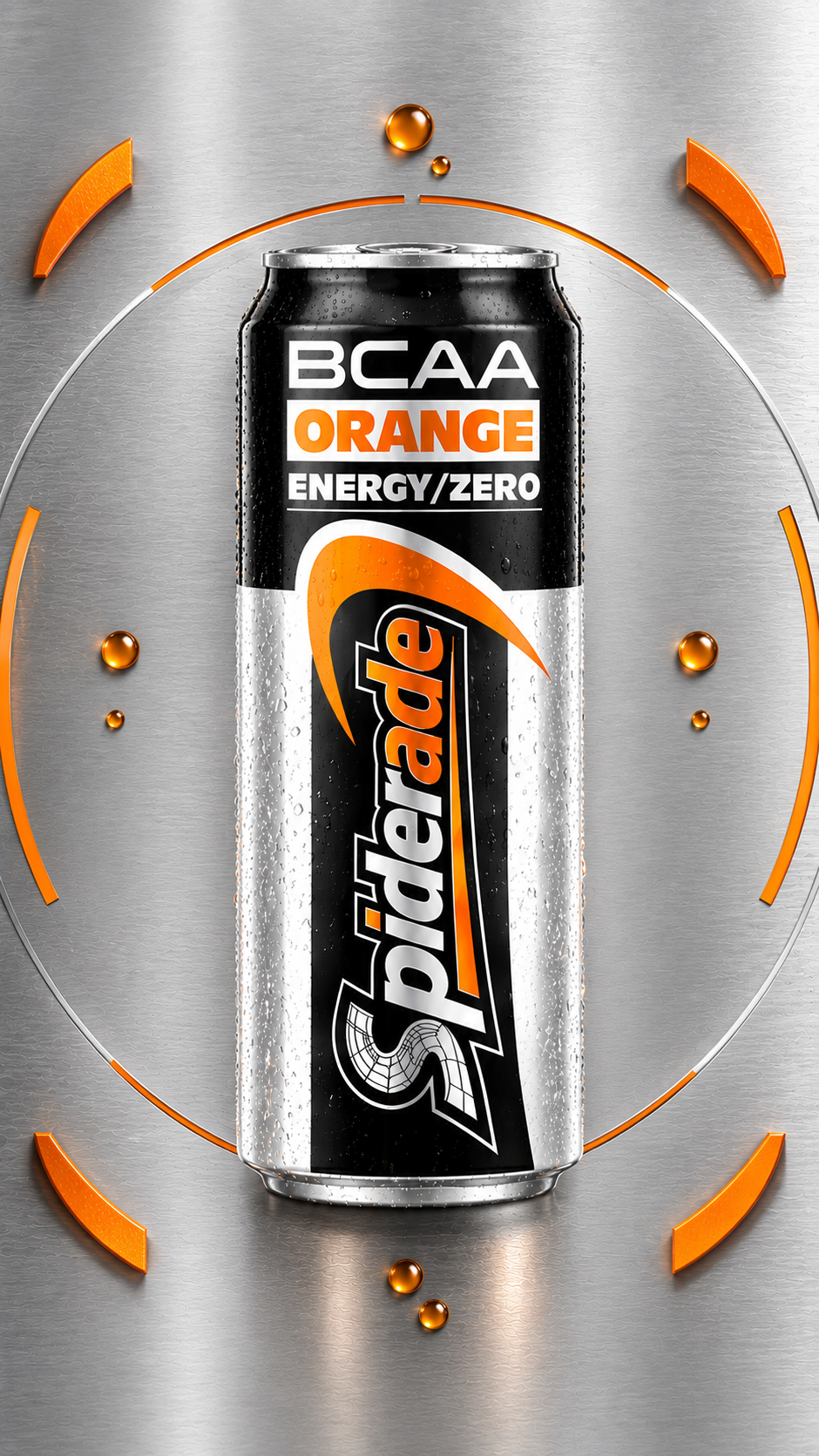
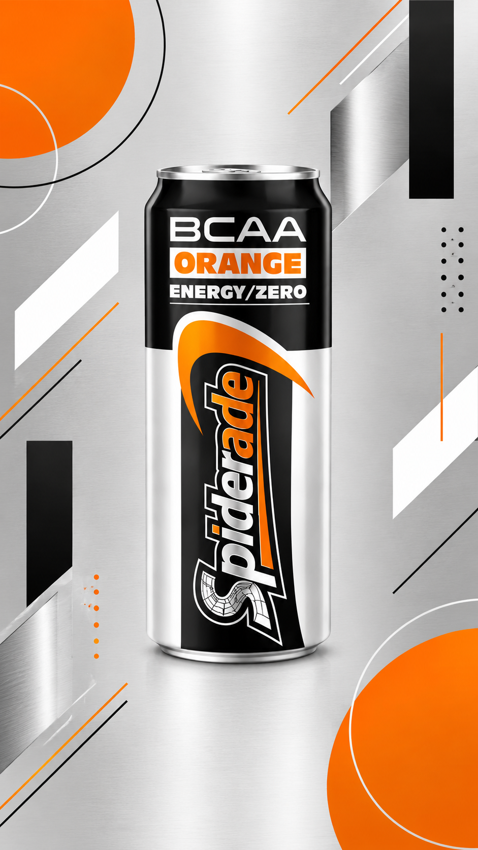
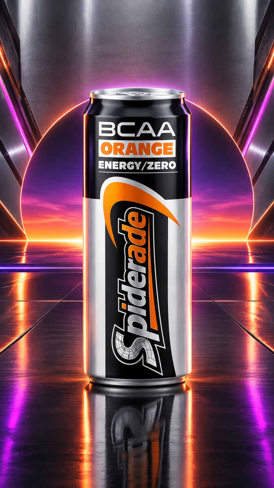
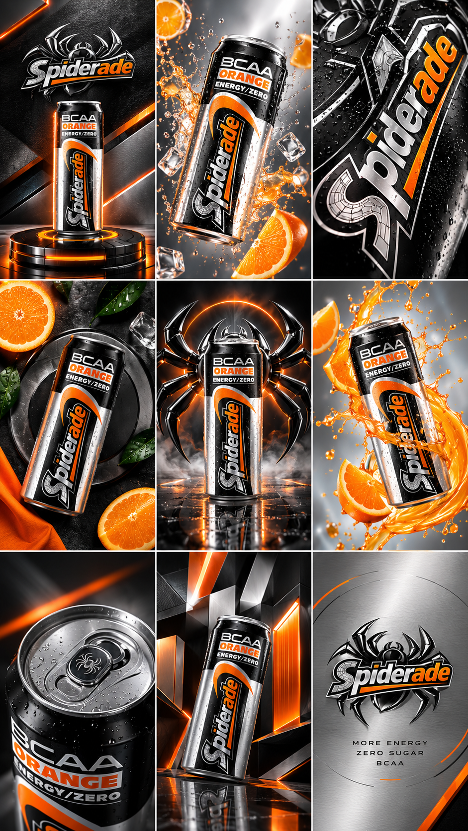
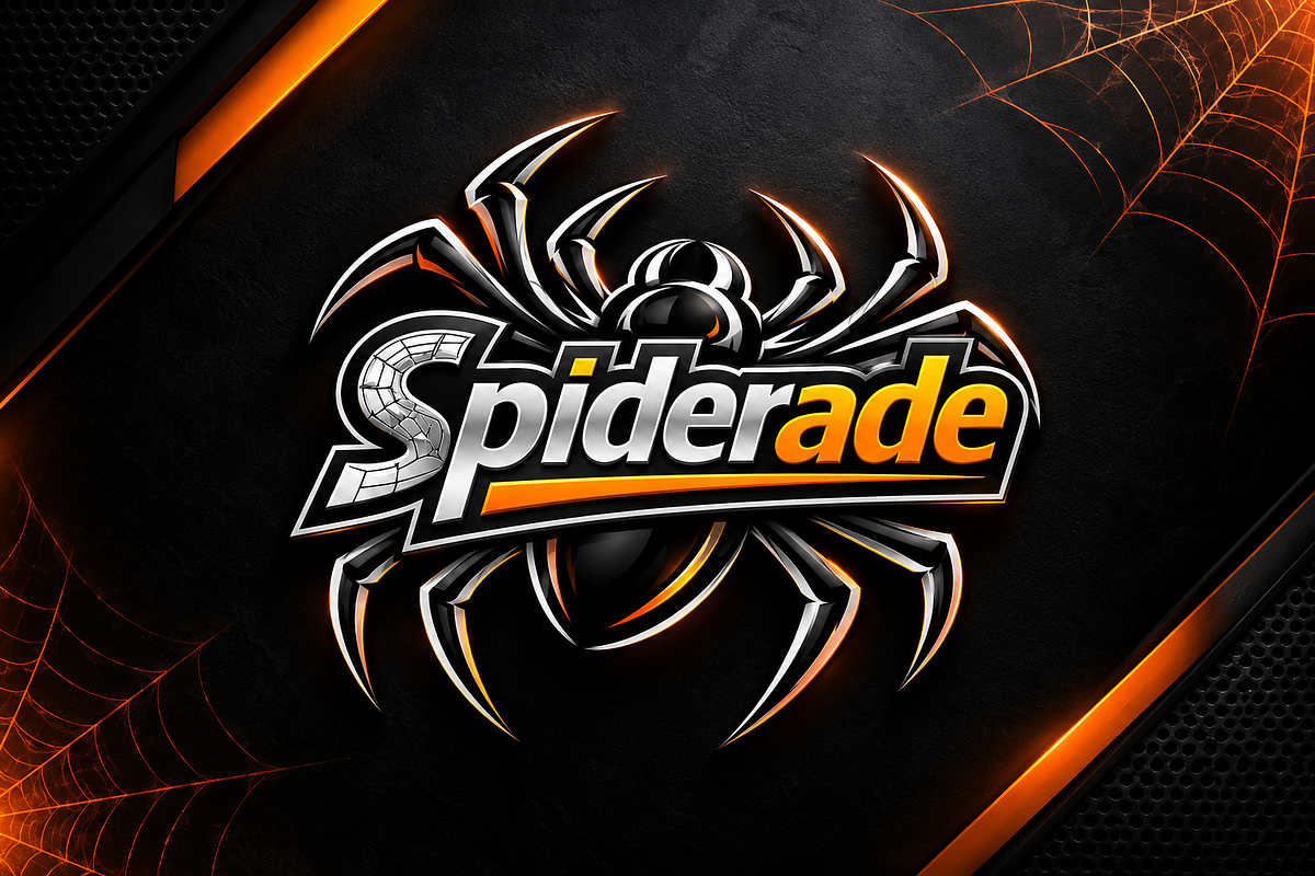
SPIDERADE — BCAA ORANGE | Energy / Zero A high-impact visual identity and advertising art direction concept created for Spiderade’s BCAA Orange energy drink. The project explores the visual relationship between energy, performance, hydration and citrus freshness, translating these attributes into a bold black, silver and orange visual language. The Spiderade identity becomes the central visual element, supported by a distinctive spider-inspired graphic system that communicates strength, agility, precision and performance. The packaging was treated as the hero of the campaign, with the BCAA Orange can presented through a series of premium advertising compositions — from clean metallic product photography to dynamic citrus, ice, liquid and energy-driven environments. The visual system combines high-contrast typography, metallic surfaces, geometric forms, orange energy accents and dramatic lighting to create a contemporary sports-nutrition aesthetic. The objective was to build a visual world that feels powerful, premium and instantly recognizable, while maintaining a strong connection between the product flavor and its performance-oriented positioning.
Support this project
Mohammed voted for this project