
UJI Matcha Branding | Brand Identity & Social Design

Project description
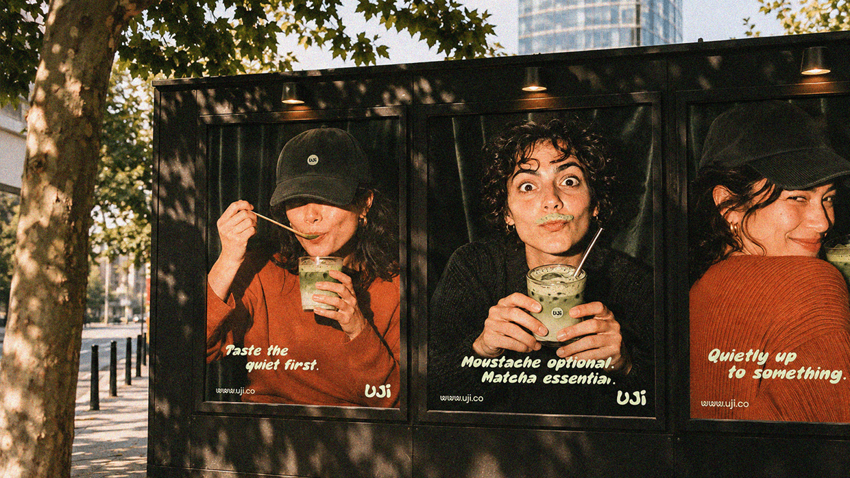
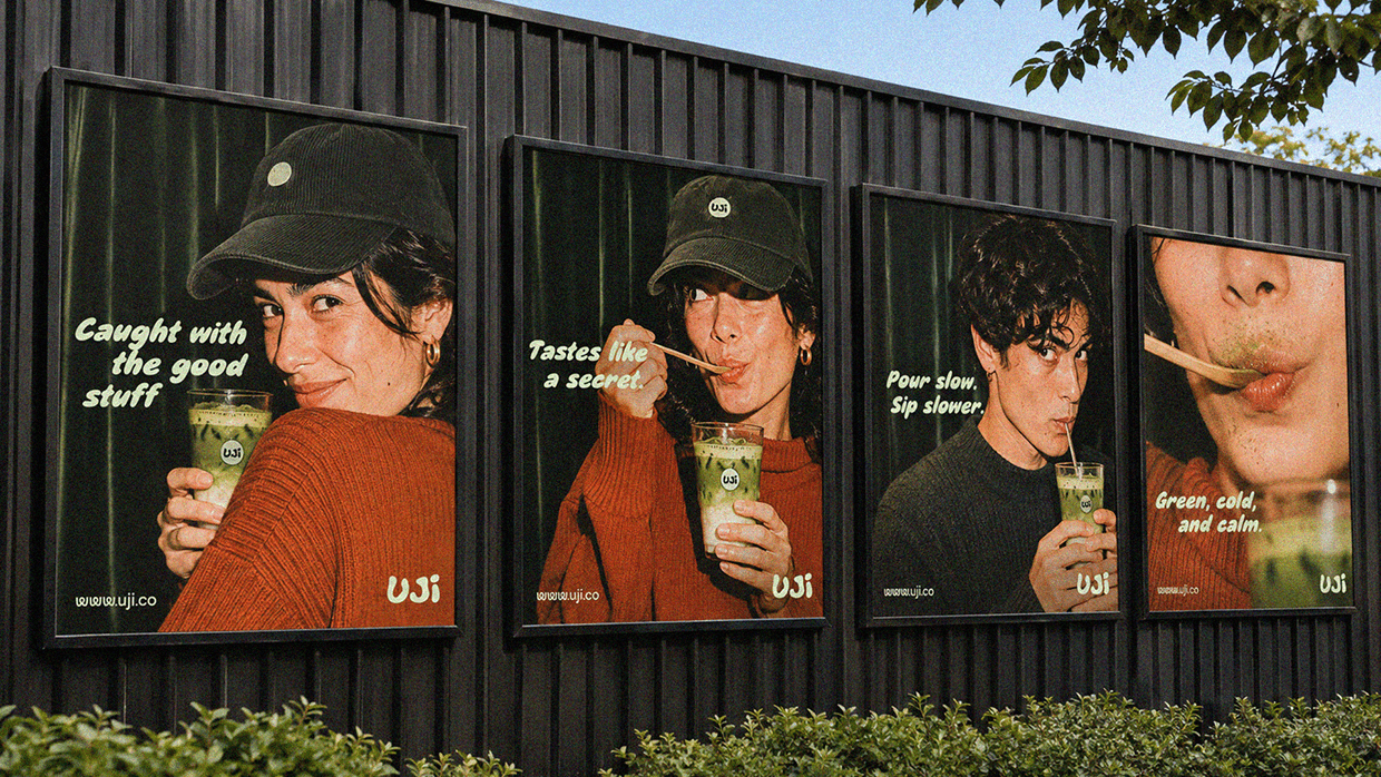
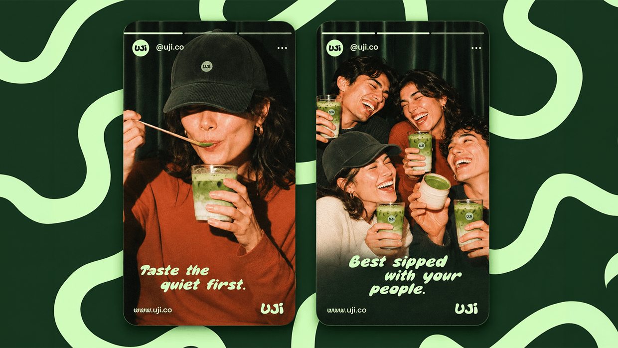
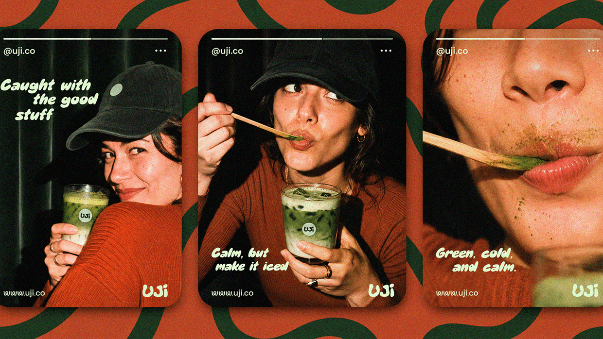
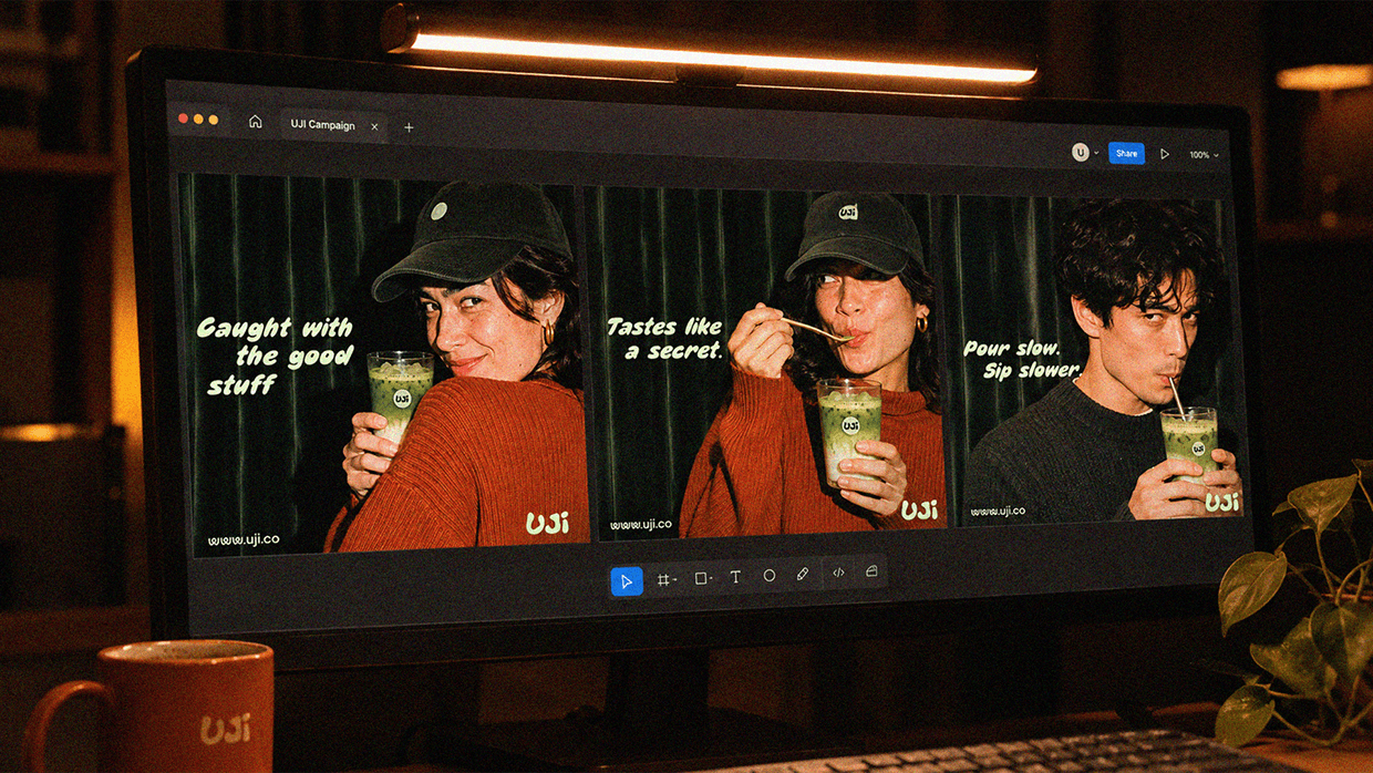
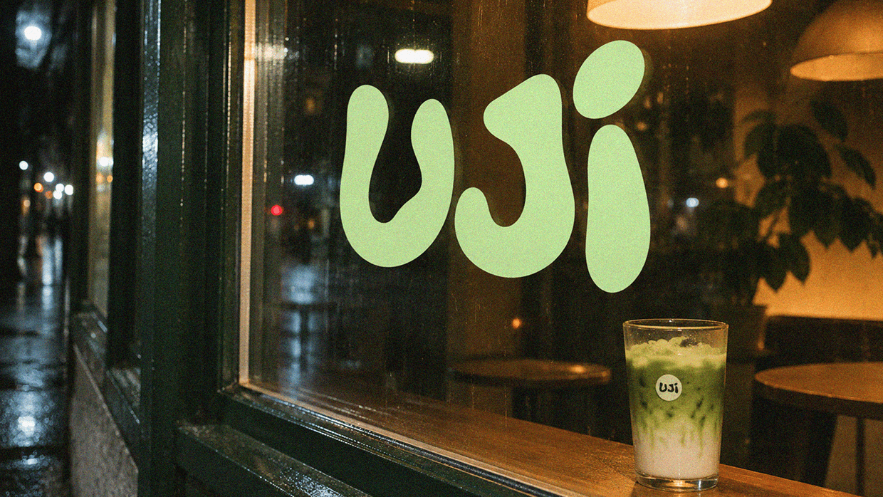
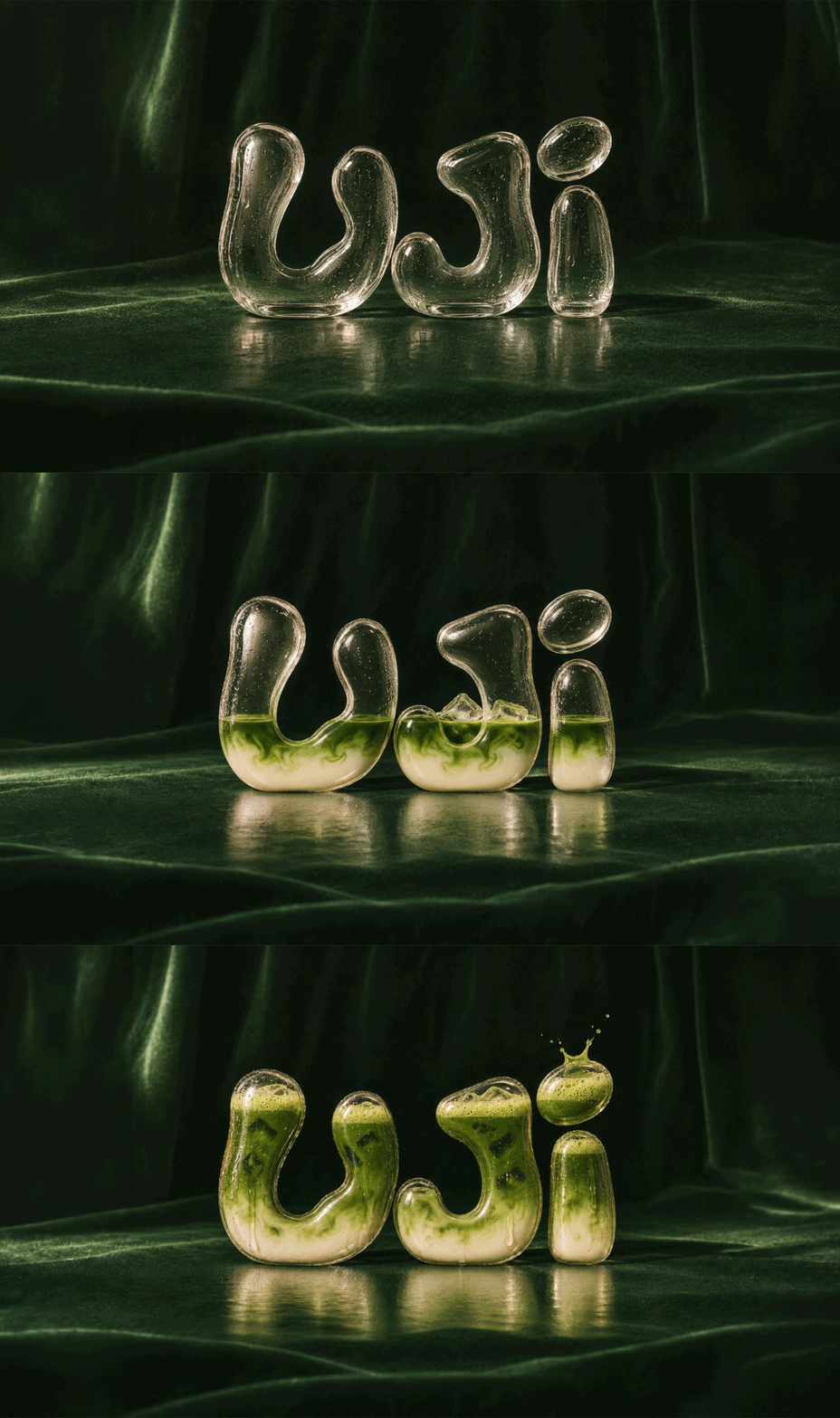
/2026/ — Branding, Digital Design & Packaging Client UJI is a matcha café and powder brand, named after the Kyoto region where some of Japan’s best-known tea is grown. Assignment Most matcha branding is quiet, precious and a little distant. The challenge was to keep the calm but lower the bar to entry, making a quiet ritual feel easy to join. Solution The identity combines a chunky, bubbly wordmark drawn to feel like poured liquid, a single mint circle that signs every cup, cap and tin, and rounded icons built for menus and packaging. A pale mint, forest green and rust palette and flash-lit, grainy photography built around real, slightly imperfect moments carry the brand from a tin on a shelf to a post in the feed. The system extends across packaging, café goods, stationery, posters, social and web banners. _____________ Brand Design / Art Direction: Monkix Studio | Scope: Strategy, logo, icons, packaging, photography direction, social