
Education Brand & Visual Identity
Project description
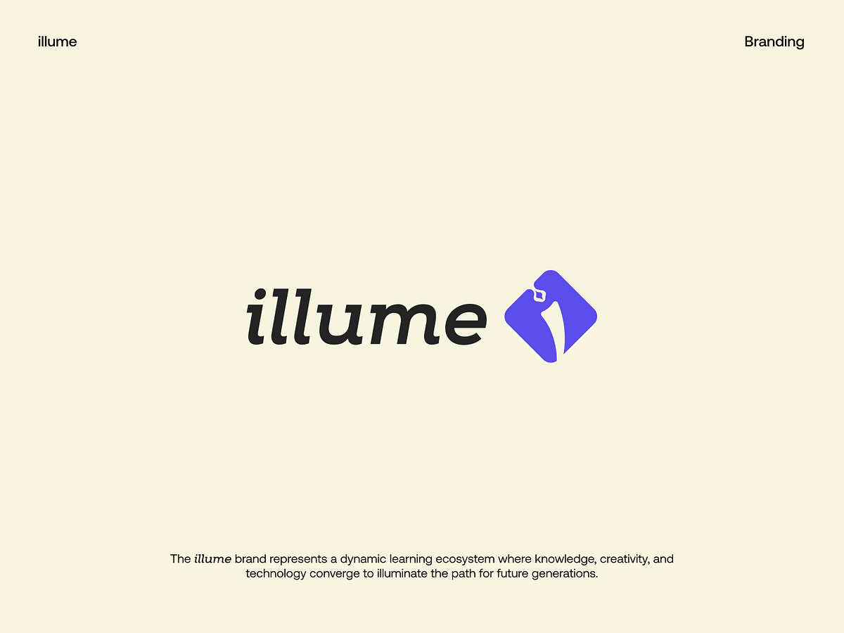
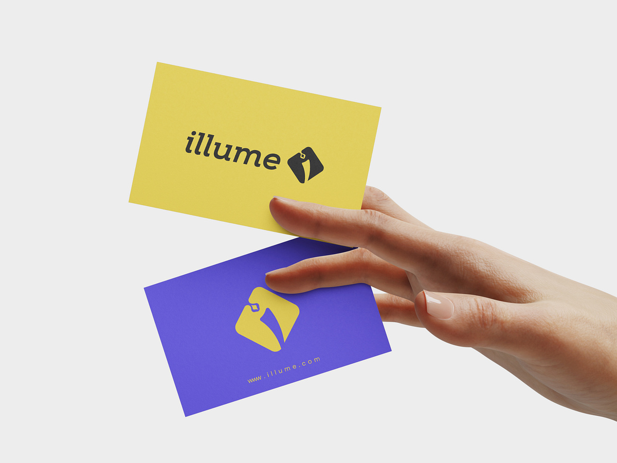
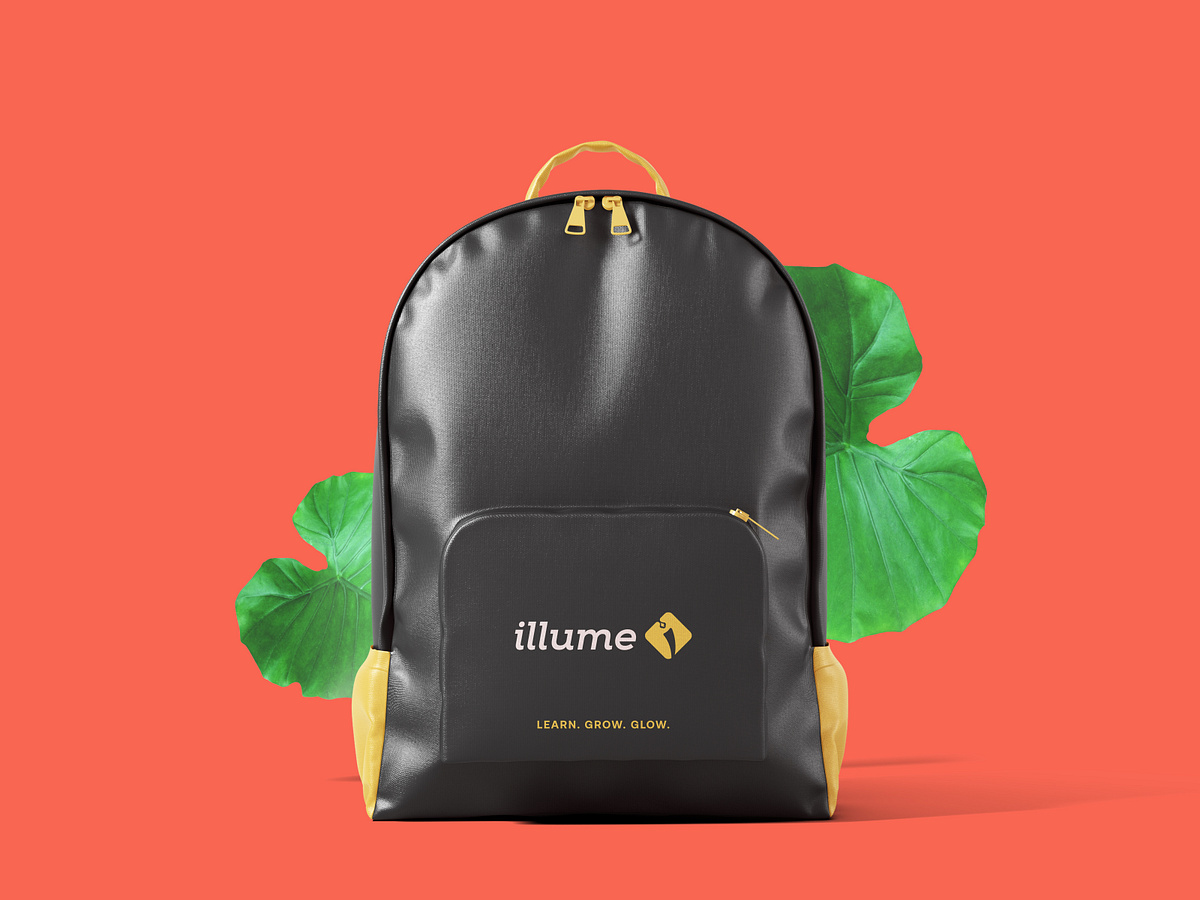
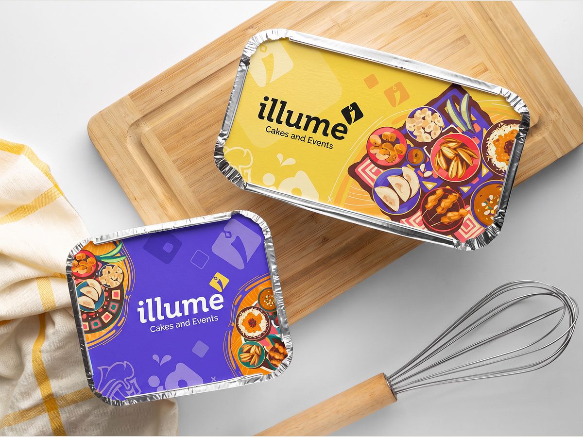
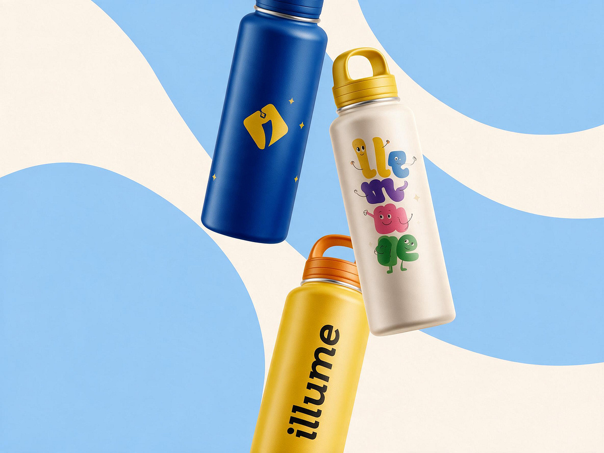
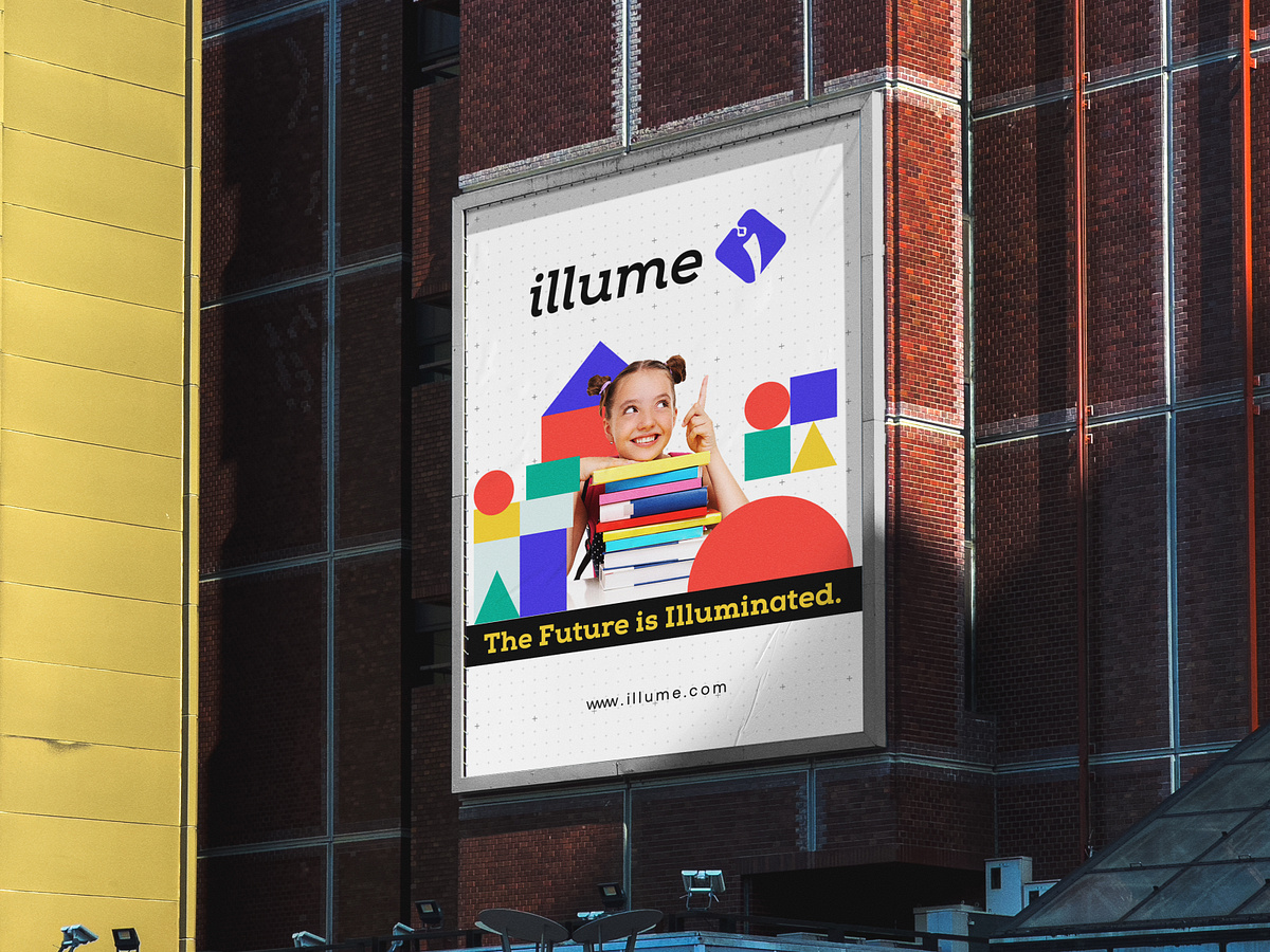
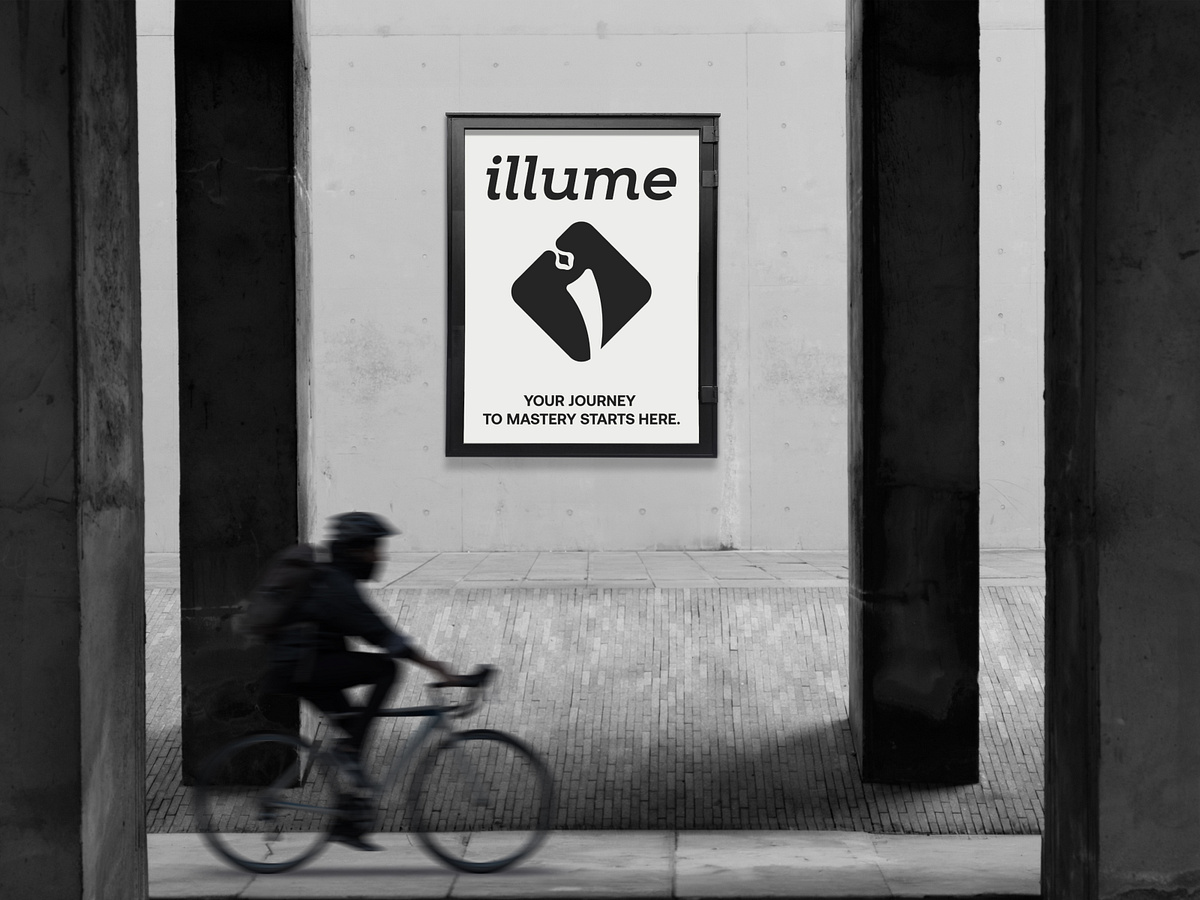
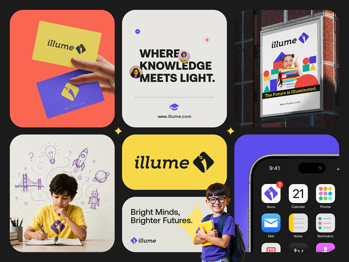
Every bright future begins with curiosity. That was the thought behind illume. We wanted to create an identity that feels welcoming to young learners while maintaining the confidence and clarity that parents expect from an education brand. The visual direction is built around a distinctive symbol, vibrant colors, and playful geometric elements. The identity then extends beyond the logo into: → Business cards → Promotional graphics → Outdoor advertising → Digital applications → Brand communication materials Each application follows the same visual direction, helping illume build a recognizable presence wherever the brand appears. Because a good education brand shouldn't just look attractive to children. It should give parents a reason to feel confident about the brand, too. illume. — Bright Minds, Brighter Futures. ______________________ 🌱 Building an education, learning, or kids-focused brand? We help businesses create: Logo | Brand Identity | Design | Websites | UI/UX | Digital Experiences 📩 DM Us. → Let's discuss your project.