
NOUREST — Nature-Led Branding & Packaging
Project description
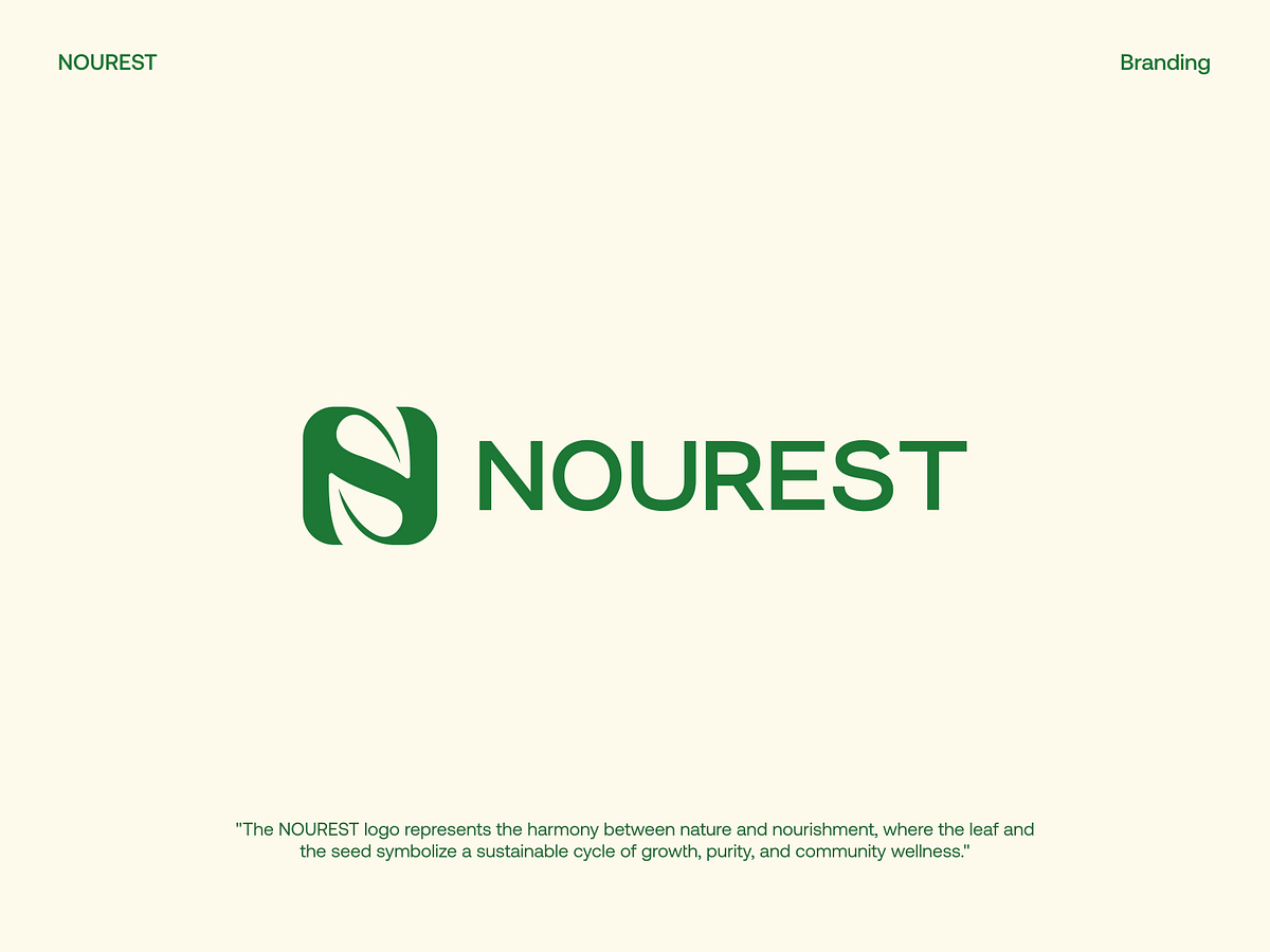
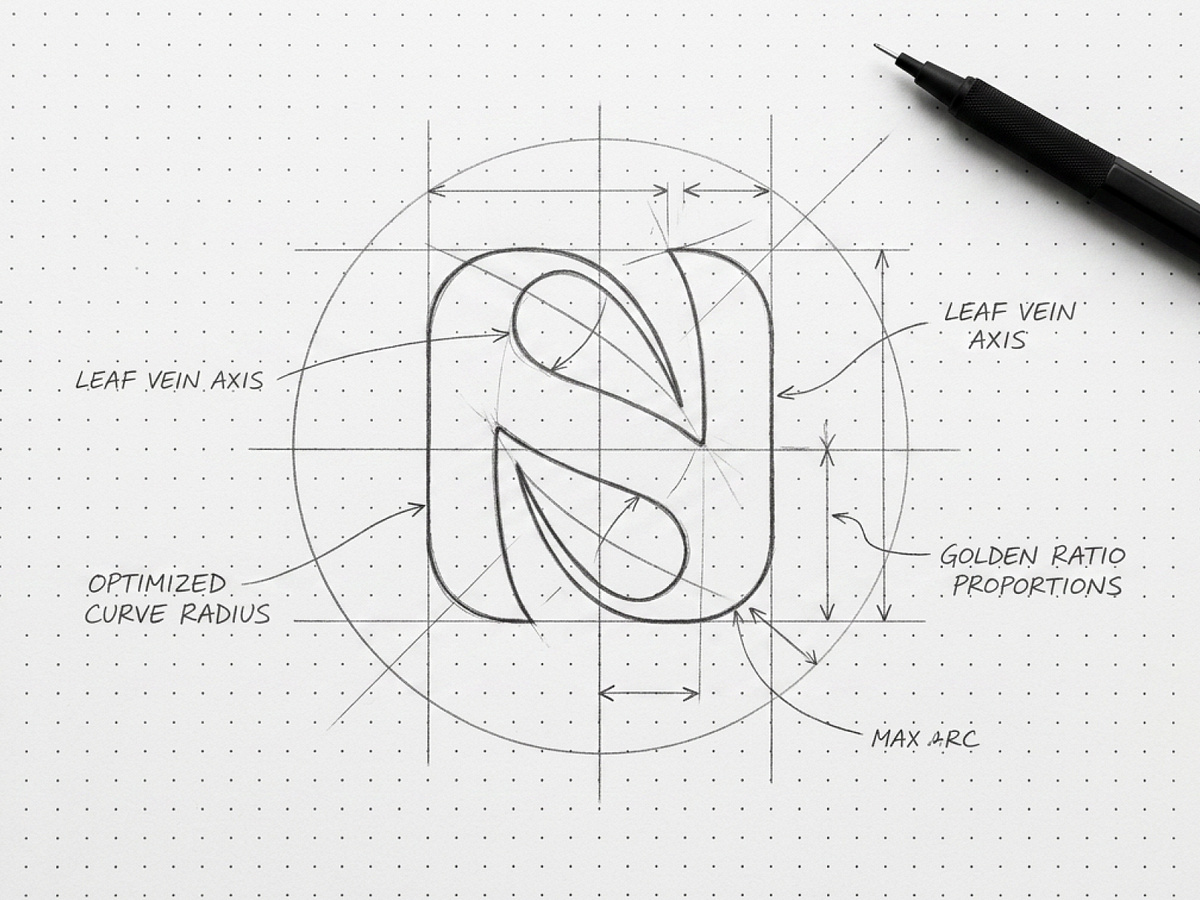
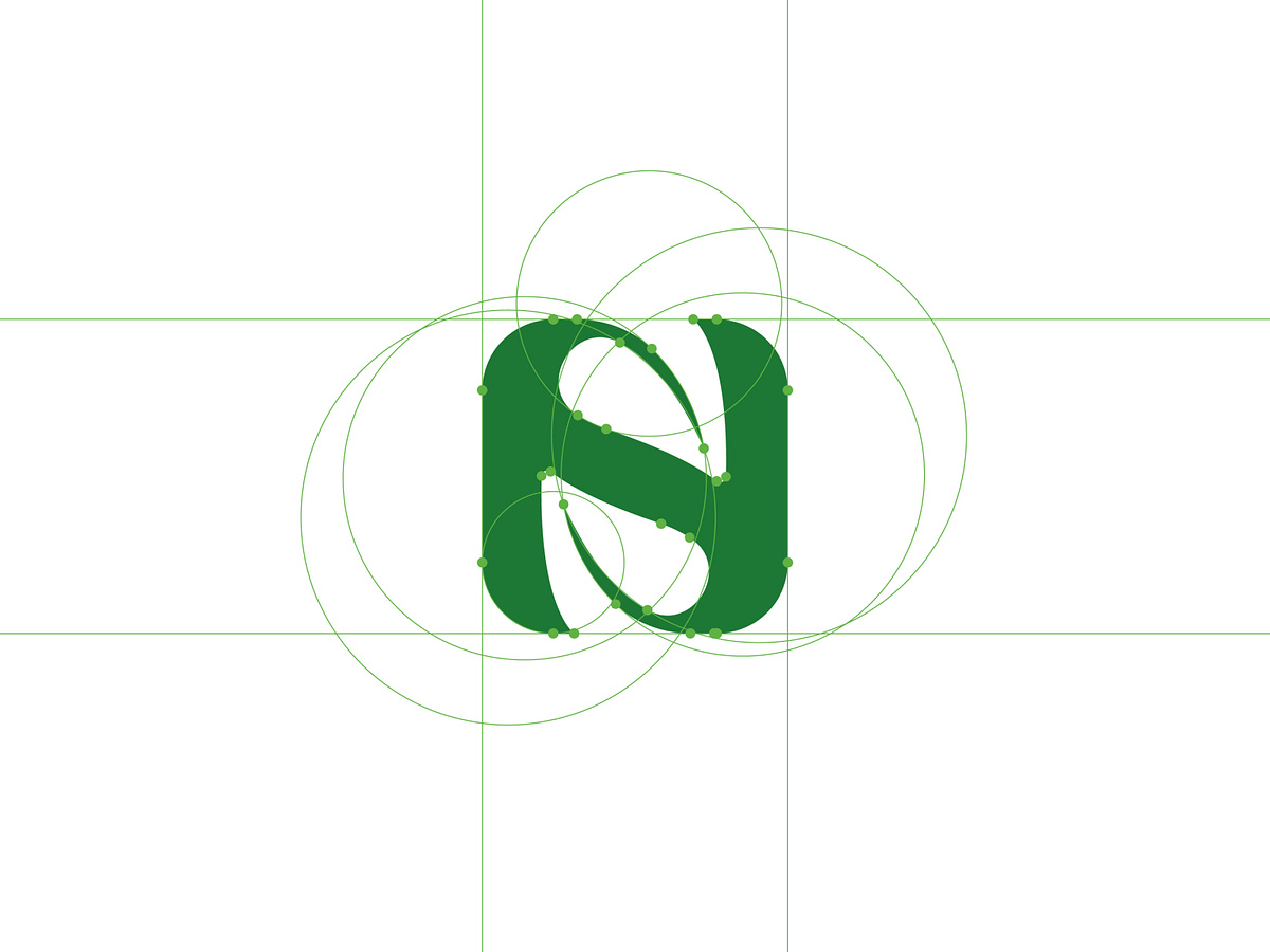
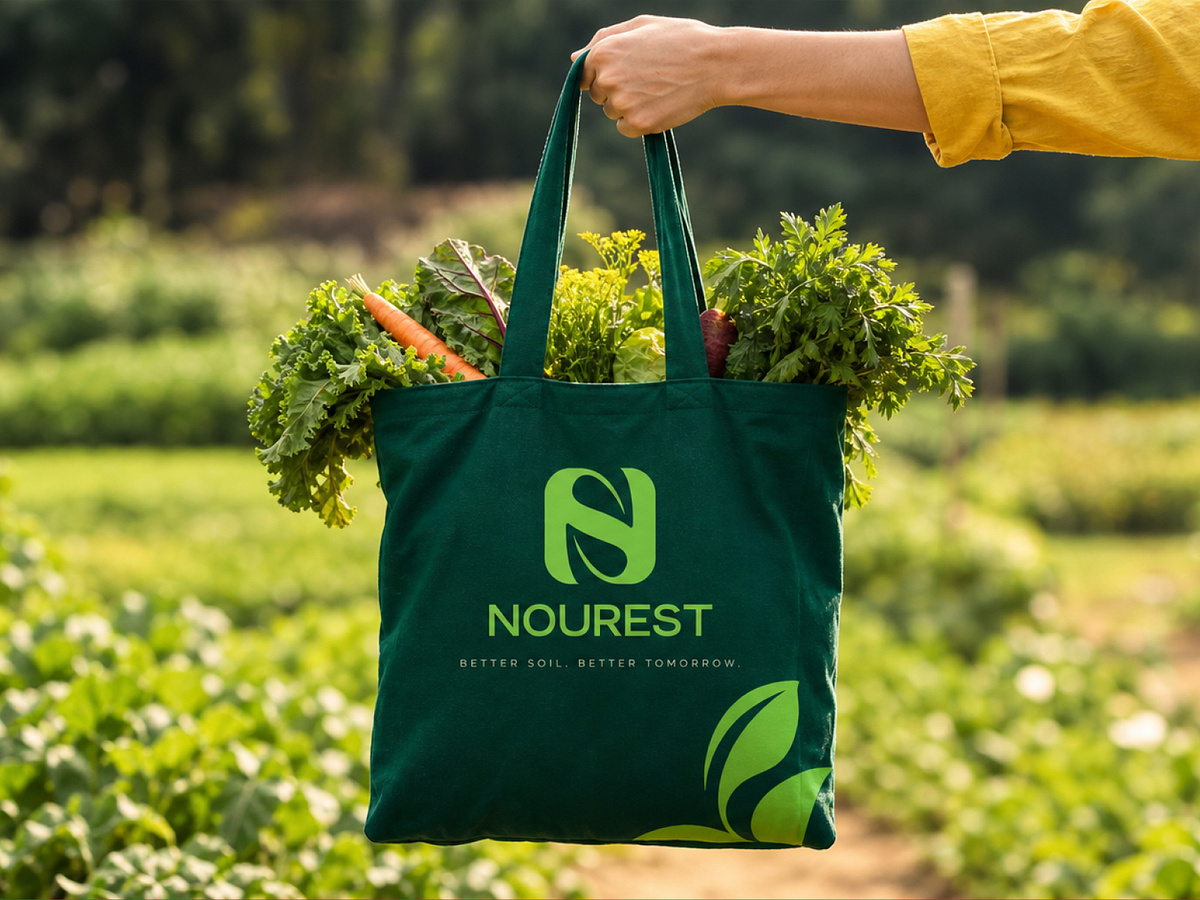
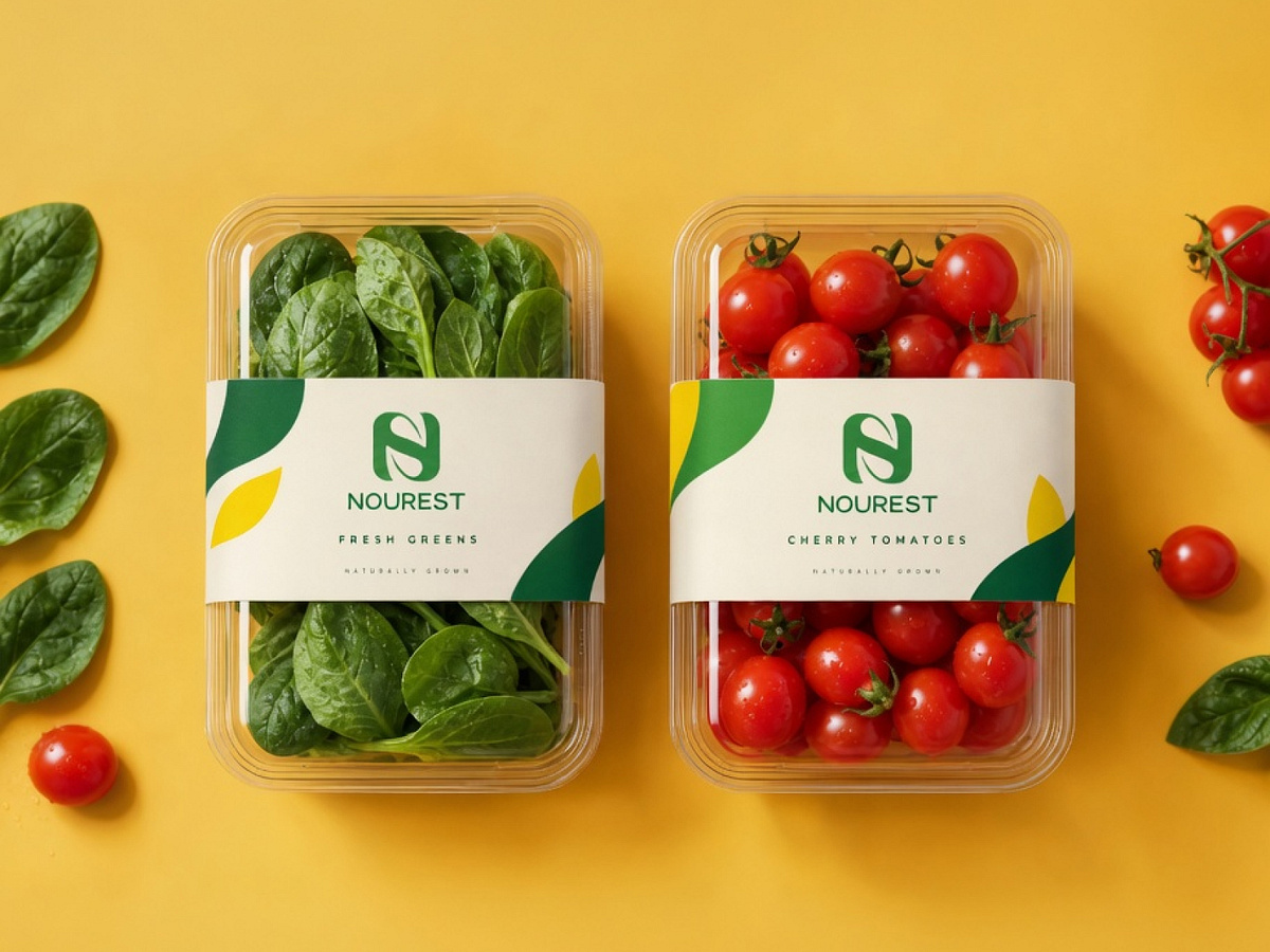
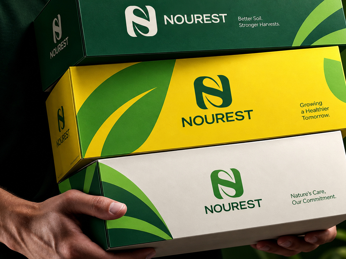
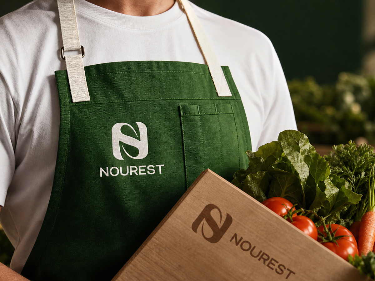
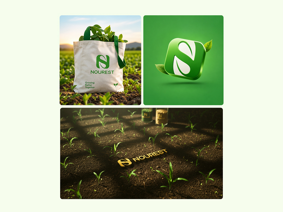
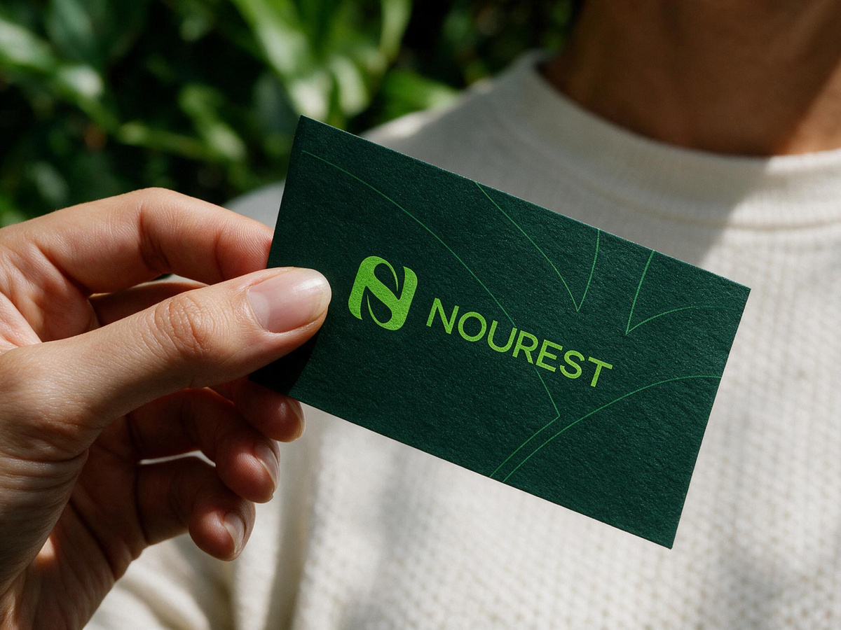
Good Branding Doesn't Just Look Green. It Gives People a Reason to Believe. Green packaging alone doesn't make a brand sustainable. The brand needs a clear identity and a consistent way to communicate what it stands for. That's the idea behind NOUREST. The visual identity was built around nature-inspired forms, deep green, and energetic yellow accents. The monogram creates a recognizable symbol, while the wider design system brings that identity into packaging, printed materials, and everyday brand applications. The goal was to create something that feels connected to nature without losing its modern, professional character. Because the strongest brand identities don't live on a presentation board. They show up consistently in the real world. NOUREST — Nature's Best, Harvested for You. 🌿 🌱 Building a nature-led, organic, or sustainability-focused brand? We help businesses create: ✦ Brand Identity & Guidelines ✦ Logo Design & Visual Systems ✦ Packaging & Brand Materials ✦ Website & UI/UX Design 📩 DM us for a free brand review.