
NOUREST — Sustainable Brand Identity
Project description
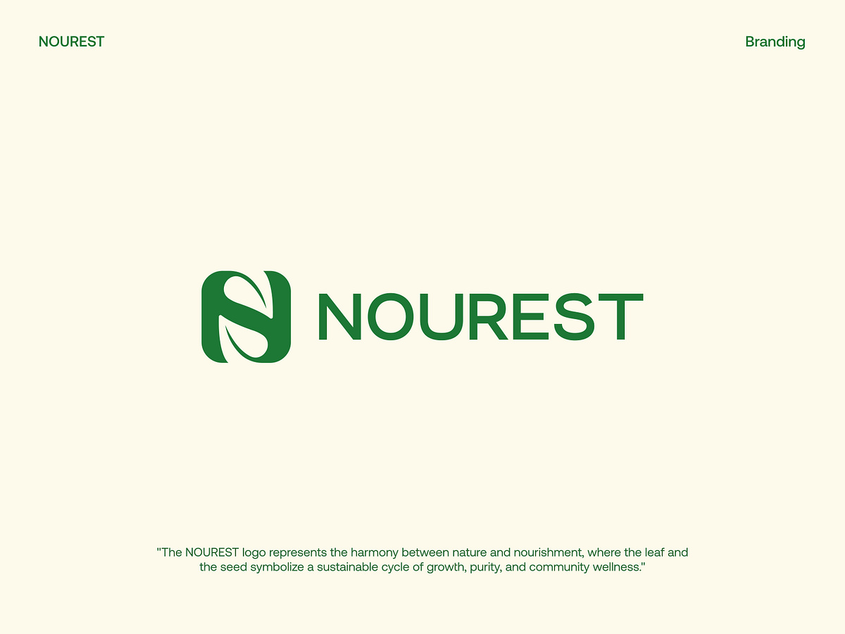
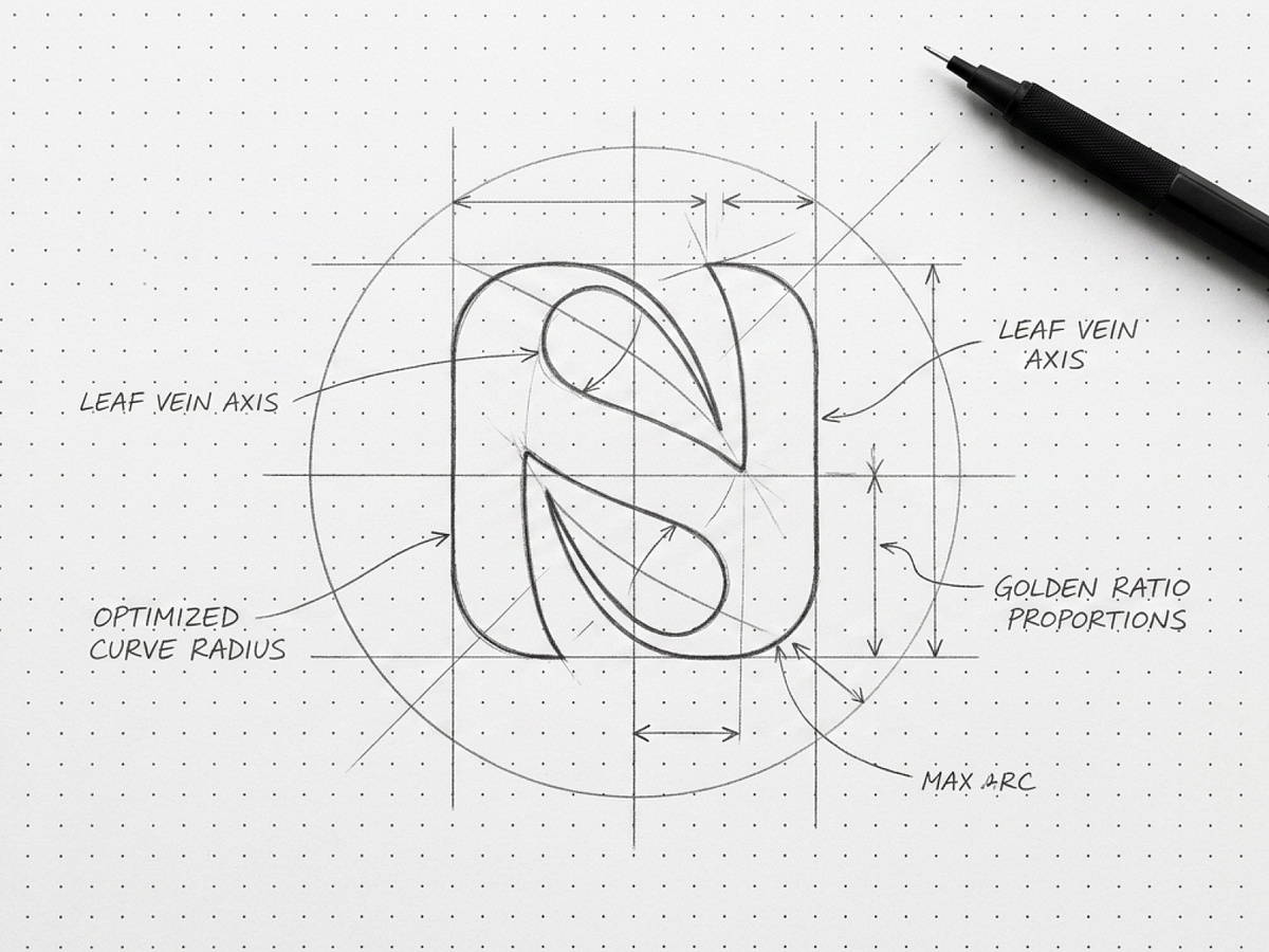
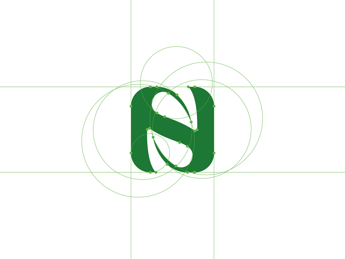
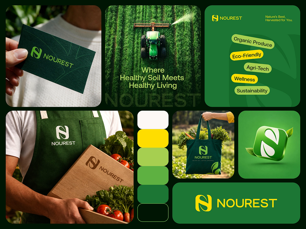
Designing a Brand Where Nature Meets Modern Business. A brand rooted in nature should feel that way everywhere. 🌿 Not just in its logo. Not just in its colors. But in every detail people see, touch, and remember. That was the thinking behind NOUREST. The identity brings together a leaf-inspired monogram, a green-led color system, and bright yellow accents to create a visual language that feels fresh, confident, and connected to nature. But the real work goes beyond the symbol. We developed the identity across brand materials, packaging, business cards, and everyday applications to keep the brand recognizable wherever it appears. Because when a business stands for nature, sustainability, and better living, its visual identity needs to communicate those values consistently. ↗ One clear identity. ↗ A consistent experience. ↗ A brand people can recognize. NOUREST — Nature's Best, Harvested for You.