

✨Interrir - Interior Design Website Exploration
Project description
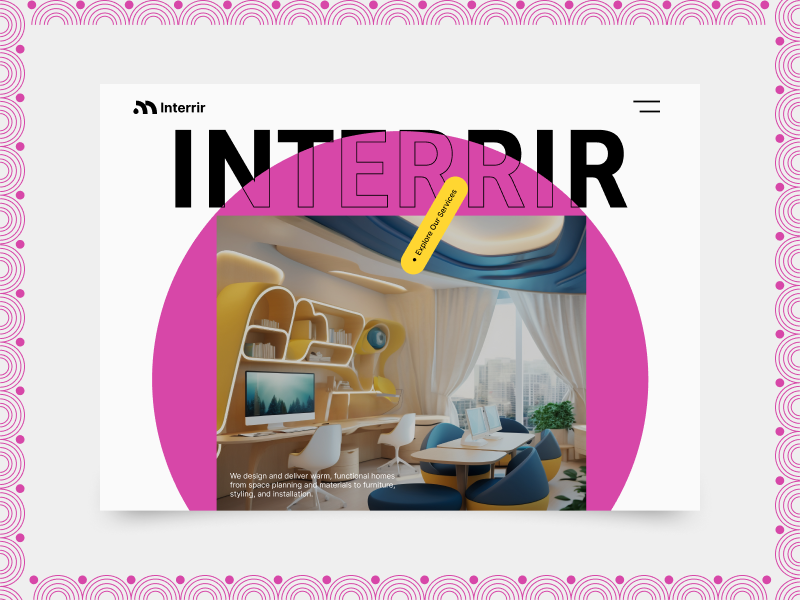
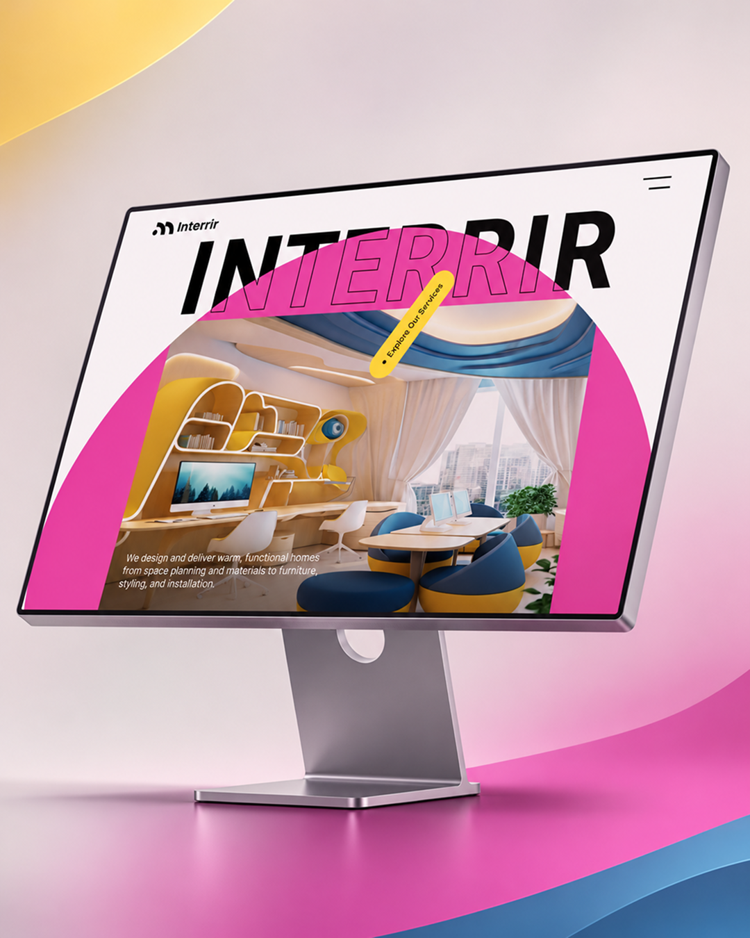
A bold landing-page concept designed for a contemporary interior design brand. The visual direction combines oversized typography, expressive geometric forms, vibrant color accents, and architectural imagery to create an identity that feels more distinctive than the conventional minimalist interior website. The hero composition was built around one central idea: make the brand name part of the interface itself. The oversized “INTERRIR” typography creates a strong visual anchor, while the pink circular form connects the headline with the project imagery below. A contrasting yellow service CTA adds another interaction point without competing with the main visual. Design Direction - Bold editorial typography - Vibrant pink + yellow accents - Large-scale geometric composition - Clean navigation - Strong project imagery - Playful but structured UI - Brand-first visual storytelling The goal was to balance creative expression and usability giving the website a memorable personality while keeping the primary content and actions easy to understand. Designed as an exploration of how interior, architecture, and creative-service brands can move beyond conventional portfolio layouts and build a stronger digital identity. Would love to hear your feedback on the typography and color direction. Press ❤️ if you’d like to see the full case study.
Support this project
Be the first to upvote