Election results dashboard
Project description
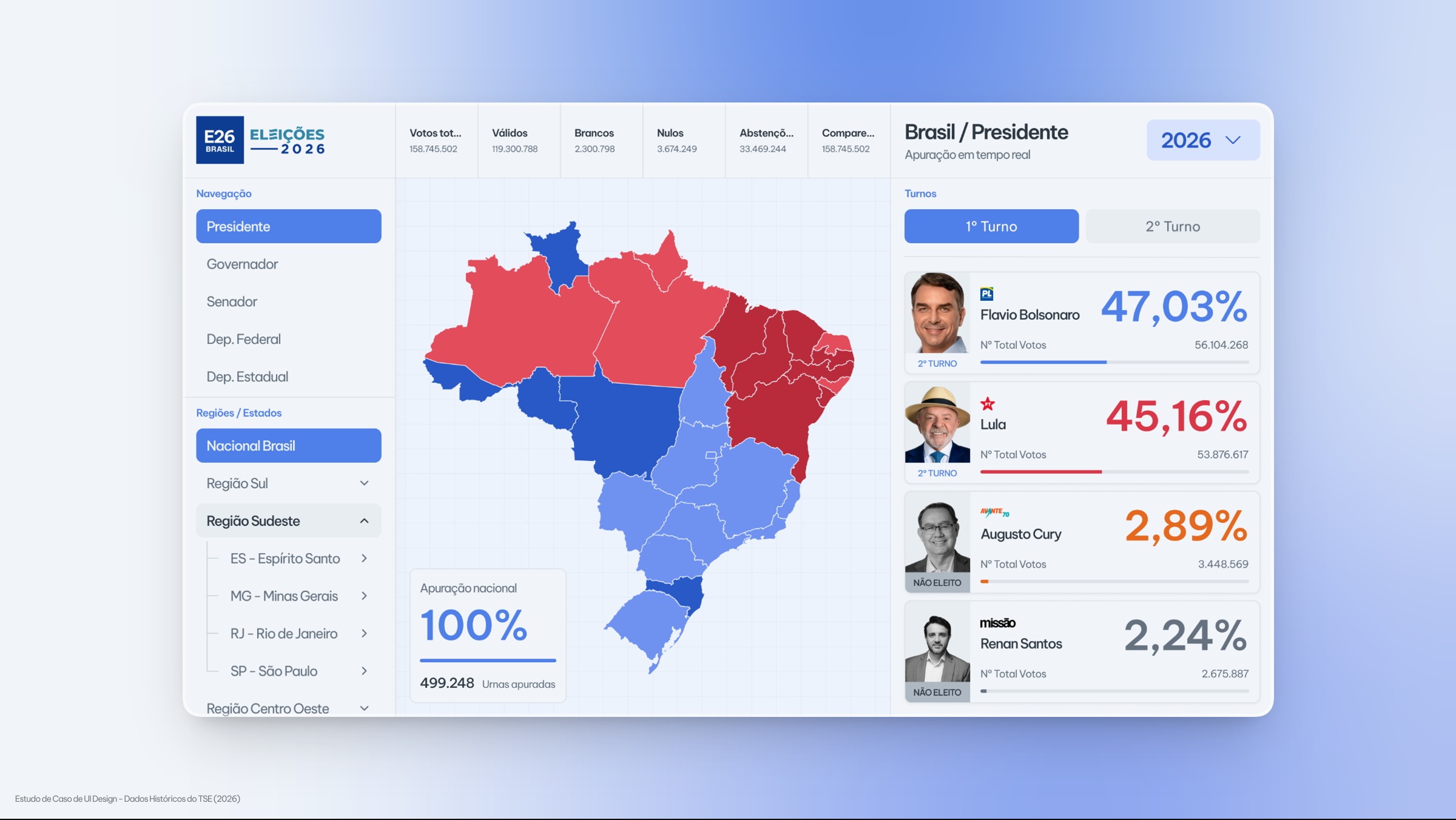
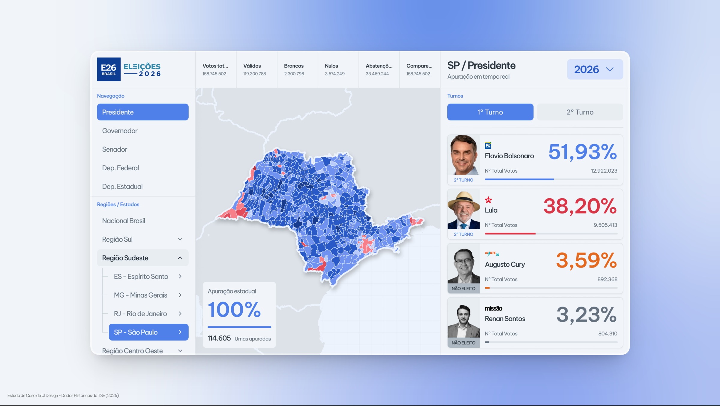
This project started with a question: how can design help journalists present live election results in a clearer and more interactive way? The concept was to develop an interactive interface that allows journalists to explore data during a broadcast through touchscreen interactions, switching between a national overview and state-level views with information on how votes are distributed across municipalities. The project explores the use of interactive maps, color scales, and visual hierarchy to transform election data into information that is easier for the public to understand. Reference data was sourced from the official TSE (Brazilian Superior Electoral Court) website. This is an independent UI/UX design concept inspired by election coverage at CNN Brasil and other broadcasters, with no institutional affiliation or endorsement. ⚠️ DISCLAIMER / LEGAL NOTICE: This project is a strictly academic UI/UX Design case study and has no political, partisan, or election campaigning purpose. The interface was developed independently to demonstrate design skills, information architecture, and complex data visualization. All numerical data and names presented are real, public historical records, consolidated and extracted from the official sources of the Superior Electoral Court (TSE) regarding the 1st Round of the 2026 Elections. This project has no link, sponsorship, or association with any government entity, political party, or candidate.