Arcova - Real Estate Brand Identity Design

Project description
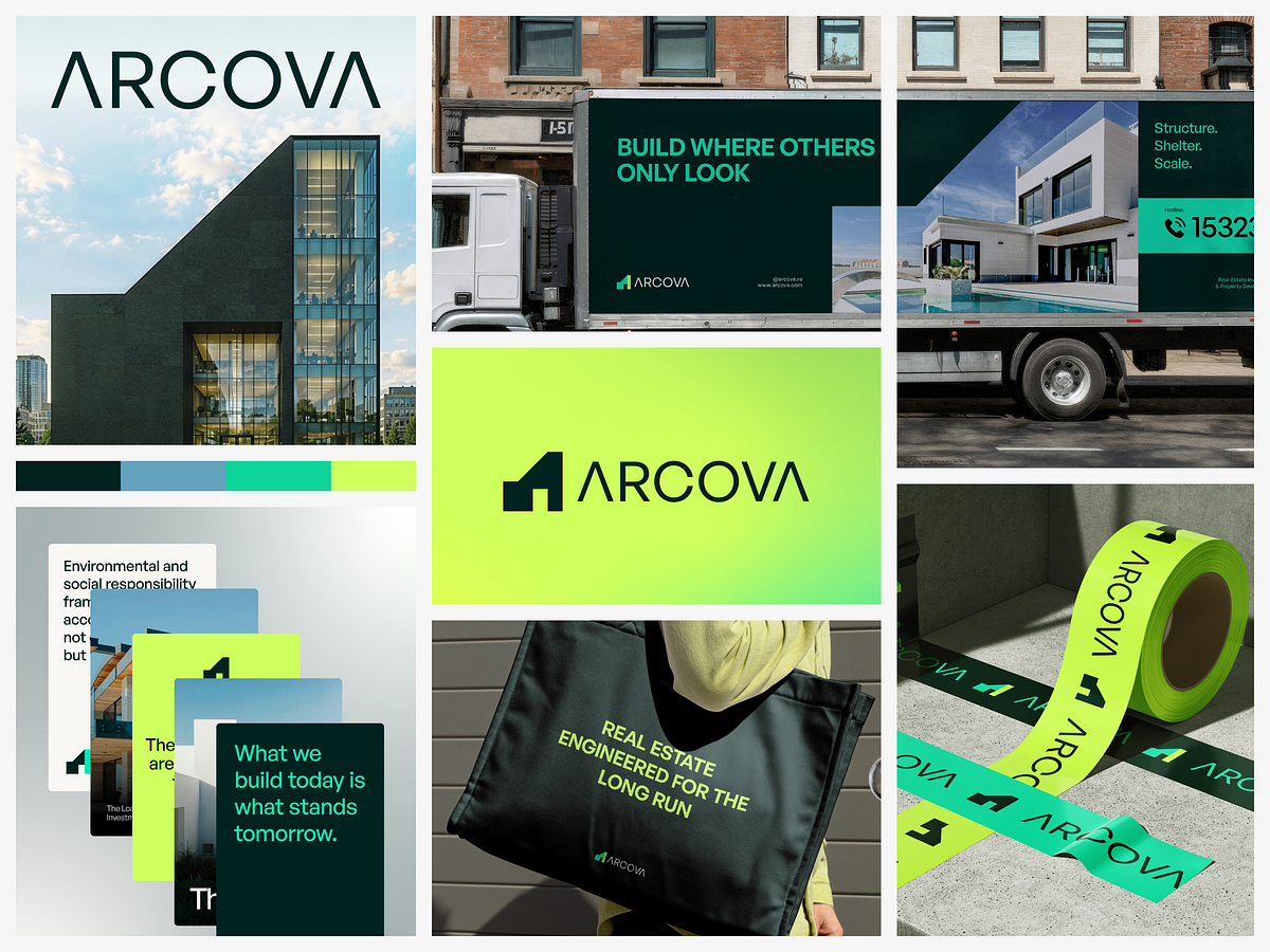
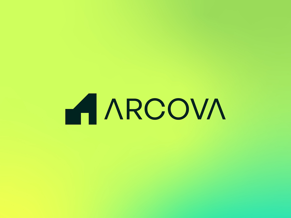
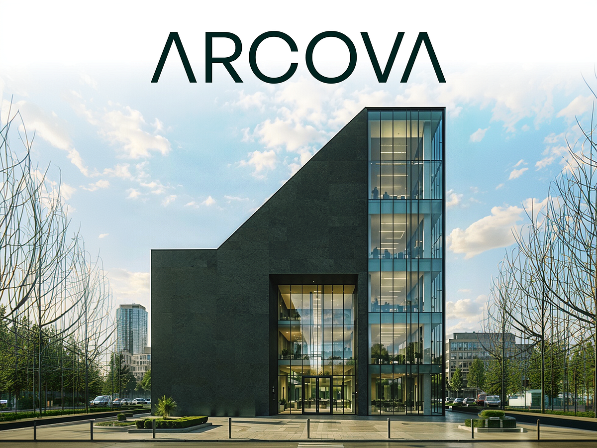
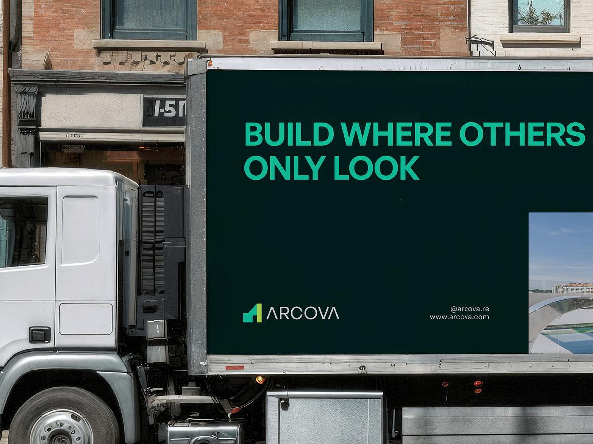
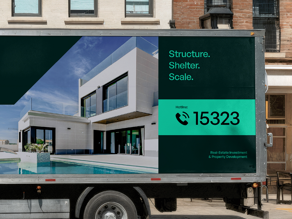
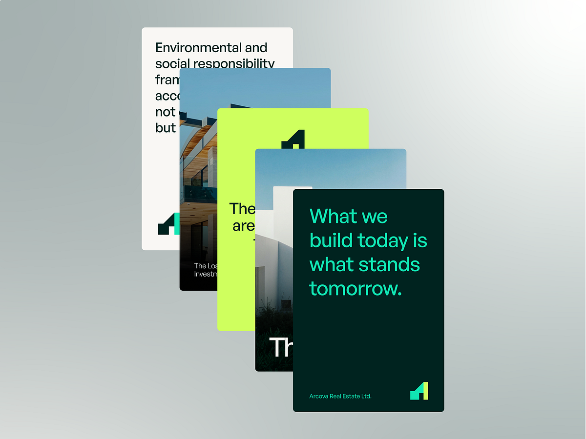
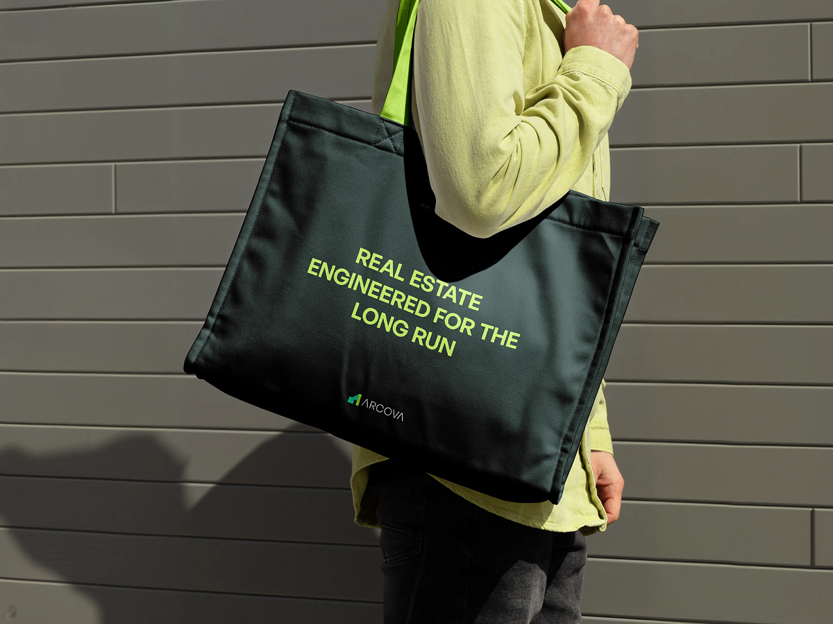
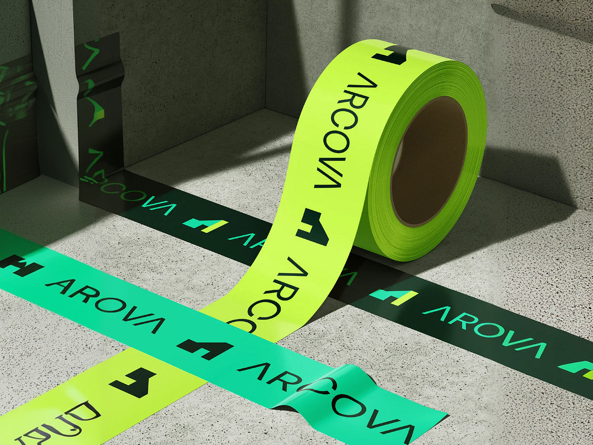
"Build where others only look." That line is on the truck. And it earns its place on every other surface too. Arcova - a real estate brand identity built in deep forest green, electric lime, and steel blue. A geometric rooftop mark that reads instantly at any scale - on a building facade, on a roll of branded tape, on a tote bag in the street. "Real Estate Engineered for the Long Run." "What we build today is what stands tomorrow." Every line of copy is doing structural work, just like the buildings. The neon tape against concrete is the standout execution -unexpected material, completely on-brand, impossible to ignore on a construction site. The building signage in brushed white on dark cladding closes the loop. This identity works from the boardroom deck to the site boundary.
Support this project
Upvote