Daze — Bold Coffee Brand Identity & Packaging Design
Project description
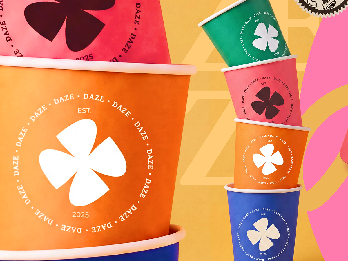
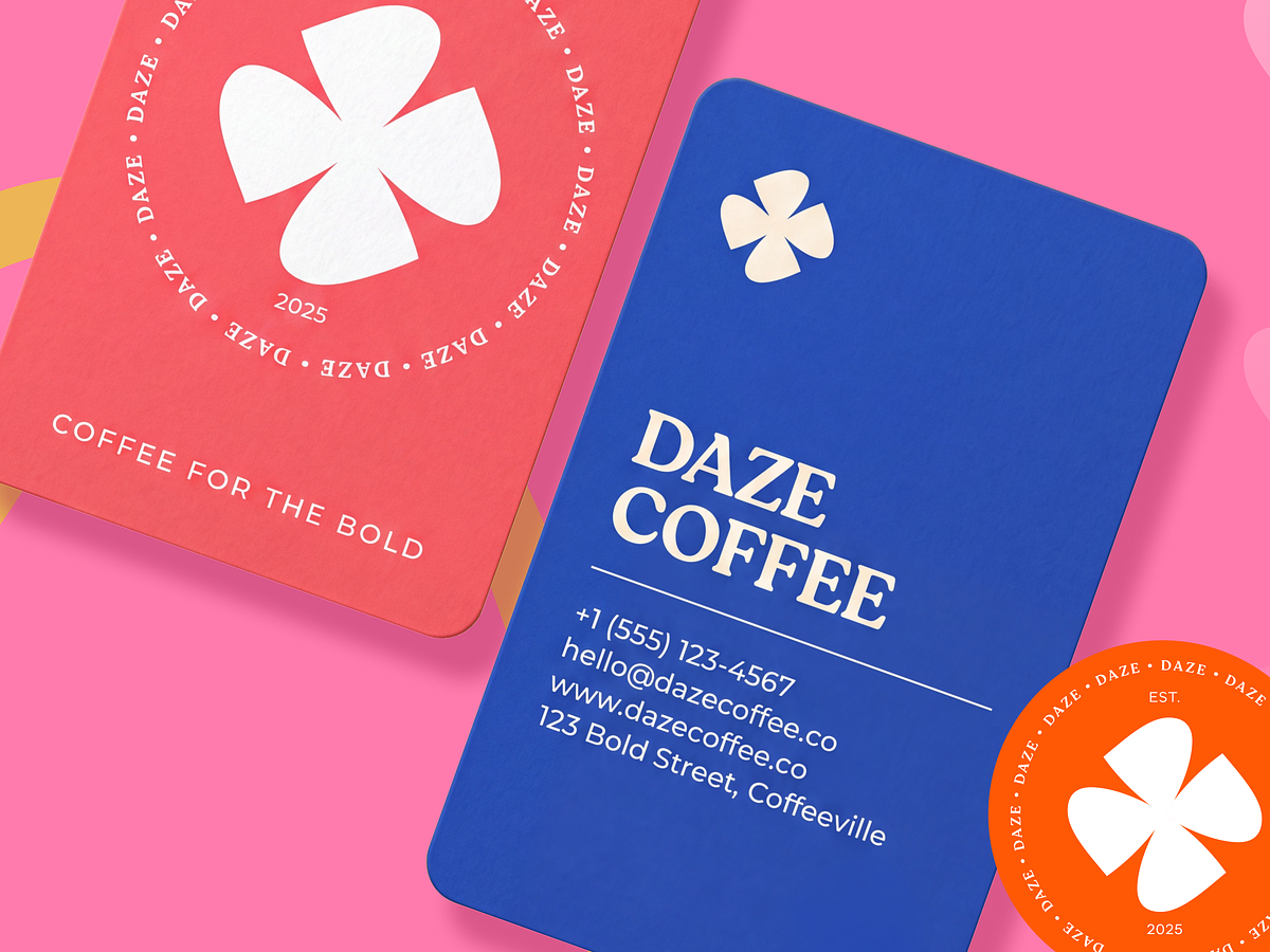
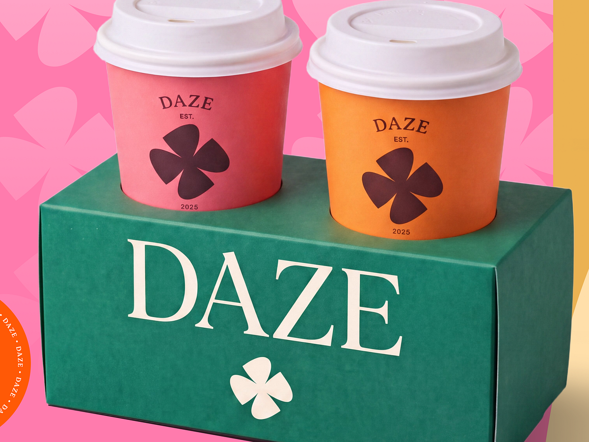
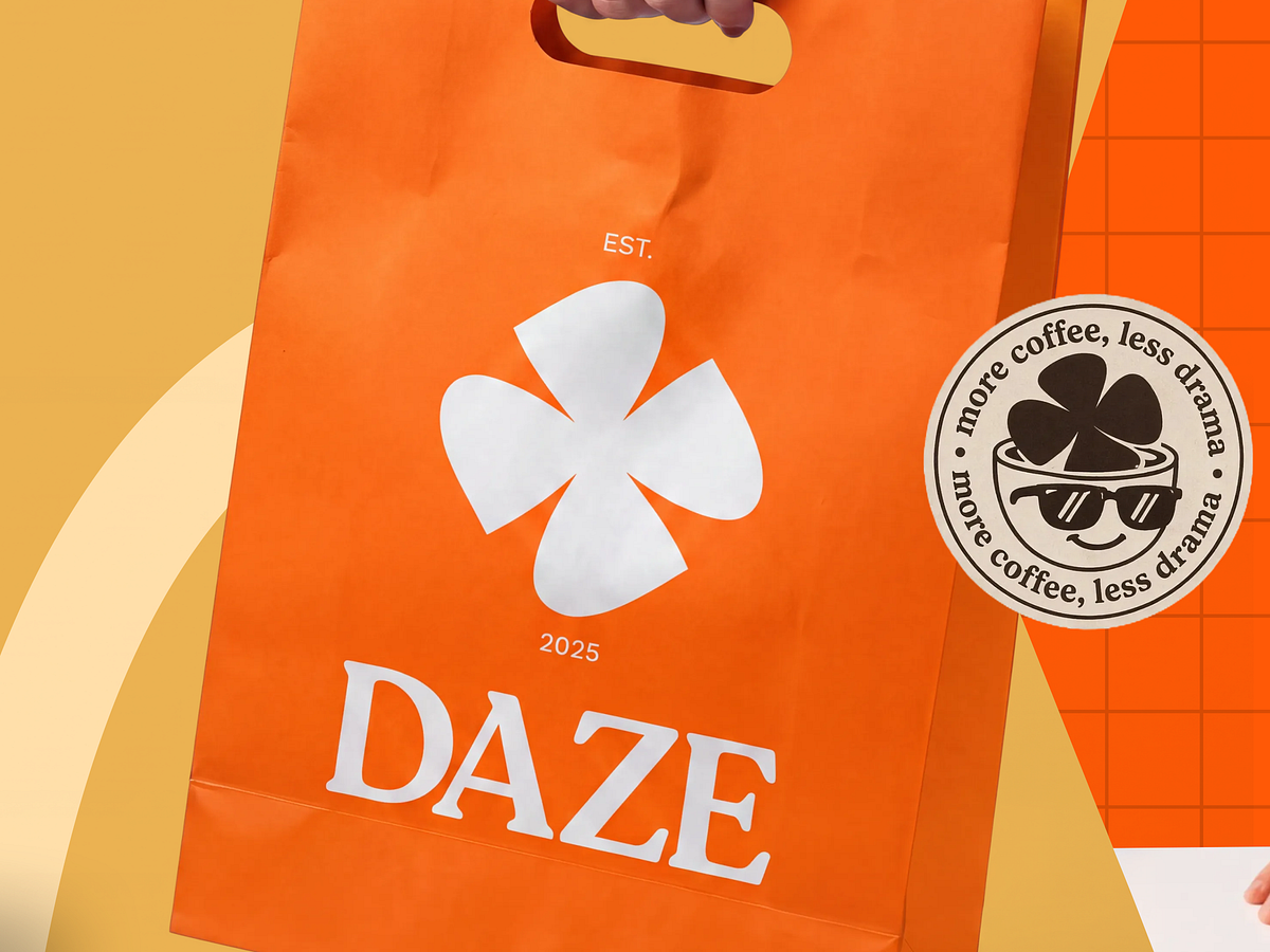
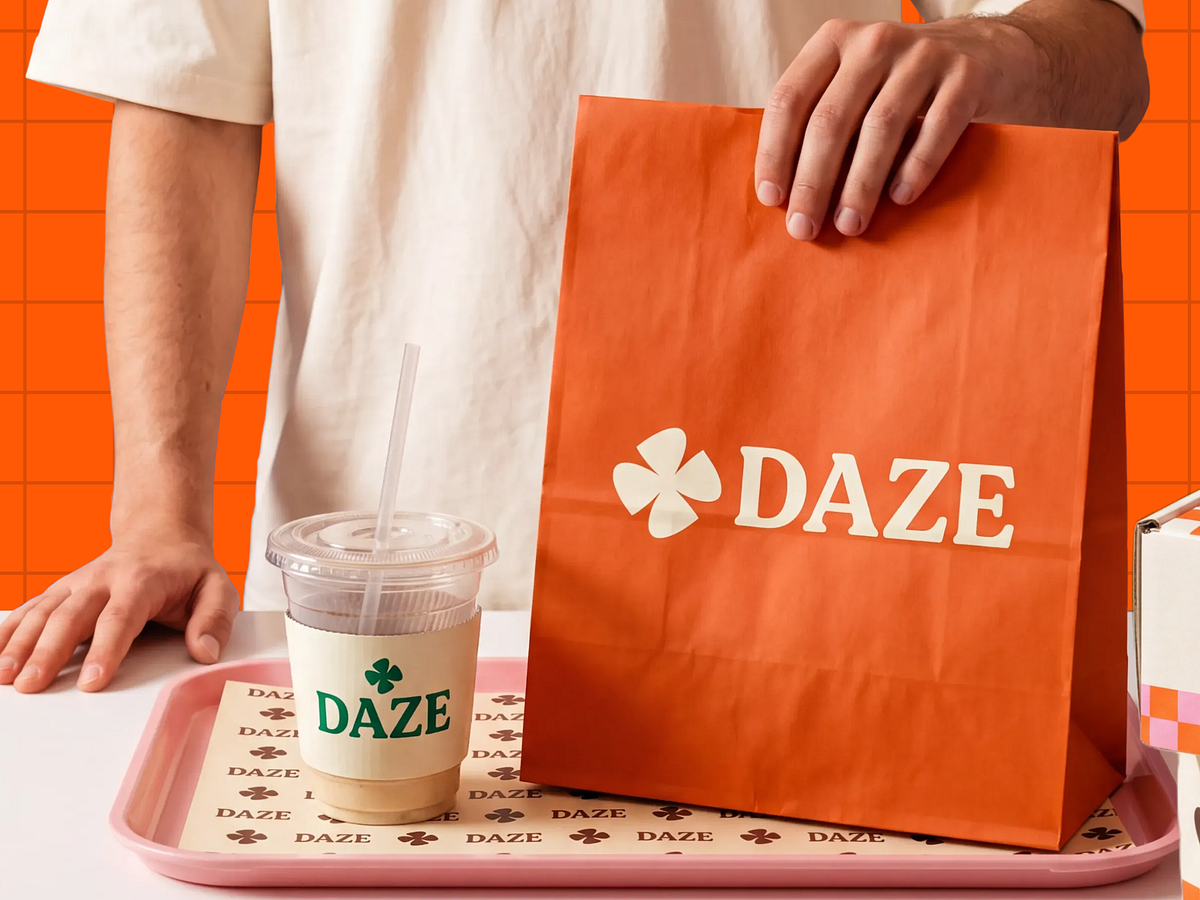
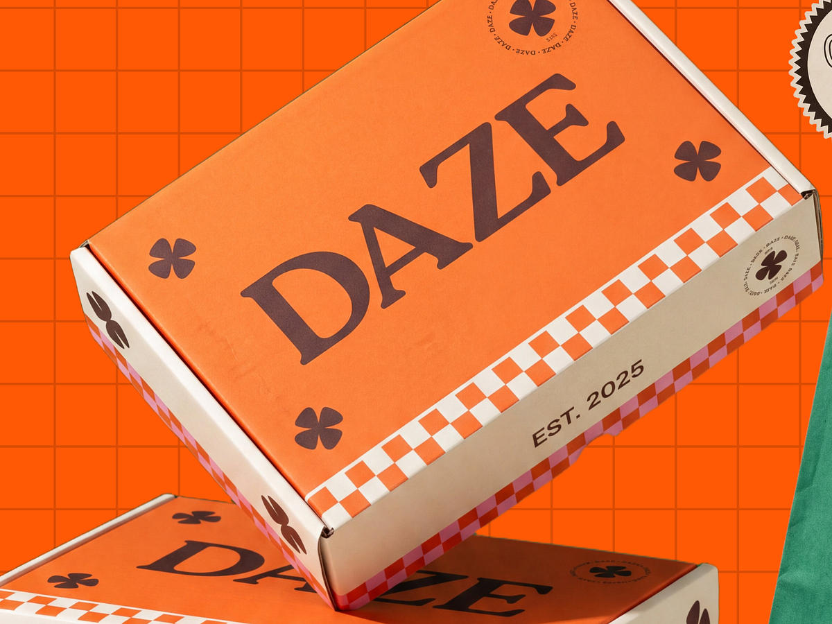
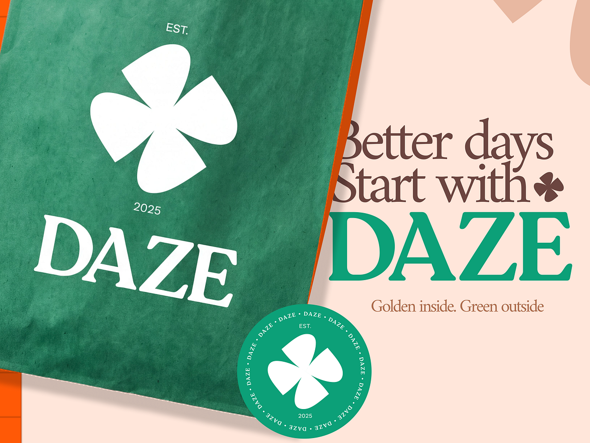
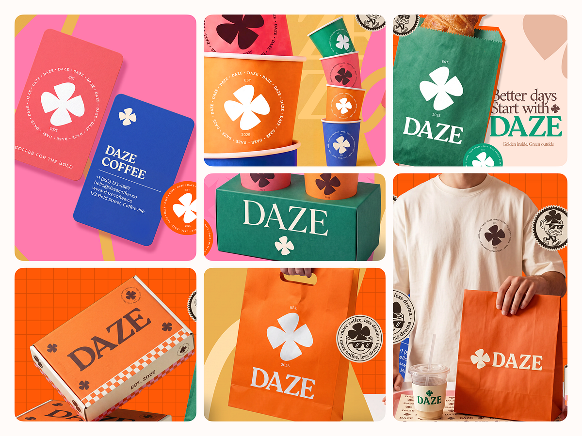
"Better days start with Daze." Not a tagline. A brand position. Daze Coffee built in cobalt blue, burnt orange, teal green, and hot pink. A four-leaf clover mark that reads as luck, freshness, and personality all at once. Business cards with rounded corners and "Coffee for the Bold" running along the edge. Stacked paper cups in three colourways. A checkerboard pastry box. A tote that makes you want to carry it empty just for the look of it. "Golden inside. Green outside." on the kraft bag. "More coffee, less drama." on the sticker. This brand writes as it talks and it talks like someone you actually want to have coffee with. The four-leaf clover in dark chocolate brown on the merch tee, the stamp seal on the cup sleeve, the maximalist colour blocking that never tips into chaos every decision is confident without being careless. Coffee for the bold. This brand means it.