Kudamono - Fruit Snack Brand Identity & Packaging Design

Project description
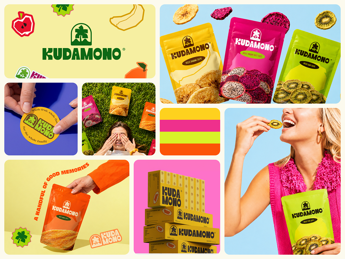
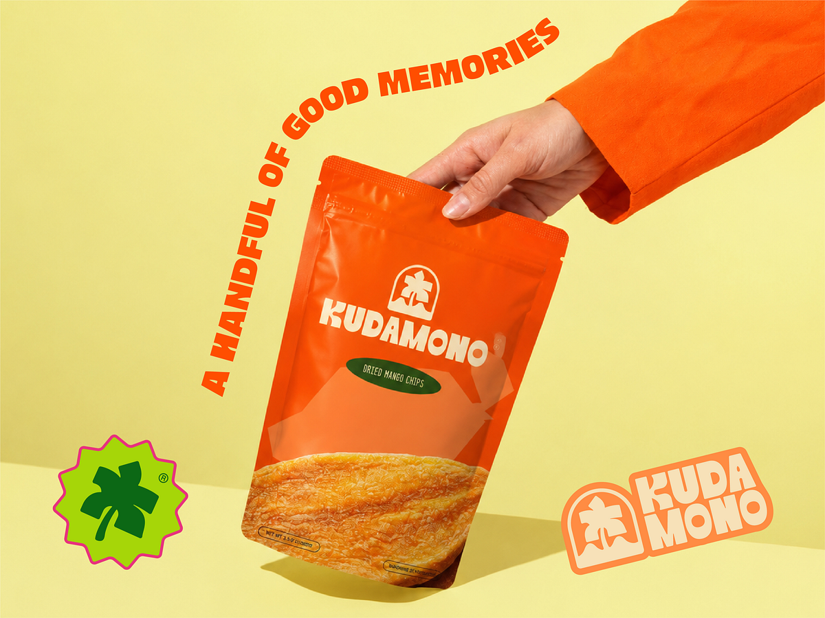
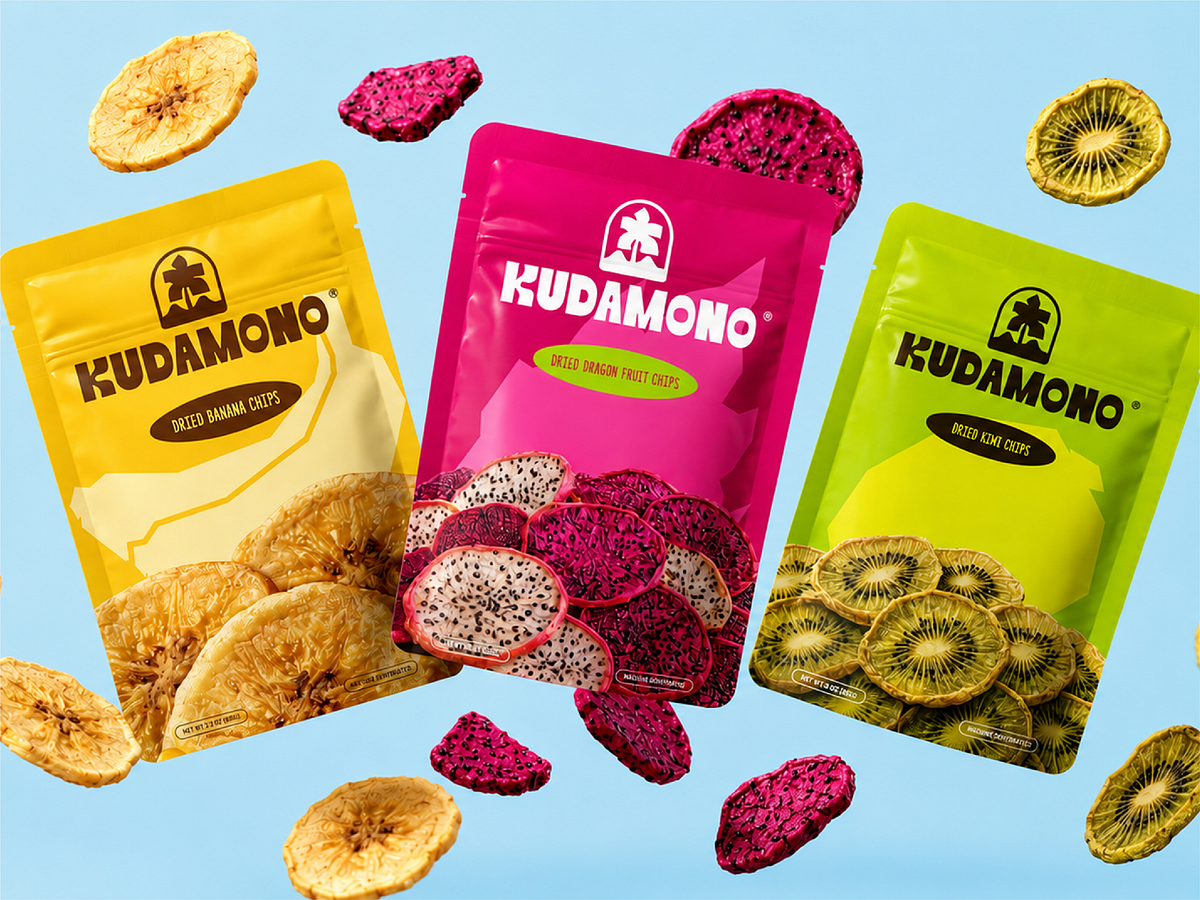
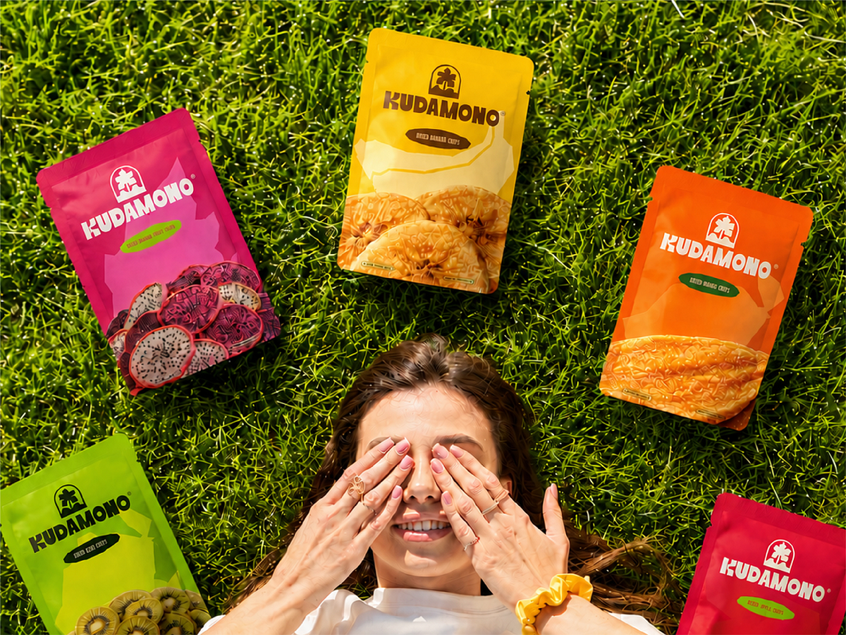
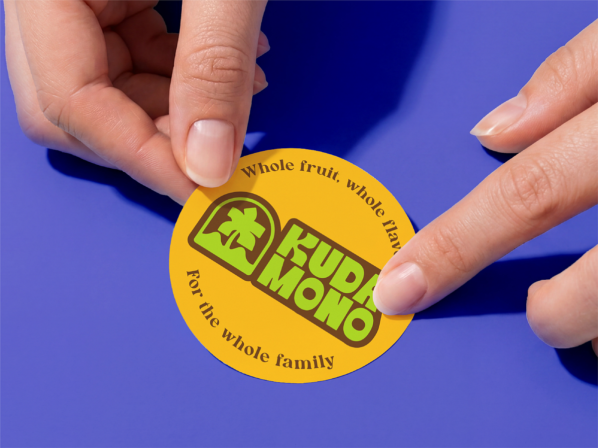
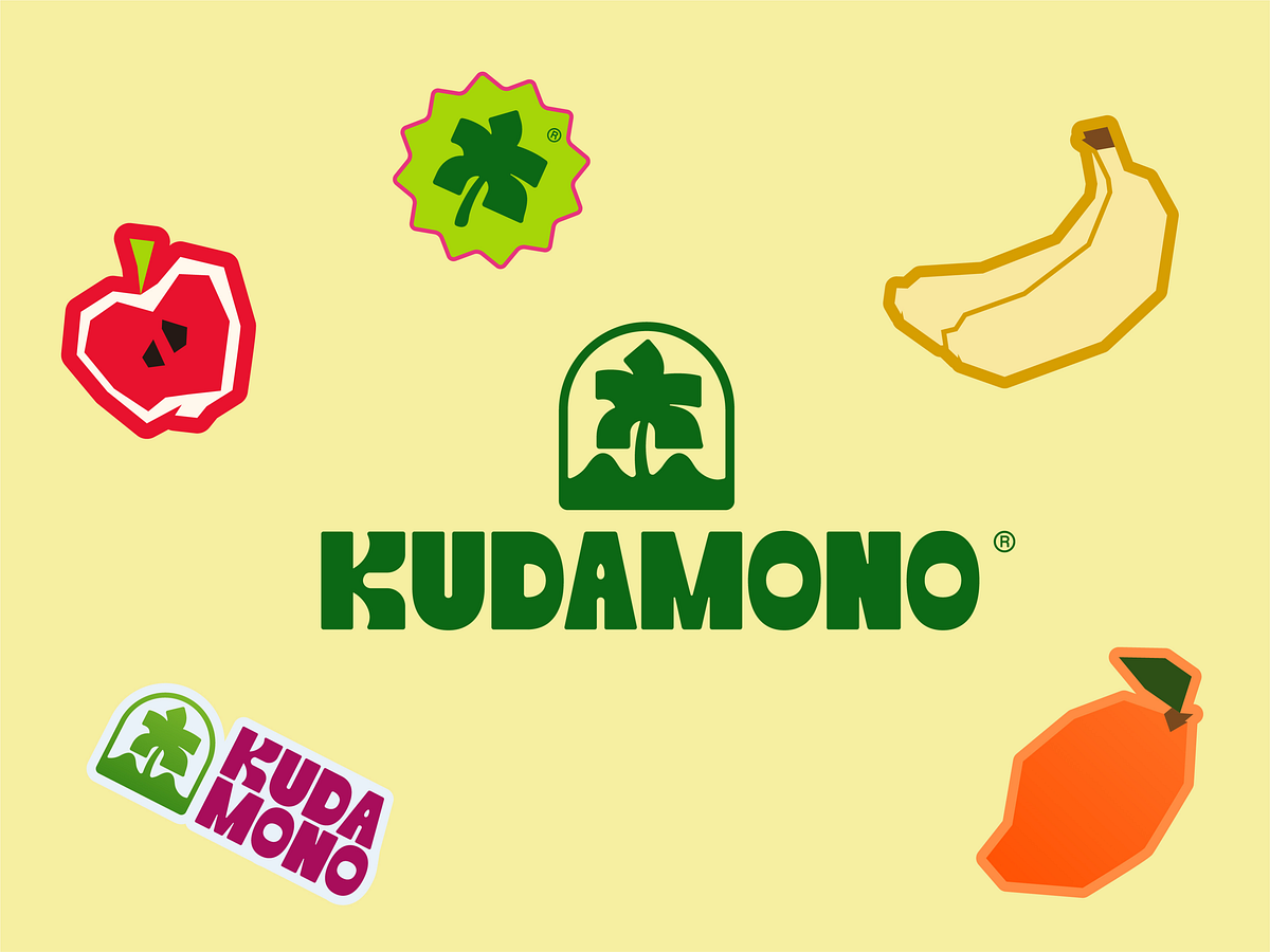
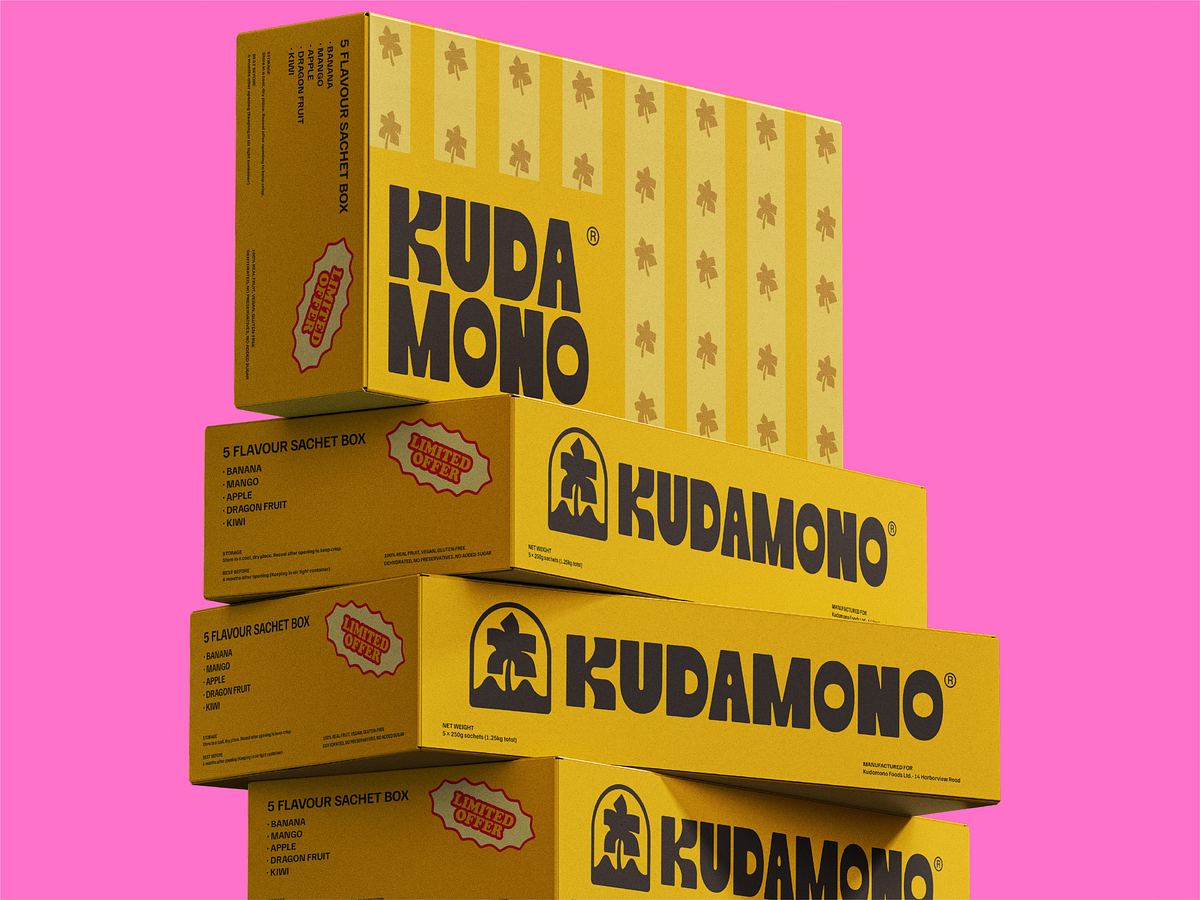
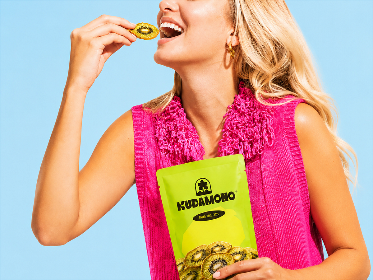
"A handful of good memories." That line is doing everything. And the brand identity earns it completely. Kudamono — a dried fruit snack brand that chose joy over health-washing. Yellow, hot pink, lime green, orange. A palm tree logomark that signals tropical without being cliché. Banana chips, dragon fruit chips, kiwi chips — each flavour with its own pouch colour, all of them loud enough to compete on any shelf. The sticker that says "Whole fruit, whole fun, for the whole family." The person lying on the grass surrounded by snack pouches, covering their eyes in delight. The campaign photography where the product and the person are equally happy. This is F&B branding that understood its job: make people feel something before they taste anything. Bold, warm, and completely uninterested in being minimal.
Support this project
Upvote