MediFlex — Medical Health Tracking Dashboard UI Design

Project description
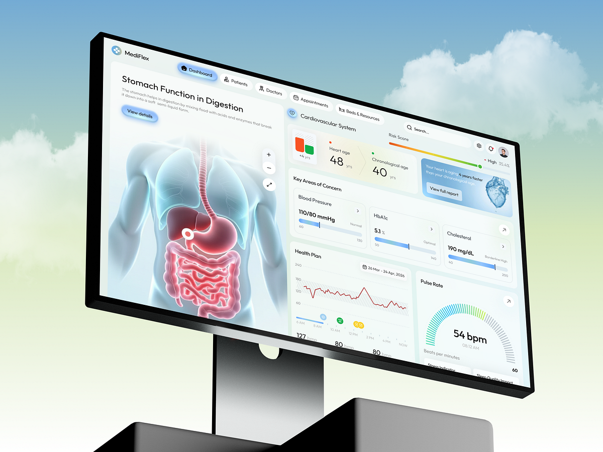
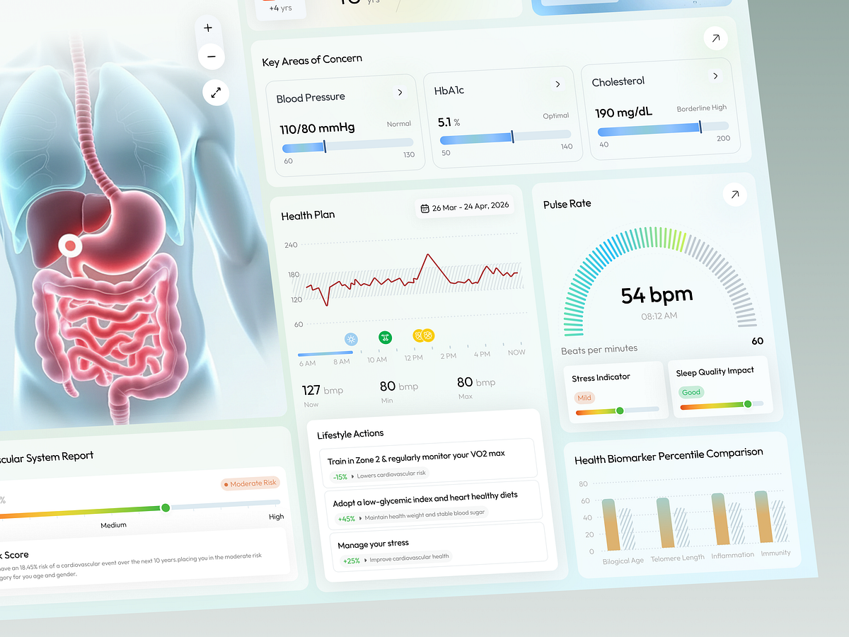
Understanding your health shouldn’t require medical training. But most healthcare platforms overload users with complex charts, scattered reports, and clinical terminology that make important data hard to interpret. We designed this dashboard to change that. Instead of fragmented information, the experience brings everything into one clear and structured interface. From cardiovascular risk scoring and heart age comparison to blood pressure, HbA1c, and cholesterol indicators — every key metric is organised so users can quickly understand their health status without confusion. To make the experience more intuitive, we introduced a 3D anatomical visualisation that helps users connect medical data with the human body. Supporting elements like progress indicators, pulse rate monitoring, stress tracking, sleep quality insights, and lifestyle recommendations transform raw data into meaningful health insights. The visual direction focuses on clarity and calmness. Soft colours, clear hierarchy, and simplified data visualisation reduce cognitive load while helping users focus on what really matters. Every design decision aims to make healthcare data feel less intimidating, more accessible, and ultimately more actionable — turning complex medical information into something people can actually understand and use.
Support this project
Upvote