Norii — Japanese Restaurant Brand Identity & Packaging Design

by Orbix Studio · Jul 2026
web
Project description
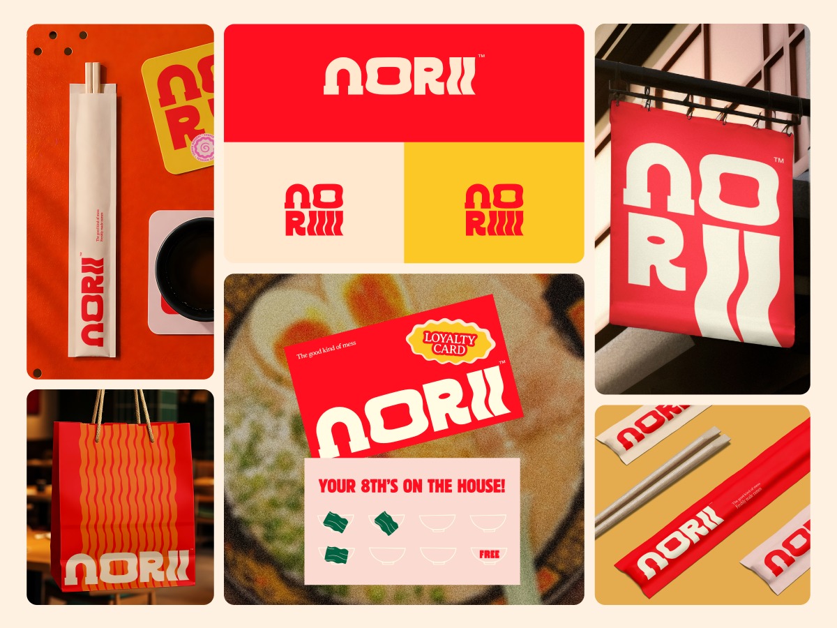
"The good kind of mess." That's on the loyalty card. And it tells you everything about how Norii was designed. Red, yellow, cream. A chunky retro wordmark where the double-I becomes noodle strokes. A takeout bag with wavy noodle lines running top to bottom. Chopstick sleeves, stamp cards, hanging signage - every touchpoint carrying the same confident, slightly chaotic energy. Nothing here is trying to be refined. It's trying to be memorable. "Your 8th's on the house" delivered with the same loud type as the logo itself. That's brand consistency that actually feels fun to be loyal to. This is F&B branding that commits completely - and looks better for it.
Support this project
Upvote