Personal Finance Analytics Dashboard Design

Project description
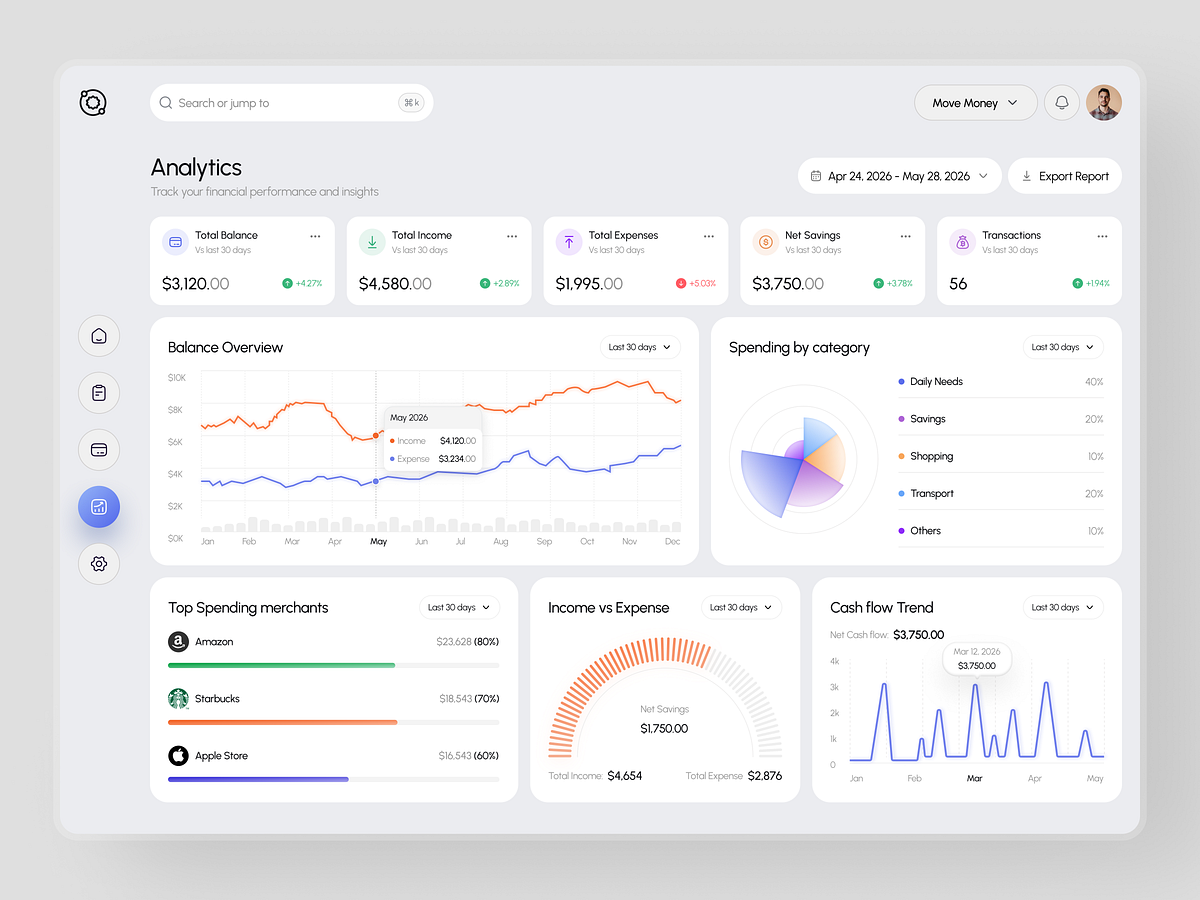
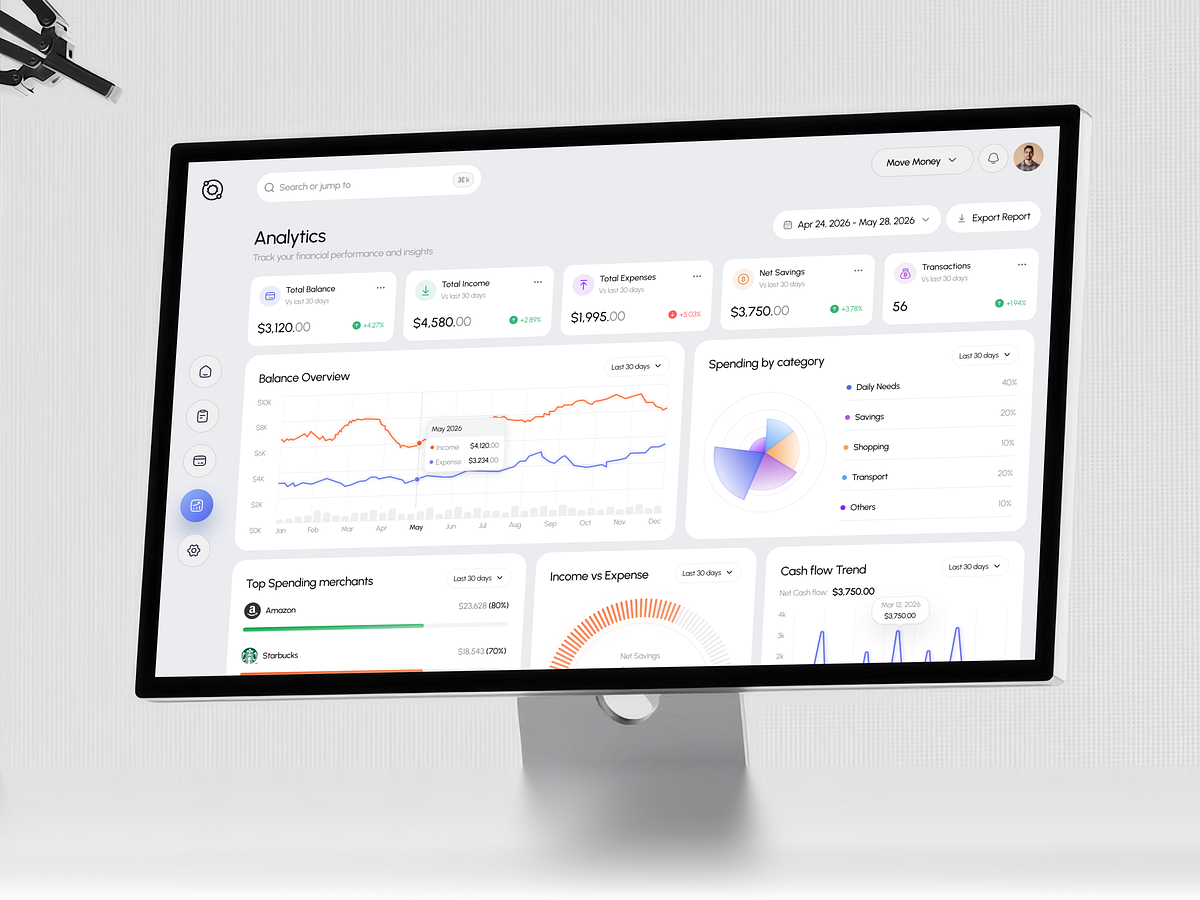
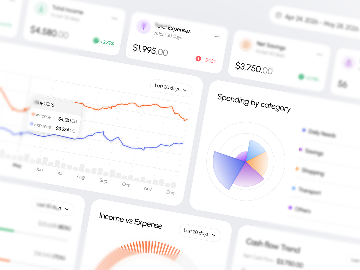
Most bank apps were built by engineers. This dashboard was built for humans. In this video, I'm breaking down a personal finance analytics dashboard UI that answers every money question you have before you even think to ask it. Balance overview, spending by category, top merchants, income vs expense, cash flow trend. All on one screen. No clicking through six different pages just to figure out where your money went. We're covering: — Why most finance apps fail at clarity — The design decisions that make data actually readable — How the petal chart for spending categories works (and why it's better than a pie chart) — What "financial clarity" actually looks like in product design Whether you're a designer, a founder building a fintech product, or just someone tired of confusing bank apps this one's for you. 👉 Want a dashboard like this built for your product? hello@orbix.studio
Support this project
Upvote