 PRO
PROHealth Dashboard Design
Project description
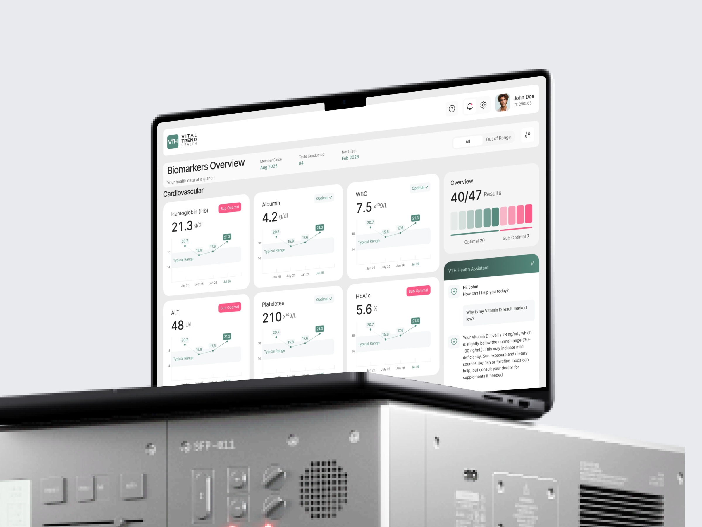
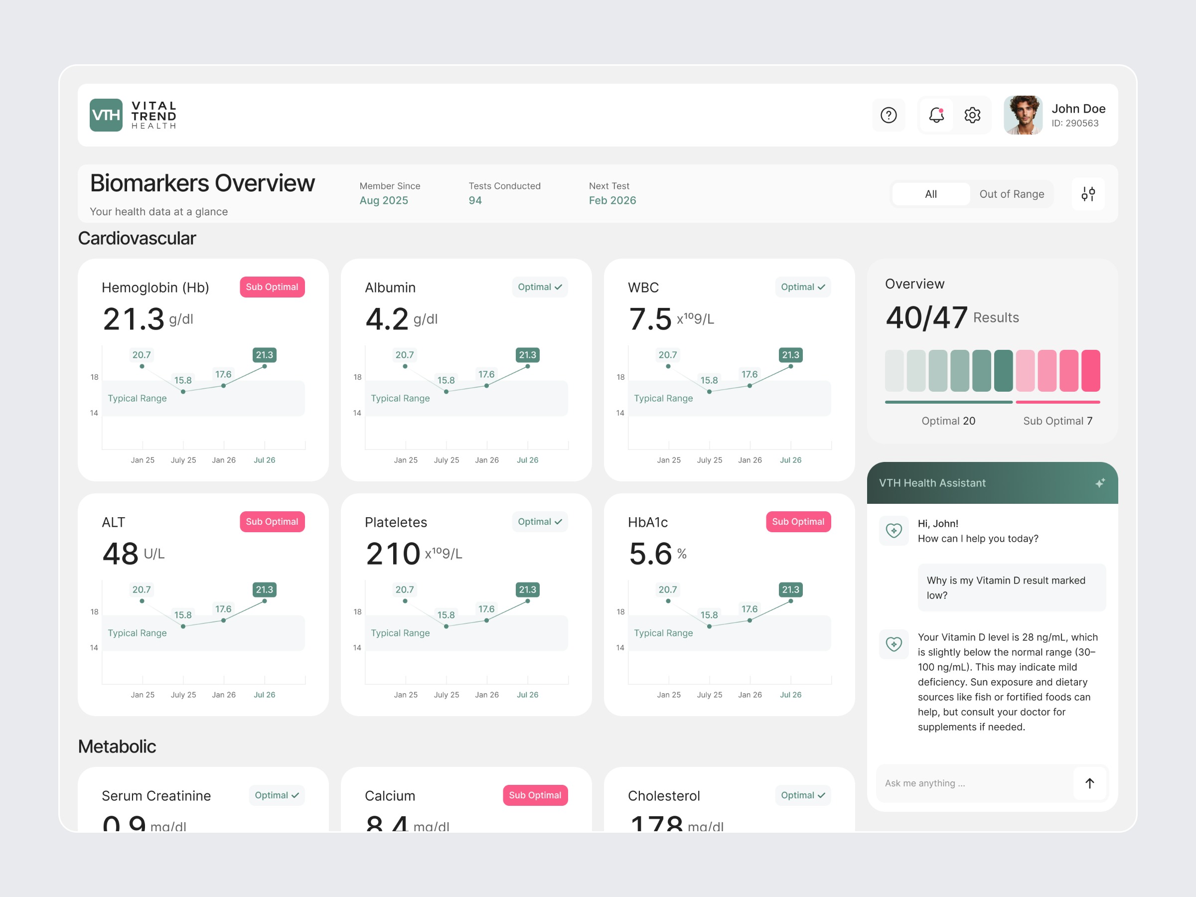
Is your health platform giving patients raw numbers without real meaning? Most health dashboards throw lab results on a screen and leave patients guessing. No trend context. No clear status. No idea what to do next. That gap costs trust. Lost trust costs retention. That is where this design changes everything. (Concept dashboard for Vital Trend Health Platform) It turns raw biomarker data into clear, actionable health insight with: → Biomarkers Overview showing all results grouped by Cardiovascular and Metabolic → Individual biomarker cards with value, unit and clear Optimal or Sub Optimal status → Trend charts for every marker showing progress against the typical healthy range → Overview panel showing 40 of 47 results with optimal vs sub optimal breakdown → All and Out of Range filter so patients focus only on what needs attention → VTH Health Assistant chat that explains exactly why a result is low or high → Member since, tests conducted and next test date visible at a glance