Drinkless — Logo Construction & Grid

Project description
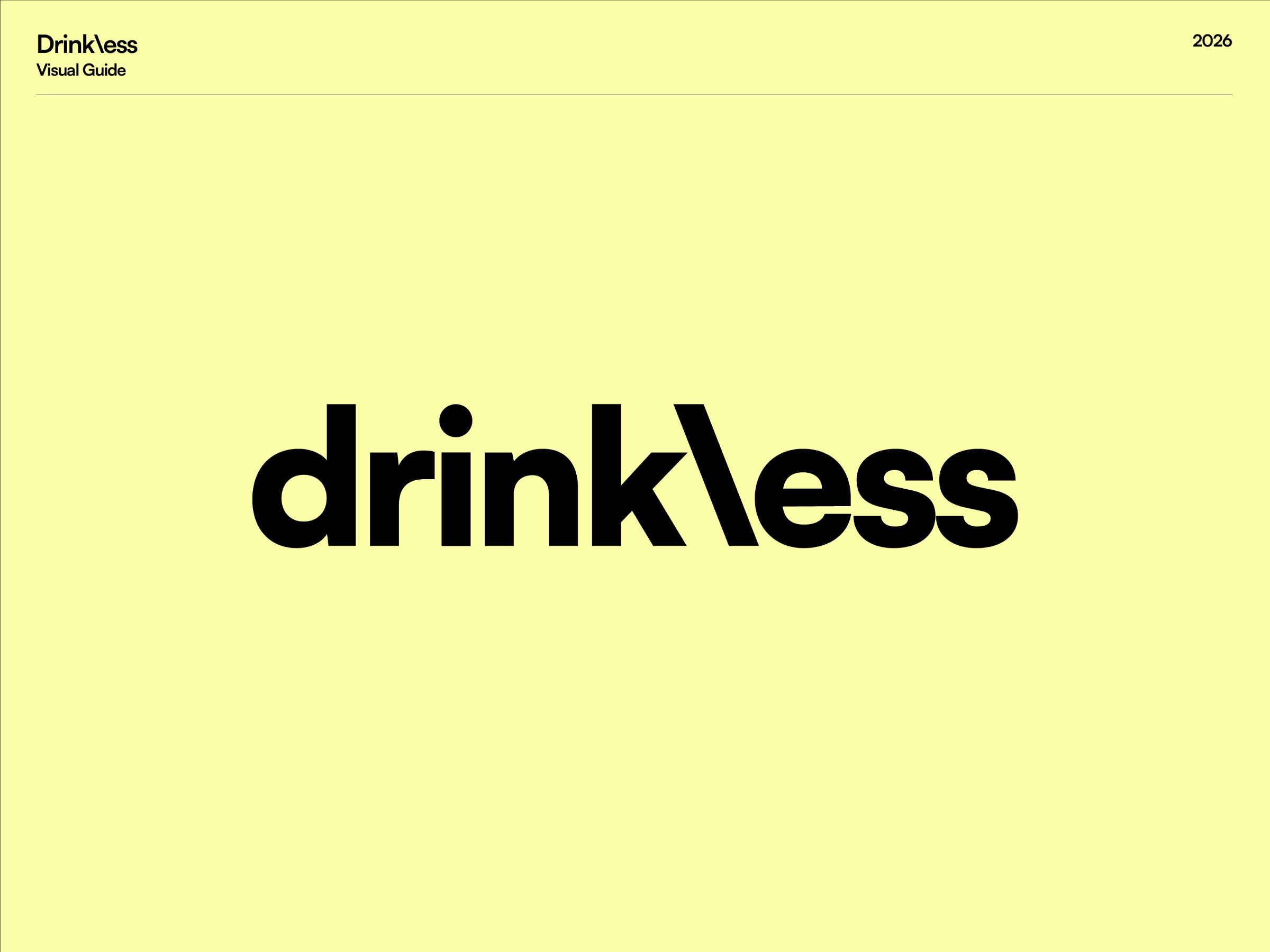
When Drinkless approached us to refine their identity, the mandate was clear: absolute geometric precision. For a brand launching physical packaging, a logo must perform flawlessly down to the smallest scale (8pt). We started by rebuilding the core 'd\' icon and wordmark on a strict mathematical grid. By carefully calculating the negative space and seamlessly fusing the elements, we ensured maximum legibility and structural balance for their upcoming launch. This is part 1 of the Drinkless visual identity system. Stay tuned for the next posts where we’ll reveal the typographic engineering and the hidden "easter egg" inside the negative space! 🍺 About Palantis — Brands Between a technical office and a craft workshop, we design identity as a rigorous and scalable system. Dedicated to human-scale organizations, technical industries, and B2B players, our practice rejects surface-level design. We focus on structural depth, where technical precision meets strategic candor to build authoritative brands. → Every project starts with a diagnostic. Contact the studio to evaluate your visual infrastructure.
Support this project
Upvote