

Split Panel CTA Showcase | Redesignee
Project description
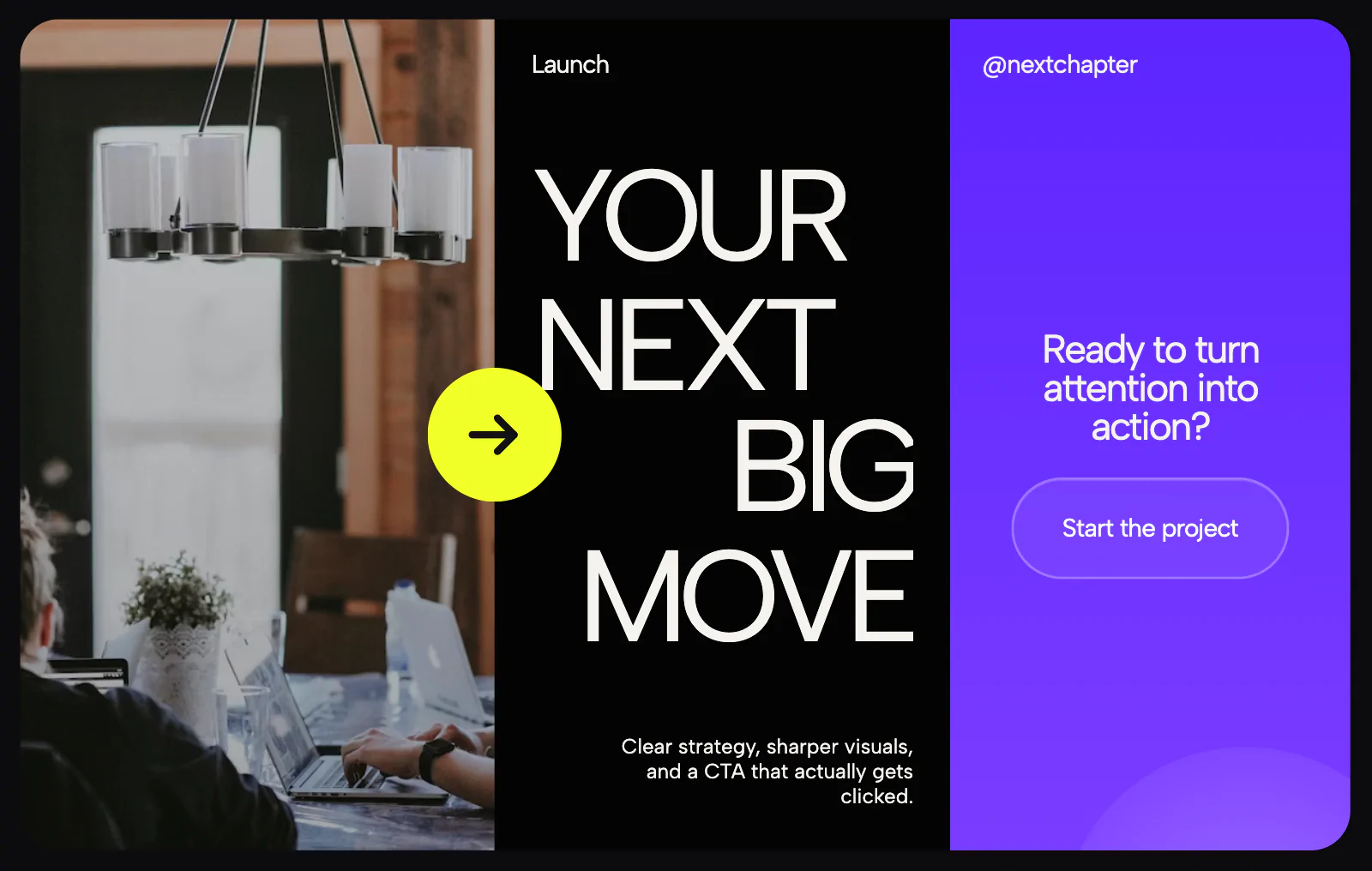
A premium split-screen Call-to-Action (CTA) section designed to maximize landing page conversions. It divides the viewport into two high-contrast panels that interact dynamically when hovered, creating a highly engaging gate before users click through. Standard CTA blocks are often generic banners with a single button that users easily scroll past. We designed this layout to make the final push on a landing page feel bold and unavoidable. By splitting the space evenly between a deep dark aesthetic and a vibrant canvas, the layout balances clean typography with raw visual energy. When a user hovers over either side, the panels fluidly shift in scale, guiding the focus directly to the target action. Key Design Features Asymmetric Hover Physics: Panels smoothly expand and contract based on mouse movement, making the user feel completely in control of the interface. Dual-Intent Architecture: Perfectly handles two distinct actions (like "Book a Demo" vs "Explore Features") side-by-side without cluttering the screen layout. Lightweight Screen Transitions: Built completely as a cloud component, meaning the split layout scaling animations run at a perfect 60fps without heavy JavaScript libraries or page bloat. Tools & Tech Stack Design & Layout: Figma Front-End: HTML5 / CSS3 / Vanilla JavaScript Platform: Redesignee Cloud Components
Support this project
Redesignee voted for this project