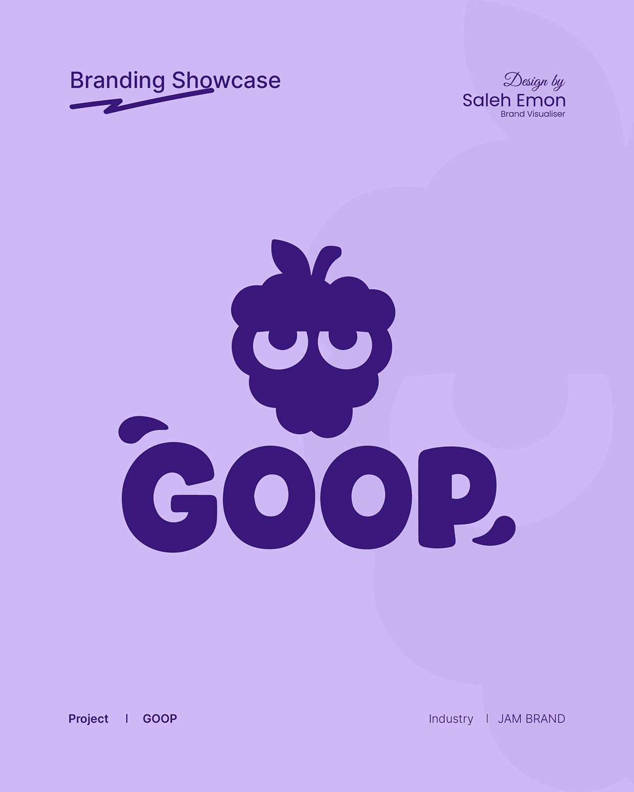
GOOP | A Playful Mixed Berry Spread Brand Identity

Project description
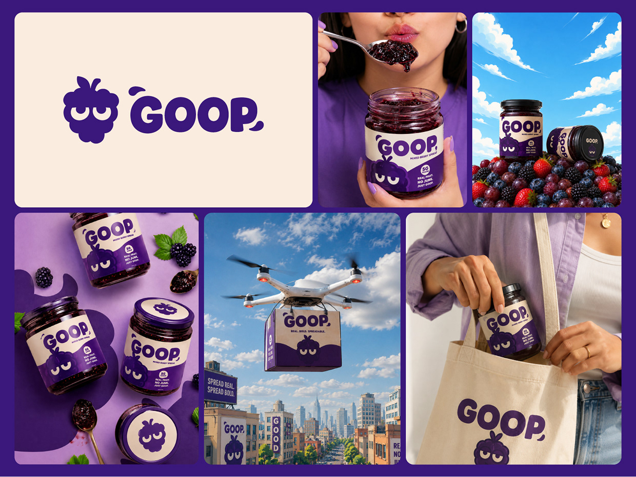
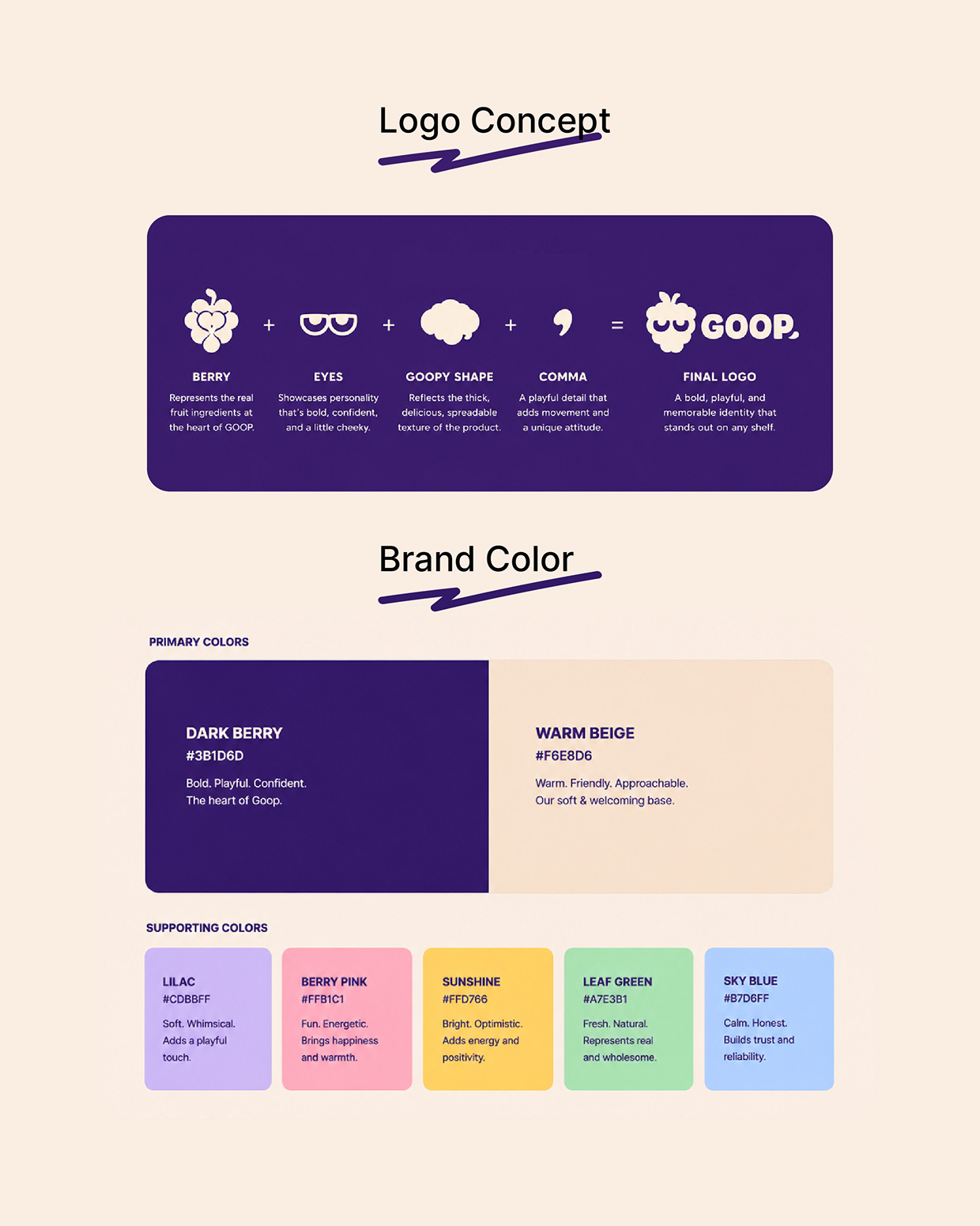
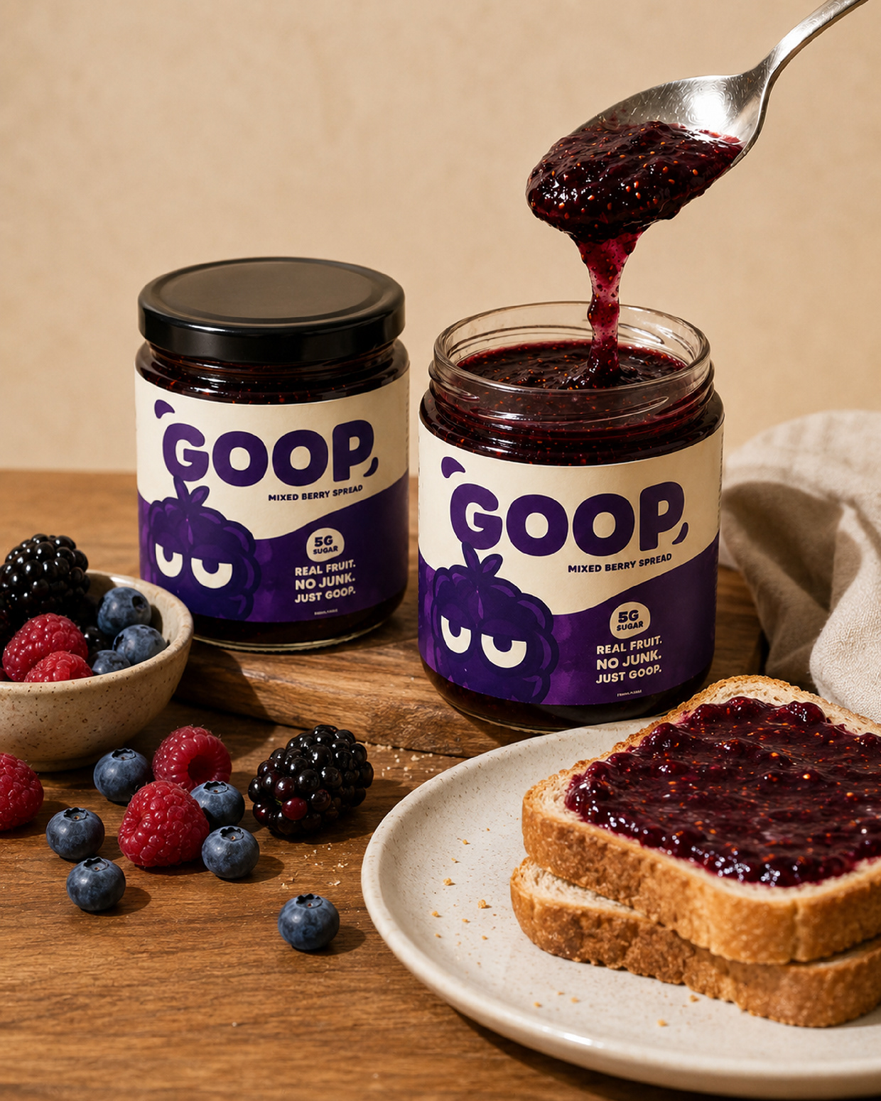
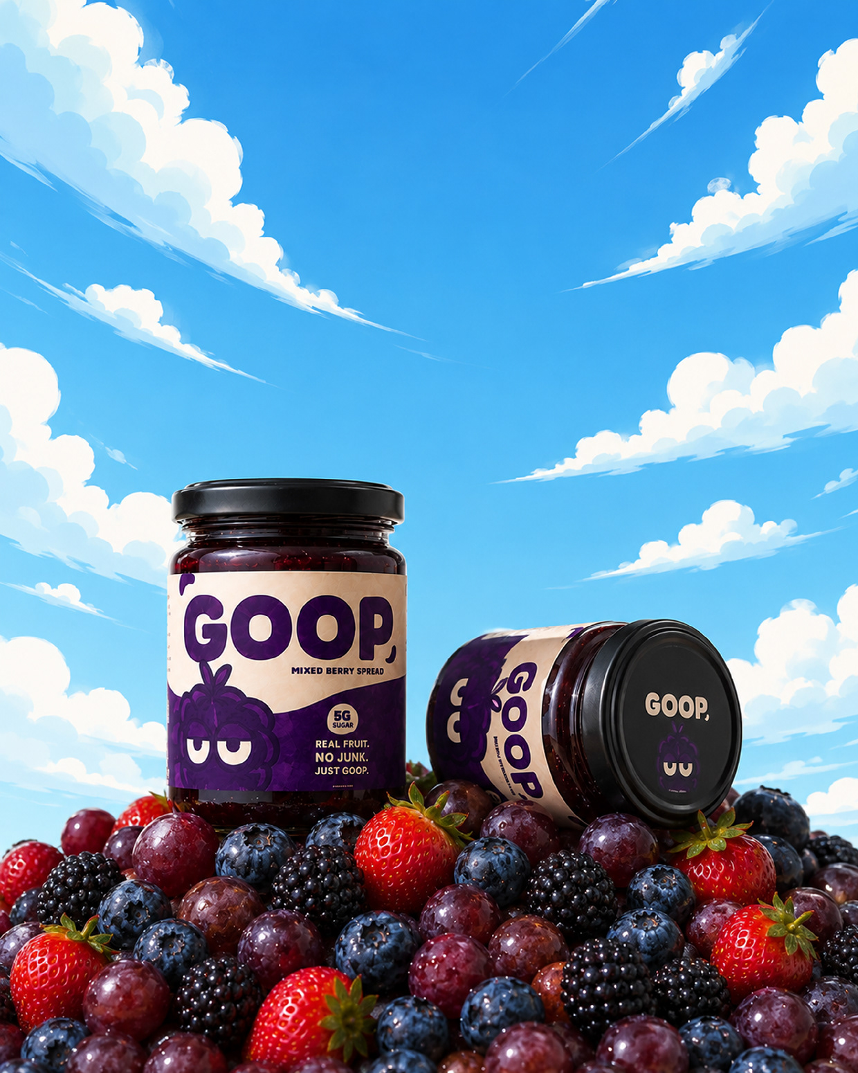
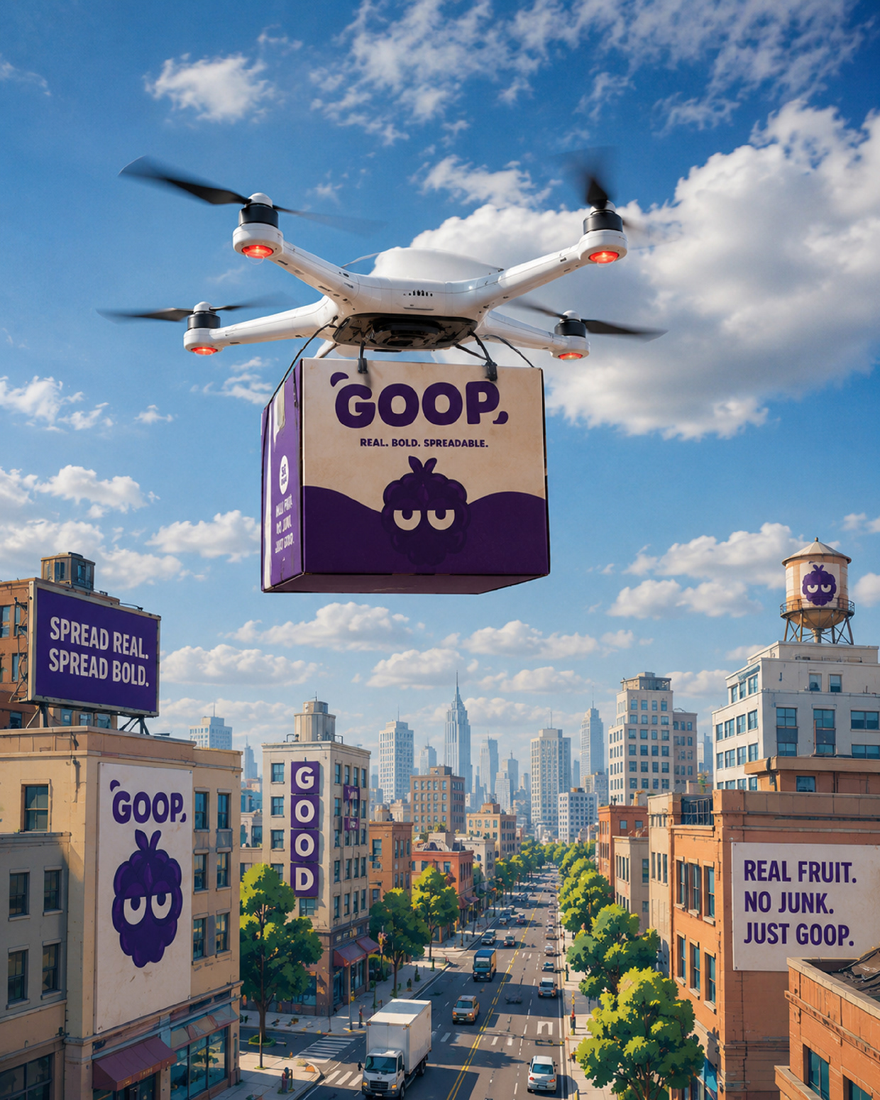
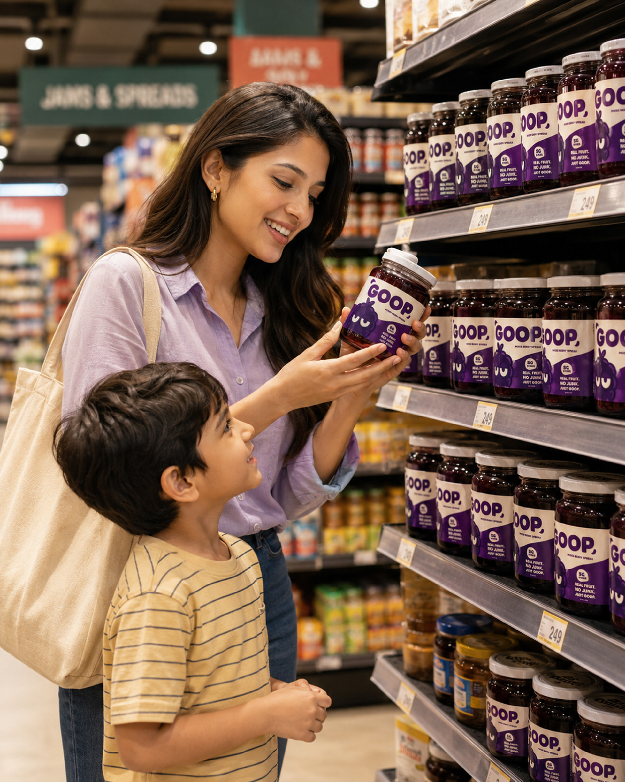
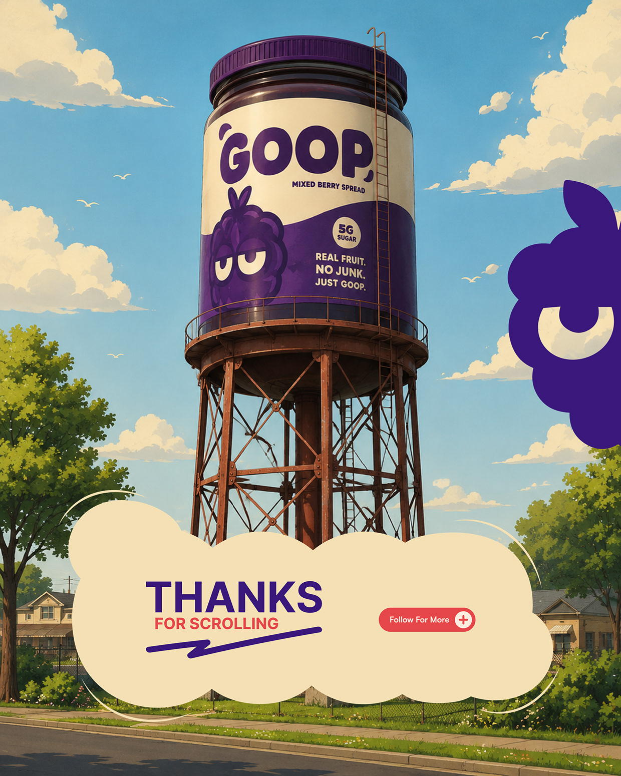
GOOP is a playful mixed berry spread brand created to break away from the usual “homemade jam” look. Instead of soft, traditional visuals, the identity uses a bold berry character, chunky typography, and a strong purple-led color system to make the brand feel fun, confident, and highly memorable. The logo combines a berry-inspired mascot, sleepy expressive eyes, soft goopy shapes, and a playful comma detail. Together, these elements create a brand mark that feels cheeky, energetic, and instantly recognizable. The packaging system was designed to feel bold on shelves while still keeping a warm, friendly food-brand personality. The cream label adds softness, while the deep berry purple gives the brand strong recognition. Supporting colors like lilac, berry pink, sunshine yellow, leaf green, and sky blue help expand the identity across campaigns, posters, social content, delivery visuals, and retail displays. GOOP is not just a jam brand. It is a character-driven food identity built a
Support this project
Upvote