Shaky Gotcha | Vol. 7.0 – Seamless Flow & UX Timing
Project description
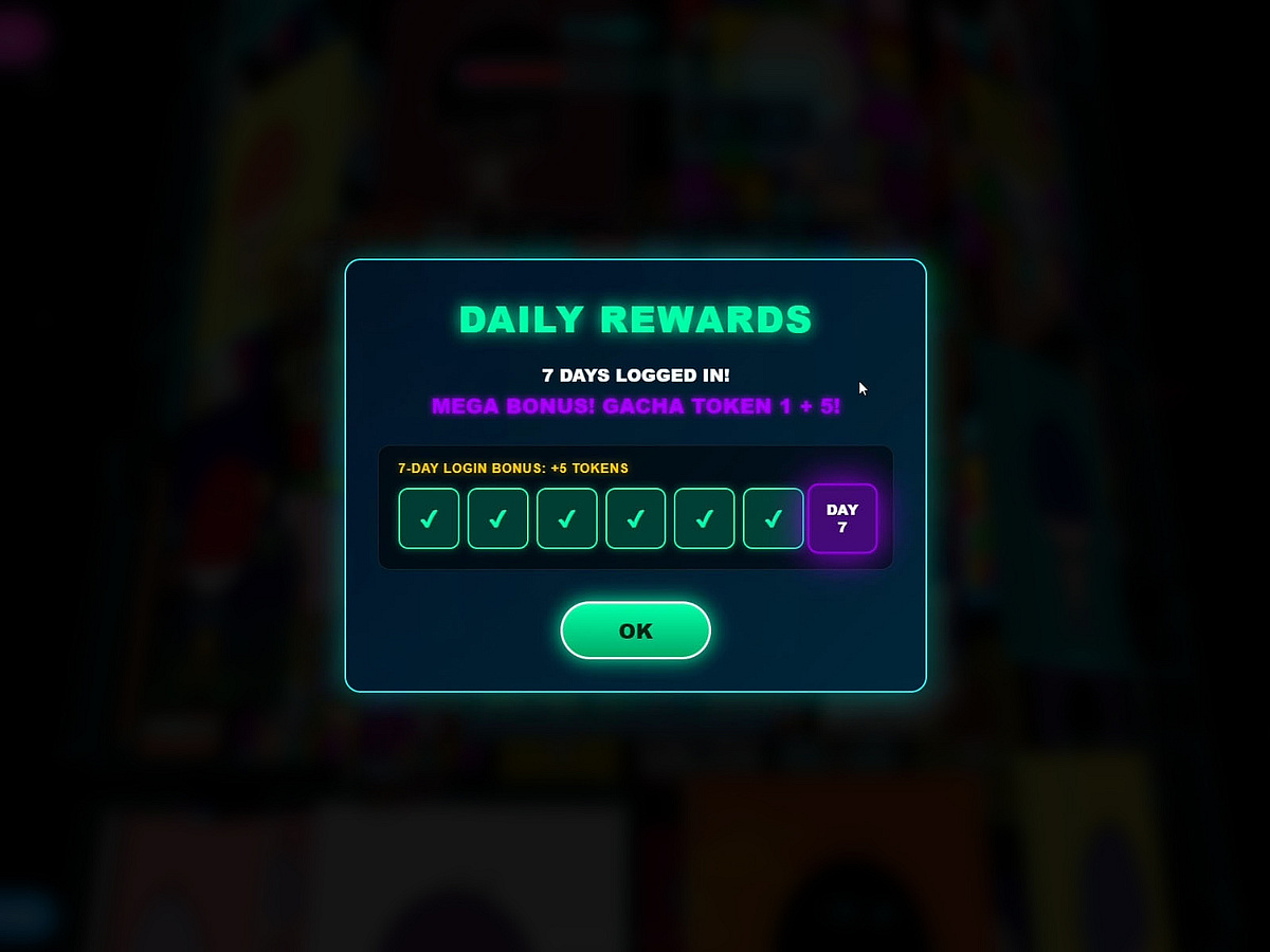
3D Web Arcade Case Study: Vol. 7.0 – Seamless Flow & UX Timing There’s nothing worse than getting into the zone… and suddenly being interrupted by a daily check-in or a pop-up. In Shaky Gotcha, rewards aren’t interruptions — they’re part of the flow. At the start, I hid a Double Welcome Gift: 1️⃣ 10 gacha coins ➔ “CLAIM” 2️⃣ 100 Soul Fragments ➔ “START MISSION” No filler. No pause. You’re immediately pushed back into action. For returning players, I did something counterintuitive:delayed pop-ups. Instead of interrupting the opening impact, the system waits 1.5 seconds — then smoothly slides in the check-in UI. This is about timing dopamine, not forcing attention. I also removed punishment-based streaks. Rewards are accumulative, not stressful. Build up for 6 days. Day 7 triggers a purple neon burst reward. The key detail: Seamless Transition. No closing screens. No breaks. Just "READY… GO!" — instantly back into the experience. Good UI/UX isn’t a salesperson. It’s an invisible hand, guiding players without breaking flow. Missed the welcome gift yesterday? Or haven’t checked in today? Step in and feel the 1.5-second golden timing, and the stress-free reward system for yourself! 🪐 Dive into the full series on my profile. (To be continued...) 🔴 Experience the live site: myshaky.com/gotcha