

Crown of Excellence: The Aslam Exports Logo
Project description
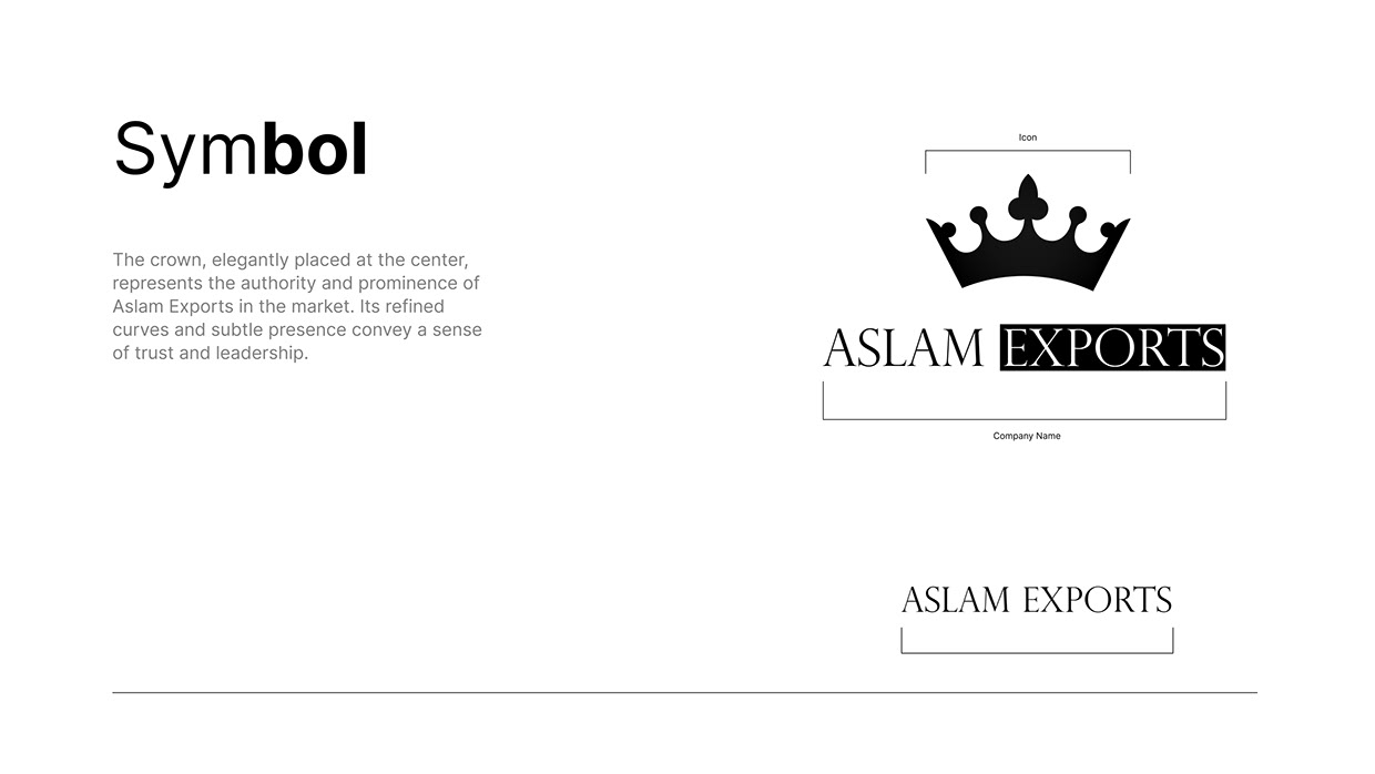
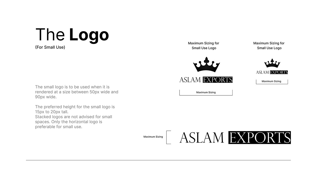
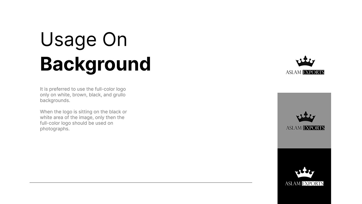
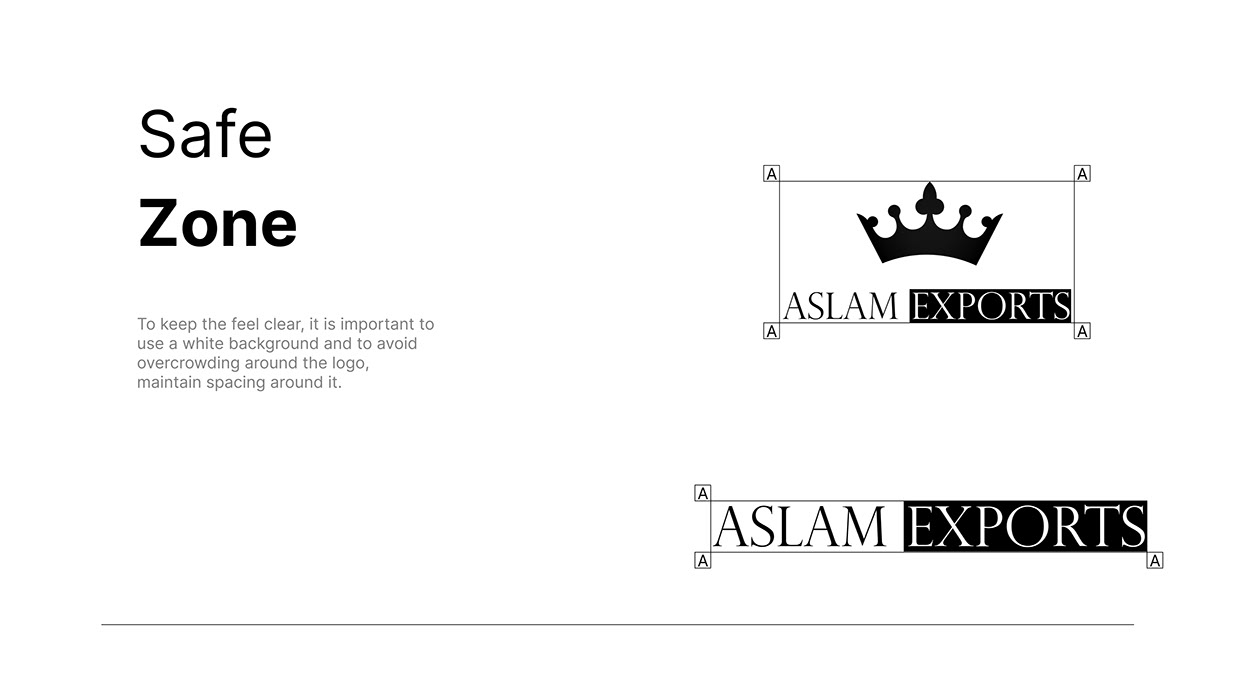
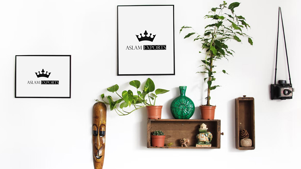
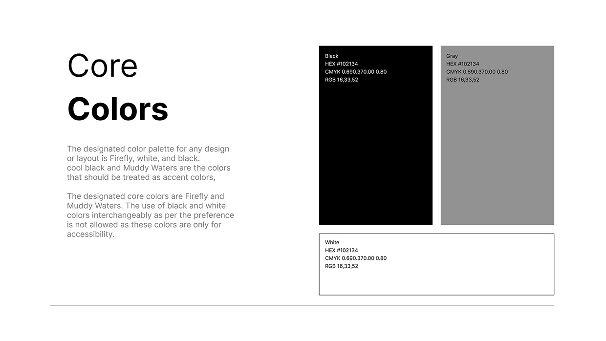
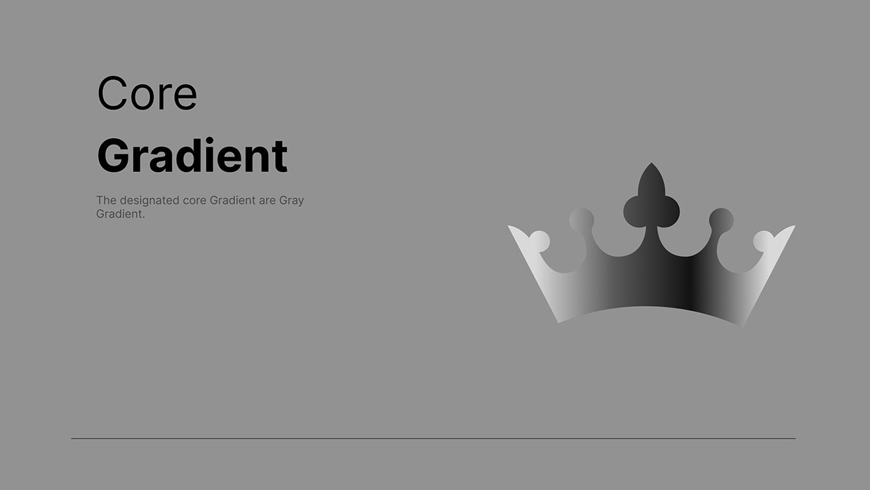
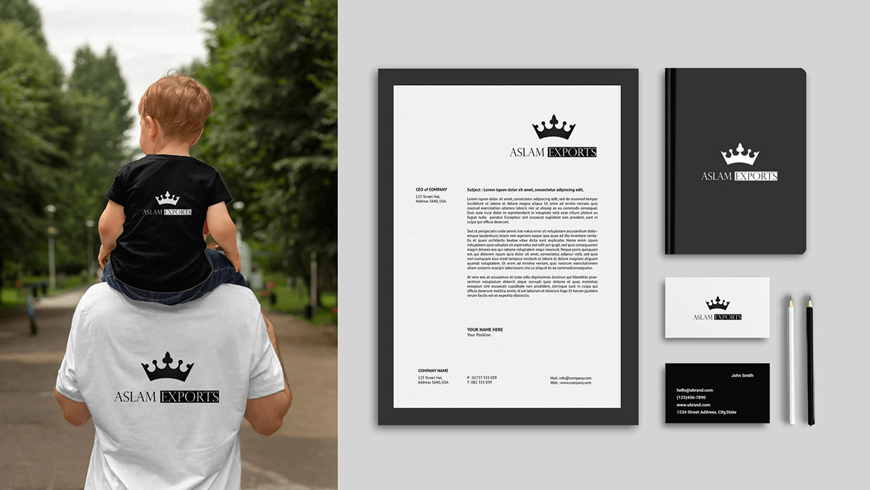
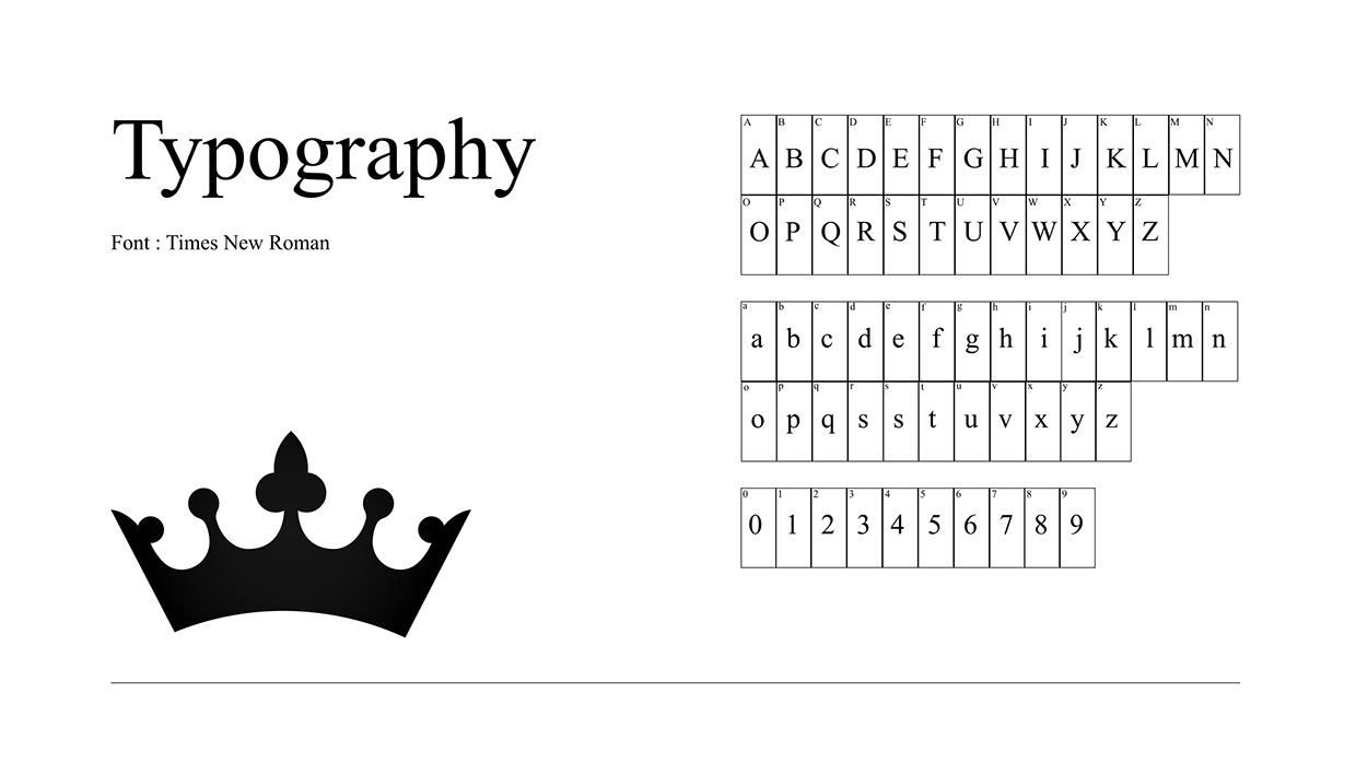
Here is a brand identity project I developed for Aslam Exports, a company operating in the global trade and export sector. The identity is anchored by a minimalist crown symbol, representing leadership, reliability, and high quality. To ensure the brand feels premium but not overly complex, I focused on clean, refined curves for the crown silhouette. For the typography, I selected a classic serif typeface to reflect tradition and professionalism. By locking up the company name with "ASLAM" in a clean format and "EXPORTS" reversed out of a solid black block, the text achieves a balanced visual weight that complements the bold shape of the crown. The strict black-and-white color palette was chosen to emphasize clarity, transparency, and a timeless, sophisticated aesthetic across international shipping documents, digital platforms, and physical packaging. What are your thoughts on this editorial approach to a global trade brand?

Support this project

Seative voted for this project