

DigitechHub: A Tech Brand's Visual Odyssey
Project description
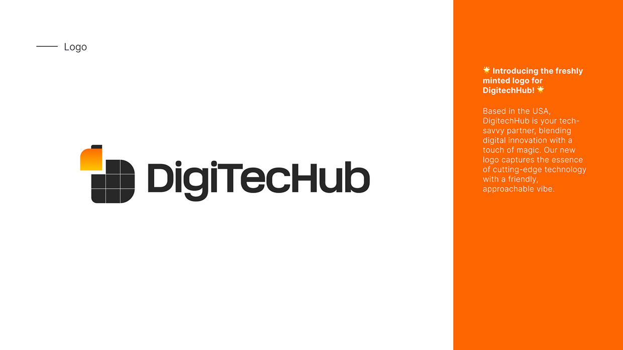
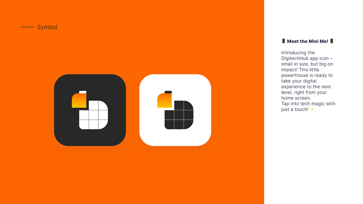
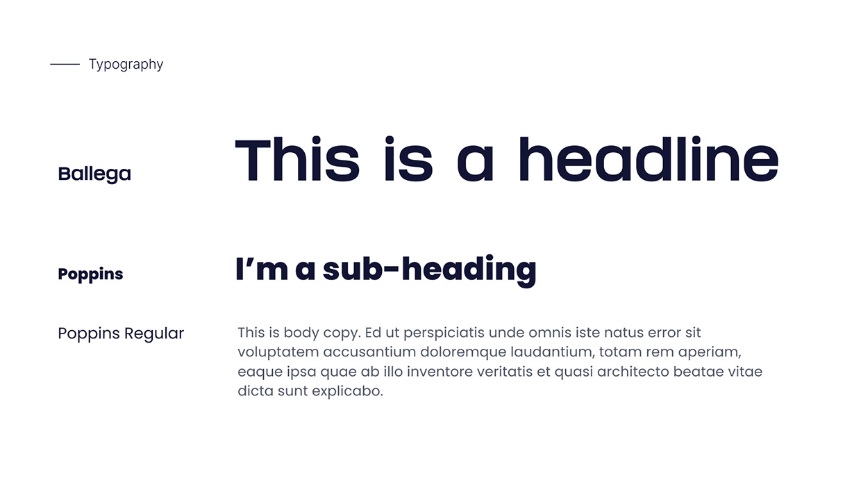
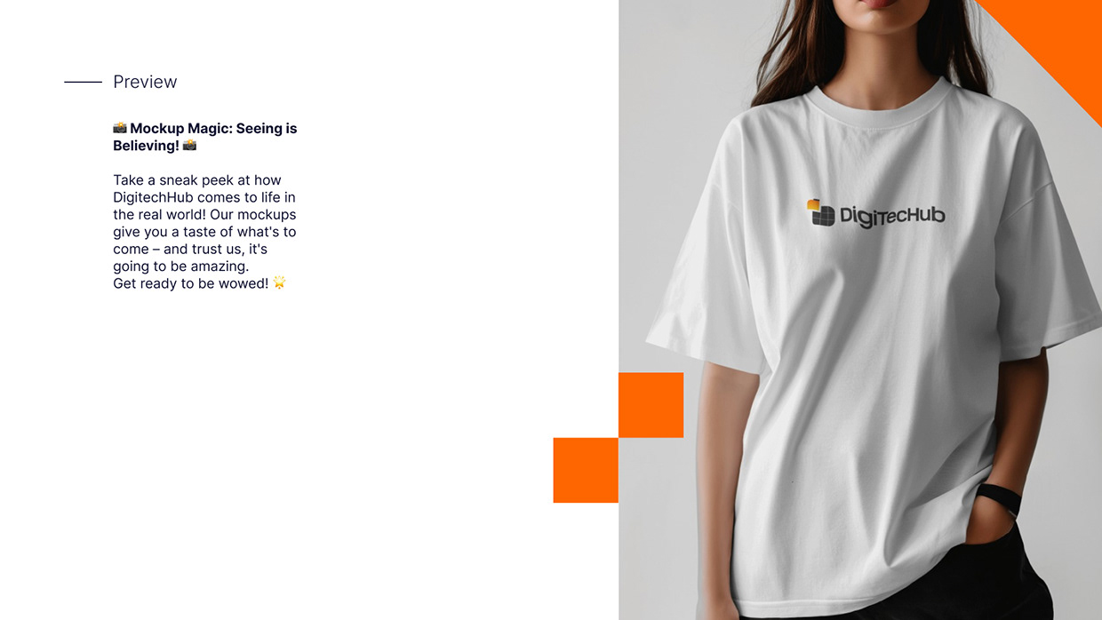
Here is a brand identity project I worked on for DigiTechHub, a B2B SaaS and digital platform concept. The logo mark is structured to form the letter "D" using a grid of modular blocks, which represents data organization, software structures, and technology. To emphasize the "hub" and "file directory" nature of the platform, I designed the top-left block with a vibrant orange-to-yellow gradient, mimicking a folder tab or an active data element lifting out of the grid. I paired this mark with a bold, modern sans-serif typeface to ensure clean legibility across web and mobile headers. The mockups show how the visual identity integrates into a clean web landing page layout, as well as a simplified preview of the icon in a mobile app format. I'd love to hear your feedback on the grid concept and the gradient accent!


Support this project
Be the first to upvote